The Inkspired Life - Sketching & Painting : Inking Out Loud
Artist Jason Nicholas demonstrates mixed-media techniques with watercolors, ink, and crayons on cold-press paper, sketching cityscapes while chatting with viewers. He discusses an upcoming architectural sketching workshop and proposes a 24-hour Inkathon fundraiser for Habitat for Humanity.
Chapters
Hey DB, good to see you. Hope you're having a great day. Thanks for tuning in. Awesome to see you. We're gonna get started here, do some sketching. Just looking for a button here on my computer. I hope everything's well though. Let's see. Here we go. Always glad to be part of this time. Oh, you are so kind. It's always great to have you here. Ooh, I didn't realize I had yellow paint on this. That's okay. So I'm just sketching with my Lamy pen, my Lamy ink, using some water. Just letting things bleed a little bit, playing around, having fun. I had the day off from school, which was nice today. We're off tomorrow as well for teachers' convention, but I am using my time to stay home and catch up on a lot of things, rest being one of them. "Thinking about drawing a building and the design of buildings found in India for Saturday's class." Ooh, thinking about drawing a building and the design of buildings found in India for Saturday's class. DB, that sounds really interesting. Awesome. I love that idea. If you have any pictures you want to share and post on the workshop page, that would be really cool. Yeah, I'd love to see what you're thinking. Definitely share an image and then— or if you have— yeah, share an image and I'll take a look. Maybe I'll do a demo, try to do a sketch as well. Sounds like a cool idea. So I'm just playing with— I have some watercolors. I'm just playing around with colors tonight. Not really trying to create anything special. You know, my usual routine, just throwing down ink. But tonight I wanted to throw down some color as well, just see what happens. Just kind of going for it, just going with my gut and using what I have in my watercolor palette. So these are Winsor Newton watercolors. I've used Winsor Newton for many, many years, so it's just something I'm used to. I got some new paper I'm gonna be trying out a little bit. I got some Strathmore watercolor paper, 140-pound, and we'll compare it to the Canson paper I'm using now, 140-pound. They're both cold press. I think the Strathmore has a rougher texture on it, which which I like better, but we'll see. Compare in a few minutes. Gotta replenish some of my paints in here. So maybe we're gonna do a— just a colorful cityscape right now. I'm excited for the workshop. The first Zoom session will be Saturday night at— I think I said 8 o'clock instead of 7:30. I think I moved it to 8, but I will— when I'm running the workshop, I will post and let you know the exact time and the link for the Zoom meet, so you'll have all that information. It's It should be a lot of fun. So thank you for everybody who signed up for it. I feel like I need some blue in this to cool things down. I think my blue— I only got a little bit in here. Cool. I like the way this watercolor is drying. It has some, uh, nice hard edges happening here. I like some of the colors, the way they're bleeding together. This area is looking kind of nice right down in here. I like what's happening right in this area. I'm gonna let the watercolor dry a little bit. I'm gonna throw down some— I think some graphite on it in some places just to pull out some of the shapes. So maybe this is a cityscape right at the edge of a body of water. Maybe it's a river. Maybe this is a road at the edge of the river here. Some kind of bridge structure. I'm not sure. I'm putting these vertical lines here just to give an architectural look and help define an edge where the buildings meet the water's edge. So we're just throwing down some vertical lines here. Here, just to help give it a little definition. Um, it amazes me how you create such awesome paintings starting with a few lines. Oh, thank you, Phoebe, I appreciate that. Um, I think part of it, I mean, is I just— I'm not really setting myself up for any expectations. I guess I'm expecting the unexpected, if that makes sense. You know, I didn't start off with an image in my mind. I'm not trying to recreate anything specific. I really want to throw down lines and just play around some watercolor tonight. And I guess the other thing is, you know, after I kind of sketch lines, I try to pull some shapes out. It's a very abstract cityscape, right? Very loose, but I think you can still get a sense of what it is. And by adding graphite or ink on top of some of the colors, I can pull out some of those shapes and maybe define buildings a little bit more. Like, I'll pop in some windows in here. I'll show you. Hey Kim, thank you for watching. Hope you're doing well. Love these colors. Oh, that's awesome. Thank you so much. I appreciate that. I am, I'm just Working out of my Winsor Newton travel watercolor palette. I've had it for a long time. You can see some of the colors are worn down. Yeah, so we're just having fun messing around with some colors tonight. I was kind of thinking fall a little bit when I was picking out the colors. You know, the leaves changing color, the oranges, the yellows, the greens. So that was kind of also some inspiration. For the colors I threw down on here. Let's sketch some windows on here. Let me zoom in. You know, so I want to make this read more like a building. So a couple things I can do. Easiest thing to do is just to throw down, take my ink, just throw down some lines like this. Just to indicate some windows. Right? I'm not sitting there, I'm not drawing every single window. I'm not doing this. I'm not drawing windows like this. Maybe they had some detail in them. I'm really— I'm just drawing just to give a suggestion of a window, right? I'm doing simple just lines. And I'll come along and I'll do it in some other places as well. So back in here, you know, if I want a building to be further in the background, appear further, sometimes I'll just make the dashes for the windows even a little bit smaller. Or lighter. And buildings are, you know, are vertical, but they have horizontal elements too. So sometimes I'll sketch some horizontal lines on them just to give more shape and form to the kind of abstract colors that are happening. And this This does not like to write on wet areas, so I can't use this where it's wet. Hey Laura, good to see you. Welcome. Hope you're having a great, great night. Good to see you. So I like to use the graphite stick as well.
It's—
I can't get really fine lines on it. It's very wide. That's okay. I like, I like the fact that it's It's wide because it keeps me looser. I'm not sketching fine details with it. It's good for kind of blocking out maybe some shapes like I'm doing here with this building on the left. Right, and just by adding those lines, it's kind of just giving it a little more definition. I'll do the same thing over here. Just loosely sketching some some of these shapes. I'm letting the colors kind of help inform where I'm going to sketch some of these lines. [MUSIC] All right, so maybe we have some of these fall-like colors of the buildings. They're kind of reflecting down in the water, if this is water down here. I'm keeping it loose and sketchy. One of the things I like about the graphite is I can go back over it with water and I can kind of paint with it. I like to call it sketch painting. Kind of sketch painting. I'm keeping it loose. It will— it's dark now, the graphite will dry lighter. There's some really cool things happening in here. Oh, DB, uh, I should have said buildings found in Russia. Ooh, DB, that's cool. Yeah, the Russian buildings with the onion-shaped domes. Maybe that's what you're thinking of. Those would be awesome to sketch in the workshop. Yeah, definitely post pictures of it so I can see what you're thinking. I'd love to see your sketch as well. So remember, the workshop is really about you sketching buildings in your style. And I'm just going to be there like in other workshops, just guiding through the process, giving you prompts, and then we'll do show and tell and give each other feedback. It's going to be a lot of fun. So don't worry about trying to copy what I'm doing. That's not the point. The point is I'm going to give you the basics of how to create architecture, but you're going to do it in your own way. It's going to be a lot of fun. Patty is in the house. What's up, Patty? Good to see you. Very cool. Thank you for joining us. Hope you're having an awesome, awesome day. I spilled water here somewhere on my palette. It's not art unless what, guys? It's not art unless you wear it. So I am definitely wearing some ink today, so it is officially art. Jason, do you ever use Aquarelle? Aquarelle crayons? Um, I do. Let me pull this out of my drawer here, see if I have them. Oh, actually, I think they are— I'll show you what I use. I think this is— let me find them.
Yeah.
So, um, Laura, I don't know if this is similar. These are Neocolor II water-soluble crayons, water-soluble wax pastels, which are basically like crayons. So I think this is similar to what you're talking about. Maybe I'll play around with them. Oh yeah, yeah, Aquarelle. So yeah, it's the same thing, maybe a different brand. But yeah, I do use them. I really love them. And my favorite colors, I have favorite ones I like to use. You can see this, it's broken here. So I think this is like a cerulean blue. Trying to remember the name of it. I have this green I love using as well. And then this, one of these says it's like pink, but it's not pink. Oh no, it says purple. This says purple, but to me in person, this looks pink and this looks purple. So I don't know if the wrong label's on there. Yeah, I do use these. Maybe I'll play around with them. I have new paper I'm going to try, so maybe we'll play around with the watercolor crayons on this new paper. That'd be cool. Yes, Neocolor 2s. I have a set of crayons. Yeah. Awesome. Same thing. That's so cool. So yeah, we'll— let me play around with those. Do a little more on this one and then we'll switch gears. Just wanted to throw down some windows on this building here. Sometimes I'll take the graphite stick and I'll kind of rub it on my palette and I'll just lift it off of here.
Paint with it.
Sketch, sketch paint, however you want to say it. I love doing these mixed media pieces with graphite, ink, watercolor. I'll use acrylic inks as well. I love the different textures and effects you can get using different mediums. There we go. Cool. Alright, so I just wanted to throw some windows on there. This is— I really like the way this is looking. This is going to dry nice. After it dries, I'll come back and add some more ink to it. Yeah, this will turn out to be a nice, I think, a nice cityscape. I'm not sure, I think I might just keep the background white on it. If not, maybe I'll do kind of a sepia tone in the background.
Cool.
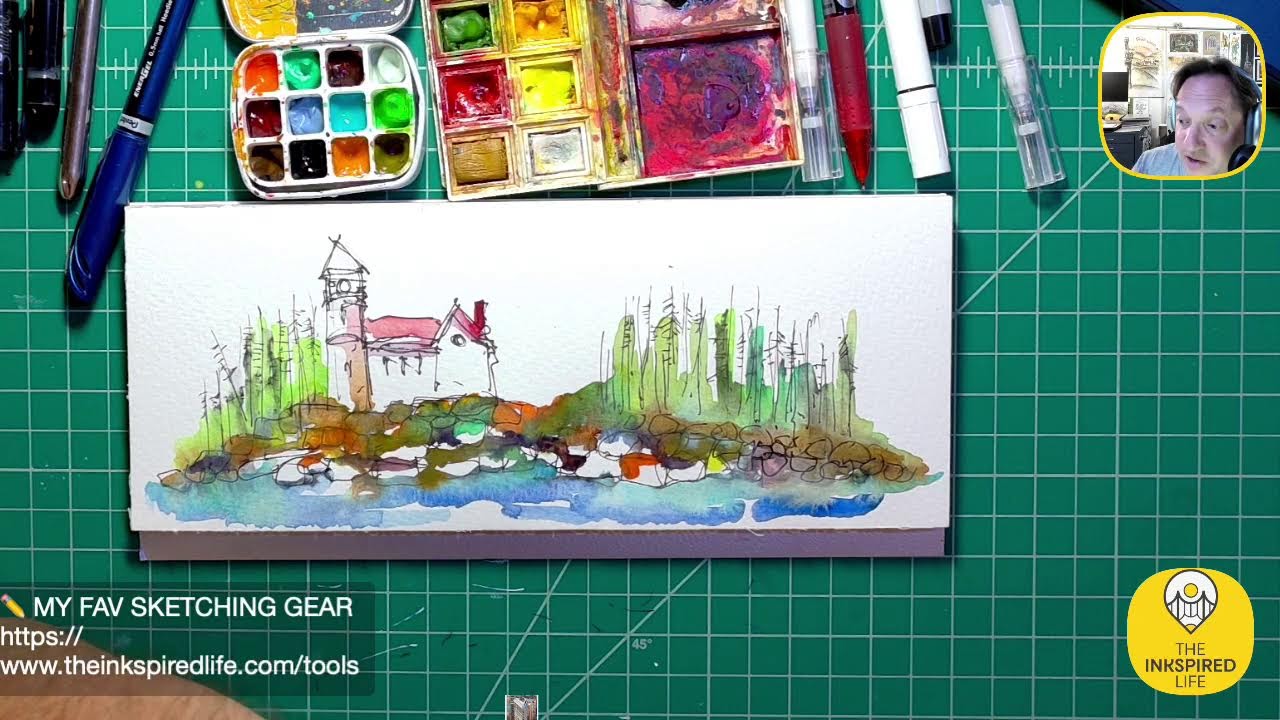
All right, let's play around with these watercolor pastels, watercolor crayons. Liking that color. Thank you. Yeah, this looks really awesome. I don't use orange watercolor too much, but this is orange. I like the way it's drying. I love the hard edge on here. I'll hold it closer. Cool piece. Alright, I'm gonna let this dry. So I got some different watercolor paper. I haven't used this yet. I had a gift card I got for my birthday which was awesome for Michaels. So I've been wanting to try different papers out. So this is a watercolor travel pad, Strathmore 140 lb cold press, 12 sheets. But I really, I love the size of this. I like the proportions. It's only 3 inches by 9 inches, which to me has a really nice feel for, especially if If I want to sketch, you know, outdoor scenes or cityscapes and things, it has that nice proportion to it. And I love the Canson paper I typically use, but I'm looking for paper that's a little rougher in texture, and the Strathmore to me is— has a rougher texture on it, so it'll be fun to play around with it. So yeah, let's just experiment, let's play around with these water— these Neocolor II water-soluble wax pastels by Caran d'Ache. I think that's French. Caran d'Ache. Well, I'm saying it's French and right here it says Swiss made. I guess it's Swiss. Oops. Let's just throw some colour down and see what happens. So I love using this blue and I love using this green. Sorry guys, I'm not really good at always remembering names. I don't actually even bother remembering names of colors, but if you would like to know, this is yellow-green on this one. This one broke. I don't, I don't know, I think it's some kind of Cerulean only in blue, but I don't— the label's ripped. No matter. I'm going to zoom in tight and we're just going to play around with color on here. Start here. So you could put, you can put these pastels down dry if you want. And you could just go over them with water. Hopefully you get a good shot there, you can see what I'm doing. Basically the wax pastel is just kind of melting away, and you could— well, paper's wet, you can draw on top of the wet paper. The water will dissolve the crayon. Let's break out some other colors. You know what, let's use this red color. Why not? And see how they blend together. So I have the red on top of the blue, red over blue makes purple, right? So we got some kind of purples happening there. So I'm going to create just a little mini— maybe a little mini cityscape happening. Let's just grab a darker blue. What is this one? This is blue, ultramarine blue. I'm just going to throw some water down on the paper here.
I'm just going to draw over it with the crayon.
And just for fun, let's throw down some of this green. And sometimes you don't need a brush when you're messing around with watercolor stuff. You can just use your, your medium as a brush. So I'm kind of using this crayon. And just moving the colors around with it. Now let's see what this green looks like with— if I just throw it down here without any water. And I'm just checking out the texture of the paper. So I'm just kind of gliding the graphite stick across the paper. You can see the texture if I hold it close to the camera. And I really, I really do like the texture that I'm getting there. Nice, throw down some watercolor on here too. Cool, there you go. So that's fun, just playing around with some different colors on there. I like the color— wow, yeah, it blends. Yeah, these, these do blend very easily and they're a lot of fun to use. I actually use them for, let me see, let's see if I can find a picture. I used them in my Welcome Home book, just to show you guys. If you look at this cover on here, some of the darker areas are where I used the, I keep calling them crayons, watercolor crayons or wax pastels. But you can see in the chimney, I use that blue color I was talking about before. I use that here. Um, lots of times I'll use them after watercolor painting's dry. I'll come back on top with these crayons and draw on top of it. Let's see if there's another— some other good examples. Yeah, you kind of see what I did here as well for the landscape here. I put Added some green on top of it, add some texture there. You know, this, this was done with the watercolor crayons as well. This here, the details up in the chimney. I like them because sometimes you can get them to be very vibrant. As compared to watercolor. Just seeing kind of other examples I used on in here. I think in here I used it as well, this magenta color up in the chimneys. So yeah, they're definitely a lot of fun to use. This is my favorite picture in here, and I think the red tiles were done with the watercolor crayons as well. So yep, so I've definitely used them before. Jason, did you get a pic— did you get a— did you get a picture of this building? Oh, did I? I will look to see if I got those pictures of those buildings. Buildings. I'm thinking you probably— did you attach them in the workshop page? If so, let me check. Hey Heather, good to see you. What paper did you use for these drawings for your book? Ooh, good question. The drawings for my book were done on— that's a good question. I want to say they were done on cardstock.
Stock.
I want to say these were done on cardstock, actually. I'm just trying to think because I have the originals here. Wow, you think I'd remember? That was back in 2012. Let's see if I can pull out the originals. Do a little show-and-tell time if you guys want to see some show-and-tell. I know I have one of my portfolios here.
Yeah, let's take a look. I'm gonna—
let's do some show-and-tell. I'll show you guys the originals of the sketches I did for Welcome Home book. I found the portfolio here. Just make some room. Hey, if you guys want show and tell, let me know. Just put, "Yes, let's do some show and tell." Say, "Show and tell, please." Let's see, I gotta zoom out. I found the portfolio. Um, "Use the watercolor to use when I'm doing a gray Yeah, grungified, ooh, and battled hearts. Yeah, that's a good way to describe it. They're creamy and turn and fun to blend. I agree, Laura. Yeah, I love your grungified hearts. Those are awesome. Even Donna and Patty says, "Woo-hoo, show and tell." My voice is like shot. You should hear me on Saturday after teaching all week. All right. So these are some of the originals from the Welcome Home book. So Patty wanted to know what they were done on. So I'm going to pull these out. Actually, no, they're watercolor paper. So these were done on watercolor paper. I'm going to say these were done on Canson 140-pound watercolor paper based on what I'm feeling here. So this was the— this is the COVID the original cover here. Here was a practice version underneath. But you can see I watercolor in here. I have the watercolor crayons, ink as well. How big are these? 8 by 9 by 8. These are 8.5 by 11, right? Oh, these are 8.5 by 12. 8.5 inches by 12 inches is what the size I worked on. You take a look at some more of the original ones. No, this isn't 140 lb. This is, this is thicker. So this is thicker than 140 lb. Whatever the next weight up is, just by feeling it, I can tell it's thicker.
That's why I thought it was cardstock.
Here's some other original images here. We have Carpenter Joe building the house. Got his family here, and here's House Up on the Hill. This was a fun one, the circus picture. What was fun about this book was taking House and just transforming houses to different characters based on who lived there. So that was kind of a fun architectural challenge. Yeah, here's a good example.
I don't know which one.
Here you can see where I went over the top of it with the watercolor crayon. If you look at the orange here. So after I did the water, I went back and just put some dry watercolor crayon on top of it. Same thing with the door area, you can see that as well. It's so nice to have these after all these years. This might be one of my favorite ones here. The house, uh, getting ready to go to sleep here. Got his nightcap, kind of a blanket here for the porch roof. Shutters are closed. And just for DB, we have some gray in the house. So DB, here's your gray. This was a rainy day. House was sad. His original owners were moving out. So I made it kind of a rainy setting for him. Got some nice gray going on in the background. Also in the window areas and the door. Gray is awesome for helping to set moods. And then this is probably I forgot I had two versions of this, actually. That's so funny. Which one made— I think this one made it to the book. I guess I was trying out different looks for the house. You know, here's like a cherry on top, and instead I changed the roofline here.
Cool.
This is, these are illustrations. Actually, these are even better. An example. These are illustrations I did for another book called "The Magic Box." I love this. This is the picture of the magic box. This was done with the watercolor crayons. This whole image. I love how you can see it kind of blended here and it had some nice dark edges on it as well. Um, so same house, different personalities. Yeah, it's the same house, but it took on the personalities of its homeowners. Homeowners, good question. Fancy art portfolio. Yes, it's fancy schmancy. The house assumed the personality of each person who lived there. It's a cool story. Oh yeah, Patty, I hope you're enjoying the book. So these were cool. So this book is— I'm not plugging anything. This book is called— I don't get any money from this book if anybody buys it. It's called The Magic Box: A Hypnotic Bedtime Story. My friend Amy wrote it. She— I believe she's a hypnotherapist. These are some of the original images. This is the most popular image from the book, is this treehouse. And this was done with the watercolor crayons.
Alright, let's see what else we have.
More show and tell. These are pictures from the book. And these are some more pictures from the book. And the magic is always inside you, remember that. Magic's always inside you. Uh, this is me playing around with watercolor markers, or watercolor acrylic watercolor markers.
Pens.
This is just a fun whimsical building I was working on. Couple sketches I did of a house and a train station. I love the Statue of Liberty, so I'm always trying to mess around doing different sketches of the Statue of Liberty. So DB, you made me think of these sketches when you were talking about the Russian buildings. These aren't Russian, but— I'll take these out. This is— and DB, this is for you because this is a pencil sketch. This is all done in pencil here. These sketches are based off a book about ancient Egypt. I can't think of the name of the book right now. I'll have to find it. There was an artist who traveled to Egypt years, years, and years, and years ago. They were studying the ancient ruins. And he was an incredible artist, illustrator. David something is his name. I'll have to get back to you on that. But this is based off of his drawings I was looking at. Oh my gosh, I can't think of the name of it. I don't have it in here, it's in the other room. These are some other buildings. These are all pencil sketches. So now that I've met DB and DB has shared some pencil shading tips, I could take these sketches to the next level for sure. So DB, thank you for your all your encouragement about using pencils. This is a logo I did for an improv troupe, to put on the logo. This is my tribute to Batwoman, or Batgirl from the TV series, Yvonne Craig. Just some other images, I'm not even sure what's in here. I love sketching on Post-it notes. These are all pretty old sketches in here. These are from my incredible artist friend, Mr. DeVries. He's an incredible, gifted artist. And these are sketches for a cookbook I was illustrating. These are some of the practice sketches I was working on, some designs. And this is, this was a watercolor tribute for a friend of ours who had lost her son in the military, so I did a tribute sketch for her. Cool. And that's it, just a little bit of randomness. Thanks for taking a look. Down memory lane. I'll just put this back in this pocket here. So these portfolios are really nice for keeping your artwork in. They are not cheap, unfortunately, but you can get them at Michaels. Um, and they're really great for protecting your artwork.
Awesome.
"You are too kind." No, I'm just speaking the truth. All right, you guys are awesome. Let's see how the other one's drying, and I think I'm going to wrap up soon. My voice is going here. Patty, thank you for the tea. I drank some of that tea the other night. I have some more. I have to go I'll drink some when I finish up here. So thank you so much for sharing that tea. So this is drying really nicely. I really love this color combination of the green and the yellow. It's almost like a lime green is kind of happening, which is really interesting. Cool. I want to check something on my computer here, so just bear with me for a sec.
Sec.
Throat Coat. Yeah, that's what it was. Good for scratchy throats. I definitely have a scratchy throat right now.
Um, let's see.
I'm just checking. I'm checking online here for a second. I want to see if DB was sent some photos. I want to see if I could see those. Maybe we'll do one more sketch tonight. I'll change the music up. We'll do another one in here. This was the one from the last Inking Out Loud. I love the way this dried. I— these colors, I'm fascinated with these colors. It's red oxide, cerulean blue, the sepia tones, the graphite. There's something for me that's really magical. You may have noticed I either go sometimes really grungy with my artwork or very vibrant and bright. It's just fun to have that kind of range. I just— there's something really magical to me about the lines on here and the way the colors are coming together.
Together.
Definitely color palette that I'm going to keep exploring. Love the movement of the building. Hey, thank you, that's awesome.
Let's see.
"Did you have that church music on when you sketched it?" That's a really— I have to go back and watch the video. I'm sure at some point in time I had the church music on. I don't remember. That's a really good question. I did do it on Inking Out Loud, so the video is out there. I'll have to go back and rewatch it. I was so in the moment that I don't even remember the music I was listening to. Well, let's do another fun sketch tonight. Sorry I'm talking a lot. We're going to change the music up. I am going to put on some of that— let's put some of that choir church music. Actually, let's contrast it. We're going to put on some heavy, heavier music for a track or two, and then I'll switch to the choir music. Um, we thought it may have inspired it. Oh, so that was inspired from Becky's suggestion about using the Duomo building in Florence as possibly a building for our workshop. That's what kind of inspired that idea. Let's put on some—
what do we want to put on?
Very good. I'm going to rock out here for a minute and then we'll contrast it with the choir music. It's always fun to see what happens. This is, this is, uh, interesting music. Kind of like it. "Pet is gonna transform into a cityscape." You guys know me all too well. I am pre-programmed for cityscapes.
How did you know?
How did you know? Actually, I'm gonna break this out. I have a brush pen here. Let's play around with this.
Settle down a little bit.
Hey D-Ray, good to see you. Hope everything's going well. Welcome. Hope, hope everything's going well with you. It's always great to see you. Cool. There we go. So I just have a cityscape, some kind of a— maybe an old church here in the foreground. Very loose kind of sketch here. Some kind of a statue. Out here next to the church. Again, very abstract. Maybe there are steps leading up to this building. Let's see if we can— let me, uh, put some people in here. Really, really tiny. I mean, they were just going to be pretty much dots on here. Yeah, maybe these are some people down here. This music really slows me down. It lets me think about detail. I'm thinking more about where I'm putting the lines. Usually the faster the music, the more wilder I can be. I can still be loose doing this, but I'm not being quick and loose. I'm just being methodically loose, if that makes sense. Um, let's see, let's see. Uh, Patty, do you know what Nilsson's album The Point— oh, I I don't, but DB had told me about The Point, so I definitely need to look into that. But oblio on his dog Arrow, who looks a little bit like Retro. Oh wow. Well, thank you for the link. Yeah, so Patty, I'm definitely going to check that out. So glad it's coming for you tomorrow. D-Ray says, "DB, yes, send it to Jason Nicholas Nicholas." Yes. Yeah, DB, I'm definitely going to watch it. Thank you guys for thinking of me. "A Lone Chapel at the Edge of Sanity." Ooh. D-Ray always has these really cool titles or descriptions. I like that. That's really cool. "A Lone Chapel at the Edge of Sanity." That's intriguing. The first church is reminding me of one of those old world churches that was built with wooden nails. Oh, that's really cool. That would be— I love that. D. Ray says a graceful building being pushed out to the sea as the dark sea devours the light of humanity. Wow. D. Ray has a gift for words. You are a true "True poet. Love your words." Yeah, pretty deep. Hey, thanks guys. I hope you like this sketch. I know it's very loose. Well, all my sketches are loose. Patty was right, it did come back to a cityscape. It's just where I gravitate. It's kind of my thing. It's my gut. But you know what's interesting though? As many cityscapes as I do, No two are ever the same. There's always something different. Different movements, different lines, different shapes, different feelings. So, you know, I love exploring these kind of dream worlds that live somewhere inside me. So it's always fun to sketch these. You guys are awesome. It's 9:16. I think I'm gonna get ready to do the Whistling Cowboy. Outro sketch. Let's take a look at— let me actually do this first. I want this to kind of bleed down a little bit or up. Let's see. This will be cool. I think I would add to this when it dries. I might come back with my ink pen, with my Lamy, or maybe even my Sharpie here, and I'll— I love my Sharpies. And to, you know, add some ink on top of it. You see me like some windows here. Right, so a lot of these cityscapes have the same vocabulary. Let me just play this music while I'm talking here. Similar vocabulary, right? You have these kind of tall vertical line strokes or brush strokes. You know, you'll see me adding details with like windows here. So this is another kind of element in the library. It's how you put all these things together differently. I tend to always have some kind of a church in my cityscapes. So that's another form of vocabulary that I like to use. I love statues. So you'll notice I try to incorporate some kind of statues, steps. So it's just putting this vocabulary together in different ways that allows you to get different results. Alright, cool, that was fun. Hey Chris, good to see you. Sharpie, yeah. Always love your simple little line suggestions for skyscraper windows. Awesome. Brave lines on the right White buildings. Yeah, we got some interesting lines going on back here, right? Totally agree. Okay. Like the walkway bridge between buildings. Ooh, you caught that, Laura. Caught that little detail there. Let me zoom in. Yeah, right there. Right. So I want to keep this open white area. I didn't want to fill it in with a building, so I thought it'd be cool just to connect the two with a little bridge space. Yeah, that's right. Go back and add another line to the right. Yes! D-Ray, just for you, we're going to add some more diagonal lines on here. Who says you can't have diagonal lines on buildings, right? Just adds a whole nother kind of texture to it. Yep, that's it. Laura says, "Yep, that's it." Laura, that's so cool you caught that. You're paying attention in class. I love that. You're a good student. You guys are all amazing. I always appreciate your positivity, your kind words, tuning in, spending time with me. I know time is precious for everybody, so the fact that you guys tune in even for a minute or two or 10 10 or a whole hour or 2 hours. I really appreciate it. Let's, uh, I would love to do a marathon, a sketch paint marathon. Just keep going. Maybe over Thanksgiving break, maybe we'll have the Inkathon. I'd love to maybe do a fundraiser and raise money Maybe donate it to one of my favorite charities, Habitat for Humanity. Maybe if I did like an Inkathon as a fundraiser, that would be cool. Let me know, would you be interested in watching an Inkathon where I'm just inking for 24 hours with some breaks here and there that are needed? But maybe, I don't know, maybe a dollar for every line I sketch. I don't know how I would make money doing it, but it would be, I think, a cool way to raise some money. Hey, Becky's in the house. Hey Becky, good to see you. Awesome. Thank you for tuning in as always. The Inklings, you guys are amaze ink. You're amaze ink. Get what I did there? Amaze ink. Yeah, this is cool. I don't think I'm going to add anything else to this sketch. Loving it. So here's what it looks like when I zoom out. Alright, let's see, what else did we work on? We did— yeah, this is the first one, right? Actually, since this is dry, let me go back and add some details on this one. Break out the Sharpie again. So DB and Patty, I will definitely, tonight I am gonna check out The Point and see what you guys are talking about. I am so intrigued. I know DB had mentioned it about a week or so ago, so I definitely have to check it out now. Let's just draw some like cross bracing down here. Just to give an indication of some kind of structure. Maybe it's a pier, maybe it's an elevated road. I'm not really sure. But just by adding these X's, it shows some cross bracing, suggesting some kind of structure.
Structure.
Maybe, maybe it's a boardwalk. I'm not sure. "On YouTube, watch the song Me and My Arrow." Definitely will do that, Me and My Arrow. "The Pwnance is the coolest story and the characters are super cool." I can't wait to check into it. "I was digging around my old sketches and paintings trying to organize, found more early attempts with Payne's Gray." Ooh, Becky Bailey is going back deep into her Payne's Gray. History. That is awesome. DB, DB, I am sure you are loving that. Inkathon is where I was referring to cramps your hand. Yeah, D-Ray, that's true. Hand cramps would not— I didn't think about that. Hand cramps could definitely be an issue with an Inkathon. I have to rethink the Inkathon. Good point. I really like this little building in front here. Oh, that red could be a trolley. Ooh, or a D-Raise. I love your imagination. Yeah, how cool could that be? Really like the purple and lime green combination. Yeah, Becky, they turn out really well. So these were, um, these are Windsor New whatever colors I was just pulling right out of my palette. This is probably sap green, I'm guessing. I'm not sure what kind of yellow this is. That's a— and then we have the magenta here. That's how I came up with those colors. Yeah, I love Becky's artwork. Becky's artwork is spot on. It's incredible. Becky, um, treated us to amazing, amazing Halloween artwork, which is so cool to see your Halloween artwork. And I still love— I still love your cow. Your cow artwork is incredible. Good stuff. I love how you each bring something different to the table. That's what it's about, right? Having fun, being creative, and just bringing it to the table. It's not always easy to share what you're creating with people. I always had an issue sharing, just afraid to put out what I was doing. I'm still afraid, to be honest with you. You know, when I do these Inking Out Louds, I don't know where things are gonna happen, and sometimes nothing happens, and that's okay. It's just having the courage just to put, put it out there and let other people see it and Everybody's gonna have a different take. Some people will hate it, some people may love it. What matters is how you feel about it and you're just enjoying the journey of creativity. Enjoy the process, that's what it's about. Yes, and cows, we got color spot on, and cows. Think About Your Troubles is my favorite song. Here's a link to all the songs. Hey, thank you Patty for the link. Everybody check out the songs. I will be doing that. I can't do it live because it's probably copyrighted or something. If I play it live, I might get shut down. I think I'm on YouTube tonight. If anybody's on YouTube, let me know. I think I'm broadcasting to YouTube and Facebook tonight. But I think this one's done for the night, guys. I'm gonna head to the Whistling Cowboy song and wrap up. So we did a few things tonight. We did this This sketch that we played around with this watercolor paper. This was the Strathmore 140-pound as well. These were the watercolor crayons. We were messing around with those a little bit tonight. Just playing with some colors. Awesome. I know that name Nilsson from from something, from something, something, a movie. I saw his name in a movie, maybe a couple different movies. Did he have anything to do with the Pink Panther movies? Why do I think I saw his name in the Pink Panther credits? Got some stuff from 2020, is really surprised how much my artwork has improved. Becky, I'm sure your artwork has definitely improved. I mean, you're doing something pretty much every day. So you're definitely— you're bound to just keep getting better and better. It's always fun to go back and take a look, for sure. I know since I've known you, your artwork has, uh, has definitely improved. We have different takes on creativity and wrapping up that said creativity. Yeah, D-Ray, I totally agree. Alright, as much as I hate to wrap up, always have a fun night with you guys. Thank you for tuning in, appreciate you as always. Today is Thursday, I may be on tomorrow night. Saturday night is our first workshop Zoom, so I will make sure you guys have the information for the link. I believe it's gonna be, I think I said from 8 to 10 o'clock, so we're gonna start a little bit later, 8 o'clock. Nilsson narrates the whole story, it's available in chapters, you search for them. Yes, this is Spaceman, another cool song. I will definitely Google or YouTube them. Thank you guys also in the workshop for trying out that new community page I hope it's working. I'm getting to learn it as well. So maybe we'll spend some time Saturday night talking about that page. Go over your show and tell. So I know everybody's been suggesting buildings for the workshop. And I also wanna see your sketch. What does architecture mean to you? It could be anything. I know Becky posted her homework. It's a very open-ended prompt, so whatever it means, it could be anything. There are no wrong answers. So I just do a sketch or a painting, as loose or as detailed as you want. It's totally up to you. So thank you guys so much, I appreciate y'all. Let's put on the cowboy music and we're gonna head on out. I think I'm gonna use my Sharpie tonight. I haven't used my Sharpie in a while. I'm gonna pick, uh, I got a bunch of random Let's see, I don't know, how about this one? Patty says her architecture sketch is almost finished. Awesome. Boy, I'm having a bad hair day. Don't mind my hair. Holy cow. We're here for the art, not the hair. You can quote me on that. We're here for the art, not the hair. That's my next t-shirt. Next t-shirt will say that. All right guys, thank you so much I appreciate you all. Keep sharing, keep paying it forward with creativity, peace, and live creatively. Thank you for your time, and hopefully I made your night a little bit more enjoyable in some way, or someone in the chat did. You guys are awesome. Here we go. Thanks guys, have a great, great night. Peace and live creatively. Have a great, great time. Night. We're here for the art, not the hair. Thank you for writing the quote down, I appreciate it. That's going on a t-shirt. Bye guys. I can't wait to go back and read these comments. I'll go back and read and respond.