Tanner Smith breaks down Taco Bell's after-hours glow-in-the-dark logo campaign, which stripped away the menu and tagline to show just a neon bell on black background at night. The lesson: timing matters as much as visibility. Design a visual cue that hits your audience exactly when they're most receptive, and you don't need words.
Chapters
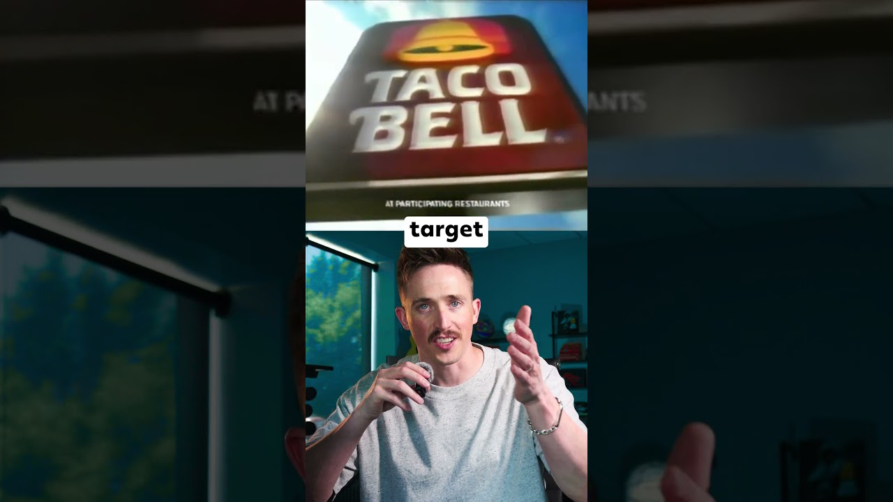
Can your brand glow in the dark? Trick question, but Taco Bell's did. They rolled out a minimalist logo, black background, neon outline, built specifically for one time of the day: after hours. There were no menu, no tagline, no cheesy jingle, just a glowing bell that whispered one thing: you're hungry, we're open. Like a moth light for the late night crowd, for the drivers, the gamers, the partygoers looking for something greasy and familiar after midnight. They let design do what most brands reserve for ad slots, target specific hours, specific moods. Because Taco Bell knew something most don't: branding isn't just about visibility, it's about timing. So here's a takeaway: if you know when your audience wants you, show up with the design that speaks to that moment in time. Because the right logo at the right time doesn't need words, it just needs to glow.