Ad Roulette #1: Outsource Accelerator, Astro Flipping, Gym Launch
Vince Reed critiques three real social ads, focusing on mobile optimization (95%+ traffic is mobile), clarity, and strong CTAs. The outsourcing ad buries its offer in confusion; the real-estate ad needs bigger text and a two-line headline; the gym ad has good copy but blends in and needs retargeting or a provocative frame to stand out.
Chapters
Oh, my goodness. What in the world have we got going on here? I think it could use some type of benefit or result. I'm still not even really sure what it's offering.
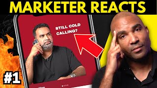
Hey, what's going on, guys? Vince Reed here. Ad roulette time. It's random. We're about to just start the scrolling. When we see an ad, we're gonna critique it, we're gonna make it better. And if it's an awesome ad, I'll let you know. I'll let you know my thoughts. So let's go. Roulette time. Drumroll. What we got here? And by the way, every third or fourth post is an ad, just so you know. And we're looking at the mobile view. For those of you who are marketers, you should be always optimizing for mobile. Most people optimize for desktop. 95, 96, 97% of traffic is all on mobile. Is this the first ad we see? Oh, my goodness. What in the world have we got going on here? First off, I don't even know what I'm saving for. I see a lot of little buttons there. Customer support. Bookkeeper, accountant, Web developer. I would say the biggest thing is clarity here, this bar right here. Save up to 70%. Scale your business in 2023. How much could you save? The first thing I would tell you with ads is you should never force your customer to have to read the ad. I know you're like, what the heck does that mean? What I mean by that is your eyes should be able to just look at the ad and read it. Right now, I have to physically work to read the copy on this ad, which essentially makes it very hard to figure out what this ad is about, how it's going to serve me. All right, so I would simplify this. So again, I'm still not even really sure what it's offering. So 70% off. I got that. Scale your business in 2023. How much can you save? Customer support. Bookkeeper, Web developer, Accountant. We want to see how much you could save. I mean, it's a lot going on here. Might be better if you had individual campaigns focused on one. Like if you want to save with accounting or web development or bookkeeping, like individual ads. But let's see what happens when we go to the page. All right, now this is the desktop version, but I can care less about desktop. Again, less than 3% of the traffic is on desktop. So we always want to look at it from a mobile perspective. And to be honest, this is pretty good. The easiest way to Build off an offshore team. See, this, to be honest, should be the ad. I mean, this is what the ad should look like. If you slid this picture up and it was this right here on the top of that ad, it would have been a lot easier and clearer for me. Save 70%, you know, on staff. This is pretty solid from. From an ad perspective. I actually think that should be the image when they click there. Oh, okay. This is the exit pop. I can get three free quotes. The complete outsourcing toolkit, outsourcing discovery call. When you give people a lot of options, sometimes it forces them to not do anything. So I don't know if I would have had this here because I was actually just about to click on the button to see the quote. But let's see. So get three free quotes, which is what it sounds like you want. I would focus on that. I might consider getting rid of that exit pop. But overall, the page I feel is solid. It could use maybe some type of benefit. You're leading with savings. You know, it's kind of a race to the bottom. What happens when my company comes out and I offer it for 75% off? This isn't bad. Maybe a video instead of this, the image. I think this. Bring the image up. Have this be the ad. So clip that out and have that be the image. And then I think a video here explaining what the benefits of the three of the quotes. I think we'd start from there. All right, so let's go back to Instagram and let's get on to the next ad Roulette. Drum roll, please. What we got? Let me know when one's there. Where we at. All right, here we go. Still cold calling. I like it. So it's clear what this person is going to do. And that's basically help me stop cold calling. Right? So I think this is clear. I think it could use some type of benefit or result. So maybe if you had like this in like a, like a thing, like you were thinking it. Still cold calling. And then like maybe some kind of percentage or some kind of hint on like a better solution. But I actually like this very clear. I know what he's going to help me with. So let's see what we got here. Let's go right to where he's. Where he's taken me. I love it. Looks good on desktop. But let's see what we're really looking for. And that is the mobile version. All right, so let's scroll down here. Let's take a look. I don't Know if it's not optimized for mobile correctly. But.
I would check this out. I think it's something going on with the image. So go back to the desktop version. Alright, so this is the classic example of a page, I believe, that's not optimized for mobile. So it's having an issue. So you can see you've got the astro flipping, you got the image here, but now go back to the mobile version. Okay. It's having an issue with the image and it's not optimized. So I would go to this page and optimize this for mobile. You could increase the size here of the bullet points and drop this headline down to two lines.
How to do 50 plus wholesale deals a month. No cold calling, no benefit.
Sorry. It says no bandit signs, no marketing. Full training with real estate wholesaler master. Alright, yeah, so I would start there. I would get this to two lines, increase the size of the bullet points and I would say you should probably try to ask for a name. I know it might lower your conversions, but when you send emails out using the person's name, I just feel like. It just feels a lot more personal than kind of like spammy. You know, people are opting into this just to kind of see what's on the other side. Out of curiosity also, it wouldn't hurt maybe if you added a video there, show some results of some of the deals you've got or go over some of the tips and the mistakes that people are making and why they want to learn from you. But much better than the other one. Very clear. Alright, so let's get back. Okay, so actually looking at this again, this is a carousel ad. So let's see if he does. And I think this is the issue with the carousel. I didn't even know it was carousel until I just happened to see this arrow. This might make more sense if you had like let's see how many there are. So there's 1, 2, 3. Okay, so there's 3. Alright, so if this was or 4, 4. So 1 of 4. Then you click on the next one. Still doing one or two deals a month. And this one would be 2 of 4. Right. So I know to keep scrolling. And the image on this one would say three or four. So I know to keep scrolling. Still saying. And then boom. Obviously that would say four or four. So I didn't even know that was a carousel ad. But really good, good. Clear. Still spending thousands of dollars. I like, I like how you did that. I don't really run a lot of carousel ads. I think that you. This would be just as effective if this was a video. You could figure out a way to have this image still on a video and then have what you have happening here just automatically shift right to this so they don't have to scroll. Because I think some people would miss it. Like I missed it, but good. Let's go to the next one and guess what expense they're excited to cut the most. So me, my man, Mr. Billie Jean. The ad's perfect. Next.
We need to critique it. That ad's awesome. Was that. There we go. There we go. How about you passing a buddy called.
Club Owner, which if I start another gym, that would definitely be one of the top two options that I would pick. I would go hard on nutrition and accountability. Where health clubs go wrong and where they're missing out on an incredible opportunity and it blows my mind is they focus so much on just receivables and forget that these are huge.
So, you know, Jim Launch has a really well known brand. Obviously this ad isn't your classic typical ad with a clear like problem attention grabber, you know, CTA on it. This is what I would call more of a branding ad. I wish I would have seen the initial thumbnail, but I think this ad would do better from a conversion perspective. I'd be curious to see how it would do.
Or they don't want group training. They still are going to go to a gym regardless. So you might as well just sell them on a basic.
So you can see down here on Instagram, the CTA is down here. Health club ownership. This is why you don't have a $5 million business.
I see so many health owners missing out on millions of dollars. Obviously Gem Launch has a big brand, right? A lot of people know them. I think that the copy is great here, but this ad blends in, which is good in some cases natively with the platform. So I'd be curious to know what the conversions are with this. I would say it's definitely a great ad to retarget to something more direct. But if I were running this ad, I think it would do better as I pause it right here, if it had like some kind of border and it said like maybe you, you mirrored what you had here. Something about why your GEM isn't a $5 million business. Right? To get people to listen. Otherwise people might just assume that it's just another content ad and not even realize it's an ad with the cta. Let's see what's going on here. Where it's taking them. So this looks good on, on desktop, but let's take a look and see what it looks like on mobile. All right, so this is obviously everything above the fold. Seven money models, we use the scale gems to over 100,000 per month like clockwork. Okay, so this is great copy, but I'm assuming this is going to be below the fold. So it's going to require someone to scroll, to click and that's not a button, so they've got to come all the way here. I would try, I would shift this ad and I would see if there's a way to maybe.
Pull this into the middle. Add a button right here that says click and then have this portion be the pop up after they click. So you get the click above the fold. I think you'd increase your opt in rate a lot faster. But everything's cool here. I mean, the only thing I would say is, you know, seven Money models, it doesn't really say that in a copy. I just think my rule is you always want to capture what's going on inside your prospect's mind. Right. So they're clicking here and they're coming to this page. Here's the mobile view. This is what you're, you're selling, this is what you're going to teach them. You want to kind of pre frame and set that up the next page. Right. But other than that, the copy is good. I think the ads are great. I know that gem launch does well, so who am I to critique them? But that's what I would do on this particular ad. With that being said, we knocked out three ads. We would continue to do that on each and every episode of Ad Roulette. And if I had to critique and add a little bit of hot sauce to everything that I said here, most of the funnels were your typical Brick Wall page funnels. And for those of you who know me, you know that I have a company called Eboov and I'm not a big fan of Brick Wall pages. Right. So if your Brick Wall page leads to a webinar or vsl, I definitely would advise you clicking on the link in the description of this video and checking out Eboov and seeing how you can use invideo conversion campaigns because it would definitely increase your results from a lead perspective and obviously get more people in front of your offer because that's what it's all about. The amount of money you make comes down to how many offers you make. With that being said, I'm out later.