Ad Roulette #4: Adworld, Insta360.io, Brad Lea
Vince Reed presents an episode of 'Ad Roulette' where he reviews several ads (Ad World Conference, Elite360, and a Brad Lea promo), critiquing creative choices and landing pages. Core themes: ads must be clearly labeled as ads, prioritize mobile UX (above-the-fold CTAs, reduce required scrolling), use clear benefit-driven copy for cold audiences, and reserve dense pages for retargeting. He praises clear headlines and criticizes crowded/mobile-unfriendly pages and excessive copy.
Chapters
My number one issue with this ad is I wouldn't even know it's an ad. Let's see what the copy says. So they're doing the soft way of saying, click funnels. We don't like you anymore. I decided to start my own thing. That's what he's saying. I'm just saying.
What's going on. Vince Freed here, and it is ad roulette time. It's where we mark up bad ads and we give thumb up to good ones. And ad roulette, here's how the game is played. I never know what ad is gonna come up. They just scroll. And I don't know if you know this, but every third or fourth post is an ad. So we're gonna see what happens. I'm gonna critique it. And not only are we gonna look at the ads, we're gonna look at the funnels too. So let the games begin. Drumroll, please. What do we have here? What do we have here? Ad World Conference.
How many of you know what ChatGPT is this year? We're kicking things off with an ad that I created using ChatGPT, the AI technology. Generative AI is here today and it works.
Artificial intelligence is probably going to change.
Your life and likely the entire world.
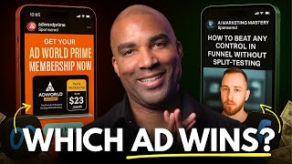
So here's the thing. Obviously, mobile, okay? That's where people are going to be scrolling. My number one issue with this ad is if you scroll quickly, it looks very native at first, which means I wouldn't even know it's an ad. Right? You have to actually realize that it says sponsored here, that it's an ad. I wish I would have seen what it was in the beginning so I could have critiqued it better. But my issue with this, unless you're familiar with Ad World Conference as a conference for people looking to obviously run ads, you might pass this and not even realize it's an ad. And the video is just kind of all over the place. I think this ad would do much better with some type of border on it. Right? With some type of copy right here. Right? We could put some kind of copy, like ad conference for entrepreneurs or business owners, or scale your ads or master the newest ad strategies at ad conference. Something to let me know if this is an ad. Because, like, for example, if I scroll down, I just happen to see this. Granted, I might be familiar with some of the people here. I might not understand that it actually is speaking to me. All right, so scroll up a little bit. Let's actually take a look at the copy in the ad. Maybe that's what they're hoping for. People are going to hit the copy. So we can see here only a few days left. So Ad World, get your ticket before it's too late. Now here's the deal. I want to give this ad the benefit of the doubt because I do get a lot of Ad World ads because I'm an advertiser. So this could be a retargeting ad. And they probably know that they're reaching people that are more sophisticated and understand that it's an ad. And obviously they're saying a few days left. So they're assuming that I already understand this particular company and what they do, which is. Which is the case. So I can't say it's bad copy, but if it was cold, Right. I would want to have some benefits to come into this conference and some of the things that they're going to learn. Maybe some tips on some of the newest and latest ad techniques and strategies that are going to be taught at the conference or maybe just highlighting some of the people. Like, here are some of the people speaking at ad conference. Also, I'm assuming again, making an assumption. Here are some of the people speaking. I think that the copy and the text in the video portion could really be letting me know that, like featured speaker, right. Letting them know, letting me know that that's the person, and then kind of allowing this to happen. So I've kind of been long winded, but I think that this needs some copy and a little bit more clarity. Let's go ahead and click on the button and see what we have here. All right, so we land on the page and the first thing that comes to mind is that there's a lot going on. It's busy. But I give them a lot of credit because it's very clear. They got a basic headline. The world's largest online event for AI and advertise AI in advertising. And then obviously the date and the button right there, you know, obviously stats. It's not bad. I think that the, the background. I know that there are some features where you can gray that out a little bit to make this pop. But again, this is a really large screen. So the perception of what I'm seeing might not be the case on a regular like laptop or desktop computer. But I will say, out of a lot of the sites that we land on, very simple copy, easy to read button right there to get your seat. I love it. I love it. All right, so let's go ahead and check out the mobile version. All right, so we have the World's largest online event for all in advertising. And you know, they've got the kind of rolling, scrolling text, master brand building, master ad creatives. And I like it in a sense where the button is above the fold. So, you know, go ahead and click on that. Let's see what the pop says.
Okay, so it just. Okay, so it's taking me here. Remember this is mobile, right? So it's taking me down. Go ahead and scroll up a little bit. So tickets are on sale. Actually the other way. Go the other way. Alright, so it tried to take me here, but you can see it cut it off. So it's telling me to get my ticket. Remember, on mobile. I think this is going to be extremely difficult to get people to understand what just happened because that was what would literally happen on the phone. Unless somebody seriously just wants to buy right now. Alright, so it's pretty clear. Keep on scrolling. See some of the other plans. Alright, so there's a lot going on here. So again, my gut tells me this is a retargeting ad. But if it were me, I would try to get it to where. If you scroll up to the first one, I would try to get it to where the buy. At least if it scrolled here, if it scrolled to this point, go ahead and scroll up to the per. To where you can purchase. Actually the other way. You want to make sure that you can see all of this so you can just buy. It's just a lot of scrolling to essentially get someone to buy. All right, so somehow figure out a way to like cut off like a lot of this and then bring that buy ticket thing up so they can just buy specifically on mobile. I know there's a lot of stuff here that you probably want the end user to know about, but in my opinion, I don't think that this ad is going to do well for sales unless a person is literally ready to buy. So if I was going to run an ad like this, it would be people that were like abandoned cart ads, people that, that are clicking on the website. It would 100% be a retargeting ad. But if it was a cold ad, I would say bad. But if it's a retargeting ad, I'd say it's pretty much right here in the middle. Let's move on to the next one. Drumroll, please. What's next? What we got coming up here? Elite360.
Obviously they're a software company and they're just straight up like, hey, this is what we do. This is what my competitors do. I mean, people that know click funnels, they pretty much know what clickfunnels does and where. I can already make a pretty qualified assumption that Elite360 is gonna do the exact same thing. Never seen this style of ad. A lot of text. I'm normally like, not for a ton of text, but in this scenario, comparison charts for software. Not a bad approach, not a bad thing. You know, if you're, if you're looking to show that you compete. Let's see what the copy says. We loved our time with clickfunnels, but we needed a better solution for our company. So they're doing the soft way of saying clickfunnels, we don't like you anymore. I decided to start my own thing. That's what he's saying. I'm just saying. I'm just saying that's what he's saying. I mean, the one thing that I think that this ad is hitting on is the fact that people that buy software, they like to compare features. So, you know, understanding your customer, that's a big part of marketing. So I think that that's good. I don't know if I would run that. I think that personally this is a lot, right? I think the more that you do here, like you put here, the more you make the customer have to like go over to the company they're using and ask them if they do that. Right. And let's just say one of these things that company does and they run over there and they actually have that feature, then that could actually work against you. Right. I would just really, me personally focus in on the benefits of, of what my software is versus doing the comparison chart. Because if I'm using software, I'm just going to go, hey, you guys don't have domains. And then I'm going to go over there. Oh, yeah, we do. And then. Or they don't. And then now that, now they go implement that into their software and then I think it defeats the purpose. Click on the Learn More button and let's see, let's see where it's taking us. All right, so the first thing I notice here is that you got the button. You got to scroll down a little bit. I think that I would definitely add the button up above the fold. And I'm assuming that it's going to probably the case, be the case on mobile as well. You know, the two comparisons, you know, they're small, right? So it's hard to read for the end user. And this is a big, a big screen. You Might be able to do the same side by side comparison. Go ahead and scroll down that you had in the ad and I think that's what's there. Yeah, I think that I would move that up personally. I don't know. Go ahead and go up because it's like boom. You're like, hey, we're going to war with clickfunnel. With clickfunnel. That's who we're targeting. You might want to, I mean, let's see, maybe, maybe I'm missing something here. I mean performance structure. I mean, I don't know how much that really is going to be the difference between them testing you or not. I think you've got a lot of real estate here. I think a demo of the, of the, of the tool, like looking inside like a video right here with the button might do you more justice than this. I think maybe moving that down, if you scroll up or scroll down with the comparison might be better. But you know, we have to see such a free trial and keep going for a limited time. Okay, cool. Then you're just listing out all the features. All right, makes sense. Let's check out the mobile version Elite360. The smarter way to build funnels unlimited faster and more tools. Okay, cool. Less copy. And he's got the authority in terms of the ask a question thing, I think that, that because of mobile might want to think about not having that pop up if it's possible unless you click. I don't use that text feature because it's getting in the way immediately. I don't see any button and I see this kind of like in the way distracting me from what's here. Let's go ahead and scroll up a little bit. So right now I would say the landing page copy. And remember, you always want to optimize for mobile. 95, 96, 97% of traffic is going to come from mobile. So here it looks like he's taking us to the website. We're seeing all of the stuff again. Just comparing it, Keep going and then boom. Down here he's got the seven day trial. I would immediately move that up to the top. So let's scroll back up. I would take this and I would scroll it and I'd put that like right here. All right, so let me get rid of that. I would take that button and I might. Instead of a video I think, I mean instead of an image, I think I would have a video and I'd move the button right here, the trial. So remember below the fold, I mean at the end of the day, you've got free software. You just want people testing it, show them where they can get it immediately. All right, so, yeah, I think that a lot of this is just too much copy. I definitely would see if you can break that up into bullet points or get it to at least three lines. But you know, again, if you have, if you're forcing yourself to read. I feel like I've said this on every single ad roulette episode. If you have to look at something and you have to force yourself to read it, then I believe it's too much copy. You should be able to look at it and just see what it says. See, you can just look and you see what that says there. You don't have to force yourself to see what he's saying here. I have to actually physically see what's going on. But overall, I think this would have been a strong ad. I have to give it a thumbs down only because mobile, remember the mobile view, that's where all the traffic is coming from. All right, People have to scroll. They're going to be off looking at the next video. All right, let's get to the next one. Drum roll, please. Here we go. What we got? All right, Bradley, turn it up now.
My name is Brad Lee. I've been doing it over 20 years. I've helped some of the biggest names in the industry create and market their online courses to the tune of millions of dollars a month. After 20 years, I've learned two things. One, you have to create a world class training system, not just a video. And then you need to promote the.
Hell out of it.
If you want to learn how to do this step by step, click the.
Link to learn more straightforward. Straightforward. Okay, so go ahead and pause it. So I think this ad is great. I mean, people that know Bradley definitely know that the guy knows what he's talking about. But when I'm creating ads, I always assume no one knows who I am. So I think what Brad could have done, especially when he started off with the authority grab in the beginning. But number one, the ad started clear of who he was talking to and then he, you know, he did his story. I might have put a little B roll. I might have put. I know it was a quick. He wants to just connect right there. But again, if it's a cold ad, I always assume no one knows who I am. So like, who's this guy? On my newsfeed, I would have did a little bit of B roll. I thought it was great. It was direct let's see what the text says. There's a formula behind selling online courses. I learned this after helping our clients sell 1.6 billion and today you can study these lessons. Okay, cool. Awesome. I'm pretty clear at the point of what you're going to learn. Go ahead and click on the learn more button. Let's see where it takes us. All right, so cool. As the branding on the top Lightspeed vt. Want to crush it with your current course online? I think I would short that. I think I would just say like selling courses online, question mark. I try to get this to one line. Discover the exact strategies used to help generate over 1.6 billion online course sales. I might say, I might like say something like, you know, discover the one or the five strategies used to help generate a 1.6 billion. And I think that's all you need in 10 years, right? In less than 10 years, something like that. I think. Well the thing, the only thing I don't me personally sells the last 10 years. That's a long time for most people and, and you know the attention span of people today. 10 years. Anybody would do anything if they said in 10 years you're gonna get me 1.6 billion. But the Internet, 10 years can be a long time. I also would, would squeeze this up, right? This looks like a clickfunnels page. So I know that if it is, you can definitely raise that up for mobile because what's gonna happen here on a mobile phone, it's gonna cut off this button, right? So you want that button below the fold. So if you can bring this up and fill this gap and then get this from three lines to two lines and then, then that brings everything up, right. So now you have the video. And also again, a lot of people don't check and optimize for mobile. You got two lines here. I would get this to one. So yes, give, send me details or something like that. Like real short, try to get it to one line. I think this would be definitely better. All right. But otherwise I think this is good. Let's go ahead. Is that, is that. I don't think that's a button. I think that's an image that's going to tell you to opt in. I can tell but go ahead and play it. Exactly. Yeah. So I think that it works. That definitely will get you opt ins to get name and phone number, which is good. Delete this stuff here, secure your spot. I think, I think it's a good start. I think it's good. I just would move everything up, you can go ahead and X off of it. I would just move everything up because I know for a fact you're losing a lot of conversions because people are likely missing the button and there's a lot of text there. But other than that, I give it a thumbs up. Definitely give it a thumbs up. All right, so we made it through more ads. We saw more funnels, and if you notice, most of them, not most, all of the ads that we clicked on. And it's like clockwork, they all drive traffic to what I call brick wall pages. And if on the other side of that brick wall page is a video, like a webinar or vsl, I highly, highly, highly advise you checking out using IBC campaigns. That's what my company provides to help you get more leads and faster sales. And you can start to beat up and punch those brick wall pages in the face that block 80% of your traffic. But with that being said, I hope you enjoyed this episode. Make sure you like, subscribe, you comment and you subscribe until the next one. I'll see you on the Internet later.