Ad Roulette #7: Jordan Belfort, Invest Diva, Banker Match
Vince Reed reviews three ads and their funnels (Invest Diva, Jordan Belfort, Banker Match) using his ad-funnel framework. He praises clear ad messaging and offers (Invest Diva, Belfort) but repeatedly criticizes mobile landing experiences: mismatched headlines, excessive copy, and CTAs below the fold. He recommends optimizing for mobile-first, aligning ad copy to landing headlines, moving purchase/opt-in buttons above the fold, and using in-video conversion (eboove) to reduce friction.
Chapters
Assuming it's something with banking. But again, you know what they say when you assume. You never want to assume. I have to be honest.
It's terrible.
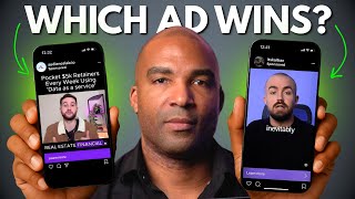
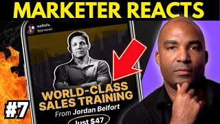
What is going on. Vince Reed here, and welcome to Ad Roulette, where we critique ads and funnels and we make them better. I don't know if you know this, but every third or fourth post is an ad. And on Ad Roulette, we just get to scrolling and whatever comes up. We critique ads and funnels and we make them better. But more importantly, we follow a specific framework. It's the exact framework I use when I run ads. It's the exact framework you should use when you run ads. And it's the exact framework I use when I set up my funnels, and so should you. Well, here's where you help us. When I go through these ads and when I go through these funnels, I'm going to critique and grade them. And in the comments, I want you to let me know if you. If I did a fair job on it, right? Was I too hard? Was that too easy? And would you have given them the same grade? All right, so with that being said, let's get the scrolling. Drum roll, please. What do we have? What do we have? Invest Diva. All right, cool. So the first thing we want to do is we want to look at the ad messaging. And what I can see here is normally I like people to have a border, but they used the image right here and they have the text here to let us know what this ad is all about in terms of messaging. So get my 500k per month fully automated webinar script. So I know that she's going to help me or whoever's on the back end of this, this ad is going to help me create a $500,000 per month webinar script, which is cool. Very clear. I love it. Now, in terms of the creative, I like this creative because what this creative is representing is that type of lifestyle. You know, you have the ocean view. It looks pretty cool. And now we have to look at the last thing, which is the ad copy. What we want to be looking for here is, is there a clear problem? And a clear that I'm going to be getting here and essentially giving me a reason to actually click on this button so you can see it says here, no sales team, no live presentation. Sell high ticket. Fully automated equals 14 million in two years. Get my complete automated webinar script. Extremely clear. Right off the bat, I love this. This would work well for retargeting this Would work well for cold traffic. I love it. I give this a thumbs up. It followed the framework. It hit all of the points that you want to look at when it comes to an ad. So let's go ahead and click on the learn more button. All right, so as you can see on the website, you've got the testimonials there, you've got the headline, no sales team, no live presentation, sell high ticket, fully automated, capturing what's going on inside of the prospect's mind. And you can obviously see they're going right for the sale. But I can really care less about the website version. Why? Because 97% or more of the traffic comes to mobile. So let's go ahead and check out the mobile view. So the first thing I noticed on the mobile version is the headline. It's real clear. It's matching what's going on inside the prospect's mind, right? It's saying $500,000 per month, fully automated system. Now, one thing that I would definitely hear is ad webinar system here, because clearly the text on the ad was talking about that I was going to get a webinar script, right? But this is talking more about a fully automated system. All right, so we always want to capture what's going on inside of the prospect's mind, right? We want to make sure that whatever was said on the ad, it's saying the exact same thing on the website. Now, the second thing I see here is there's some testimonials here, but there's a lot of copy here. A lot of copy, right? So, you know, I'm cool with, you know, some of these, but I think that I would move some of the testimonials down. And there's clearly no button above the fold, right? So it's going to create a situation where I have to scroll and the user is forced to read to figure out what's actually, you know, being done here. I clicked on this and I got here expecting to get a fully automated webinar script, was going to teach me how to make $500,000 per month. But now I'm seeing a complete automated system and I'm forced to read. And what I mean by being forced to read is my eyes can't just look at this and know what's taking place. I have to actually physically read it. So, for example, no sales team, no live presentation. So high ticket, fully automated equals 14.26 million in two years. So, number one, what I would likely do is try to figure out a way to Move this up and then there's just a lot of copy here. Right. So, you know, get my complete automated webinar script plus ninja tips, blah blah, blah, blah. But there's no button. Right. So there's nothing for me to do if the majority of the traffic is coming from mobile, which we know that it is. Right. And we thought that we were coming here for a script that's gonna teach me this. That's all I need to focus on, on this ad. So let's go ahead and scroll down, let's see if there's a button or anything that pops up early on in the, in the post. So now it's kind of matching what's going on in the mind with the image there. I'm scrolling down, looks like they're getting, they're trying to get me to buy directly. So they're taking me right here to invest $347 into this exact script. So what I would typically do is I think that this would be where I would have them land. Right. If you're trying to get them right to buy. Okay. I might have just this part be what I saw and maybe clearer version of the headline that's matching what was being said on the ad. Right. If you're trying to get them to buy, remember you're optimizing for mobile. That's where all the traffic is going to come from. Okay. You want to tell them why they want to buy this with a simple headline. And then I would try to get this up above the fold and then all of the other stuff that you had above, like the testimonials, I likely would put that underneath the button. Again, that's if you're trying to get sales, which obviously you are, you want this to be front and center. And if people don't have to scroll down, that's going to increase your chances of getting them right to buy. Right. So that's what I would definitely do for this. So because this did not capture what was going on inside the prospect's mind, immediately remember I clicked thinking I was getting a webinar script, but instead the top was talking about an automated system. And because there was so much copy there, it was hard for me to really just look at it and see what was going on. And because that the button is below the fold, I have to give the landing page the final experience a thumbs down. Alright. A thumbs down when it comes to my framework. Alright. So the question is, how would you grade this? Would you have given the ad a thumbs up and the funnel Page a thumbs down like me. Let me know in the comments, and we're going to get on to the next one. All right, Drum roll, please. What we got? What we got? What's next? What's next? There we go. There we go. Okay. The man, the Myth, the legend, Mr. Jordan Belfort, the Wolf of Wall Street. Okay, the first thing we want to look at is we want to look at the ad messaging. Right there on the image, we see who this is about. And again, with every single ad, you always want to assume that people have no idea who you are. Right. With an ad, although I know who this individual is, you have to assume when you're creating ad that no one knows who you are. Right? So at this point, if I don't know who he is, it's just a guy standing here. So the only thing I have to go by is the ad messaging. World class sales training from Jordan Belfort. Now I know who he is. Just $47. You can't get more clear. Get more clear than that, Right? So in terms of, you know, looking at the image and saying, okay, what is the creative looking like? Right? We know that the messaging is right, but is the creative there? I'm going to make the assumption not knowing who he is, that this guy's a master at sales, right? He's saying who he is. He has a power position. He's showing the guns a little bit. So we'll give that. I'm going to say he's doing a good job there. And then last but not least, let's take a look at the copy. All right, so 96% off. Sell me this pin challenge. Okay. And let's go ahead and keep going. This has got to be one of the craziest, most ludicrous offers in the entire Internet. I think it's doing a great job. And what I'm getting immediately from the copy that I just read is, hey, look, this guy can teach you how to sell a pen. The price of this is usually way higher, and it's right there up front of what the price is going to be. This is great because the people that are going to click, they already know what the price is. They already know what they're going to get. So I'm going to, hands down, give this ad a thumbs up because it met all the criteria of our framework. All right, so let's go ahead and click on the learn more button. All right, so a lot going here on the desktop version, but as always, I'm more interested in what's happening on mobile because that's where 97% of the traffic comes from. So let's take a look at the mobile version. All right, so the first thing I'm going to do here in our framework is that we want to look at the page headline, right? So we can look at the headline live. Now, sell me this PIN challenge. In just seven days, I'll teach you the number one sales lead gen system in the world. All right? So you can tell, you know, in terms of the third part of my framework that, you know, this is not really optimized perfectly for mobile, but I can also tell that they tried. So for example, if you were to come in here on whatever page builder you're using and just, you know, go down a couple notches in terms of your size, you could get this from two lines to one, right? This is, this is fine. So what that would immediately do is take this to one line, move all of this up. All right, There is a lot of copy here. Okay. There is a lot of copy here again, forcing me to have to actually read. I want to be able to just see what's happening and be able to make a decision. So this is cool. It's not a lot of copy. This is clear. Okay. But all of this is stuff that I have to read. So you can see here the number one sales and lead gen system in the world to quickly and easily sell any product or service and turn your business into a profit minting machine. Then there's a lot of copy here again. But this is definitely missing the big component in terms of the mobile friendly aspect of it. And most importantly, the button is below the fold. There's nowhere for me to click, there's nothing for me to do right here and nowhere for me to buy. Remember I got here, I already knew that it was going to be $47. There's not much more convincing than I have to do outside of telling me exactly what I'm going to get. And there's just a lot of copy for me to read. So let's go ahead and scroll down, let's see where the button comes up here. So again, a picture of Jordan. More information here, A video. Okay, and then the button is coming down here, looks like come down or I'm assuming a place to buy. So go ahead and click on Yes, I want this. Let's see what happens here. Yes, I want access to sell me this PIN challenge and nothing is happening. So let's scroll down again. Or did this take me to a different page? I think it Took me to another page, possibly. All right, so there's a lot. Okay, now it took me to the order form. Okay. So this essentially took me to a place to buy. I had to click it and took me to another page. Right. So now I'm able to buy. Alright, so what I would try to do on the button is have this just pop up with the pop up where when they click it, it just comes somewhere here so they can buy. So if you can go back to the page before. Okay, I would move the button up. All right. I would put the video up, I'd have, I would make this one line, I'd pull this up and I put the video there with the button. They already know the price, we already know what we're going to get. When they click the button, I'd have that order form pop up where they could just buy right there. And it would basically eliminate a lot of steps. Right now I'm having to scroll, I'm having to do too much reading and I'm having to go to another page to buy and I'm making it difficult for a person that already knew the price and already was interested. So because of those reasons, I would give the funnel experience a thumbs down. And that was up to you. Following the framework, how would you grade it? Comment and let me know if you would grade it the same in terms of the ad and the funnel. And with that being said, it's on to the next. Drum roll please. Let's see what we got. What we got, what we got? There we go. We just got one. Okay, cool. Banker match. Alright, so video, okay, obviously banker match I'm assuming is something with banking. But again, you know what they say, when you assume, you never want to assume. Now there's no border or anything on this video. So lately I've been really advising a lot of people using video ads to use some type of border. Because what's the first part of, you know, the ad framework? It's obviously, you know, the ad messaging. So I don't really know what this ad is about unless I can hear what he's saying. And remember when the ad first pops up in your newsfeed, it's silent. So the person that's watching it can. They have no idea that it's even an ad or what you're offering. All right, so this is really one of those things where he definitely on the video, as I can see for a second, it had the website, but depending on where it was when it got in front of me, I wouldn't know what this is about, right? So I would say that there's really no messaging here on this ad. So for those reasons, I'm going to have to give it a thumbs down at that point. But let's go ahead and listen to the actual video and see if that helps us out a bit.
You're not getting the results that you deserve as a mortgage professional. It's time to make a change. You want to find a company that's going to match your skills, experience and goals to help you succeed in the industry. And to do that, you need to find a company that specializes in making this happen. Banker Match uses AI technology and industry intel to help you land your dream job. This means no more losing deals to competition due to rates and pricing. Instead, take control of your career and connect with Banker Match today.
All right, so, you know, because I have a little bit of experience in the mortgage world, I understand what he's saying and it looks like he's just trying to match mortgage bankers with banks and people that they can work with, which is cool. So I think that this would definitely do better with something on the border, like maybe just, you know, add a border and say, you know, matching mortgage bankers with banks to, you know, help you in your career or something like that. Right, that would help it. I thought that it was clear in terms of the video, right? So the people that are watching this, I think that would definitely understand what's, what's going on. Let's take a look at the copy here. So attention MLOs, mortgage loan officers and branch managers. So he's calling them out. I love it. Very clear. And who he's talking to. Undervalued and unfulfilled. In your current role, are you losing deals to your, to your competition due to pricing? It's time to make a change. Great copy. Clear who it is. I gotta say, great job on this ad. Alright. The only thing I could say here was that if there was a border, so immediately, you know, I was aware of that this was an ad and when I saw it in my newsfeed, I would know exactly who it's for. If I didn't, you know, look at the copy and watch the video, I wouldn't know that. So for those reasons, all right, because I think you're probably paying a little bit too much for the click because people are missing you because of, you know, not knowing what exactly who you serve. I'm gonna give it a thumbs down on the pure fact that there's no clear border or direct, you know, intent of the ad. But to be honest with you, it could have went either way. But I'm gonna just to be just a jerk today I'm gonna give you a thumbs down. So go ahead and click on the learn more button. Alright, so I'm looking at the desktop version of this site and I have to be honest.
It'S terrible. All right. But maybe it's optimized for mobile. Maybe they're doing something and not really paying attention to the desktop version. But let's go ahead and take a look at the mobile version. But terrible mobile version. Let's take a look at it. All right, so step number one, we want to look at the headline, right? Headline is great. Has the website domain. It's clear. Matching mortgage bankers with banks have no complaint there. Okay, easy to read. Matching top mortgage companies with top loan officers and branch managers. Arrow 45 seconds. Unlock a better future. And the form above the fold. Okay. I think that it could use maybe a little bit of copy here to direct me to do that. Right. I know that I'm looking for the full name and I think that I can clock up. Click on that. Click on that. Actually, can I. Is that asking me to fill it out because I see the play button or is that a video? I'm a little confused now. Can you. Is it asking me to type in my full name? Okay. Yeah, so I think it just needs. You need to, you know, tell me what you want me to do. Right. I'm assuming I saw that it was a form but it was a little unclear. It'd be just because of my perception of looking at it on this big board. But other than that, if you go back up to the top, what I do like about it is it's very clear of who they're capturing, what's going on inside the prospect's mind. Right. Clear of what's going to happen. But I think that it could be more direction of telling me what to do here. This could look a lot better. Maybe we make this a button and then when they click on the button, the form pops up where I can fill it out right here. It's just there. It looks like there's like some kind of maybe styling issue where it's a little off and I'm just doesn't look inviting to have me give you my name and email address. Alright. So for those reasons I'm gonna give this a thumbs down. Alright. And I've done this a long time and most of the ads that I see and funnels that I see It's a pretty easy thumbs down and a pretty easy thumbs up, depending on which way I want to go. But this was difficult. Even though I gave it two thumbs down. This could easily be a thumbs up by simply making this a button and having this be a little bit more friendly for me to opt in and then obviously giving more direction on the ad. Alright, so although I gave you a thumbs down, whoever wrote this ad, I think you have a great start to making it better. All right, so question is for you, would you have graded this ad and this funnel the way that I just did? Let me know in the comments and let me know how you would have graded and if I did a fair job. All right, so we got a chance to go through several ads. We got a chance to check out the ad framework. We saw the funnel framework, and for the most part a lot of the ads and funnels we saw were pretty strong, if so, just some minor tweaks to make them better. Now, if there was one suggestion, and I typically say this on most of the ad roulette episodes that I shoot, and that is the fact that the majority of the ads drove traffic to a brick wall page. Now, of the three ads that we looked at today, two of them sent traffic directly to an order page, directly to buy. Now what I would advise all of them doing, and this is only if you want to increase sales, increase leads like dramatically fast in a really, really efficient way, would be to start leveraging what I call IBC campaigns. My company, eboove, it allows you essentially turn your videos into funnels. Okay. With in video conversion technology. And we found that people that are using that technology are increasing sales. So why is this so cool? Number one, when you use eboob and in video conversion technology that opt in form, it's mobile friendly. And you can actually run these videos with ads so you can connect your ad account to it, it'll fire the pixel, you'll be able to capture the lead, do remarketing and all that cool stuff. So if you want to learn more about evoob, you can actually go ahead and click on the link in the description of this video. It'll take you to a short demo. And if you start using eboob and in video conversion technology with the funnels that I'm sharing with you guys on these ad roulette episodes, you'll absolutely crush it. And with that being said, if you're using a brick wall page that looks like this. Hold on, let me set up for a second. Yeah, that was you want to talk. What? What? This is what I want you to do when you drive traffic to a brick wall page. I'm out. I'll see you on.
Sam.