This 1 Mistake WRECKED a Sales Funnel with FIRE Ads 🔥– Ad Roulette E12
Vince Reed scores two Instagram ad funnels using a 0-3 framework for each. The winning funnel hits 5/6 points while the other scores 3/6, mainly because it sends traffic to a community page instead of a lead capture page. Both need shorter headlines, mobile optimization, and captions on the creative.
Questions this video answers
Funnel number two (score: 5 out of 6).
"$65,694 in 23 days."
Chapters
I think that you should be getting some leads here. You got to be building your list. And have you drove this to probably a page of captured lead and then sent them? I thought you might have won.
Hey, what's going on? Ventri here, founder of eboo.com and welcome to this episode of Ad Roulette where we critique ads and funnels with one sole purpose, to make them better. Following this three part framework that you see here on the screen, we follow the three part framework for ads and we follow the three part framework for funnels. Now here's how it works. The reason call it ad roulette is because my team, what they do is we come to Instagram and we just get to scrolling. We get to scrolling and I don't know if you know this, but every third or fourth post is an ad. So we check out the first ad that we see and we just try to make it better and then at the end we pick a winner. All right, so we're going to get two ads, two funnels. At the end we're going to pick a winner and then you let me know if I did, if I picked the right choice. All right, so let's go ahead and get started. Drumroll please.
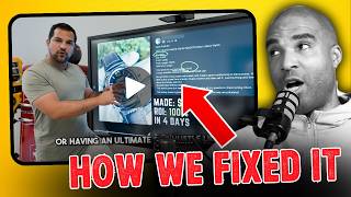
All right, awesome. All right, so we got the ads lab. I love it. I love it. Alright, so following the three part framework for ads, the first thing we want to do is we want to look at the ad messaging. Now you have to understand when an ad pops up, okay, the first thing that you're going to see is either obviously the image. Now I'm in a platform. I love it. I love this ad already. I like that he's using demonstration, one of the best forms of marketing where you can demonstrate the tool. He's giving you a reason to click the button. Guys, this is so important, right? He's showing that he's done it, he's run a lot, he's spent a lot of money on ads, he created this tool or he's he's going to show you how to use it looks like ChatGPT to create either a product or some sort and he's going to teach you how to do it when you click on the learn more button. Gave you a reason. Very clear what you're going to get. I like it. All right, so let's look at the copy below. So this is really interesting. It's a tactic that I've actually used before in my marketing. Very little copy. It literally says this is the quickest I've ever gone from idea to sales. That's it. And I like it because he's literally like, hey, you want to know what this is all about? Click to learn more. Sometimes less is more. All right, so let's go ahead and get into the funnel. Go ahead and click on the learn more button.
All right, awesome. So this is taking you right to a VSL page. Alright. The first thing we want to do in the funnel following the framework is we want to look at the headline. Alright, so for anyone looking to build a high profit digital product, okay, so he's going to teach you how to build a product. The first thing that I can see here is this headline. There's a lot going on here. So what you want to do in my opinion when you're leveraging a page is you want the prospect when they're clicking to be able to just see and understand the copy without forcing yourself your eyes to act. I know that sounds crazy. So if you look at this page, you have to actually read all the copy. Average people are now making thousands with this new extraction prompt allowing them to create and sell products in a day using the same system that made me $65,694 in 23 days. There's a lot going on but I have to actually read that to see that. So what I would suggest trying to do is shorten that to figure out a way to get the same point across in less copy so I can just look at it and kind of figure out what he's saying. So it could be like this simple prop allowed me to create a that earned $65,694 in 23 days. Something a little bit tighter that's just there smaller that I could see. All right, so we got the video below the VSL and I can see that it's optimized for mobile. We have the get instant access button right below the fold. Above the fold I should say. Really clear. Then there's some more copy there. Alright, so there's a lot to think about. There are some good things that I saw with both of these funnels. But now is the moment of truth. Time to pick a winner. Hey now before we get to the winner of this episode of Ad Roulette, I know it's good. If you are running ads to a webinar or a VSL funnel, check out my members area inside my eBoob account. I want to show you how we're getting 50 to 79% conversions on our funnels driving traffic to regular webinar and vsl Funnels and how we're using Eboov to do it. So if you click on the link in the description of this video, you can check out our quick vsl. It'll explain more about Eboov. It'll take your funnel game to a whole new level. All right, with that being said, let's get back to. To the episode.
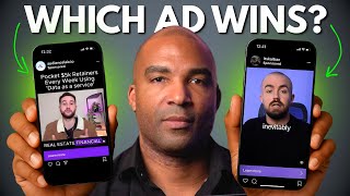
All right, so using our three step framework, okay, what we're going to do is when it comes to ads and funnels, the highest score you can have is a three out of three in each section. Right? So it's possible to get a 3 out of 3 from the ads. It's possible to get a 3 out of 3 from THE FUNNEL, and then we just tally up the points and whoever has the highest point total wins this episode of Ad Roulette. All right, so we had the first ad here, the Ads Lab. I thought it was really interesting. I thought it was extremely organic. All right. Sometimes, you know, you can break the rules. I feel like this is standing out a lot because it's against the grain of what you're seeing a lot of today, which is essentially people putting a lot of stuff on the video. And it's clear that it's an ad. This is one of those ads that seems organic. It doesn't actually feel like an ad, which can work, especially for the vibe that this guy's giving out. I like, I like what I see here. However, when it comes to just grading this with the messaging, unless you're looking at the handle, you know, it'd be easy to scroll by like. So, for example, if I didn't know, if I didn't have the ability to look at the handle and just kind of like, just condition myself to do that. And I'm not familiar with who this gentleman is, I could just scroll by this and not even know that it's an ad that could actually help me. So for that, for that reason, the messaging is off. Because the messaging has to give off something clear. So what he could do in this case is maybe put captions like the other ad on this so I could obviously know what it's all about. The creative, I'm gonna. I have no problem with the creative. I mean, because once I played the video, he was telling the story, he was saying, you know, why he created this particular community. It was extremely clear. I actually liked.
Was giving what it was supposed to give, and then the copy was on point. So for those reasons, because there was. The messaging could appear to be unclear depending on who lands I'M gonna go ahead and Give this a 2 out of 3 when it comes to ads. All right, now with the funnel. All right, now, again, this is a bias from my own personal experience, right? This isn't like anything. Like, this could totally be converting. But because everybody that markets directly to the school community page is going to look like this, a person that's clicking it could have their own preconceived notions, oh, this is just a school group. And click off without even looking at the copy, without even clicking on any of the other images to really see what it's all about on the funnel. So when it comes to the headline, I thought it was clear, but it almost loses a point automatically. I would prefer for it to go to like a separate page and then link to the actual school community. We actually have some members that are part of my company that have a massive, I think over 12,000 people in their group. And what they do, they drive traffic to a different page, first explaining it, and then the person has to opt in or click to get sent a link to the community. So you can capture leads because everybody here, if they land, you're not getting any leads. So you're basically, if it costs you two or three dollars for that, click, that money's out the window. And now we can get into that over and over again in terms of how that can hurt you. But for that reason, I think the page driving to the community and it could be converting, I wouldn't personally do that, but it could be working for him. But the headline grow your school group with ads that convert, it's following the framework. It's very clear what this is all about. However, I've seen these funnels before and I know that you can switch where they land in the creative. So, for example, if it was a different image here, it might not say that. So I can't give it a point for headline because that could actually change. But if it stayed on this, it'd be extremely clear of what it was all about. Now, when it comes to creative, it's doing what it's supposed to do. I mean, it's saying, hey, this is a community you can join. It's saying the price, and it's obviously mobile friendly here as well. But because this can change, the headline can, meaning it could be an image or a picture. It won't always say, grow your school group. With ads that convert, I can't give it a point for headlining because the creative can always be different. I can't give it a point for the Creative, but I do think it's strong in terms of mobile friendly. You can't get more mobile friendly from there. This is very clear. So it says who's running the group, how much it is, how many members, it's great. But for those reasons I just mentioned, I got to give this a one out of three, which gives this particular funnel a three out of six. All right, now moving on to my next funnel here. All right, so this funnel hit on all cylinders. I felt from the ad, it had the, it had the captions going on. So the messaging was on point, the creator was on point, the ad was clear. I love demonstration. He showed the tool in action and you know, people are going to want to click to learn more, to go see how to actually do that. And then it was something different. Let me give you some bonus points here. There wasn't a lot of copy, but it was clear. All right, because the whole point of an ad, you guys, is to get people to click. Okay? That's the whole point. A lot of people trying to sell everything in the ad. The point of the ad is to be clear so you know what it's about and get them to click because you want them to get to the funnel. Alright, so for those reasons, I thought the messaging was clear, I thought the creator was clear, I thought the copy was different. Therefore I'm giving you a point for that. So I'm gonna give you a three out of three when it comes to the ad framework. Alright? So moving on to the funnel, the first thing I'm doing to do is look at the headline. So I'm looking at the headline here. The problem is it's a lot to look at, right? I mean, when I look at that, I have no idea what that says. I physically forced my eyes to start reading that. So when it comes to headline, although it might be saying the right things, most people are gonna see all that stuff down there and it's like they don't know what it's about, right? So you're already losing some people who aren't gonna actually sit there and read through all that copy. Remember, this could look perfectly fine on desktop, but 99% of the traffic, I should say 97, is gonna come from mobile. The creative, the video there is clear. Obviously there's gonna be more information about its product and obviously it looks like the buttons above the fold. So that's great from it being mobile friendly. So many markers, I can't tell you, they just fail to optimize for mobile. Last point, I will Say if you do decide to edit the copy on the top of this page, I like the main headline, one line and then the sub head, which is obviously your main head. No more than three lines. So I would try to shrink that down almost like the bottom headline here where it says using the same system that made me 65,000. Like if there was just. If there was just three lines like that size above, I think that's the proper size. But however, because the headline was just a lot to see, I think the creative was good. I think that it's mobile friendly. So with that being said, I'm going to give this funnel a two out of three, which gives them a grand total of five out of six out of six. Which means our winner here today is funnel number two. Congratulations. Funnel number two. Okay, you're hitting on all cylinders. Five out of six. I gotta say, these funnels are both great. And I was extremely tough on this only because of my own bias. So my man running the ads lab. Get it. I'm sure that's probably converting. But you know, I think that you should be getting some leads here. You gotta be building your list. And have you drove this to a. Probably a page of captured leads and then sent them. You might have won on the pure fact that for me, this here with all the copy, that's like. Because that's where you're getting. That's all your traffic is going there. You might have had a shot to win this episode. But I'm sure I'll see more of your ads and hopefully we'll catch you on the next one. With that being said, I hope you guys enjoyed this episode of Abuellette and I'll see you guys on the next one. Later.
Sam.