This Instagram Ad Looked Great…UNTIL I Saw The Funnel – Ad Roulette E14
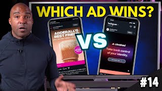
YouTube episode of Vince Reed's Ad Roulette (Jul 4, 2025) where he critiques two Instagram ads and their landing funnels—Everyday Dose (a coffee/product blend) and Cloaked (privacy app/service). For each ad he evaluates messaging, creative, and copy, then inspects the funnel for headline clarity and mobile-friendliness; Cloaked wins (6/6) while Everyday Dose scores 3/6 (strong ad, weak mobile funnel).
Chapters
I'm gonna have to say, okay, from the mobile perspective, this could look amazing on a desktop computer. Okay. Not too strong when it comes to the funnel.
Hey, what's going on? Vinsh Reed here, founder of eboov.com and welcome to another episode of Ad Roulette where we critique ads and make them better following this three part framework that you see here in the screen. So here's how it works. We're gonna just get the scroll and that's why it's calling Ad Roulette. And the first ad that we see, we're gonna critique it using the three part. We're gonna pick two ads and two funnels and then at the end we're gonna pick a winner and it's up to you to let me know if I pick the right winner. With that being said, let's let the games begin. Let's get the scrolling. Drum roll please.
All right, let's see what we have here. All right, so everyday dose, Adderall's best friend. I don't know about this one. Adderall's best friend. We got, we got coffee, we got lion's mane, we got collagen, we got L, Phenylene or how you say that somebody, how you say that? The nine.
Theanine and chaga. Okay, sounds interesting. All right, so the first thing we want to do when it comes to the ad is we want to look at the messaging. Alright? So the messaging is essentially when you're looking at the ad, in this case, it's an image. Okay. What is it giving off? Like, is it essentially clear? Are we able to understand what's happening just by literally looking at what we see here? Now if it were a video ad, typically with video ads, okay, the video is muted when you first see it. That's why messaging is extremely important. And in this case with the image, it's extremely clear. I mean, it doesn't get any clearer when it comes to messaging. When you see it says Adderall's best friend, it obviously has a list of all the ingredients inside of this drink. And it looks like some type of coffee mix drink that's easy to make. You can see there it says try now 45 days money back guarantee. So very clear messaging. All right, now the creative is clear as well because again, okay, even if it didn't have the sub headline there, I can see it looks like coffee. So I would assume just by seeing the image that it was some type of coffee drink. Alright. And then obviously you have the shop now on the Button. Now let's go ahead and take a look at the copy, which is the third part of the framework. So if we scroll down here, you can see it says the all in one productivity boost, get 40% off plus over $100 in free gifts. And then it goes down the list of different things that you're going to see by using this product. Mental clarity, sustained energy, boosted immunity, improved gut health, reduced stress. Really cool. Then it has a testimonial which is really interesting. People love that. And then Obviously the risk free 45 days and receive the gifts again. All right, so really strong copy, clear of what it's going to do. For me, I think this is real strong imaging. So let's go ahead and take a look at the funnel where the money is made.
Alright, so the first thing we want to do with the funnel is we want to look at the headline. All right, so you can see at the very top again it's gonna it lists or as the exit pop, it pops up immediately. Let's go ahead and click off of that. But at the top, okay, you can see it's really clear. 40% off starter kit, $100 in free gifts. Again, reiterating what it said on the ad. Okay, now there's not much of a headline here. What I'm looking for here is again something really clear on top. Now something that I am noticing right away is what I'm seeing when it comes to the creative and the copy. And that's what I see at the top of the actual funnel. It's different than what I actually saw from the ad. So if I'm honest, I'm not actually sure. Looks like there's the different packets of coffee. It looks like it's showing the box. It looks like it's some type of tool. Keep going back up. Go back up to the top. It looks like there's some kind of tool, I guess to help you make the coffee. It looks like maybe there's an app or something from the phone. There's a lot going on here, but to me it's different than essentially what I saw from the ad. But this is obviously it looks like the entire kit. Let's go ahead and scroll down. So I don't see much of a page headline. I don't see much of the creative essentially in terms of capturing what's going on inside of my mind. I was expecting to see something just with the coffee, although it does have the pack of coffee. Go back up again on the image. It doesn't have the same Image that I saw from the ad, you can see 30 servings of coffee. The next thing we want to do is we want to look to make sure that this is mobile friendly. So if you scroll up again to the top, you can see that, you know, there's no button to actually buy above the fold. Something that you want to have on your funnels is make it really easy for a person to buy. Remember, 99% of traffic is going to come from mobile. This funnel might look great on a desktop computer, but most of traffic is coming from mobile. It's not mobile friendly. And again, the image is showing me something different than what I was expecting. Again, I do see that there is a little package of coffee on the side, but the imagery from what I saw from the ad is extremely, is different. So let's go ahead and scroll down and let's see where we can buy. Okay, so down here you can see pick your roast. You can pick the different kinds of coffee you want coffee or mild medium roast and then your different serving sizes. And then obviously you can see how you can purchase it right there with limited time sale $27. I think this needs to come above the fold. So let's scroll up again. If you were able to move that portion above the fold where it's talking about the serving size where you could see where you could pick, I think this would actually have improved this funnel. All right, so in looking at all of this, you know, page headline, the creative and the copy, I mean you have the entire kit. But I was expecting just kind of to match what I saw from the ad. So the creative and copy a little bit different and then obviously it doesn't look like it's mobile friendly. That's something we definitely have to take note when it comes to this funnel. Alright, so let's go ahead and check out the next ad. Alright, what do we got here? Stop. All right, keep it close. I actually have been seeing this ad a lot and this is actually a product that I've been actually thinking about getting myself. So I'm excited to actually do this one. Alright, so the first thing we want to do when it comes to the ad is we want to check out the messaging. Can we just look at the ad and get a general idea of what this product is all about? Because remember, just as you can see, it's going to be muted and that's how it's going to appear in the news feed of your potential customers. They're going to see a muted ad. Now I can see here it's really highlighting things. Hundreds of online stores hacked in the new campaign. You can see we've got the captions going on. You can see the company name Cloaked. Okay, so it's kind of going through a bunch of stuff here. So but you know, take back control of your identity. So even though it's muted, I'm getting a general idea of what this pod is all about. So the messaging is pretty strong when it comes to this ad. Let's go ahead and take a look. Listen to what it's actually saying.
So you had it unmute it, but not with cloaked. Cloaked generates one time IDs for every site and helps avoid data leaks before they can happen. Take back your privacy with Cloaked. Today you add to cart, enter your info and hit submit. Within days your data ends up leaked in a breach, then sold to hundreds of shady data brokers. Just like that, your privacy is gone, but not cloaked.
All right, so although we kind of listened to it backwards, it was really clear. Okay, obviously explain exactly how your information gets stolen online and then it was really clear on saying how Cloak's gonna protect your information from individuals who are buying your data online legally and then obviously out there selling it, trying to scam people. Right. So this is a really strong product. I thought the, the creative was great. Very clear, you know, demonstration showing how the app works. Looks really smooth and easy to use. Really good. So now let's go ahead and take a look at the copy. Alright, so it looks like they use the strategy that I saw being used in a prior episode. Really short copy. It simply says one liner. Your data is being stolen. Is there anything else there? I don't think so. That's it. I mean it's pretty clear. Remember the whole point of an ad, the whole point of an ad is to be clear and to get you to do one thing and that's click that button. That's it. So really clear when it came to the copy. I've been using some strategies like this very short copy, just exactly calling out the problem. In this case, your data is being stolen. Nobody wants their data stolen, so you're going to click. So let's go ahead and click and take a look at the funnel.
All right. All right, so the first thing we want to do is we want to look at the page headline. But when we come to the funnel, okay, the first thing we see here is a little pop up, pops up. Instagram found a promo code. This is interesting. I'm not even sure what this is, but this is really cool for the funnel, something new that I've never even seen before. So it looks like you can get a promo code and obviously use this product. Really, really interesting. Can we click off of that? Is there a way to click off of that code? Okay. To get rid of it. All right, so we get rid of it. First thing we want to do is we want to look at the page headline. We've got the branding of the company up top, the logo saying cloaked. And then we've got the headline digital footprint eraser. Because your privacy can't wait. Really clear headline. Then you got the subhead, one click to scan, another to secure. So your privacy score instantly. No cost or commitment. All right, so really clear. And then obviously in this case it looks like they want you to put your phone number in to scan, I'm assuming and it's going to let you know if your information has been illegally put online for people to steal. So really cool. Then obviously below you can see above the fold, you can copy the code and obviously it looks like get a discount. So the headline is clear, the creative is extremely clear. It's another way to get the user involved in a way that's not really aggressive. Right. If you click this, you obviously want to protect your content. So it's going to obviously do the phone number scan to see if that's happened to you. And if you come up in this scan, I'm assuming that you're likely going to try this out, especially using the coupon code. It's mobile friendly. The headline is there. I thought the creative was strong. Really, really solid funnel. However, there can only be one winner. So if you're watching this, go ahead in the comments. Let me know who you think is the winner before we actually get to the winner because it's going to be good. Hey now, before we get to the winner of this episode of Agroulette, I know it's good. If you are running ads to a webinar or a VSL funnel, check out my members area inside my EBOOP account. I want to show you how we're getting 50 to 79% conversions on our funnels, driving traffic to regular webinar and VSL funnels and how we're using EBOOV to do it. So if you click on the link in the description of this video, you can check out our quick vsl. It'll explain more about eboov. It'll take your funnel game to a whole new level. Alright, with that being said, let's get back to the episode.
All right. It is the time, it is the moment of truth where we pick a winner. All right, so we're going to start off with the Everyday dose, Adderall's best friend. All right, so when we're looking at the ad, I thought the messaging was clear. Okay. I thought the messaging was clear with the ad. Adderall's best friend, it had the subhead, you know, obviously it was clear that it was coffee and then it lists out the different ingredients and obviously you had, you know, the 45 day money back guarantee there. Really clear messaging, very clear creative. I knew that it was, that it was coffee. It was really clear what it was going to do. Help me with clarity. I thought that the messaging, the creative was great and I thought that the copy was actually strong. If you remember, it listed all the benefits of taking the copy. And with that being said, I thought the messaging was great, I thought the creative was great and I thought the copy was great. And for those reasons, the ad itself, I'm going to go ahead and give this ad a three out of three. All right, now moving over to the funnel, I'm going to have to say, okay, from the mobile perspective, this could look amazing on a desktop computer. Okay. Not too strong. When it comes to the funnel, there was no clear headline. Okay. If you notice, one of the things you always want to do when it comes to your marketing, you want to capture what's going on inside of your prospect's mind. As you notice, when I'm looking at this image, I'm having to figure out like what this is all about. Now I understand underneath I can scroll through and see different images that might actually connect me more to this ad. But some people aren't going to do that. Like, I wasn't thinking about doing that when I clicked on it. I just looked at the image and the headline that was there. There was no clear headline and the creative was different than what I was expecting for the ad. Alright, so for those reasons, you know the headline, you're going to lose a point and the creator, you're going to lose the point. And then when it comes to mobile friendly, there was no place for me to actually purchase or do anything above the fold. And for those reasons, when it comes to the funnel, on the mobile version of it, I have to give you a 0 out of 3, giving you a grand total of 3 out of 6 for your ad and your funnel. Moving on to cloaked, a product that I want to try, might I say, okay, I thought that the ad Was really clear when it comes to messaging. You had the brand logo, you had the clear message where it says take back your take back control of your identity. Really clear in terms of what this product is all about. When we listen to the ad it addressed the problem how the content or how your information is getting stolen and, and how they can actually fix it. And then it had something that I'm really becoming more of a fan of at the one sentence. Okay, clear problem in terms of the copy. All right, so when it comes to the messaging and the creative and the copy, I'm gonna go ahead and give this ad a 3 out of 3. Alright. Now looking over at the funnel, I thought they did a great job. As you can see, the colors are on point when it comes to the brand. On the mobile version of the funnel you have the logo up top. Then you had a clear page headline, digital footprint eraser because your privacy can't wait. Then you had the subhead. All right, so the creative and I thought that the, the copy was good. And also the thing that I thought was really interesting was you had the original. When you first actually hit the funnel, the, that piece of software popped up, allows you to get the, the code to get a discount. I mean I'm sure that's something that's connected to this, this, this actual builder, whatever software that is by the way, whatever stop that where that is. If you see this in the comments, let me know what that was. I thought that was really cool. But you also had the phone number there to scan to see if you were essentially in the system and your phone number was out there potentially to be hacked. So this funnel was really strong in all ways. The headline was strong, the creative and the copy was strong allowing you to scan to see if your number was there and obviously the pop up to get the coupon code making it easier for you to purchase. And it was mobile friendly as you can see right here. Copy the code right above for you to take action, actually purchase for those reasons. I don't do this often. I'm gonna have to give this funnel a 3 out of 3 as well. Giving, keep it cloaked a 6 out of 6. Which means you are the winner of this episode of Ad Roulette. Congratulations on winning this episode of Agroulette. I'm excited. And again this is. It looks like a really clear product. Had you had a headline and maybe when you land had a clearer message right there when it comes to creative and the copy. And then obviously put some type of button above the fold for mobile. I think that's going to improve your sales. Other than that, this was a really good episode. Two good products. Hope you guys learned a lot from it. I'll see you on the next one later.