A Guide To Optimizing Your Homepage, Product Page, and Collection Pages (Shopify CRO Audit)
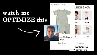
A Shopify store selling toddler clothes gets a conversion audit. The speaker shows how to redesign the homepage hero to highlight unique selling points like hyper-allergenic fabrics, then walks through collection and product pages. Most shoppers never scroll past the Add-to-Cart button, so put your best persuasive information above it.
Chapters
What I normally say for like a homepage is, I really do believe in just having a really, really simple design for your hero section, because this is where if you're doing retargeting, a lot of your traffic going to come back here. And you just want it to be really easy for them to get to where they want to be. So the thing that I would say is, for new customers, you land on your page, just make sure that they're understanding exactly what your brand is. I'm new to your brand, this is the first time I'm looking at your store. And I don't know what you sell yet. And it should be really, really obvious straight away, either with a photo or with your copy, ideally with both. They should both tie together and explain exactly what you sell and what your unique selling point is. So for this, I mean, I know you're, you're doing something with toddlers, right? Because that's for you sending your message. But for a new customer who doesn't know that, it should be really obvious. And then what your unique selling point is. So for example, maybe you could say, you know, toddler clothing that's, you know, hyperallergenic, or, you know, is ultra soft, or do you get what I mean? Or grows with the toddler so it lasts longer, you know, have some sort of unique angle on there and tie that in with your headline and your image. This sort of stuff that I'm mentioning now, I think is really, really powerful. So that's what I'd recommend there. Now, I know you've got this little bar up here. I know where that's coming from because I know there's been like a zero trend on this and people have done different design variations of it. I'm personally not a fan because again, it's like, you know, the first thing you're kind of showing here in terms of hierarchy is like this. Slider. The way that I like to do homepages is if you look at an example of this over here for our nutrition, and we look at their homepage hero, this is really optimized, because for new traffic, you're landing on their homepage is kind of styled like a landing page, we have a really powerful headline, 3 different unique benefits of their brand. And then we have a very simple button that just gets people to their collection page to the next stage in the flow. So something like this, I think would work well for you. Just, you know, have your social proof, have a really strong headline that explains what you do and what your unique selling point is. 3 benefits, you don't even need to have these if you have a powerful headline, a really good image. And then, you know, a nice button that directs them to the collection page. That's what I'd say. And then what I would have underneath is exactly what we have here for row is you could have instead of a bestseller section, you could have a shop by category. And this is where you can tie in these different categories up here. So that's kind of the flow that I would do. I would definitely have a shop by category section as your next one, because then people can really quickly see what the different types of products you sell. So like, you can do dresses, you can do bodysuits, the PJs, etc., etc. So you can have all of those there. You could also have a bestseller section then underneath, or you could put them above, depending on what you want to do. But that's, I think, a better flow there for your homepage. So let's go to your collection page. Your banner here is definitely a little bit too big. Compare this to the one that we've done for row. You can see for row, only taking up about maybe 20% of the screen on mobile. So a lot more efficient. And of course in row, we're calling out the guarantee and the headline up here. So you can see, look, just a little bit better. I don't mind this select size. I think this is quite nice. But it would be interesting to see from your heatmap software, if you have a heatmap software installed, do people actually use this? Do people actually buy straight away from the collection page? If the case is no, if the case that people are still on the majority clicking through to your product page, and then looking at the different images and then purchasing, then I would remove that select style button and just, just keep it a little bit simpler. Because right now, there's kind of a lot of brown that's going on your product pages, and it's kind of taken away from your styles of your clothing. So this is something I'd just be a little bit careful of. One thing that you could also do as well, I don't know if you've looked at this brand, but Bellroy, their collection pages are probably one of the nicest collection pages I've ever seen. I'll show you an example of it. And like all the best principles are here. So you can see if I go into their collection page again, nice little banner, not taking up too much space. But look at it, just beautiful, clean, nice product shot. They got a short little description of each collection. And then what they're doing, which is really smart, is they're tying in the products with also some beautiful like benefit text as well coming through. And you can see lifestyle shot. More product photos, lifestyle shot, more product photos, lifestyle shot. So you can see something like that is what I would say and recommend for you as well if you want to kind of do a flow like that. Um, let's go into your product page. So instead of having these little buttons here, I would actually just have little thumbnails of your image. What I mean by that is, I don't think we've actually done that for row, um, but I think that'll already do it. Let's have a look and see. No, Battle Royale don't do it either. But what I mean is like, I'll show you an example of client work that we have actually done this for. Go to Right Wing Naturals. You can see little thumbnail photos like this. Just makes it really easy for mobile users to actually click on different ones. This is more important for a fashion brand. That's why we didn't do it for Row. And we did, you know, and I don't think, I mean, I would recommend Battle Royale to do it as well, but I think they want to keep it, they want to keep it like a really minimal design. Like for a fashion brand like yourself, I think it's really important for people to have the different images as thumbnails here for mobile users to quickly see the different, like, let's say, lifestyle shots that they want to, like, focus on. Again, like, the formatting on your, on your product page is just a bit weird. The text is kind of all over the place, you know. You know, instead of having to read reviews here, I would have— and doesn't even look like there's any reviews here, so I would basically just showcase a bit stronger social proof if you have it, even pull in some reviews from your site, just more general ones you can put in there. Your size chart. That's nice. At least you've got that there. It actually looks like on first glance, because these are all gray, it looks like these are all sold out. That was actually my first instinct. So I'm not really happy with the way this has been like laid out here because I think it's a little bit confusing. Like this is not really obvious. It looks like they're all sold out, you know. So I would just keep, keep the border color black and then just fill in solid black when it's selected, if that makes sense. I think you've got color here, but I think, you know what you could have done? You could have just displayed all the colors in like little circles and keep them a little bit smaller so that they're all shown on first glance without forcing people to actually scroll. Add to cart button's fine. And the gift note, I think is just a little bit clashing. I would maybe put that a little bit smaller. And then I think what your product pages is missing is the benefits. Like, you know, give people some benefits of like what. The quality of your fabric, how long it lasts, is it machine washable? Does it stretch and grow with, you know, the— as the kid ages, you know, stuff like that. And also your money-back guarantee, if you offer that, how many units you've sold as a brand, as like social proof, instead of forcing people to scroll down, because on product pages, people normally do not scroll down below the Add to Cart button, only about 30% on average do. So this is the section that you really want to dial in.










