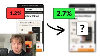
Why Visual Chaos Undermines Your Product's Message

27 Aug 2025 · 0 min

0:29

A designer critiques a website that feels cramped and chaotic despite promising calmness. The fix: more white space, a dominant product image, and a clear call-to-action button. The real problem is inconsistent brand colors—multiple greens, purples, and pinks—that create visual noise and dilute the message.


More from Pedro

youtube.com

How you position your Offer to increase conversions

8mo ago
youtube.com

How to optimize your Shopify fashion brand with CRO

8mo ago
youtube.com

How To Convert 3-5x Better With Your Landing Page

8mo ago
youtube.com

How To Increase Your Shopify Conversion Rate

9mo ago
youtube.com

How To Optimize Your Shopify Product Page

9mo ago
youtube.com

Why Mobile Friction is 10x Worse A Crucial UX Insight

1y ago
youtube.com

Why Images Speak Louder Than Words

1y ago
youtube.com

You'll NEVER make a bad Landing Page again after watching THIS

1y ago
youtube.com

Why Carousels Might Be Hurting Your Website

1y ago
youtube.com

How to 3-5x your Conversion Rate in 47 minutes (full masterclass)

1y ago
youtube.com

How To Optimize a Product Page like a CRO Expert

1y ago
See all content