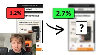
A CRO expert reviews an e-commerce product page and recommends replacing vague benefit icons with specific claims like "14 vitamins and minerals," adding customer photos and reviews, and redesigning the order form to reduce friction. He suggests focusing on four key benefits with larger images and cleaner copy.
Chapters
Cool. So let me go through your product page now. I like what you've done here with these benefits. What I would say though, to make them stronger just on first glance, productivity, focus, clarity, anyone can kind of say that. But I think what's more powerful is if you kind of reiterate this information to people, 14 vitamins and minerals, and explain the benefit of that underneath. You could use that there. So put instead of these icons, the numbers. In big. So you could have 14 vitamins and minerals, XXX, you know, explain the benefit after. Zero additives and sugar. Okay. And then explain the benefit. You don't get any crashes. You don't, you know, you can consume it guilt-free. And then the third one, let's see if we can find you a third one. You could say, yeah, definitely, definitely this. Each serving 5 grams of this power. Yeah, you definitely need to be communicating this. This stuff here is really important. In fact, you should probably replace one of the items I was just talking about with this. So 100,000 milligrams of functional mushrooms, 350 milligrams of adaptogens and nootropics, and then explain the benefit to go with them. That this info way more potent than these 3 different points you got down here. That's what I'd say straight away. Also, I feel like in your product listing photos, there's a lot of text going on. A lot of hierarchy. There's a breakdown in hierarchy, I would say. Make your image, your product image bigger. Okay. This information you can kill from the product listing photos because we're going to have it down here now. Um, or some of it at least. And you know what you can do? Like mushroom coffee, but better. Instead of saying that, because you're kind of saying the same stuff up here. You can call out this information in your headline. So if the points that we're going to mention down here are not going to mention this, then call this out in your headline. 14 minerals and vitamins, zero additives and sugar. And then the subheadline can explain the benefit of that. Okay. This stuff down here, I probably just remove that. I think again, we're, we're doing too much down here, you know, so you're, we're kind of repeating the information a lot, which is not ideal. Because I think that when there's too much information, it can saturate or it can dilute the main message. So life-transforming benefits, I'd simplify it down again. I would simplify this down again. I would basically say if you can simplify it down to like the top 4 benefits and really hone in on them, on each of them, and explain how your product delivers on each of them, that's going to be more potent than just briefly talking about 6 or 7. If that makes sense. So let's go through this. Get more done without the burnout. Okay. I think the, the text that you have down here in the image icons are too small and there should be, should be including a headline up here in the image. If that's going to be the trend for the other ones. I like what you've done down here, breaking down the nutrition facts. If it was just what you need. Okay. This is good. Yeah, this one's probably my favorite. I like what you've done here. I think you're comparing too much in this graph. Break it down, make the text easier. Maybe just focus on the top 6, 6 or 5 or 6 items to compare. 3 ways you can enjoy. That's nice. I would just make the images bigger. You know, I think the images are going to be a lot easier for people to understand how to enjoy it. I think there's a lot of text in your images. Like this one just seems a bit like tedious for someone to read it. You know, I know you've done, you've done a good job breaking it down with icons, but like how to incorporate Cogni Brew into your routine. Maybe replace this with some user-generated photos instead. Surely you have some, some products. Yeah. Like, look at these, look at these photos down here. These are some really nice photos that you have of your product. This one's really nice. Bring these as well into your product listing photos to also break up just having text-heavy slides. So, you know, every maybe second after every two slides, you can just have a single photo of just like a lifestyle shot of the product. I think that would be nice just to break it up. But this one's a really nice one as well. You know, this one's a really nice one. This one is way better than the one that you're using up in your, in your photos. And people are not gonna see these photos cuz they're so far down. So you want to be bringing them into your, into your product listing photos. You've also got some customer photos in here as well. So you can create a collage from these. They're really nice. These are decent UGC photos. So bring them into your product listing photos as well. And maybe you can also underneath that collage, bring out a featured review from one of your customers. I just went past one. Yeah. Over here, like professional wushu athlete. Maybe you can bring in this one and just focus on, gives me steady energy, faster recovery, and no crashes, keeps me focused and in control. So that's a, that's a cool review to put in there. The reason why I'm only giving you feedback on this is because this is going to be the biggest uplift for you, your photos, because this is what most people are going to see and engage with. Yeah, I think the rest of your product page looks clean, so I think it's good. Choose your pack. Oh, you're scrolling people all the way down to here. Yeah, I'm not sure about this because I feel like you're just creating a little bit more friction for people. Why not just offer it like— why not keep it like this, this order form that we did for Row? Where is it? Let's go to one of their pages. We spend a lot of ad traffic on testing out these different pages. Sorry, this is not the product I want to show you. I want to show you one of their single products. Yeah, something like this. This store converts at over 6% and they're doing, they're doing pretty well. And the reason is, is like the UX/UI is super clean, you know, and this is the— we redesigned this order form about 6 or 7 times over the course of a year and a half. And there's, it's a lot of ad data that's gone into this. So I would, and if you look at it, we, it's kind of like first principles thinking. We were like, well, what do we actually need to show the customer? What is the offer that we're going to offer? And if you look at your offer, it's very similar to this. So I'm pretty sure that you could map this onto this framework that we've, that we built for ROE. Cool. That's what I'd say. Hopefully you got some value.