Convert More With Optimized UX-UI Design
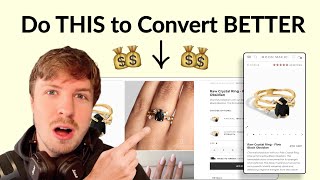
Pedro Loureiro audits a Shopify jewelry brand's product page and recommends adding thumbnail previews to the image carousel, cutting order-form copy to two or three benefit bullets, and making material and gemstone selectors visual with colored circles and icons instead of text dropdowns.
Chapters
In this video, I tear apart a jewelry brand's website and I break down what are the fundamental things that they can do to move the needle in terms of CRO. And these principles really apply to any brand out there on Shopify that is looking to scale reliably. So let's dive right into this. It's funny, but the previous audit that I've just did for someone was also in the jewelry space. It was another jewelry brand. And they were asking me, what are some of the top most important things I can do to optimize a jewelry brand? And the thing that I told them is pretty much going to be the same thing that I'm going to tell you. It's the most fundamental things you can do to improve any jewelry brand or any fashion brand is with your imagery, because that is what the majority of people are going to determine on whether or not they're going to buy or not buy. And they're basing it really on how good it looks. They want to see, is it actually worth the price that you're actually selling for? So first of all, I like the fact that your imagery are big, just stretching across the entire screen, which is good. and it seems like you have pretty good imagery, which is good. Let's look at this. So we have, what is this? Raw crystal ring, flow black obsidian. Okay. I like this image. That's quite nice. Stone of strength. Nice. I like that as well. Another nice image. I'm not sure what this is though. Is that maybe the little box that it comes in? I think you need to make that clear. Okay. And you have a nice video here as well. Really nice. Really nice. The quality looks really good. So I've got to say, your images are really good, which is the most important part. So I'm not too worried about that. The only thing I would say that you could do to test is replace these little dots over here with actual little mini thumbnails of the photos themselves, because in many cases, it's hard to tell for mobile users what they're actually going to get when they scroll through this carousel. But you have a lot of great imagery, and I'm worried that people are not scrolling through the entire ones to see it, but they would have a higher chance of scrolling through if they could see like a mini thumbnail of each of the photos, and then they could say, oh, wow, what's that photo with the, with the 4 different rings? Let me click on that and see it, you know, and that's going to help them. So that might help them to actually scroll through even more and get sold better. So let's have a look at your information that you've got in your order form. So channel protection with a raw crystal ring flow. Okay, so what I would say you could do, either trim this down to 2 lines maximum, or change it to like 3 benefits, 3 bullet benefits. So you could have like 3 little benefits all in the horizontal line over here. And, you know, explain what those benefits are. Maybe it's releasing stress. Yeah, powerful shield. So shield, shield yourself from negative energy. That could be one of them. And then you could add in a third benefit over here. Maybe it could be the material type, which is really important. You know, what is the actual material? And you need to kind of communicate that in here. Because you have it. Oh yeah, you have it down here, right? The material, but communicate that, I would say, in one of your benefits as well. I like this functionality that you have, but the images definitely need to be changed because it's not logical straight away on first— like, honestly, when I, when I was like looking at this straight away, I actually thought you were cross-selling different rings straight away. So that was my first impression. And that was just out of the corner of my eye. And so that's also how people might be reading this. And so you want to make it clear to people, if this is going to be a material selector, then just show the material of the gold in here. So you could just have maybe it's even just the color. Yellow in here. It doesn't need to be anything fancy. It could just be a circle with a color yellow in there. Okay. And that would also save you some space. And then for the gemstone, it could just be like a black gemstone. I'm sure you also have photos of just the gemstone on its own that you could put in there. So that's what I would say there. The size, you have a size guide. This looks pretty good. Is there any way though that you can make your size guide a little bit more visual? They always convert better when they're a little bit more visual instead of people having to read them off a grid. Like the fact that you have a size guide. Let's look at your details. Cool. Maybe some of this information as well, you can bring back into your benefit points up here. Properties of black obsidian. We have this over here. Yeah. So all of this stuff over here. This I think is a little bit more powerful than even some of the copy that you have already. So all I'm saying is try a version of your copy that's simpler, that's shorter, but a little bit more potent. Use the assets that you have to communicate a little bit better. Okay, 2-year warranty. That looks good. Shop the look. Cool. You have some cross-sells down here. That's nice. The rest of it is honestly pretty good though. I think what I recommend is just simplifying, simplifying it, making it easier for people to navigate. So these thumbnails, make it easier for people to navigate by adding thumbnails in there to your carousel. Trim down the information in the order form. Actually focus on the benefits a little bit more. So you could even do, like I mentioned, 3 bullet points. And this, make it a little bit more logical to people that these are not cross-sells. So these are actually material selectors that they actually need to choose the options. So I would format everything the same. So see this headline over here? You could even have that as material, then have another headline underneath, choose gemstone, and then have another headline underneath, choose size. Make it all formatted the same because right now we have a different pattern. It's like material, gemstone, then size. It all looks a little bit different. Keep it in the same structure, okay? And that makes it easier for people to navigate through and buy.
If you're looking for further help, we do offer a service so we can craft a high-converting landing page that is designed to outbeat your current page by at least 10%. Our specialty is designing these high-converting landing pages, and we pretty much do this every day for the e-com clients that we work with, such as Snow, CarePod, Soloway, Velvet Caviar, and many more DTC brands, helping them to increase their ad performance and get better results in terms of their conversion rate, average order value, and overall profitability. If you're interested in learning what results we can get for you and how our process works, then check out the description. There are links to our website, and of course, you can also book in a call with me and answer any questions you have. Cool, and I hope you got some value from this video.










