Copy My Exact $100 Million Landing Page Shopify Step-By-Step Tutorial
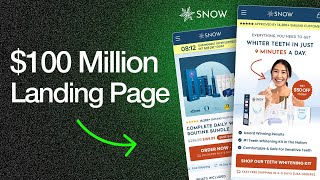
Sash breaks down the exact landing page and product page design he built for Snow, a teeth-whitening brand, showing how bundling, price anchoring, and social proof increased conversions. He walks through every section from the hero to the CTA, explaining the psychology behind each choice and sharing specific copy examples.
Chapters
Hi, it's Sash here. So on this little video today, I want to actually go through two designs that I did for Snow last year. One of them is a product page design and the other one is a landing page design. And you can, by going through this video with me, I'm going to point out all of the CRO insights and tactics that we use to really, really dial this in for Snow and help them with their CRO side of things. So let's start with the, we can start with the product page first, I guess is a good place to start. And the reason why Snow came to me is because they had a bunch of different products and Snow loved to put their products together and create these different bundles for them. One of the things they wanted to do though, is increase their conversion rate and bundle it in a way that increases the perceived value for your customers. So when you think about Snow, they have like toothbrushes, they got different like skincare products, like, sorry, they got different like tooth whitening products, stuff like that. So the, the main thing that I was trying to do for them is, is really how can we create a bundle that actually makes sense and, and kind of fits into someone's routine. So the idea that we had is to create a teeth whitening routine. So when you think about it, you know, having a toothbrush, having your toothpaste, having all of these different things that can make it easier for people to get the brighter smile that they want or their perfect smile, well then that's, that's tapping into their confidence. You know what I mean? That's helping them live a more confident, life, right? So that is the main outcome. That's the desired outcome that people want. So that was the mindset and the strategy going into this page. Okay. It was to create a teeth whitening bundle using all of their, their existing products, no, but combining them in a way that actually increases the perceived value even more. Okay. So what we did is focus on the product page. And, you know, like I say, on kind of my tweets on Twitter all the time is like the most important section on the product page is this first section here. This is what we call, you know, the, the hero section on any page, or the, you know, you can call it the above the fold section. This is basically the section that people are going to land on straight away. So on a product page, this is usually going to be like an order form. So it's going to have a button that says order now. It's going to have your product name, the price, the savings, the image of the product. It's going to have all of the important information to give people who are interested in buying you know, to get them to that, to that cart straight away, right? The difference between the product page and landing page is a landing page doesn't have an order form straight away. It warms you up. It has information more about the product. It's more about a learning experience straight away. A product page, you go straight to an order form. It's all about, okay, here's the information that you need to buy. Do you want to buy? That's what, that's the differences. So going through this, you can see the design. What we did is we have little bit of an urgency thing here. We got the, you know, because when Snow were running this page, they had an offer at the time. So they were going to offer people like an extra discount on this, on this bundle when they, when they were launching it. And the way that we positioned it is we had this, these bundles of these, these different items. We have the toothbrush, we got the little, you know, whitening toothpaste here. And then we also had this like this magic powder, which is again, just again, to enhance the whitening effect of your teeth. What we did is we positioned this as being free in the bundle. So Snowboard Generous to be flexible in how we're positioning the offer. But when you can offer something like this for free in your offer, it's funny how it can increase the perceived value in your, in your product. And I want to show you another example I've done for another client before that has, that he's done incredibly well with since we've run his page. So this is Ro Nutrition. This is another one of my clients and they're a supplement brand. But the cool thing about for them is, right, is you can see one of their offers down here, this 25% off offer. The way that we bundle this is they were going to get 5 bottles, but one of them is going to be positioned as being free. So it's funny, but it's a little, you know, psychological, I guess you could say positioning that we're doing here that in the buyer's mind, they feel like they're getting a better deal instead of just saying, okay, buy 5 bottles and get like a 20% discount. We're saying, you know, buy 5, you're going to get a 25% discount and, or, and one of them is going to be free. So it just seems more powerful. And when you— and the real power of this is when you compare it to another one of your variants. So if we look at this one bottle now, this is at $55.95. And when we compare it to the, to the 5-pack that they're going to get with a free bottle, it's only $41.97 each. So this one bottle feels really undesirable when you compare it to the 5-pack. And of course, when this works, when you can get this to work with a client store, you can get— you can craft them a really, really solid offer like this, like with Snow's offer, you're going to increase the AOV so much more. So we can go from what was originally like a $55 AOV, maybe a $65 AOV, now to maybe, I have to do the math on this. What is this like? $170, $200 AOV? Because this is like in pounds. So you can see the power of CRO, the power of psychology at play here. And this is only, we're only really talking about the offer here. So this is without me going even into the UX, the UI. which I'm going to about to go into now. So just want to give that little example because this always makes me— I just think it's very, very cool. We can get the offer to, to be that powerful and appealing to people. Okay. Another thing that I want to point out is obviously your image is really, really important. The image on a product page is a critical, critical component. And I see a lot of people talking about CRO on Twitter, but not many people talk about the image and the power of photography. Well, when it comes to premium products, and I mean high-ticket products, anything over $100, I classify as a high-ticket item, your product imagery needs to be really, really good. It really does. Because again, if you have really poor imagery, if it looks like it's Photoshopped or CGI generated, it's not going to give customers that level of trust that a premium product should be given people. So when you look at Snow's imagery, when you look at Ro Nutrition's imagery, it's professional. It looks clean. It looks like professional companies created this product. It doesn't look user-generated or anything like that. And again, it's just a subconscious form of trust. That's a first impression that people are going to get when they land on this page. So you want it to be a good impression and you want to build that trust from straight away, because I know I'm going off on a tangent here, but think about it this way. Imagine if they land on your page, they're really, really excited to buy your offer. Like you're really solving a big problem to them, but they see an image that looks like it's Photoshopped, that looks like it's been, you know, generated by some AI tool. That doesn't look real. Well, then you're going to have to find other areas throughout your page. The customer is going to go to other areas of your page to see if you're legit or not. Maybe they're going to read more reviews. Maybe they're going to actually search up your company online. They're actually going to be, okay, a little bit nervous now. Well, maybe is this company legit? You're going to start putting questions in their mind. So this is what I mean. I know what we're talking about, very, very, um, sort of like advanced things in the, in the SEO side of things, but these are really important. Like what I'm talking about here, I think is very, very important. Anyway, so going on for the image, we have social proof in the image as well. When you can do that, you know, obviously don't do it in a way that's like overpowering your product imagery, but do it, you know, if you've got these, these, these awards and you're featured in these publications, why not bring them into your imagery? Because again, this is a section that most people who come to your product page are going to interact with. So you want to be calling them out. We have our social proof down here. So instead of saying like, okay, this has been reviewed by you know, 200 people and there's like 50 5-star reviews or whatever, whatever that number is, saying the actual total amount of customers that have bought this kit and the total amount of customers that you have is, is a much more stronger form of social proof when you have, let's say, a lower review count. And, and I say this again, when it comes to premium products, this is something that you want to be doing. Okay. Another thing that's important is if you are running a sale on your product pages, make sure that you call out the savings amount. I see time and time again, the amount of stores that come and do an audit with me and they don't actually— they have a sale on, but they don't have the savings amount being shown. Again, you're causing your customers to have to do the math, to have to work out the math. And some of them don't even know, like some of them may not even bother to do the math. They look at this. Let's say I remove this, you know, look at it now. Like, I don't really know how good of a deal this is straight away. You know, some people might miss this. but by making it very clear how much people are saving, you're again, getting into the mind that this is— you're, you're telling them, you're communicating to them how good of an offer this is. So another like small little CRO things that I've been doing is I've designed a lot of order forms over the last few years. I've been doing all of this and I found that the best type of order form or the best type of CTA in the order form should have the price in it when you, when you can do it. So for example, we have order now or shop now and have the actual price after the savings, after the sale is on, have that in the button. Again, just another way to make it easier for people to understand how much the price is because you want to, you want to be transparent. You want to, you want to make it easier for people to understand, okay, what is your offer? How much is it going to cost? Like these are not, these are not bits of information to hide from people. Like no one is going to purchase a product that they don't know what the price is. You know what I mean? It's just not going to happen. Like if I removed all of this and I removed the price and the button, do you think people would order? Do you think people would actually check out? No, they wouldn't, because they wouldn't know what they're ordering. They wouldn't know if it's a $500 product, if it's a $50 product, how much are they actually charging? Again, communicate information that customers need and communicate in a way that's very clear. We also have another important information here. This is logistical information. Again, this is another thing that's not really talked about a lot, but it has a lot of value to customers. For example, knowing how long it's going to take to ship, Knowing if you offer free shipping, if you have a money-back guarantee, if you're actually made in the US or something like that, another form of trust. So information like that, bring it into your order form and make it, you know, make it clear to people that you actually have these things going on. If you deliver very, very quickly in 3 to 5 days, that's a great selling point. That's great to communicate that to people so that they know they're going to get it pretty quick. So then we go on to I guess I would start calling this like below the fold. So this is, I guess, you know, this is going to be the section of the page where people have to scroll down to see. So what we're doing in this section here is we're actually showing people what they get. So they see the image, they see the bundle of products. Now we're actually telling people what they get. Okay. And we're also including the fact that they're going to get free shipping in there as well. And then some of the tabs we're showing that they have a guarantee. We go into the natural ingredients that we have, and you can see that we have that information over there. And then we have shipping returns as well. Which is also— it's funny, not many order forms actually have the shipping and returns information in the order form. And whenever I work with the clients on optimizing their product page, I always include the shipping and returns in the order form, right in this section. Because again, if you think about it, this is information that people need to purchase. People want— like, if you look at even yourself and the way that you purchase items, you before you go to purchase a $100 or $200 product, you're going to know, you're going to want to know, okay, can I return the product if there's problems that I have? If I don't like it, is there a returns policy? How long is it going to take to ship? Things like that you're going to want to know. So give that information to people, you know, on the page and make it easy for them to access the information. A lot of stores, what they do is they don't include this information on the page. They have it buried all the way down here at the bottom in like their terms and conditions. Again, you're just making it harder for people to get that conversion. So let's go down and below this information section, these, these information tabs, we have another social proof section. And for Snow, their dream outcome that they're giving to people is a better smile, a brighter smile, you know, you know, more attractive smile, whatever that may be for different people. Right. And so the big thing that we try to do here is I try to include before and after shots of their actual customers. That look super genuine because these are actual customers who are getting these amazing results with their products and just displaying them like an auto-scrolling carousel. So here we have a few different shots and then we go into one of the most important sections down here. And the reason why some of this copy isn't in here is because Snow wanted to write some of this copy themselves. They have their own copywriter, but I basically laid out the section for them. But this section is to communicate the routine. So we're selling people on the routine here. So this is a bundle. This is meant to be a routine, like a lifestyle. And you can, you can understand that when, why we're doing this is because we're now making it, we're almost getting into people's heads that this is, you know, everyone brushes their teeth every day, or at least I hope so. But now we're just making it almost like we're taking that routine and we're upgrading it. We're saying that you can continue to brush your teeth every single day, but this is a new routine that you can sub in to replace it, to continue to get an amazing, you know, dental hygiene, but also to have the effects of whitening your teeth at the same time. So that's the whole thing that we're selling people on is the convenience, the convenience of this routine. Okay. So, um, and then we're showing what the different products in this kit actually do. And then we have a little section down here that, um, and I call this like the value stack. So this, I used to work in a, um, like before I set up my own business doing landing pages, I used to work for a personal development company and I used to help them market info products. And one of the things that I learned from that industry is just how they structured the information. It was very copyright, you know, there was very text-heavy information. There would be a lot of text and selling people. But what I noticed is there was a trend when it came to high-converting landing pages for info products. They all had like a value stack, which was when they were selling a course or an info product, they would lay out all the different modules on that course to make it super easy for people to understand what they're getting. And then at the end, at the bottom of the page, they would stack it all together. Like, like what I've done here and show the whole course of the info product, what the total value is, and then show what they're actually getting it for. So show the offer. Now, the reason why this works, why info products businesses do this and why it works for them so well is because if you can think about it, E— info products compared to e-com stores have a lot of a harder job in some respects on selling to customers because they're selling the intangible. They're selling a digital product, something that you can't physically interact with. So the value is all perceived value. I talk about perceived value on Twitter quite a lot, but when it comes to the info space, it's all perceived value unless you're getting like a booklet or something like that to go along with it. It's all perceived value. It's all about, you know, you know, transformation, health benefits, you know, all things that you can't really measure tangibly. You can feel straight away, right? But with e-com, a lot of it is the tangible, right? But because we're talking about this routine, you know, I wanted to bring in this value stack because I know how powerful it is. So this is almost like combining some principles that I've learned in the, in the info product world with the e-com world. And putting them in a way that, that obviously makes sense for this product. So I thought that was just something interesting to talk about. And then we go down to this section here. And the cool thing about working with big brands like Snow is they tend to have a lot of amazing social proof. You know, Snow is a $100 million plus company, if not more, by the time that I'm recording this right now. But they've been featured in countless magazines. They've got, you know, thousands and thousands of customers all around the world. In the US, they've been featured on The Ellen Show, for example. So they have so much social proof already. And in this case, all it is, is we just want to display it. We just want to put that social proof on the product page and, and make people aware of it because we can't always assume that no matter how big the brand is, that new customers are going to know about, about this brand and feel the same trust that we know that this company has, if that makes sense. So moving down the page, we have this this comparison chart. And this is a type of section that I often include on a lot of the pages that I do for clients because the way, the reason why this section works well for a lot of different products and e-com products is because again, you're basically, what you're doing is you're basically saying, okay, how can I say this in a way that doesn't make it sound too complicated? But like, What we're trying to do on the landing page or product page is we're basically trying to say, this is what my product does. This is the benefits of it. And this is why, you know, it can work for you if this is the outcome you're looking for. What a comparison chart does is it says, this is why our product is better than anyone else on the market. So it's almost like you're stacking another side onto what you've already said. So we've already gone through the product. We've already said, we've already created that, that desire in people's minds. Okay, this is a really cool product. This is amazing. It does all these different things. I love it. You know, I'm really hooked now. But this section is now saying, and it's now relieving the objection that some people might have. Well, well, well, can I get a cheaper alternative elsewhere? I know this. I believe in the product. I know it's great. I know it's something that I want, but can I go to Amazon and get cheaper products elsewhere? So this product, what it does is it tells people why they should shop with Snow, why they should buy this product, why this product is the best one for the market, what they're doing. And of course, these are all legitimate reasons. Like, if you're going to go for a cheaper product, you're not going to get the same level of results. Like, Snow have engineered their toothbrush, you know, and their, and their toothpaste in a way with experts. So you're getting like the best of the best here. But again, it's just about communicating that with people. People, you know, not everyone is going to know that when they first land on the page. So if your store, you know, is innovating and it has all of this credibility that you're not really showing in your product page, Make sure you get a section like this on your, on your product page or landing page that shows how it compares to other products on the market. Okay. So, and then we have the social proof section again. It doesn't hurt to have it again. And this is going to be right above the reviews widget that they have. Okay. And then we have just before we hit the end of the section, we have a guarantee section. So again, to alleviate risk, handles the objection. Okay. Well, what if something happens? What if something happens to my product? Well, Snow have this amazing guarantee. Well, you can try it for 30 days. If you're not impressed, get a full refund, no questions asked. Boom. You know what I mean? So when you have a guarantee that's that good, it really, really helps you push higher ticket products. Okay. Because that's, that's always going to be the biggest thing that's stopping people from purchase. Okay. Even if they believe in your product so much, you're always going to get people as you start to target colder and colder audiences who are like, well, I'm about to drop $200 on this product from this brand that I've just seen on an ad. 5 minutes ago. Do I really want to take that risk? If they see that they have a guarantee that, hey, they can try it out for 30 days and send it back and get a full refund if they don't like it, well then that's, you know, that's, that's going to, that might be the one thing that pushes them over the edge to convert. Okay. So always try to think of it from that perspective. And then the final section down here is we just have that value stack again, communicating the total value, then what they're going to get it for today, showing basically showing how good the offer is. Okay. So that is the product page. Now let's go on to the landing page. Okay. So for this landing page, what we're doing here is we're communicating a different bundle of products. Okay. For Snow. And we're, we're basically positioning them as like this teeth whitening kit. So when we talk about landing pages, again, just like how the most important section on the product page is the top section, the most important section on landing page is the top section as well, but also the order forms, the section that they convert on. So we'll speak about the two of those sections as well. So that's why landing pages are a little bit more complicated in some respects. So with this hero section, all the essentials of CRO need to be there. You know, you need to have social proof, you need to have the benefits, it needs to be benefit-oriented. You need to have a strong headline that makes, you know, that communicates the desired outcome, right? And then you need to have photos of your products and then ideally your target demographic holding that product. Okay. So just begin that communicates trust, makes it look more premium. And then of course, having some logistical information in there as well makes it clear. And of course, it goes without saying, you need to have a button in your, in your hero section. Some brands I see, not, not, you know, these are very rare, but some brands that I do an audit for, they don't even have a button in the hero section. And sometimes I cry on the call just out of shock. I'm only joking. But yeah, it is quite shocking to see. Because you're just killing conversions if you don't have a button in your, in your hero section. So basically that's all the elements that we got here. We got the social proof, we got the strong headline, whiter teeth in just 9 minutes a day. So it's doing two things. It's communicating the desired outcome, which is whiter teeth. And it's also communicating the speed. So efficiency, ease of use, convenience. Because again, one of the things that people may think when they first come to Snow is how long is this going to take? Okay. I really do want whiter teeth. But how long is this actually going to take? If it only takes 9 minutes a day, well then for a lot of people, that's an awesome amount of time, you know what I mean, to get such incredible results. So yeah, so you can see the value there. And then we have a few benefits to talk about Snow. So award-winning results, and they've got a plethora of awards that are highlighted on this page. But for Snow, that's huge. So again, when people come to here, they know, okay, they must be in good hands because look at all these awards that Snow have got. The number one teeth whitening kit in the nation, and that's a true claim. They've actually, they've got that title. Comfortable and safe for sensitive teeth. So this is another little benefit again that we, or really it's an objection that we're handling with some people because when you're talking about oral, you know, dental products, one of the things that a lot of people suffer with is sensitive teeth. And I think I went through a period in my childhood as well where I had very sensitive teeth. They seem to be okay now, but even some parts of my gums though, even when I'm drinking some types of liquid, they can really like trigger sensitive and it's really painful. So again, this is something you need to be thinking about is, okay, within this little niche of products that we're targeting, what are the different objections that people have and what are the main ones? And just focus on those main ones first of all. And again, that will help you communicate the value of your product. So then we go into this section below the fold and this is really a video that explains how the product works. That, you know, gets across all the real value points. So when you have a video like this on your landing page, a quick, quick, like 2 to 3 minute video that explains the benefits of the product, maybe show some customers using it, give some real testimonials in there as well. That can be really, really powerful. Like basically that video does the whole job of what your landing page does, but just again, make it has, you know, it's in, it's in a form that's more easier for people to digest, a video form. So yeah, so definitely do this if you have the resources and the assets to be able to create a video. So we have all the rewards in here. We got all the different testimonials from these different companies or these different publications, right? That Snow have been featured in. And again, you're just stacking on and stacking on the social proof, which is always a good thing. So then we have the routine. So this is very similar to what we have in the product page. But again, this is just communicating the different products in this kit and showing how it gets them to the desired result, which is the perfect smile. And then we go through this little carousel. So this is something that I was testing last year for a lot of different clients is like, instead of having all the different sections stacked in a list, how about we stack them in a carousel and just make it very, very easy for people to consume. Now in general, I don't recommend using carousels just because again, you're kind of limiting people. You know, it limits the engagement that people have, like a lot of people don't really engage and get to the end of the carousel. But when you're like Snow and you have so many different good benefits, bits about your product, displaying them in the vertical list is again risking people dropping off just because they don't want to read through all that information. So in this case, we went with the carousel. We went with 7 reasons why 14,000+ customers rank Snow as number 1. And we go through all the different reasons, you know, wider smile, dentist-approved, sensitive teeth, easy to use, whiter whenever you are, whiten whenever you are, and then the 30-day money-back guarantee. And then we have the social proof section down here again, the award section. And that's literally, I think, the exact same as the product page. So we just copy that in. And then we have the comparison chart again, I think, with the same information that we, that I did for them over here, but just in a style that fits this page. And then we have the order form. So again, we have this little pattern interrupt section over here that displays the offer. Then we have the image, very similar to kind of what we did up here, as you can see, same layout. We have, you know, the offer is very, you know, easily communicated. We got the awards in there. We got someone holding the product. Then we have social proof. So we got the total amount of customers. We got the product title. We got the savings amount. And then we got two different options. So by default, we've selected this product to be, you know, one-time purchase. But people can also click this one, subscribe and save, and they can get an extra 20% off, off the already discounted price. So again, they can even get a better deal if they want that subscription. And then below the fold, so below this order form, we have the 3 different or the 4 different tabs. Very similar, the same structure basically as the order form on the product page, going over what's included, our guarantee, the natural ingredients, and the shipping returns. So what I would say for every brand is you should always have what's included if you, if you got a bundle, always have, you know, your shipping, your returns in there. And if you're doing a tech product, if you're selling hair dryers, I've got a brand that's selling hair dryers. If you're selling any sort of tech products, have a tab that goes over the technical specifications as well, like the voltage, all the information that, you know, people who buy tech products want to know about your brand, about the products. So, yeah. And then we have social proof sections. This is like the reviews again. And then we have the FAQs and then we have, basically I classify this whole section as like the final call to action. So again, this is just when they scroll to the end of the page, it's just another CTA to help them click and scroll back up to the order form if they're now interested in going ahead. So I hope you got some value from this deep dive into this project that I work on with Snow. And yeah, I'd be curious if you guys have any questions or anything you want me to dive deeper. I'm very, very, as you can see, passionate about doing these videos. I love talking about CRO. I love talking about all the psychology and all the different principles that go into designing different pages like this. So yeah, you can expect more content on the way. And of course, if you are a D2C brand, if you're an e-com brand and you're interested in me doing an audit for your business, or you want me to do a landing page for you and work with you on CRO, just book a call with me. I'll leave a link somewhere, somewhere below this video for you to book a call with me. Cool. Thanks so much.










