Copywriting Tips, Product Listing Photos, & Design (CRO Audit)
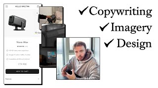
This content was created by Pedro Loureiro. This content was uploaded by Pedro Loureiro. This is a YouTube CRO audit video titled "Copywriting Tips, Product Listing Photos, & Design (CRO Audit)" (created 2025-03-07). A single speaker provides a detailed conversion-rate-optimization review of a projector e‑commerce site/brand (mentions Hello Spectra, Nova Max, Spectra smart projector). The speaker critiques the homepage hero (headline, CTA copy, imagery), recommends moving stronger messaging higher, adding the word “projector” to CTAs, and using clearer benefit-driven headlines. They give product-page advice focused on the order form and top-of-page content: optimize listing photos and carousel (add lifestyle photos, video, and text callouts), present unique selling points (immersion, ease of use, clarity), add a comparison chart for multiple SKUs, handle price objections (e.g., compare cost to cinema tickets), surface trust signals (free shipping, warranty/money-back trial, featured reviews), restructure FAQs and reviews, and improve layout/formatting for mobile readability. The excerpt is in English and emphasizes fundamentals of messaging, offer, and simple design to improve conversions.
Chapters
when you come to your homepage, it's always really, really important to hit, you know, new customers and readers straight away with exactly what you do. And just to be clear, I've got, you know, I know it's a projector, because I've come from your product page. And I can see this is that type of product, right? But if someone, if this was their only experience, your website landing on your homepage, would they be able to understand that it's a projector? Right from here? I don't think so. So even if it's just something simple that you put into your button, discover projectors, discover our projectors, that will make it so much more clear. Just small things just to make it clear, because the clearer you can make, you know, the clearer you can communicate basically to your customers and to potential customers, the more people are going to buy. It is that simple. It's such a simple principle, but it's so powerful at the same time, because I think a lot of people when they think about conversion rate optimization and marketing, they dance around with all these like complicated like theories and frameworks and gimmicky tactics, instead of actually just focusing on improving the fundamentals. And what are the fundamentals? Well, having really good messaging, and that's design, and that's your words and your imagery, and how clear they are at communicating what your product does and what its benefits are. Having a really good offer. And of course, having a really well-optimized you know, mobile experience. That's kind of the third pillar there. So that's the first thing I would say on your, on your homepage here is section is just adding in the word projectors into your CTA button makes it clear what your products do. The next thing I would say here is, you know, live an extraordinary experience, you know, that to me, pretty weak headline, because it's not really telling me about, you know, what your product, what the benefit of your projector is. And there's a number of different ways you can write your headline, you can write your headline, and you can say, you can focus on one unique selling point about your projector compared to other ones on the market. So that's called like, you know, market positioning, how you position against competitors or competitor positioning, if you prefer. Another one could be focusing on the emotional benefit of someone who hasn't, you know, bought a projector yet. So you could be like, well, you know, get the big picture of the big screen, you know, blast it, blast it up on your wall. And make it more immersive. So you can talk about the immersion of the movie experience or the video experience, and that your projector— and you can go into all the different features that you have and tie them back to that main benefit. You know, we have a really advanced, you know, I guess you could say like clarity, the clarity of our projector is, is better than other ones on the market, you know, you can talk about all these different things. So, you know, ease of use, etc., etc. So your headline needs to be wrapped, I think, around something like that, something more powerful that explains, you know, what, what's Hello Spectra about? Why is it, why, why should I as a, as a web user stick around on your website? And you need to give me at least one really powerful reason, you know, to learn more. Doesn't need to always like sell me straight away, but just give me enough of a reason to hang around and want to learn more. Also, I think I do like this image. I like the popcorn and I like the projector, but maybe there's another image as well that you can choose in here that, you know, might make it more striking and might communicate as well what your main benefit is. So this is a cool image that you have over here. It's actually quite nice. I would try and blow that up a little bit more. So it's, you've actually got it down here. Look at this. So your, your second, your third section down here, the big screen experience at home. That to me, way stronger headline than your first one. And you know what I do to tweak it? I would say, get the big screen experience at home or enjoy the big screen experience at home. That's it. That could— that's how simple your headline can be. And then, you know, you'd have maybe, you know, a photo that ideally shows your projector with, you know, what it's actually projecting at the same time. And then you can use this as your second, you know, supporting headline and transform your living room or your bedroom with Hello Spectra's portable projectors. So, you know, it's funny, I didn't, I didn't read your website. It's my first time coming across it. But this is intuitively what I thought would be strong, way stronger messaging. You've actually got it down here. So you already know, you already have really strong messaging, but it's just, it's the third section on your home, on your, on your homepage. And that means that already, you know, a good majority of website viewers are not going to read it and not going to encounter this. So definitely, I would move some of this messaging to your hero section. It seems like you got two different products here. I'm not sure if you've got any more. But if it's— if this is the case, you only have two, don't put them in a scrolling section like this. What I would do is I would model this brand that I used to work with, And for CRO, and look at this section that we, that we did for them down here, care prod for every room. They did these humidifiers. And you know, instead of having a scrolling section or that, we just had a comparison chart. So it's very easy for people who come across this to understand which one is the right one for them. And I think that's what you need. You need a comparison chart section over here that shows people what's the difference between the Nova Max and the Spectra smart projector. So that they can understand when it comes to optimizing product pages. So we've talked about your homepage now, and I've suggested some of the biggest things you can do to really move the needle there. When it comes to product page, what's the most important parts of the product page that you can optimize? Well, it is the order form, it is this section over here, anything below, down here, majority people are not going to actually view because, you know, looking at heatmap data from, from hundreds of different stores, the majority of website viewers do not scroll down on a product page. So about, you're looking at 80% of traffic will only, will only see this section up here, this top section, which means that it really does need to be super optimized. It doesn't mean it needs to be like flashy design or fancy design or anything crazy like that. It just means, and I'll talk about this now, like the real important things you can do to your order form to make sure it's optimized are one, making sure that your product photography in the carousel, your listing photos, basically making sure that they're really, really optimized. And without throwing the word optimized out there all the time, like, what do I mean by that? Well, it just means that I should, as a web viewer, be able to scroll through your images and learn everything that I need to learn about your product, all the main benefits, how to use it. I should see some social proof in there. I should see some lifestyle photos in there that So I can kind of picture how it will look in my environment. I should see maybe a video in there and I can see one down here of it in, in use. This stuff should be in your carousel. And I can already see that that video, this one down here, which is really good, really powerful, you know, is not in here. So this is the first thing I would do is make sure that you're bringing in this video. This video that you've got here, this GIF or video, I would honestly put that as your second one in the in the listing photos. This is nice as well, this close-up shot that you've got down here. And I would maybe just have a little text callout that points to it and explains, you know, how easy it is for them to, like, you know, link their headphones or, you know, link a USB or other cable to it. So basically, what I'm saying is, like, all of these value benefits you've got down here, you need to basically include them in your product listing photos and, and make sure that they're easy for people to read and consume and very quick. You know, and I think what's also missing in here is some really nice lifestyle photos. So you have a really nice lifestyle photo here that I can see. Look at this photo over here. This is beautiful. You know, the projector with the popcorn. Honestly, something like that might even be better than this first photo that you have here, you know, because it just looks, just looks more premium. I think you just need to have a square photo instead. The next thing in here is going to be the same thing that I talked about on your homepage. You need to really communicate as quickly and easily as possible what your main unique selling points are for your products. And I think we talked about on the homepage, the big screen experience, immersion, ease of use, you know, and quality. So all of those things I think need to be communicated here and very, very simply. So I don't mind that you have the bullet points here. But I don't think it's, you know, I think the language and the way that you're phrasing it needs to be talking a little bit more about the immersion. So that people can paint in their mind how much better that this is than a TV, how much better this is than their current projector that's maybe not as big or not as good, you know, clarity-wise. That's kind of, that's really, really important. So another thing that people are going to have is, and this is with every store, is basically a price objection. So with every product, everyone is always going to have a price objection. They're going to, you know, that's always the biggest, one of the biggest things that's you know, that pushes people not to purchase is the price, right? Because maybe they don't see the value in it at that price point. But you never— no brand ever has a price problem. They always have a communication problem. So if someone is thinking, oh, that seems expensive, it means that we just haven't done a good job at communicating the value of it. And one thing that I think you can do for the Nova Max to really communicate the value of it is talk about how costly it is to go to the cinema. So the average cinema ticket, I don't know, maybe $10, $20 every single time. So you can talk that the Nova Max is, let's just say it's $20. So this is like 9 cinema tickets. This is going to cost you and then it's free. So you could say, you know, something that could be cool in the copywriting is you could say it pays for itself after 9 cinema tickets or something along those lines so that people can actually see, yeah, I spend Wow, I'm spending hundreds of dollars on going to the cinema when I can, you know, invest this money into this projector, and then have it in my— and then have the cinema experience in my living room or in my bedroom, the comfort of my own home. So that's how— that's one way that you can get around the price problem. And it's important because that could be one of the main reasons that's stopping someone who's got a TV from not buying this. But now you're giving them a really rational reason on why it's a good investment for them, you know. So you're almost kind of saying, hey, it's actually the smart choice. If you're going to the cinema all the time, and you kind of— you're a movie— you're a movie buff, you're a movie enthusiast, and you want the comfort of the cinema from your home, this is actually the smart choice for you. And it's the best one on the market. So that's something I would tie into your copywriting. So you got your features down here. This stuff, I think, needs to be better formatted. You know, you know, mobile users, like the— when I talk about design on x.com, and you know, on my newsletter and things like that, I think a lot of people think that I talk about aesthetics, but I actually don't. I actually talk about— when I talk about design, I'm talking about like how you format information, how you use space, how you use font sizes, how you communicate certain things, because, you know, aesthetics doesn't really matter. You know, you can have a really basic landing page or website. And it will convert really well. If you have a great offer, you got great messaging and great images. But if you have a great offer, and you got great messages, but you have a really poor design, really poor way of formatting those images, really poor way of communicating your offer, the whole thing will fall flat. And so even this stuff, you might look at it and say, well, it's just a dropdown communicating this stuff. But make it easier for people to understand this, format this text a little bit neater, you know, maybe put the, the little subtitles in bold. So it's easier for people to actually understand all of this delivery information. I would honestly give this to them at a glance. So under your Add to Cart button, I would put underneath here, the fact that you do offer free delivery, maybe putting your warranty period or your money-back guarantee here, or putting your estimated shipping date. So you have a 14-day money-back guarantee or money-back offer for them to like try it out. That's something that I would talk about as well in your order form. And maybe another thing you can do in your order form is bring up a customer review that handles a really important objection. So to kind of summarize what I talked about, you know, your homepage, we talked about the messaging there that needs to be stronger, stronger headline, stronger image if you can, and the button should have the word projector in it. So it's super clear what you guys actually sell. Your product page, the biggest thing that you can leverage is your listing photos, improving these listing photos, adding in some, some better lifestyle photos showing the product in use like this video down here. And maybe another photo that shows the product in use with people that would make it a lot more powerful. And also, I think some other, some other photos in here where you can actually bring in the text, you know, talk about the full home cinema experience, talk about the immersion, talk about how easy it is to set up. You know, that sort of stuff needs to be in there. I think you also need maybe a little how-to-use section. You can add that as like an image, 3 steps on how easy it is to like turn this thing on, plug it in and connect, you know, just make it super easy so that people before they even purchase your product, they know how to use it. Really, really important. The next thing we talked about on your product page is diving deeper into the messaging around the immersion, around the cinema experience. We also talked about the price objection. I think that's really important. So you can talk about how it compares to a cinema ticket. And the other thing we talked about is formatting. So features and delivery, you can format that better. And you can also bring some of that key information such as the fact that you offer free shipping, the fact that you offer a 14-day, basically free trial for them to like test out the product risk-free, add that underneath your Add to Cart button. So it's easier for people to, to see and build trust with you. And then the final thing I would do, cherry on the cake, bring out a featured review down here for a customer that, you know, that's a really strong one. And actually, there is one more thing. The other important section that people engage with on product pages is your FAQ section. So I don't think you— oh, you do have it down here. So this FAQ section, I would actually put that at the bottom of the page. Put your reviews next. So I would go like this. Have a really optimized listing photo carousel, then have your reviews, then have a really strategic FAQ section. And these FAQs, they need to be the top objections that your customers have, or people in this market. You know, so, you know, you kind of need to dive into the research on that, look at any emails that people have sent you. Is there any recurring questions that people are asking you? You know, look at those top objections that keep on coming up, even people who've already bought from you. Is there a pattern? You know, what have they said about your— about even the reviews here? What have they said about your product? So, you know, lighting could be a topic that comes up, you know, how well does this work in different rooms with different lighting setups? So those are the top questions, I think, you know, your, your FAQs are really, really important sales tools. So the more strategic you can get with them, The better they're going to help you convert.










