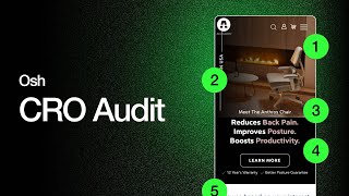
Pedro Loureiro audits a Shopify store's conversion rate, recommending a prominent shop button, clearer product comparisons, better social proof with medical endorsements, and fixing mobile navigation issues like awkward horizontal scrolling.
Chapters
Okay guys, so as promised, this is like a little audit of the, of your site. So I just went through your site yesterday on my mobile phone and just kind of went through and just deep dived into everything. And I'm gonna do another audit again, a deeper audit, just going through the entire site in more depth and going through all the different pages. But this is kind of on the main page. This is particularly on your homepage navigation menu and then also like clicking through to some of the main CTAs. So what I would say is like for this navigation menu, I definitely think we need to add a like shop now CTA to the bottom or something like that. Just so for like people who basically don't really know what category they need to select. I think that could be an easy little win that we can add here, just like a shop now button down here or even below here that just says, you know, shop the chair, something like that in black. For this, all capitals text is pretty hard to read and it's kind of like covering the photo in my opinion. So I think this would be awesome to like redesign this and get a more optimized, you know, design going for this. You know, with lowercase text and, you know, actually being able to see the image, if that makes sense. Definitely think we should add the CTA below here. I don't think there's any CTA around this section, so we need to add the CTA, especially if we're calling out the fact that, you know, people can customize the chair. Then this, this zero risk guarantee, I want to put this on like a 2x2 grid. We'll just make it less, take up less vertical height, basically just to simplify the whole page. Then this, this sitting is believing. So this is on your, I think on your current testimonial page, isn't it? Or I think it might be a section on your homepage. I'm not too sure which page it was on again, but it was scrolling way too fast. I couldn't even really read the text. It would scroll too fast and I had to put my thumb on it to kind of stop. So that's definitely something that we can optimize very quickly there. Then this section here on your homepage. So it's designed with purpose by medical seating professionals. So we should actually call them out. We should call out all the different people, the doctors, the chiropractors, the physicians, the people who vouch for your products and actually list them here, show their photo, show their credentials. This is just going to bump up this section here and give it a lot more social proof. Then this, I think, easy little win here is just to add the FTA logo so that when people are scrolling through your homepage on, you know, very quickly, they're just going to see this. And, you know, again, just that logo, just, you know, being, seeing that is going to, you know, again, create, create more trust. These things here, I think we should definitely add the new side-by-side design that we did for you. If you can remember back to when we optimized the original, um, landing page. Where was it? It was, I think it was over here. We did a side by side. Yeah. This thing over here. I think this would be really, really cool to get that in. I think it's just a lot easier for people to read and you can see the comparison very, very clearly. Because over here, basically, you're kind of just showing, where is the other one? Yeah. You're basically calling out others first. And it's like, I don't even understand what this section is when I'm coming to it first. You know, I think it needs a proper headline, like kind of how we have here Anthros versus traditional desk chairs. So basically just, sub in this section for that section, if that makes sense. Add our graph. I think this— our graph is probably a better graph than this because again, it's not really clear what this is, what I'm looking at here. I know from your side you're going to say this is the pressure point when someone sits on the cushion, but it's not clear from looking at these graphs that it is. And I just think that maybe this graph is a lot clearer on being able to see the comfort, if that makes sense, and see how Anthros ranks versus the rest. So honestly, you know what I'd love to do is maybe just as well as go through the pain page and do a full 2 weeks into that and revamp. I think we just need to revamp the homepage as well. Take some of the sections that we've already done for you here and actually just sub them in for these sections on the homepage, if that makes sense. This section I really don't like because it's kind of weird. If you go onto your phone and you scroll through this section, it's really weird. It looks like there's a whole massive slide and you've got to like, and then it scrolls horizontally. And then I have to keep on scrolling down for it to scroll through horizontally and then I can move on to the page. It's just a bit weird. Yeah, it doesn't really make sense and it's not really easy to navigate through, if that makes sense. This section here, this should all be above the fold. So like in pain, a gamer and everything, those 3 categories should all be visible on my screen at the same time. So if I go back to the design that we did for that section, if I can find it. Yeah, here. I think doing something like this, displaying it horizontally, is going to be better than displaying it vertically, if that makes sense. So that's my thoughts on that. I think having it stacked vertically, yeah, I mean, they're getting cut off. So yeah, that's kind of everything. I think this, these, I've been doing these audits for another, another client recently and I think they're very, very valuable. At least that's what they've told me. And just going through it functionality-wise on your phone, you can actually see a lot of the different issues that your customers are going to be encountering, basically. And especially since most of your traffic is coming through mobile initially, we just want this information to be so easy for them to consume. So yeah, that's my thoughts there, guys. And like I said, I'll be doing a deeper audit and I'm actually thinking about doing this like a monthly thing, just going through people's websites. Because I think this is like something that needs to be constantly monitored, especially when you have most of your traffic going through mobile. Cool. Hopefully that's good. And let me know your thoughts.