Design Hierarchy, UX-UI, & Copywriting Tips (CRO Audit)
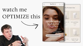
A CRO audit of a vegan protein brand's website reveals problems with visual hierarchy, messaging, and mobile experience. The presenter recommends testing a static hero image with social proof, tightening the headline to emphasize 21g protein and complete amino acids, and switching the product page to a vertical layout with clearer benefit bullets. Bundle testing (1, 3, and 5-pack options) could boost average order value.
Chapters
The most important section when it comes to your website is obviously your hero section. So this section here, I think your, your subheading down here is actually quite nice. At least you're communicating very quickly to people exactly what you sell and who you're selling it to, you know, so your range of premium vegan nutritional supplements designed for women. I quite like that. I think the video in the background is nice. It makes your brand look a lot premium, a lot more premium. One thing I would actually test though, is actually trying to test out doing a static image background instead, and do something where you could actually showcase your, your products in the actual image. So it's super clear and super visual for people who land on your website for the first time to see exactly what you sell. So they can actually see the packaging. And maybe you have like a model shot of someone opening up the packaging or consuming it in the type of lifestyle that they would be consuming within. If you get what I mean. So that's the first thing I would say. And then of course, if you have any like social proof or anything that would build trust straight away with people, and that could even be Instagram followers, or it could be like a news publication that you've been featured on, it could be an award that your brand has been accredited with, or it could even be just your total order amount. So how many customers you actually ship to. So things like that go a long way and just giving people that little bit of trust when they land on your website. And this is great for people who are new to your brand for the first time to build that trust. So let's just click in here and we can go through the flow. So the premier line, so you actually have, you actually have just, just two products, it seems. So samples, the vegan, the vegan protein, and you've got vegan protein. So one thing I would say is, if your brand, if Nolu, if that's how you pronounce it, only sells protein, vegan protein, that should be hit in the first line. So instead of like harmonizing health and elegance, which is kind of like a bit— I mean, it sounds nice, right? But it's kind of this like vague term. I would just hit them straight away with the protein and the vegan protein. And then also maybe you can call out in your headline, a unique selling point about your vegan protein. That makes it different or superior to anyone else in the market. 21 grams of protein contains all 9 amino acids, easy to digest, full and creamy in its taste. So what you could, you know, straight away, some things that you could say here that would make it a little bit more stronger is like, you know, you could even just say on your, on your homepage hero, yeah, like you've, you've got it here. So complete amino acid complex, you know, maybe instead of Instead of that, for people who don't really know what that is, you could even just hit them with like the 3 top benefits when they come onto your, your homepage, your homepage page. So for example, like the first checkbox could be vegan, vegan protein, great tasting vegan protein made for women designed to reduce hunger and sugar cravings and, and promote recovery. So that could be maybe a little bit stronger copy that you could put on your actual homepage here instead of like you know, this kind of more vague stuff that you've got going on. What I'm just trying to basically say in a nutshell is that your messaging— one really, really easy, quick way to make your messaging stronger is just to be— to make it simpler, and just to make it more direct on what your actual product benefits is. And what they are is like, even if you just think about it from the customer's perspective, why would I buy your vegan protein if I'm a woman shopping for Nolo? Why would I buy your vegan protein compared to, let's say, another brand? You know, so, so getting across that point in your homepage hero, I think is a really, really important thing to get across, because that's already going to hook someone in. And one thing could be like, let's say in your niche, women in this niche, they know that vegan protein, let's say, may not be great tasting. So that's something that may be like a really, really powerful point that you could hone in on with your messaging. So you can say, We have, you know, it's, it's low calories, it's got all of the, you know, 21 grams of protein. So it's, you know, it's really, really good packed with protein for you, but it's really good tasting and creamy and it's not full of lumps compared to like other proteins out there. So what I'm trying to get across is like, I, I feel like your brand needs a bit more of a punch. It needs something to like make people understand that Nolu is superior or different than the other options that they have on the market. You know, and I think you need to just focus on what is the main, the main point there. And that is your unique selling point. And I think that's where you just need to drill down a little bit more in your, in your messaging, if that makes sense. So I've kind of given you a few different points that I would, I would mention, like the hormonal balance, this could, this could be one that you're, you're zeroing in on. So you could say that, you know, we've got a specific crafted formula that's designed to, you know, that, you know, for women, that's designed to create a healthy hormonal balance. So that could be something you could dive into a little bit more in depth with your, with your messaging. For your images, a photo like this is great, where you can actually see the packaging, you can see the size of it. And you can see basically, that it is actually powder, you know what is inside the packaging. So your product is a powder product. But when people see packets like this, you know, they're not always going to assume that it's going to be powder. So one great tip I would always say if you have a packaging product is don't just show the product packaging on its own, have a little mound of like the powder next to it, you know, and the color of it, just, just something small. It's so simple, but it's so visual in communicating exactly that, okay, it's vegan protein powder. If you get what I mean. What I would try and avoid doing is having these like super long product pages because first of all, displaying the information here horizontally, it makes it very, very cramped. So what I'd recommend you doing is following just a little bit more of a simpler framework. And we've done these, we've done a re-re-optimized order form for Roam Nutrition that you can see over here and it's stacked vertically. And this is all we're really saying. We're just saying liposomal curcumin and resveratrol. And then the benefit underneath. In your case, you could stack maybe 3 benefits underneath. And then we just have the quantity selector, 1 bottle, 3 bottles, 6 bottles, giving them a one-time purchase option if they just want to check out for one time, or subscribe and save. And if they click on that, they can see the different benefits they're going to get there. And then underneath that is where we have the more heavy landing page copy that goes into the benefits of the actual specific product that we're talking about. So I would kind of recommend a similar flow to that. My point being, like, the more simpler you structure your information, and make it easier for people to actually digest, the, the more people are actually going to convert, you know. So that's what I would say. The most important platform that you can optimize for is your mobile experience, because in most cases, like 70-80% plus of traffic will convert on mobile devices. So any small improvements that you make to your mobile user experience will have a significant impact on your conversion rate and average order value, and ultimately your bottom line. So one thing I would say is, you know, even seeing if you can use some cool AI tools like Midjourney and Photoshop AI to, you know, make your product imagery a little bit more engaging, you know, so like you have some really nice shots down here, right? So maybe some of these can be brought up to the hero section. That's what I would say. And I just want to reiterate my point from before. You need to really establish what your unique selling point is, you know, instead of having like, you know, 7 or 8 unique selling points, which is kind of what most brands do. And they sort of spread their messaging out for all 8 points. I would have one really, really powerful unique selling point. That you focus in on. And then of course, maybe 2 or 3 other secondary unique selling points that you'd mention, but you don't really dive as deep into. Like, I'll give you an example. Ro Nutrition, their unique selling point in across all of their products is superior absorption. So every single product they're doing, no matter what, you know, benefit it's giving, whether it's, you know, helping improve their skincare or it's helping you, you know, ease inflammation. The unique selling point of their brand is superior absorption. But what is the mechanism? What is the unique selling point of your protein? It could be the unique formula that you've, that you've crafted for it. And that unique formula is maybe designed in a way that actually promotes the best hormonal balance for women compared to other brands out there. Or it could be the other points I mentioned before, but I definitely think you need to zero in on a unique selling point. To really just make this super strong. That makes sense. This is, I think, a little bit of the issue with your, with your product pages. It's just, it's a little bit too long and there's not really any hierarchy to it. And what I mean by that is if we look, if we just go through your page, your headline does not really command attention of your product title. It doesn't command attention. Like my, my visual attention is being drawn to this OnePlus One Free. Then it's kind of being drawn to this because it kind of takes a lot of color and power, then it's kind of drawn to this. And then it's kind of drawn to this and this and this. And then this subscribe and save, like this, this text over here is actually, it seems like it's bigger size than the actual subheadline category that it's within. So the hierarchy is kind of all, you know, mismatched throughout your page. And the reason why this is important is because, you know, your layout and your hierarchy of the different elements and the text and the images and the colors you use in your page, directs actually the attention of people's eyes. And so we want them to be drawn to the most important parts of your page. Now I'm going to be a bit cheeky and pull up my own, my own website. But basically one of the, one of the reasons that I've redesigned my website is I wanted to design it in a way where it's not using a lot of color. Because, you know, I run an agency called Conversion Alchemy, and the whole service that we're offering is obviously landing pages and CRO. And so I know from this that when people come to my website, it's not really going to be the text that's really going to sell the service, but it's going to be the work itself. So I wanted to strip away all the color from the page and let the images of our work do the selling for, for, you know, for the page basically. So you can see that the only times when I'm using color is when I'm trying to really, really highlight specific points. You can see like social proof here, you know, we've done over 500+ pages. The work itself. So we actually showcasing our work, this is where all the color is going. And then of course, a lot of images. And then when we have some color down here, it's directed to our reviews and everything like that. So same principle at play, you know, for your product page, your hierarchy is really, really precious. My point is, the easier you can make it for people to read and understand the flow that you're trying to direct them through, the easier— the more people actually consume the most powerful information. And then of course, that will lead to greater conversions and of course, greater sales for you. So that's kind of the knock-on effect from it. And that's why as a whole, you know, what I've done on this audit is I've tried to hit both of these two elements here. I think your offer is pretty strong. Like, I love the fact that you're offering a 3-pack, a 2-pack, and a 1-pack. I would also recommend testing maybe a 5-pack instead of a 2-pack. So you could do a 1-pack, a 3-pack, and maybe a 5-pack. And see if that would actually lift your average order value a lot more. I think your offer is really good. I would test out doing a 5-pack and see if that would actually work for you. But the main areas I think would really, really move the needle is with your messaging and the design.










