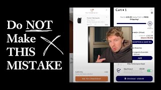
E-commerce owners waste time optimizing carts when they should fix upstream problems. 80-90% of mobile traffic goes through the navigation menu, so a 5% friction reduction there beats any cart tweak. Keep your cart simple like Bellroy does, and spend your effort on homepage, product pages, and navigation instead.
Chapters
The only times I would recommend optimizing your cart is if you can narrow down the metrics and you know for a reason that you have a serious issue with your cart. Most of the time, people overcomplicate their cart. And what they do is instead of optimizing the most important parts of their site, like the homepage, the product page, the collection page, the navigation menu, they instead do other stuff like optimizing their cart and other pages of the website, thinking that that will actually give them the majority of the uplift. But the way— and this is going to be maybe like a different way of looking at it— but your cart, I think most people view it as okay, they view it in like, like a silo, like as if it's on its own, it's not connected to anything else in the store. Because they think, okay, if someone goes to the cart, how can we then increase their chances of them converting? But you've got to look at it a different way. If someone actually has added something into your cart, it means that they have an intention, they're interested in buying. Someone wouldn't go to the trouble of adding something into the cart if they didn't have some form of interest. Here's what the problem is. A lot of people, when they come to optimizing their cart, they overclutter it, they overcomplicate it. And what they end up doing is actually creating more resistance and friction that actually reduces the amount of, of people actually ending up converting. I'm going to show you an example of a 9-figure brand who have optimized their site pretty well. Like Bellroy, I often talk about these guys, they are really, really nice website for e-commerce. Mobile design is pretty optimized and dialed in. But like, they're not doing anything crazy. They're not overcomplicating it. But look at their cart. I'll show you this. I've added this item into my cart over here for Bellroy. Look, there's nothing else going on though in their cart. They're keeping it simple. It's probably one of the default carts that came with and one of the themes that they're running, or maybe they just designed it themselves and went with a really basic design. Because, and this is a 9-figure brand, right? Because they know that, okay, all of the heavy selling, and all of the CRO and all the optimization that comes before the cart, you know, no one's going to go from an ad to the cart straight away, they're going to go through the education process. And so what you want to do, and this is the principle here, is focus all your energy on just making sure that the fundamentals are dialed in. Focus on making sure that when they click on the ad, when they go to your landing page or website or product page or navigation menu, making sure that that flow is optimized as well as possible. And then when they get to the cart, honestly, I would just go with a very simple cart as possible. You can, if you really want to have some upsells or anything like that, use a cart app, you know, use one of the really basic ones on Shopify. But in most cases, I wouldn't recommend optimizing it. I'll show you one of our client stores, Raw Nutrition. We've applied this philosophy to them, like we've optimized their homepage, we've optimized their navigation menu, we've done landing pages for them, when product pages, collection pages, etc., etc. The one thing we haven't done is cart. You know, this is just a very default basic cart app that they have in here, you know, that just incentivizes people to like upgrade. But this, this is done with an app, you can do this with an app basically. So I think people, they go a little bit too crazy with the cart. In most cases. And that's why I wanted to record this Loom for you. What I would recommend is honestly, for Wildbup, just keep it simple, go back to the basics, look at from a high-level view, okay, what will really move the needle for people coming into my store? And those things are always going to be the hero section, this section over here, when people land on your page, you know, retargeting traffic that comes back to your website, you know, can people from this section understand what your brand is, what they sell, and then how they can actually take the next action to learn to get further into your funnel. And you know, right now, it's not really clear from this hero section, is it what you guys sell? The next section, your navigation menu. So this navigation menu is, is another area that huge amount of traffic go through. Most stores that I audit, they get about 80 to 90% of their mobile traffic flows through their navigation menu. Now that's, that's, that's like a standard for most e-commerce stores. And that's actually a stat that I don't think a lot of e-commerce stores are aware of. Because it's crazy. You know, a lot of the times when I get on a call and I audit people's stores, they tell me about all these different pages that they want to audit. And their navigation menu is never mentioned because they're not aware of how much traffic goes through it and how significant it is. But navigation menu is seriously important to your, your website, if you think about it. The majority of, of customers in e-com are mobile users. And the navigation menu is a huge flow experience in getting people from where they land on to where they want to be. And so if you can even increase or decrease the friction by 5%, let's just say 5%, when someone lands in your store, if you can make it 5% more easy for them to get to where they want to be, to get to a specific product page or collection page, Well, that's just going to have a massive impact on, on that person ending up converting, you know, all the traffic that's coming through. So if you think about it, like 90% on average of, of mobile traffic goes through navigation menu, 5% increase would be huge. Compare that to like a collection page or product page, or, you know, that sort of uplift is not going to be the same as like a navigation menu. So navigation menu, your homepage hero, your product page order form, which we've done for you, Those are the major things. So cart, I would honestly put at the bottom of the list. And if you really, really want to optimize your cart, go with a really basic cart app. And I can recommend you a few if you want. But honestly, for your case, you'd really just want to be cross-selling people different products, right? But I wouldn't overclutter it. Because the problem is sometimes when you can add in these little CRO gimmicky CRO tactics like cross-sells and upsells, at the final step in the funnel, which is like the cart and checkout process, it can create friction, like what I said, and we don't want to create friction for people, we want to make it frictionless. So that's the principle behind all of this. And coming to your store, looking at it again, those are the things that I'd recommend for you to do next.