Fix These 7 Mistakes Killing Your Shopify Conversions
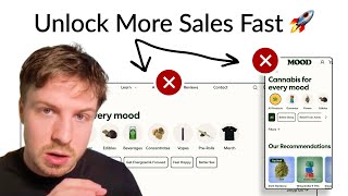
A Shopify store audit reveals seven conversion killers: a weak homepage video, mobile navigation cut off at 650 pixels, collection pages missing USP and social proof, product pages with poor hierarchy and too much text, and missing bundle options. The fix is a stronger hero section, restructured menus, vertical stacks instead of sliders, 5-7 strategic product images, and tiered pricing with trust signals throughout.
Chapters
One of the easiest ways that you can improve conversion rates is by optimizing where your traffic is actually flowing through your website. And in this video, you're going to see me audit a real store and show you how you can actually do this. So let's dive right in. So you got a video here, but we've seen that static photos out-convert videos because videos are much harder to actually do right. And this video is not really selling anything about your brand. It's covered by text, first of all, on mobile. So it's really hard to see actually anything behind this. So I would replace that. With a homepage hero section where you can actually see an overview of everything that's included with your brand. Here's a better example of what I mean. You can see for this homepage for IntegraPet, we just put all of their products on display. And then visually, they can actually see what's included in the product. So you can see all the different product types straight away. So we're not focusing on one specific product, we can have your gummies in there, the other items you actually sell all on display straight away, have some social proof in there, like, you know, your customer account, the delivery, any other terms that are really, really important for your customers. Have a really strong headline that captures their attention, a subheadline that gives it more context, and a clear CTA above the fold that gets them to the next step in the funnel. One thing that will be interesting to test is instead of actually having this Weed for Every Need section down here, try doing the Shop by Category section straight underneath. I like the fact that you have this category section expanded by default, but what I would say is we shouldn't have to scroll really in your navigation menu. So there shouldn't be any information that's being cut off. And right now, if we actually look at 650 pixels in, in height, we can see that the Shop by Mood is actually getting cut off. Anything below that is getting cut off down here. So what I would recommend is you restructure this and tidy it up to make it a little bit more optimized for people to actually navigate through. And really, that's just UX/UI touch-ups to do with this. And just by making it a little bit more frictionless for people to navigate through this, you can definitely increase the performance. And this is really important because a lot of people do actually navigate through the navigation menu. So it's really important to actually have that optimized. So on your collection page, you have the categories spread out into different sections down here. What I would recommend for a collection page, so that you can actually use it as a page that you're directing cold traffic to, have a banner or have a small little section at the top, like really, really small section that actually communicates your unique selling point, that intros people into your brand, give them some quick bullet points about what you do, what you sell, why they should trust you, have some social proof in there as well. That way you can actually drive traffic directly to this page as well. And it will better convert because you're warming people up when they first land on this page. The other thing I'd recommend testing is instead of having everything in horizontal sliders, have everything displayed vertically. So stack everything vertically, but you don't need to display everything at once. You can hide other items behind a view more button, but have it vertically. So if they click on that view more, it will just load more below because mobile users, they find it easier to scroll vertically. So if we can make it easier for them to scroll vertically, and that's their natural flow, then they're going to stay around your page for longer. They're going to see more of your products, which means there's a higher chance they're actually going to click through and buy something that they really resonate with. So that's the principle behind it. So let's go through one of your product pages over here. So you've got the ratings over here. The text over here is really, really small. So I would bring this over here on the left. And these different bullet points you've got down here, I would put them underneath your product title. And you've actually got them repeated down here as well. So, so do you need them twice? I'm not sure. This subheading that you've got, I would actually just place that further down, further down the page. You don't need to have too much text. You don't need to oversell your product. But the main area of focus I would say that you can do to optimize your product page is with your listing photos. These should follow a really strategic structure. And they should handle the top objections that customers have when they come to any one of your individual products, they should really sell them. By me swiping through those 5 to 7 photos, I should understand everything your product does, how to use it, what is it about, what the benefits are, and have, you know, some really, really powerful testimonials that really should back up a winning ad angle that you already have data on. That's kind of the best way to do it, because that way, you're just maximizing the persuasion on your product page. One thing that I'd also recommend doing is introducing bundles for people. So give people the option to actually buy a 2-pack or a 3-pack of these. If you know that that's normal in their buying behavior, if you can notice from the order amounts that people are ordering 2 or 3 or more of these into their cart at once, if people like these certain products, then introduce packs. And here's an example of how you can do it. You can see we've got a 1-pack, we've got a 3-pack, and we've got a 6-pack. And then we've got a one-time or subscription option as well. And we're pricing everything in tiers. So for 1-pack, we're not giving them any discount. But for 3-packs, we're giving them a slight discount. And obviously they're getting the best value if they upgrade to the 6-pack or the highest pack in your tier. That way we're just rewarding customers for the more that they actually get. And they feel like they're getting even more value because they love this product. They want to buy it in large quantities, but now they're also getting rewarded for it. I would add some images into these so people can visually see the distinction between these two. And then I would describe what this tier is. So what is this tier? Is this the potency? Is that the weight? Is that the quantity? Like, give people who don't know anything about your brand a description of what these different tabs are. Don't assume that you already know this. And give people What is the difference? And just make it easier for them to make a decision. Same with this, this should have a little description about what this actual selection is. And also, I think some of your text is really, really small, like the prices is really small. Some of the subtext down here is really small as well. So you've got 825,000 customers. So all of this information over here, that's what I would be surfacing throughout your flow. I'd be putting that on your homepage, I'd be putting that on your collection page, I'd be putting that on your product page, but making it more prominent. Also, if you have some quotes from Vice, Forbes, or Inc., or other brands like this, have them as featured testimonials in your listing photos. You can pull out a quote from a customer, and then you can also pull out a quote from Vice or someone else. And that's just going to make it even more potent, even more powerful. If you're looking for further help, we do offer a service so we can craft a high-converting landing page that is designed to outbeat your current page by at least 10%. Our specialty is designing these high-converting landing pages. And we pretty much do this every day for the e-com clients that we work with, such as Snow, CarePod, Soloway, Velvet Caviar, and many more DTC brands, helping them to increase their ad performance and get better results in terms of their conversion conversion rate, average order value, and overall profitability. If you're interested in learning what results we can get for you, and how our process works, then check out the description, there are links to our website. And of course, you can also book a call with me and answer any questions you have. Cool. And I hope you got some value from this video.










