Fix THIS To Unlock More Conversions
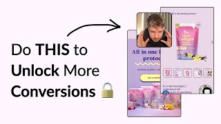
Pedro Loureiro audits Fuel Nutrition's e-commerce site and identifies conversion killers: a weak hero headline that doesn't lead with the core promise (youthful skin), trust logos in the wrong spot, and confusing pricing that hides per-unit costs. He recommends restructuring the page around three pillars—affordability, speed, and safety—and simplifying the offer into a clean tiered pricing model with a subscribe-and-save option.
Chapters
You're about to watch me go through a store and show you how you can improve your copywriting, your offer, and your UX/UI to maximize your conversions. So let's dive right in. All-in-one beauty protocol, achieve youthful, luminous skin. This sounds nice, but doesn't tell me anything about your product, what it actually is, and how it actually helps me get what you're promising here. Both of these, this headline and this sub, subheadline, are kind of both promises. You're You're saying all-in-one beauty protocol, achieve youthful, luminous skin. And it's kind of— it should be the other way around, really. This should be the thing you're leading with, achieve youthful, luminous skin, because that's your main promise. And then your subheadline down here, you should be using this space to communicate what your product is and how it actually works to deliver on your promise, which is youthful, luminous skin. So that's the most important thing you can do to your hero section. And you've got the product down here, which is multicollagen peptides. And I feel if your products are all based around multicollagen peptides, that should be in your copy here. I'm taking a look at your Instagram and we have this text you have here is giving me more information than your website is. So Fuel Nutrition offers functional nutrition beverages to improve energy and beauty. So it's still not great because you need to be calling out exactly how it works here. But I shouldn't have to go to your Instagram to get more context. It should be really clear from the hero section. Exactly what you sell, exactly what the promise is, and that you should be providing some proof and proof on the promise. So how does me taking one daily serving of this thing give me the youthful luminous skin? So you've got 3 different logos down here. To make these stronger, I would honestly just take these logos and put them underneath your product imagery down here. You don't need like a massive banner to separate them because I honestly missed this when I was scrolling through. So take these logos, put them underneath here, and you can say as featured on and you can put them next to it. What would make them even more powerful is if you can bring out a quote featured by them. So did Time give you a quote on your product? Did ABC give you a review on your product that you can bring in? Or USA Today? If so, then bring them in there, and that'd be a lot more powerful. So this section down here, one daily serving, limitless, limitless benefits. So again, I would tie in the limitless benefits to the skin, whatever that main value proposition that you're offering is. So one daily serving for limitless skin benefits or effortless, effortless skin benefits. I think that'd be a better word than limitless. Limitless, it's not really believable. Everyone knows that there's a limit to some degree, but effortless, that's kind of what people are looking for. Like, why would someone buy multi-collagen peptides in whatever formula you've got over here? So I'm assuming these are like What is this kind of maybe some powder or something like that? Or maybe it's like a pill or whatever it is. People who are shopping with you, they want what you're promising, which is youthful, luminous skin. But they, but what they don't want is they don't want it to take a lot of effort, time, or money. So that's what should be threaded through our headlines is this is a solution to get your youthful, luminous skin in an affordable way, in a really time-efficient way, and a really safe and reliable way. That's all they, that's all they want to know. And if we can just communicate that through each one of our different messaging angles, we're just reinforcing trust. And we're persuading more people, of course, to try sell and to buy and to convert. So the copy down here is too long, but people are not going to stick around to read this. You are hitting the different angles, which is good, like the save money, but I would lead with the, you know, you could even, you know, you could have done, you could have done this, you could have taken the money angle down here. And as little as 91p per serving. And you could have tied that in here. One daily serving, only for less than $1 per day, or something like that to get your youthful skin tied into the benefit. That could be really important. Because in this section, in the headline, then straight away, you're addressing the money angle, the affordability angle. So that's what this section can do. You can address the money angle, and then you can have another section underneath addresses the time efficiency angle. And then you can have another section underneath that addresses the safety and reliability angle. We talk about why collagen peptides are, you know, all the rage nowadays, because science has proven that they're really good for your skin. And you know, you can show all the science behind it. And if you can communicate those 3 different points and make them really easy for people to understand, that's going to make your messaging super, super strong. And that will make your product seem like it is the really good solution or the really good option for people to buy. So like I said, just too much information going here. And it's all condensed together, it's all mixed in, And people are not going to read this, they're going to look at your headlines over here. And they're not going to read your subtext. And that's what I'm worried about. They're going to see all-in-one beauty daily blend. But we've already mentioned that up here, we've already mentioned up here. So if we are going to use a lot of text down here, we want the headlines to give them the summary of what the information is about. So it should be really easy, even if people are skimming through, to pick out the information that we want them to read. So you've got your different reviews, This is very small, this section to navigate with. And honestly, I've seen a lot of these sections that people do not engage with, which is crazy because it looks like people would engage with these items because they're featuring people. And but the problem is that when people come down to a section like this, they just skim over it, or maybe they click on the first section, or the first video for a few seconds, and then they— and then that's it when they bounce. When actually it was video number 5, let's say, in the grid that that was our most powerful one. So what I would say would be best is like best practice or something like this is pick out your top 3 videos that are really powerful that complement, let's say, all of the winning ad data that you've got, and maybe merge them into one video. Just make them, clip them up into one video and have that in a section like this on why choose Fuel. That could be the headline or something like that. They click on the video, they watch it, and then of course, Don't just assume they're going to watch the video underneath. Give them a summary of what the video is in. Give them like 3 bullet points of why they should choose Fuel. So that could be your section over here. So you're taking a video, merging it all with your best content, keeping it under, let's say, a minute so it's easy for people to digest. And then you're giving people like a bullet-pointed summary underneath, kind of like what you've done here. But again, I think you should condense that. I saw on your X profile that you said this is a women-owned brand, of course, found about yourself. So what you can do is I would communicate that in here. Like, when did you set it up? Why did you set it up? You don't need to communicate all of that here, but you could say women-owned since and put in the year or something like that. And just, it just makes it more personal because again, people don't really, they don't really resonate with brands, but they resonate with the people behind them. So that could be one way of just making your business a little bit more personal and that little bit more memorable to people when they first interact with it. And then you can, instead of having this section down here, what we stand for, because again, this is coming from the angle of the brand. Make this about you. Make this your story. Instead of putting in stock photo here for women smiling, which is what every brand does, put in a photo of you. Share your story, your journey. I like this section down here as well. Your new beauty routine made easy. But I think you should add images here. Just, and I wouldn't add too much text to this. So you can just keep it to one line for each of them. So this little asset over here, you've got the, it shows me you putting in fruit. And then it has a photo here of the product, but it's not showing the person putting in whatever is in that packet of the product. And that's the part that I want to see. I don't want to see the fruit going in there. You know, and I don't want to see the after. It's missing that crucial step in between of someone opening the packet and pouring it in. Because that's not really being shown anywhere in your homepage. Is I want to see what is actually inside the packet. I want to see what's inside, what I'm actually going to get before I shop and before I buy. So if it's powder, just show like a scoop of it next to it. You've got it. I can see it is powder, actually. You've got it all the way down here, but it's so small that no one is going to be able to see this. So let me quickly look at your product page, and we can go through this. So your listing photos, the text is too small here. No one is going to be able to read this. What I think you should do is just condense your listing photos down to 5 photos, because sometimes I think you can oversell it, and I don't think this is a product you need to really oversell. The information there that we just need to communicate is the time efficiency, affordability, and of course the safety and reliability of it. Those 3 things. So those can be communicated pretty easily over 3 to 4 images, and then just add in like a 5th or 6th image of a lifestyle shot. So I'll show you an example of some listing photos that we've done for one of our clients recently. You can see that we've done 8 photos in total in the carousel. And the first photo is just a really simple product photo. The second photo is a lifestyle photo. The third one is like a recommendation by a health expert. For you, this could be just a featured customer quote, or you could bring in that you've got this dermatologist quote over here. So you could bring in a little snippet of this. Then we have the supplement facts, which I think you have, you have that, or I think already in there. But again, you can just see even in the supplement facts, we're giving people like a summary of the key information, the key benefits. We condensed it down to the top 4. We have dosage information. We have the USP. So explaining actually how the unique selling point of the brand works, and that's their, their liquid liposomal technology. And for you, this could be talking about the powdered form of the multi-collagen peptides and why that is, let's say, the best form for people to take. It's easy, it's no mess, it's really convenient, and of course, really cost-effective. So you can communicate that in this listing photo. And then of course, you could even do like another listing photo like this, how it compares to like other solutions on the market. But even honestly, I'd say if you even crushed out these first 7 photos, I think that'd be a lot stronger than what you currently have. So the other issue that I'm seeing with your product pages, I'm having to scroll down an awful lot to get to your offer section and the offer section itself. It's really confusing to see what's going on. There is no hierarchy. This is definitely going to cause people a fair bit of friction to understand what's going on here. We have the flexible plan, then we've got like a headline down here, choose the flavor. The spacing's broken up here, the padding's not really working. It just looks a bit broken and a bit like all over the place. And you can see here, even when I'm clicking in between the different items, it's like glitching out. It's really slow and unresponsive. And it's missing the key information. I want to know which one I'm clicking on. Like, how long is this going to last for? How long is the 1-pack going to last me? How long is the 2-pack of the 3-pack? And I honestly think that you could be offering more than the 3-packs. The 3-packs, I think, should be your middle tier. I think you should be offering a 5 or a 6-pack instead. I'm getting a little confused here because your 1-pack is— you're saying it's $50, but then when I click on the 3-pack, it's saying it's $40. That must be per unit, maybe. Is that per unit, $40 per unit? Again, this is confusing me. So you can imagine what this experience is giving to like your customers, you're going to be looking at this even more in depth. Any information like this is confusing is going to slow people down and cause them to bounce, make it super clear what they're actually getting. So if it's $40 per unit or per pack, communicate that there. And this is why I think it's just your offer is not too bad. I think it's just how you're structuring the information. And what I would say you could do I'll show you Ro again since I've got that page up. Just structure the information a bit more nicely like this. You can see for Ro, we got a month, 1-month supply, we got a 3-month supply, we got a 6-month supply. We are showing here very clearly in the price what the price is per each. We're giving people a one-time purchase option or subscribe and save if they want to actually save even more. So something super simple like that, really simple product page, but it's really powerful. So in summary of what you can do to improve your product page, is improve your listing photos, condense down the information over here so it's less vertical space for people to scroll down. And then of course, restructure and optimize your order form or this offer section down here. Make it easier for people to understand what the different offers you've got. Make— communicate exactly what the price savings are for each. And the final thing I'd recommend is I would change your offer to be a 1-pack, 3-pack in the middle, and then do a 5 or 6-pack being the last one. And give people the biggest discount and the biggest reward with that. If that works, that will really give you a nice uplift with your AOV as well. If you're looking for further help, we do offer a service so we can craft a high-converting landing page that is designed to outbeat your current page by at least 10%. Our specialty is designing these high-converting landing pages, and we pretty much do this every day for the e-com clients that we work with, such as Snow, Carepaw, Soloway, Velvet Caviar, and many more DTC brands, helping them to increase their ad performance and get better results in terms of their conversion rate, average order value, and overall profitability. If you're interested in learning what results we can get for you and how our process works, then check out the description. There are links to our website, and of course, you can also book in a call with me and answer any questions you have. Cool. And I hope you got some value from this video.










