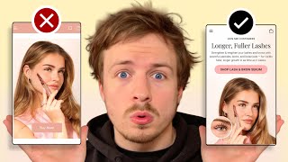
A Shopify store's hero section has no headline, social proof, or strong call-to-action, wasting the critical first five seconds. Adding a clear headline, customer numbers or influencer endorsements, authentic Instagram photos, and a prominent CTA button can double sales. Most brands already have these assets on Instagram but fail to use them on their website.
Chapters
5 seconds is all you have to capture someone's attention when they first land at your landing page. In this video, I'm going to show you some best practices of how you can actually do this by walking through a live example. Let's dive right in. The first thing I'm going to say is there is no text that you're showing in your hero section straight away. Your hero section is the most important section of any page that you're sending traffic to, which is— Your hero section is the first section they're going to land on. What is the first section they're going to see? What we can see here is you've got your product in here. But imagine I'm new to your brand. Imagine if I haven't seen an ad or I have seen an ad, but I've only seen a few seconds of it and I've clicked on your website out of curiosity. You should be telling me in a few seconds, under 5 seconds, who you are, what you sell, provide some proof as to why I should trust you, and then have a call to action. And that call to action should be clear and obvious. And here, even the buy now, you know, it doesn't stand out. So there's quite a few things going on here that you can do to improve this. Definitely add in some social proof. That can be your total customer amount. Definitely add in a headline into this on what you're selling here. So you're selling a lash and brow serum, and I'm just trying to see if there's any copywriting that we can take from your Instagram. You know what's interesting is you have some really nice photos here. This is a nice photo you've got from your Instagram over here of this person holding up the product. I'm not sure if that's real or if this is photo generated or what this is, but, um, it was looking quite nice. You have quite a nice following as well. In some of your photos. So, you know, I'm quite surprised to be honest with you, because when I first looked at your brand, I look at the hero section, there's nothing going on there, you know? So really, I'm telling you, your first impression that you give to a new customer when they come onto your store is so important because look at the difference between your Instagram and your website. It's crazy the difference. On your website, you have built zero trust with me. Within the first few seconds. On the Instagram, you've built up all the trust within me with the first few seconds. You actually have some really nice photos in here. You got some cut, you know, it looks like UGC photos of people holding up your bags and everything like that. Look at this. You got like a video here. You've got your own little booth, you know, in Dubai. So what I'm trying to say is you need to sell the big brand that you are visually to people when they first land on your page and how you can do that. Is by choosing a better image. By choosing a better image, by bringing in some more powerful messaging, bringing in a powerful headline, bringing in some social proof. That can be your total customer amount, like I said. That can also be maybe some big influencers that you've partnered with, or a big influencer, you could have a photo of that person, a model shot of them using the product. But the biggest form of social proof for you is gonna be in your images. And this image over here is not doing any justice because it really doesn't— when I first saw this, I actually just thought the product was like Photoshopped onto her face. It doesn't look real. It just doesn't look real enough. But when I look at your Instagram, the photos over here are much better quality. So I'm telling you, if you take away anything from this audit, please improve your hero section, bring in some better images into there, bring in a headline that ties everything together, that communicates what you sell, who you are, and why people should care and establishes some proof and make your call to action much stronger. Your listing photos are the most important part on your product page. So these photos over here, and again, you only have a few different images in here and they all seem to be different types of images of your products. There's no lifestyle photos in here. And we need to put in lifestyle photos in here because you're selling people on the end result. You're selling people on, you know, what they're going to actually look like and what they want to look like. So having images like this is going to sell people on the end result. So this is really important. This video, I think, is actually perfect. You could bring this video into your listing photos as well, because I'm hoping that this video communicates the top different selling points on your product. And if it does, then you can bring it in there and that will really do a good job as well of communicating trust and giving people some more education on your products as well. I would also bring in a before and after image like this. This could be another good image that you bring into your listing photos as well. Some more UGC photos like this as well could be great. And I would definitely recommend ditching this sort of like, I don't know what color this is, but this sort of like pinkish color background that you've got. Just keep it on a white background. Some of the parts of your text are really, really hard to see like this bundle and save and some of the other texts really hard to see. So just keep it clean, keep it simple. You don't need to overcomplicate it with the design. You know, your buttons don't really stand out. Basically, in a nutshell, what I'm saying is your brand, by looking at your Instagram, you've got so many good assets there, so many premium assets that are really, really powerful sales tools, and you're not using them on your website. You know, and by the way, if I sound harsh, I'm not being harsh. It's because a lot of brands make this mistake. You're not alone. A lot of brands out there, they have amazing Instagram pages. They've got amazing social media pages where they have tons and tons of great assets and social proof. But they fail to bring it onto the website. And just like my first impression when I landed on your website, that's going to be the first impression that a lot of other people are going to have as well. They're going to think, okay, this isn't a big brand. It's maybe, you know, not a great product. Do I really need to trust? And then boom, they're gone within a few seconds and that's it. You've lost the sale. So you want to really sell them and you want to sell them quick and use the amazing images you have, bring them onto your product page and you will definitely capture a lot more attention and a lot more sales. So that's what I recommend.
If you're looking for further help, we do offer a service where we can craft a high-converting landing page that is designed to outbeat your current page by at least 10%. Our specialty is designing these high-converting landing pages, and we pretty much do this every day for the e-com clients that we work with, such as Snow, CarePod, Soloway, Velvet Caviar, and many more DTC brands, helping them to increase their ad performance and get better results in terms of their conversion rate, average order value, and overall profitability. If you're interested in learning what results we can get for you and how our process works, then check out the description. There are links to our website, and of course, you can also book in a call with me and answer any questions you have. Cool. And I hope you got some value from this video.