Headlines, Imagery, & Layout Hacks (CRO Audit)
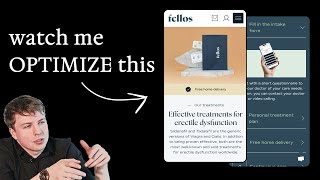
A CRO audit of an erectile-dysfunction clinic landing page. Key moves: add a hero image, replace bold claims with real social proof like order counts and Google reviews, consolidate CTAs so "How It Works" scrolls instead of redirects, and show packaging size to signal discretion. Reframe headlines around shame and low confidence, then flip to positive feelings after using the product.
Chapters
You're about to watch me do a live SEO audit for a brand that reached out to me. I'm about to dissect one of their landing pages and suggest to them some really, really high-impact optimizations that they can make to move the needle for their page. So let's dive in. Your hero section here is, I feel like, missing an image. You know, it's all text-based, and I feel like an image would be a lot more powerful to communicate that. I feel like there's a lot going on here, and you're expecting that when someone lands on your page straight away, that they're going to consume all of this, and that's not always the case. With a claim like this, number one online clinic for men. What I would say for that is, just make sure that if you are making a statement like that, that you can back it up, because it's okay to make bold statements like that in your headline. But oftentimes, there's a lot of brands out there that make these wild claims, we're the number one in the market and things like that. And it just doesn't go down well with a lot of people if you don't have the social proof to back it up. If you have the social proof to back it up, then great. But if not, then I would refrain from using a statement like this and instead use this space to communicate the social proof that you actually do have. How many orders have you already shipped? How many men have you actually helped with this product? Or use the space for something else. Maybe you can use the space up here, or you can put it down here and actually have a quote from a customer that has gone through your product, that has used your product and How it's actually changed his life. That would be a lot more powerful. So that's what I'd say for your hero section. Google reviews, not a big fan of using something like this because again, you're going to get people who redirect. Yeah, for this, for this exact reason, you're going to get people who redirect away from the page. Like I mentioned about the reviews, try and see if you can pull in one of these reviews from here that you think is good and strong into your hero section instead. See if our treatment is suitable for you. See, so this is interesting. So you've got two call to actions here. You've got start your treatment. And then you've got see if treatment is suitable for you. What I would recommend is I actually think this see if our treatment is suitable for you might be actually a good call to action as well for you to offer. But then it goes to this page that talks about how it works. Okay, here's what I say instead, because this would be a better flow for you. Your homepage, let me go back to it. Sorry, let me go back to this page. I would recommend having two call to actions. I've lost the English translation now. I'd recommend having two call to actions, a call to action number one. So your first button will be start your treatment. And then underneath that, I will put in a second call to action button and have that literally say how it works. And when people click on it, instead of them being redirected to another page, scroll them down to the section on your page that actually talks about how it works. That I think would be a lot more powerful, a lot more optimal, if you can understand where I'm coming from. So that's what I would say there for your hero section. Obviously, this is the most important part of any page that you do because this is where the majority of your traffic are going to land on. So let's scroll down here and let's go through your product order form and the rest of your landing page. So I do like your images. I think this is nice. I think your branding is pretty neat. One thing I would like to see though is a size comparison. The reason why I'd say this is important is because what people don't want to have is order this product and have a massive box that comes to their house. Because discretion is such an important factor in, you know, this, this niche, right? So that's why I'd say the hand, something simple like this, another one of our clients here. But look at this, just something simple, the hand off the screen, cutting off the screen, just holding up the soap. Gives you a size reference. If you didn't, if we didn't have the hand in this photo, when people look at this image, they wouldn't understand how big the soaps are. They wouldn't, they might even think that they're super small. Or they could even think that they're super large. And it's really important that people who come to your store understand the size of your product visually very quickly, because that increases their perceived value, and also levels their expectation of what they're actually going to get. Really important in the e-commerce space. What another reason being because people are shopping digitally, they traditionally, they would have walked into a store and they can see with their eyes in 3 dimensions using all of their senses, looking at your product, but on a store, on a webpage, they don't have any of those things. So that's why we've got to help them out visually, with text, and with any other form that we can do to help them understand what they're actually going to get when they place that order. So sorry for that side tangent there going on about visual stuff. Anyway, let's go through this. ED treatments, So let's go through this. Generic versions of Viagra and I can never pronounce this name, Cialis, I think is how you pronounce it, right? In addition to being proven effective, both are most well-known and sold treatments for erectile dysfunction worldwide. Okay. How we would design, let's say, a landing page for you is I would introduce your product and I would, instead of using a headline like treating erectile dysfunction or something along those lines, I would tie it in more to something emotional. Because this is such an emotional product for someone. If someone is suffering from this, this is a huge pain point for them for obvious reasons, like the confidence. Maybe they're not satisfying their partner. Maybe they're, they haven't got a partner yet because this is preventing them from going out and actually being themselves because they're scared of, oh, letting someone down, all of these negative thoughts that they have in their head. So this is a real emotional pain point that people have. What I would say is you can take, you can really try to improve your messaging by tying into your headline some of the thoughts and some of the feelings that people might be saying. That's why it's good to associate— you don't want to overdo this, by the way— talking about the shame that men feel with this, I think is really good because you want to communicate to the men that you get it, you understand where they're coming from, and that's— and that this product that you're offering them is the best solution for them. So that's what I'd say. So I definitely think you need a stronger headline. Not necessarily you need to talk about shame and go heavy into that, but just talking about either the negative aspect of the thoughts and feelings that they're having right now, or painting the picture of how they will feel once they've consumed your product. So here's what I would say for the flow. First section being your hero section, like we discussed. Second section, I would basically do what I call a problem solution. You introduce the problem that they have, paint a picture of it. So for example, you can talk about the causes of erectile dysfunction. You can also talk about some of the emotions and feelings that people have and the other problems that come from it. So for example, not being able to satisfy your partner, the feelings of negativity, etc., etc., the low confidence, you could talk about all of that in this section. And then that's when you introduce your product and you say, we understand you, we get you. That's why we created this product using X and Y ingredients, because they are the best formulated ingredients for you to get to overcome this product and get the results that you want to get. And then after that section, then you go into more of the benefits. Here's all the other benefits you're gonna get with our product. Then you might do a section talking about the ingredients in particular. Then you might call out some, you might do a how it works section calling out how easy it is to actually consume it and take it. And then you might do a section on, you could do a section on basically discretion. We get you, we know this is a sensitive topic, we know that a lot of people don't— this is the first time buying product like this, and they don't want their neighbors or their partner or anyone in their family to get it. So that's why we designed our packaging to be as discreet as possible. And you can show an image of your packaging. And this is what you're going to get when you arrive at the door, just so you alleviate the risk from them. Then you can call out some feature reviews in a section. Then you can also go into your order form. And then below that, you can do your FAQs, your frequently asked questions. And then maybe at the bottom, a final call to action. That's what I'd recommend. I'd keep it simple like that. And I actually think that's all you really need.










