High-Ticket Offers, Order Form Design, & Imagery (CRO Audit)
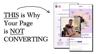
A CRO audit of a high-ticket pillow product page identifies three key problems: vague headlines like "you deserve" instead of concrete proof, confusing pricing where the pillow costs more than the pillow-plus-pants bundle, and a cluttered order form. The fix is tighter messaging, clearer guarantees, and moving upsells to checkout.
Chapters
The 3 most important things that you can do to move the needle for your brand are 1, your messaging, 2, your offer, and 3, the UI and UX or the design basically. If you can improve those 3 things, you'll have a really solid store and really solid metrics. Now with this, because your product is, let's say, premium, your images and your copywriting are even more important, and they come under the bracket of messaging. So your image here, what I would say is like you've only got 2 images in your listing, your product listing photos in this carousel. I definitely think you need a few more because on product pages, the section that gets the most engagement is your images up here. And I can tell that, you know, this is okay, it's a nice render that you've got here, but you need, you need to have this for the other colors as well so that people can see it. Ideally, there should be some lifestyle shots as well in here. Let's say, woman using it, you know, and it should also be some, some, let's say close-up photos of the fabric, show off the quality, you know. So that's what I would say. And you need to do that for, of course, all three of the color variations. I think that's very important. And even after months of use, it still feels like new. So this is quite a good review here. You know, the quality is incredible. Let's talk about the quality. So But that's a review that's saying it. We need to kind of communicate that to people, that the quality is amazing, that it's going to last you for a very long time, that it's hyperallergenic and, you know, easy to wash. We need to communicate all of those things visually and instantly to people who come on the page. That's why your images are so important. So honestly, I would say if you can take anything from this review, try to look at your assets, your visual assets right now and see how can I improve them? You know, how can we get some better imagery in here too? Bulk up the imagery in the, in the product listing photos? How can we get photos that for the pink version and the white version? So you've got 3 different bullet points here. You deserve sleep without the pain, you deserve customized comfort, you deserve lasting support. I personally will say that because you're saying you deserve, but you're not really telling people how your product does that. So I would honestly remove the you deserve and say sleep without the pain. And then after that, maybe even, even in brackets, explain how it does it, explain how it actually does that point. And customized comfort, how is it customizable? So you talk about that very briefly, ideally. And then lasting support. So you talk about how long this— so that's to do the quality, right? So how long this product actually lasts for. And you can even quote that review that we just saw, you know, even after a few months of use, still feels like brand new, you These 3 bullet points over here, these are, these are claims, like what I call claims. So you're claiming that you're going to sleep without the pain if you buy my product, you're going to have customized comfort if you buy my product, you're going to have lasting support. That's the claim. But with every claim, there needs to be a proof. So moms deserve more comfort, this text over here, I'd remove it. I don't think it's really doing anything. So buy pillow only and buy pillow and pants. So if the main product is the pillow, then you risk distracting people with the pants and anything like that. Also, I'm just looking here, you buy the pillow only and it's $194, but you buy it with the pants and it's $174. Seems a bit strange. Yeah, I've just noticed that. I'm not sure what's happening there, to be honest. That doesn't seem to make any sense to me. So it's so it's costing them like $20 or $30 extra to buy the pillow on its own. But if they buy the pants, they're saving $30. If that is a strategic thing you've done, I don't think it's, it's a good idea because again, I think it's going to create confusion. If you're, whatever your main thing is, like I just try and do things very simply, very simple. If I was, had a brand and my main product was, let's say this pillow, I would just make it the main thing. and I honestly wouldn't talk about these other supplementary products, I would leave any upsells like this to the cart. Once they, once I've convinced them to purchase, it's a $200 product. So, you know, you're, that's not really a spontaneous purchase that someone's going to do that they're going to, they're going to think before they purchase something like that. And so you want to make sure that, okay, if someone's coming onto this page, how can I give them as much information as they need, not overwhelm them, or just give them as much information as they need to actually convert with confidence. Once you got them to the cart stage, so once they've already taken that first action to say they're interested, then like upselling them into the pants and the other stuff is a lot easier. I think you're just trying to do everything on this one page. And the problem I think with that approach is I don't think you've done a good enough job of selling them on the pillow first, which is what you need to do first. So only until you've mastered that and you've you really done a solid job and selling them on the pillow, then I would focus on the upsell and cross-sells, you know, and honestly, you know, you could do if you wanted to, like, increase your AOV naturally, is just maybe reposition your offer and just say, buy it, buy one pillow only, and it's, let's say, $194. And then you could say, you can buy two pillows. And let's say you get, you get like a small discount. And buy maybe 3 pillows, or you can maybe add in like this with this maternity support belt in there as well. Or just some other products where it doesn't really require them to think too much. And they're like, okay, you know what, I need 2 pillows anyway. And I'm gonna buy that one. And how you can sell them on the 2 pillows, you can say, well, one of them is, you know, you're gonna have in the wash, so you can have the other one while that one's in the wash. So you always have a bit of support and never need it. You know, that's a very good reason to get people to like buy too. Some people will buy it, most people will buy too, obviously. But I'm just trying to give you a maybe a bit more of an authentic or stronger reason, a way to let them increase your AOV. That's what I'm trying to say here. But honestly, if I was in your place, I would just try and eliminate all the fluff. I would just focus on your main flow, focus on trying to get them to actually convert the $200. And then after you've converted them at the $200, and they're in the cart, then you can try and upsell them the other stuff. So I know there's no content down here, so I'm not really going to review that, but your order form is the most important thing. So in summary, I would improve your averages, get better images in there, simplify your order form, make any claim that you're, you're doing, back it up with actual proof and stats. And then I would just simplify your offering. I would focus talking a little bit more about the pillow, diving into each of the benefits in more detail. Showing some user-generated content, showing some, some mothers with a pillow and showing them really happy and, you know, having some more reviews on there, creating that social proof, creating that hype with your product. And also talking about your guarantee and your warranty, stuff like that, that would be really, really, that would make it a lot stronger.










