How Carnivore Snax Can 3x Sales With "Strategic CRO"
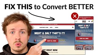
Speaker A audits Carnivore Snacks' website and identifies 15 conversion issues, from hero image composition to price placement, with testable fixes. The walkthrough covers AOV tactics, UGC collages, and ingredient transparency. Speaker B then pitches a landing-page service for DTC brands.
Chapters
Let's take a look at Carnivore Snacks website and see what we can do to optimize it. Your image is getting cut off here, and that is caused in part by your announcement bar taking up 2 lines. So what I'd recommend is just making sure that your entire image fits this, this screen space that we have over here. So you can increase the visible space by moving your announcement bar to only take up 1 line. And then what I'd also recommend is just using an image that shows your product a little bit smaller. So you can have a smaller little product shot. And what I'd also recommend with your image is actually show what's inside. So show the little snacks that's actually inside these. So show the meat chips next to the packet over here so that people can actually see the packet and they can see straight away what's inside. So I'm opening up your navigation menu. I think the font is a little bit too big. I think it just makes it a little bit difficult to read. What I would recommend testing instead is instead of having these, all of these different icons up here, you have like 6 It seems like you have 6 products up here in total. Instead of having them up here, what I'd recommend you do is you could literally just include a 3x3 grid or even a 2x2 grid and have all the products displayed in your navigation menu up front and have the names underneath, have the images bigger. And that way it's going to be easier to see because your images are really, really small here. So it's kind of hard to see, hard to see your product just by looking at these. So I'd actually just do a 3x3 grid or a 2x2 grid in your navigation menu, show all your products. So even these ones over here that are getting cut off, show them all. And that way, it's now one click for anyone to get to any of your products. And then I would also just add, add like a little bestseller badge to your top-selling products. And that way, if someone's coming to your brand for the first time, they can look at one of your bestsellers if, if they want to learn more. And that's where they're going to see all your social proof. So we're landing on your collection page over here. You've got a nice little banner. So 100% grass-fed and finished. Try to include an image as well of your products, maybe like a lifestyle photo. I mean, I'm pretty sure that you have some good assets. Yeah, you got tons, you got tons of assets over here. So I definitely would recommend taking like this, this could be great. I know this is a video. But you can literally just take this image up here and put it in your top little banner. It just makes the page more engaging. And you can also send cold traffic to this. Straight away, and now they're going to see your image straight away in the hero section, which is really important. So I'm not sure what's happening with your product pages, but it seems like the images are struggling to load here, um, which is interesting. Anyway, it might just be because I'm viewing it in this viewer. Let's just look at this. So New York Strip, you've got your price over here on the right. What I would recommend is just put your price underneath. That way you can make your product title in just one line over here, and I think it would just make it a little more neat. I wonder if it would be better to show them instead of the packet to show them the actual snack itself and how that changes depending on what option they choose. Because it's hard to kind of visualize just by looking at the pack what the product is going to be. And obviously that might change if your section up here had an image in it that actually showed the product. But just making it clear, if you're showing different options, it should be clear from the photos, from the thumbnails, what those different options are. So, so one thing I can see that you're doing is you're defaulting to the one-time order. That's cool. What I would recommend is adding in bundles. So you have, you know, you have, let's say someone's coming across the skirt steak. Well, why not give them an option to buy 3 packs of it? Why not give them the option to buy 5 packs of it? Why not give them the option to buy even more if they wanted to? And have them subscribe as well. So the way that you can set it up is a functionality like this, where they can buy, let's say, 1 pack if they just want to have 1 pack, and they can subscribe to it as well. Or they can buy 3 packs and they will get like a little discount. And they can also subscribe to the 3 packs if they want 3 packs delivered to them every month. Or they can get even more. So I'd recommend doing something like that. That would definitely help your AOV and also help new customers. If people love your snacks and they want to buy more, instead of them having to add, you know, 5 of these one time into their order, why not just give them like a little mini discount to incentivize them to upgrade even more? So one of the most important parts to do with a product page is your product listing photos, but So I can't really review those. I would just recommend that you follow a framework where the first image is showing the packet and the snack next to the packet so that people can see it straight away. There also should be information on how long or how many snacks are in that packet and how long an average packet is actually going to last for. Now you might say, well, some people are going to eat more faster than other people, but you should give people like a rough range and that can help them judge, okay, do I need to buy 3 packs? Do I need to buy 5 packs? 'Cause then if you want to, if you can get into their mind that actually only one pack contains X amount of items, a lot of people might say, well, actually, I need to have two, or I need to have three. The other thing that you should be doing is bringing in that Joe Rogan quote into your listing photos. So I'm not sure if that's in there, but I would definitely recommend that. Also bring in some UGC photos in there so you can have a collage of customers enjoying your product. You should bring in your ingredients, even though there's only two, should be an ingredient section in there and why you only have two ingredients. So you could talk about, well, this is the reason that we founded this brand is we wanted to keep pretty authentic and clean products that don't have all the artificial fillers in there.
If you're looking for further help, we do offer a service so we can craft a high-converting landing page that is designed to outbeat your current page by at least 10%. Our specialty is designing these high-converting landing pages, and we pretty much do this every day for the e-com clients that we work with, such as Snow, Carepaw, Soloway, Velvet Caviar, and many more DTC brands, helping them to increase their ad performance and get better results in terms of their conversion rate, average order value, and overall profitability. If you're interested in learning what results we can get for you and how our process works, then check out the description. There are links to our website. And of course, you can also book a call with me and answer any questions you have.
Cool.
And I hope you got some value from this video.










