How To Actually Optimize a Shopify Store
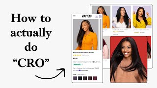
Pedro Loureiro audits a Shopify store page by page, identifying conversion killers. Navigation menus drive ten times more uplift than hero CTAs, so simplify categories and add icons. Product pages waste space with stacked payment widgets and misplaced color swatches that should be consolidated and reordered.
Chapters
There's a crazy, crazy way that you can actually scale a lot faster and a lot more reliably without spending more ads. And that is by applying the core principles of conversion rate optimization. And I'm going to be showing you what those principles are in this video, and how you can apply them to your store to start getting results today. First of all, I like the fact that you are showing all the elements in the hero section. But the problem that I have here is that new customers or new shoppers that are landing on your store, They're not going to be able to know what you sell straight away by looking at this. It's not clear. So you know, you have it down here. But I would honestly just make sure, like, even in sale periods, that you're calling out exactly what you're selling in your headline. So there's different ways you can do that. You can put it maybe in your headline. You can even maybe call it up here. Maven Premium Hair Extensions, 15% off, Spring Break Refresh. You'd be surprised what a difference something like that can make. I like the fact that you are linking this in the announcement bar. That's pretty good. You're calling out the code in here as well. So all of these different benefits down here, this I think is missed space because we can put so much more powerful elements than this down here. Like these different points down here, we're expecting that people are going to read them. They're not. We're giving them 4 items to read. People are like, the speed at which people consume content or not even consume it, but like skim over is crazy. So instead of this, honestly, what I would say you could do to make this even more powerful is just bring in a review. Of your customer, like a really powerful one. If you can find a review that complements a winning ad angle, I think that would definitely increase your click-throughs on this hero section. I think it'll make it a lot more powerful. So another thing that I'm noticing here, and I know that this is because of how you design things on desktop, but there's like this white space bar over here. And I know that is because of how you design things on desktop, but it's almost like you've designed your theme to be you designed it for desktop, but not really for mobile. I would really recommend that you make all your images full width on mobile because you have great imagery. Like these are all high quality imagery that you have. You just want to show them off. Next thing is your navigation menu. And the crazy thing about this is when I do heatmap audits for different stores, the navigation menu gets more engagement than the main CTA in your hero section. And you can look at this for your own store and see if it's actually the same for your brand. I would assume it is because, and the crazy thing is that optimizing your navigation menu can bring like 10 times more of an uplift than you can do to your hero section, which is crazy, and most people overlook it. So let's take a look at your navigation menu. It's clean, and I will give you the fact that at least it's clean, and at least you've prioritized your purchase links rather than this stuff down here, your secondary links. So that's obviously a good thing. But what I think you could do to take to the next level is just simplify your categories even more. Like, do you need all of these categories to, like, get people to where they want to get to? In my opinion, I think it's way too many categories you've got going on here. So I would simplify it. And I would honestly try to look at if you can bring in some featured bestsellers into here to make it easier for them to click through, or just make it easier here by adding in some images next to these categories. So it makes it easier for people to see. So this is actually a navigation menu that we designed for one of our clients recently and that we're going to launch soon. You can see it's talking about the principles that I just mentioned. We're at— we've added in icons here to make it easier for people to actually see what it's actually about. So when they actually see an icon with the text, it just makes it that little bit faster for them to consume the information. So it's hacking their brain a little bit and making it easier for them. So it's all about reducing the effort. And because we know so much traffic flows through the navigation menu, any little bit of effort that we can reduce for them through that experience will result in more conversions. That's how crazily powerful your navigation menu is, because it serves as like the backbone for people's mobile experience. And if you can make that navigational experience more and more effortless, you will just bring more and more of that traffic to your product pages, to your collection pages, to the next step in the flow. And obviously, that will lead to more conversions. So that's how powerful it is. I'll show you an example now of a client navigation menu that we've done that has a bunch of different categories. Now, this works a little bit better because they have so many different SKUs that we couldn't just simplify into like a couple of different categories. but at least we've put in some icons here. If this was just a massive wall of text, it would make it much harder for people to understand the difference between the categories and get to where they want to get to. And we've also surfaced here at the bottom some bestsellers. I'll show you one more navigation menu client example here so you can just have another reference. So this one for Ro Nutrition is using the images. So you can see we've got, again, 4 categories here. We've got shop by benefit. So you could, if you have like a bunch of different other categories as well, this could be another way of like doing it. So like secondary categories could be in a dropdown. Down. And then of course you could be featuring your top bestsellers up here, and then maybe a link to, let's say, a specific collection down here. One thing as well is I would definitely recommend adding in a shop all button into your navigation menu. It's definitely missing that. If they don't know which category they want to get to but they just want to move ahead, that button will help them do that. So I'm going to take a look at the next stage in your flow. So let's take a look at your collection page. The spacing here between your grid— because it's— you're spacing things a little bit too far apart, the imagery is being reduced. I would make your imagery I know I'm being crazy here, but I would make it take up a little bit more space. That little bit of extra space taking up your imagery will be more compelling to people because the imagery is what's really going to compel them to click through and buy your product. You have great imagery, so show it off. One thing I think as well you're missing here on your collection page is adding a banner to like sell people. So if I go to a collection page for Row, you can see again, like we're maximizing the space here a little bit more than what you're doing. And this is not really a product that needs to people to be sold on the imagery. It's more about the text. It's the opposite. And yet we're still trying to lead as much with the imagery here. Because that's how important imagery is. You can see in the banner, we've got 60-day guarantee and free shipping. So these banners are great. Because you can sell, you can now send traffic directly to collection pages, and it will convert that little bit better, because you will just be warming up that cold traffic straight away on your homepage, or on your collection page. I mean, all products doesn't really mean anything. So you can bring in a banner in here, maybe have like a nice lifestyle photo. And then call it an end in like a little headline with obviously the main benefit of what your product provides. Or you can bring in some social proof, how many orders you shipped, how many customers you have. I think that would go a long way. What I can see here after just taking a little bit of a deeper dive, I can see that you're actually, you're showing a lot of SKUs on your collection page. This means it like, look at the scroll depth here. Like it's your page just goes on and goes on. And this is not a good sign. I mean, if we were to do a heatmap audit for you, I can guarantee that the drop-off rate would be Yeah, it would be significant. And that's going to be important because products that are lower down on your collection page could have higher conversion rates for you. But because they're so far down, the resistance for people to get to them is like insanely high. And so they don't get to them, they bounce. The solution here is either one, how we're grouping the products or a better filtering system. What I would even say is if you have all of these products being listed on your collection page like this, then your filter should not be behind a screen like this. It would, it needs to be surfaced in some way. So I'll show you this filtering mechanism we've designed for Anthro, is that brand that I was showing you earlier. And this mechanism, we have a, we're going to be building like a social proof page, which will have a ton of like testimonials on it. So we don't want to hide the filtering system behind a button because that will increase the resistance. I know it seems slight to us. Oh, they're just clicking the button. But that to a mobile user, that to traffic at scale is a lot of resistance. We're surfacing the filter widget right in the page. So it's literally just one click and you'll be able to filter it. And something like that is definitely, I think, what you'd need for your page as well. You can see we've got top filter and then subcategories. Something like that mechanism could work for you as well. I'm going to go into one of your product pages here. So let's take a look at this. So you're showing the interest-free payments. So you're showing both of these. This is misused real estate in my opinion, because there's no need to have two of these widgets stacked on top of each other. I know that you're going to say this is a widget and there's nothing you can do to like code around it. But what you can do is you can just put in a little bit of code in here, write the code and do a script where you can add the two little logos in there. And you can say make 4 interest-free payments of $14 with Afterpay or ShopPay. You can have them both on one line. That way reducing the vertical space that much more. And to be honest with you, this is taking up more attention for me than this. And if you also think about it, like $60 for hair extensions, I know you're going to say that your audience may be price sensitive, but every audience is price sensitive. Every audience is. Sometimes when you're showing this information, it can do more damage than good. I would just surface this a little bit lower. So I'd maybe put this underneath your add to cart button or just show the fact that you can actually in one line that you can reduce this with, with Afterpay. Because my perception of your brand is the imagery that you have, the really nice branding, the reputation, the social proof is you can afford to justify these higher price points. Like all of this stuff here, I think is overkill. I would just reduce it to one element at max, bring like reduce the vertical space because this massive paragraph over here, what this is missing out on is this is costing you UX/UI functionality. Because we're bringing the color options all the way down, which means like you look at this, I have to scroll all the way down here and then I have to scroll up every single time I click on the different color options. So it's not really, it's not really, it's not really designed better for the mobile experience of the actual shopper. So these I would recommend swapping around or trying to reduce the vertical space of this block here. Your imagery, there is nothing I need to say about your imagery. Your imagery is definitely Amazing. Like, your imagery is top-notch. All of this stuff down here, because the links are so bold, they're drawing my attention more than the actual text. So the hierarchy here needs to be reversed. The link should be less important, but the actual text, which is your guarantee, should be more important. So I think some of this information down here should be surfaced higher up as well, like the hair quality, the how long it's going to last, and how to actually care for it. Some of this stuff I think should be mentioned. As well up here or further up in your page, maybe underneath your add to cart button, just, and then turn it into benefits so that people can actually really understand the quality of your product here. So you have your featured reviews down here. This button I think is a little bit, it's a little bit weird. It's not really working properly. So I just take a look at that and see what's going on there. So 5 out of 5, it's saying here 1,092 reviews. This isn't— this can't be right, because I can see that you have 3% 4 stars. So it seems like this is not really giving me the right number here. And I'm telling you that people will be that skeptical. People will be, you know, if they see something like that, they'll be like, okay, is something going on there? What I think you're missing on your product pages is more education below the fold. I really do think that your brand would benefit from having the below the fold section really going into, let's say, all the intricate benefits of your product. Doesn't need to be super salesy, super educational, but it could be like a section on how to apply it, how to actually put it on your hair, how to care for it, and how it's better than alternatives on the market, why you should go with this one, why you should go with Maven. You talk about how long you've been in business, how much people you've actually helped, feature, bring in some more social proof in there. These elements below the fold, that will obviously help you convert more. And then you can bring in some of the top sections that you're doing. Convert them into like a listing photo and bring that listing photo into your carousel. And that way, now we're just maximizing the persuasion that each different product page has. If you're looking for further help, we do offer a service so we can craft a high-converting landing page that is designed to outbeat your current page by at least 10%. Our specialty is designing these high-converting landing pages, and we pretty much do this every day for the e-com clients that we work with, such as Snow, CarePod, Soloway, Velvet Caviar, and many more DTC brands, helping them to increase their ad performance and get better results in terms of their conversion conversion rate, average order value, and overall profitability. If you're interested in learning what results we can get for you and how our process works, then check out the description. There are links to our website. And of course, you can also book a call with me and answer any questions you have. Cool. And I hope you got some value from this video.










