How to Apply CRO To Your Shopify Store (CRO Audit)
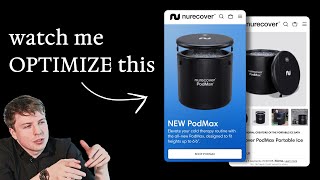
A CRO audit of the Nurocover Shopify store identifies friction points on the homepage and product pages. Key fixes: replace the carousel hero with a single slide and dual CTAs, add testimonials throughout, create a comparison chart for the three pod models, and display discounts with expiry dates to create urgency.
Chapters
So in this SEO audit, I'm going to be looking at Nurocover, a wellness brand that manufactures cold therapy products. Let's take a look at their website and see how they can improve their conversions. When I come to your homepage, what's the first thing I see? I see special offer over here. And then it gets covered up with this. So the first thing I'd say is I'm not a big fan of these carousels because from the data that I've been looking at is that carousels get less engagement than when you just have one. Single slide. And what I'd say is if you have a special offer like this, you can easily incorporate this into your main image. Do you know what I mean? Or you can put it up here in your navigation bar, or you can add just a little box down here, or second even CTA even, or a box to actually showcase that. The problem with two slides is it's just taking away their attention and it's kind of diluting it. And because also this slide is automated, people may be looking at this And then the minute that it goes away, they're okay, struggling there. You've lost their interest. Do you get what I mean? And also there's no little icons down here to actually show you that it is a carousel slide. There's a few different things I'd say that just create extra unnecessary friction when people first land on your website. And the reason why I'm stressing about this is because your homepage hero section, this first section when people land on your website, is the most important part of your website. And so it really needs to be dialed in as much as possible. Needs to reduce friction. It needs to basically communicate exactly what your brand does, and why people should care, what your unique selling point is, list out the benefits, maybe a guarantee, showcase some social proof. And then of course, give people a clear call to action to get them to where they want to be. So in your case, if you have a new feature product, one of your CTAs, like what you've got here, could be the PodMax. And I'll show you— not to promote this stuff, but I'll show you this. This is a homepage hero section that we did when Carepod were launching their Cube. You know what I mean? So we had basically the CTA that actually linked directly to their Cube. And then of course, if they wanted to learn more about it, they click on the second CTA. So you can definitely do like dual CTAs, what I call them, in your homepage hero section. It's perfectly fine to do that. And I think this would be a good opportunity for here. If you've got a couple of different feature products going on, you can definitely link two little buttons here together, and that will just keep everything a lot more organized. So I would definitely say also have some sort of form of social proof here. I also don't like the fact that this special offer slide here— I like that you have an offer going on. I think this is very valuable, but like the button kind of blends in with the text and it's not really a clear call to action. And also this, it feels like there's a lot going on. You get, there's just too much that's drawing my eye away from it. I feel like if this is the main offer, the fact that you get a free pod with a sauna, Or you get free accessories with the pod. It's two competing special offers. And I think you're better off saving this information for the product page. When they go on there, that's when they see that all the intricate details of this offer. What you can do in your homepage hero is just tease it. So that's what I'd say. And I also think that kind of what I mentioned a few minutes ago is that your homepage hero section needs to explain what your brand is about. Now, I know you might be saying, well, Surely it's pretty obvious that we do cold therapy and that we do these different like pods. But you just need to make it super clear for people because someone may come onto your page, they may never have seen something like this before. They may have come from an ad, or maybe their friend has recommended it. And so it needs to be so clear within the first few seconds, just like how a great ad, they have a great hook. You need to create a great hook on your homepage hero to make sure you're decreasing bounce rates, driving through clicks actually for people to learn more about your product. So what I'd say is you can definitely, like, the new Pod Max, that could be smaller text. Put that maybe up here, smaller text. But your main headline should still be your main headline, like cold therapy reimagined or recovery reimagined. That can be your headline up here. And then basically your subheadline can be elevate your cold therapy routine with the all-new Pod Max designed to fit heights up to 6.6. So you can keep this subheadline, but now you're just making your new Pod Max smaller text. You're keeping this as your main headline so that people can know when they instantly land on your page, oh, this is about recovery. I'm going to get faster recovery or better recovery or deeper recovery with NeuroRecover. So that's what I'd say. This is another great headline you've got down here. The world's first portable ice bath. The world's first portable sauna. Like this, these two sections over here, the pod and the Tropic, I would honestly say See if you could actually put them underneath here, underneath your hero. I feel like these would be very powerful. And what I'd say is instead of having them stacked on top of each other, like, vertically, try them horizontally so they take up less vertical space. And it should be still very easy for people to navigate to. But you can have the image over here. I wouldn't put any text over the image. Put the text below it. Put it below it. So you could have the Pod and then the Tropic. And then if they click on either one, it will go to that product page. This section I don't think is really useful because you're already mentioning the, the sauna down here. So I would, again, instead of using this section, I would probably see if you could dive into more of the information around what makes your, like, your brand unique with a pod. So you can maybe talk about the pod or the, or the sauna and talk more about the details of it, talk more about. And then of course, after you've maybe done one or two sections on the sauna, then you have a shop topic. CTA that will go there. But instead of just saying, just check it out, because you're already linking to it over here, you're not really giving them any more information apart from a different image. So that's another thing I'd say. This section, again, don't think it's really important. You're duplicating up here. What I'm noticing is, like, on your homepage, there's a lot of opportunities with space that you can use. So you're just repeating the same call to action. Every single section is just linking them back to the product page, but you're not really giving them any other, any other reason to click through. You're just saying, okay, shop now. But the best way that I've seen it, and I'll show you an example over here, like Raw Nutrition, when people come to their homepage, we have a main call to action up here, then we have a shop bestsellers section, that we've got health and experts. So then we're going into a bit more education and building social proof, then we've got the Raw Difference. So we're told, so we're giving them more information about the brand, because we know as people scroll down, The more someone scrolls down, the more someone spends time on your page, it means they're more interested, they're more warm. And so if we know that they're warm and they're scrolling down, it, it may mean that they just need a bit more information before they're willing to give us that first engagement, which is clicking through to a product page or clicking through to a collection page. So that's why we do this. This is all strategic. And then we're just giving people like a summary of the benefits that they can expect with ROW featuring some really strategic reviews, which again, could be a really great example on your homepage. How can we put in some reviews there that talk about, like, maybe you can feature like an athlete that's used your, your, your pod, and how it's helped them recovery. Or you can talk about someone who's maybe suffering from, from some like pain with their joints, or whatever the different target pain points that you're solving with your different products, featured a different review for it. And then of course, you can do what we've done, and just have them link to the specific product which they're giving a review about. So for example, if this is giving you a review about the pod, link it to the pod. If this is giving you a review about the Tropic, link it to the Tropic. That I think will make it a lot more powerful and compelling. Should definitely be a lot more social proof on your homepage. Definitely, I think, a little bit more education about the pod and the Tropic on the homepage as well. And also a little bit more about your brand. I know you've got the story section down here, but I just feel it's a little bit weak. Our story, our promise. Every kind of brand says the same thing. If you think about it, we're always trying to create the best in the world. But what really makes a good story is, if I go back to like Ro, is it's just a little bit more personal. You can see we're actually featuring a photo of the founder, Ryan Bishop, feels more personal. And we're giving a quote as if he said it himself. We're showing his— and really what this is doing, like the function of this story section is not to say, hey, we're trying to create the best nutrition brand in the world. The function of the story section is basically a social proof, is to build more trust. We want people to know that there's a face behind this brand, that the people behind this brand really give a damn about the product. They're passionate about it and they want to create perfection. That's what we want to make people feel like. So that's why we're giving them this like small snippet of text and showing the care that's gone into building this brand. And the same with you, for example, really this section should link to your story. And have a bigger, more expanded story about NeuroCover. Who set it up? Why did you guys set it up? What was the problem out there in the market that you noticed? And then you realize that there's actually no adequate solutions. And even if you can even say that we know there's other ice baths that are on the market, but they had XYZ problem with them. And that's why we created the NeuroCover. You can see what I mean. Like you can make this section so much more powerful and actually use it as a sales tool. So definitely I would keep your Our Story section, but here's how you can like reposition it to actually target different people's objections and get people to, of course, learn more bit about your brand. So I noticed you have these, these quotes down here at the bottom. Trust me, when people get to the bottom of the page, they're not going to really see this stuff. This is maybe about less than 10%, less than 5% of the traffic. Is actually going to scroll down all the way to the bottom of your page. And some of these quotes might be good. A brand that cares. Truly innovative products. I think you have— how many quotes do you have? You've got Healthline Men's, BuzzFeed. So you've got 3 different quotes. You could probably feature them all instead of in a carousel. You could feature all of those quotes in a single line and have the quote text displayed. Or what you could do, which is even probably even more powerful, take Healthline, put that quote, maybe put that quote in between here, then take the next quote, put it down in between here, then take the next quote and put it down in between here. So that way, as people are scrolling through your homepage, they're getting that little kick of hype around your brand. They're seeing, oh, Healthline have like vouched for this brand. Oh, this other brand like this, sorry, I forgot who, BuzzFeed have seen this product and they've vouched for it. So as people are scrolling through your homepage, they're seeing these other brands that have given, that have given you the thumbs up as well. And that, of course, I think is just going to make it a lot more powerful. That's what I'd say about your homepage. I think there's quite a few opportunities there. So let's just go to your product page. I'm going to try and keep this short so that this Loom doesn't go on too much. So let's go over this. So the original creators of the portable ice bath. I think instead of this headline, you mentioned on your homepage that you're the world's 'First Portable Ice Bath.' Much stronger headline, a much stronger, like, point to, like, mention. So I would use that instead. 'Nura Cover'— I don't think I would use this. You have— you've already got your logo. I would— and this text is getting a little bit long, it's on two lines. So I'd remove your brand name here, just call it the 'Podmax.' 'Podmax Portable Ice Bath' sounds a little bit more premium as well. So I just do that, and obviously you can shave off some space. So limited time only, 25% off with the code WINTER. If you're ever running a discount, always show the price savings automatically. Because you'd be surprised, I know you probably think, oh, this is so obvious, people are going to see this. Even if people are, first of all, not everyone is going to see this. They're going to look at the price. People, the way that they like look at pages, they like their eyes like dart around like that, like crazy. And, and they're only going to spend, some people are only going to spend like a few seconds on the page. And of course, knowing that there's a discount on your product might be the one thing that gets someone to buy now. So that's why this is really important. If you've got a sale, always show the price savings in here on your actual, on your price so that people, the first thing that they see is not that it's £600 or whatever it is in the dollar amount if you're in the US, not that they see your full price, but they actually see, oh, it's on sale. And then the other part I'd say is show when this sale is gonna expire. So that way, you give them a reason to purchase now instead of thinking, oh, maybe this, like, maybe this 25% off winter sale is going to be on for the whole of Q4. And maybe it's not, maybe this is only going to be run for the next few weeks. Or maybe it's only going to be run until X amount of units are sold, or until we're out of stock. So building in some sort of form of natural urgency here is going to help you drive more sales. And this is really important because a lot of brands, they just slap a discount code on their store. and then they're wondering why, oh, not many people are seeing it, or not many people are like converting, is because there's no urgency attached to it. People are becoming more and more used to seeing discount codes being evergreen discount codes. And so one way you can create a bit more urgency is just by adding an expiry date to this. When does your sale actually end? So that's what I'd say. Now you had, I believe, your special offer, right? So you had the free accessories with the pod. Mentioned here on your homepage. This is an opportunity to bring that back when people come onto your, onto your product page. So I believe this is the product page, right? I seem to be on a different one. Okay, it looks different. So this is the portable ice bath. The other one is a different product, or am I getting confused? World's portable ice bath. I see. So you've got 3 different models of your ice bath. So this is interesting. So this kind of changes the game a little bit because you've got 3 different models of your ice bath. So. This is great, because this also creates another challenge for the customer, just like how I've engaged with it. Now it's created a bit of confusion. Because now, if I'm a customer, and I'm coming to your store, I'm very warm to buy, and I know that I need a portable ice bath, and I'm sold on your brand after reading the information. This is going to create a little bit of friction, because now I'm going to be like, okay, which one should I buy? Which one is best for me? Should I buy the £90 one? Should I buy the £130 one? Or should I buy the $600 one? And by the way, your savings should always be showing here. You've got these two on sale, and then this one is not showing on sale, but I just looked at your product page and you are running a sale on this one as well. Yeah, so I'm not sure what's happening here, but what I'd say you can easily do is do something like we've done for CarePod where you show a comparison chart. I believe we've done on their homepage. Yeah, here we go. I'm just going to redirect me now. Yeah, we've done it. We've done a comparison chart like this. That shows the different benefits of their different humidifiers. So the problem that we've noticed with people who are shopping from CarePod is they don't know which humidifier is right for them. And so what we've done is we've just looked at, looked at their reviews, looked at the use cases in which customers have used their different CarePods. So looked at their buying behavior, and then basically wrote different descriptions for each of them. So the Plus, the Cube, the One, the Mini, and then we basically said, okay, this is perfect for 700 square feet apartments, 500 square feet spaces, etc., etc., and giving them like a little recommendation. So one bedroom, like a one bedroom or like a home office, etc., etc. This I think is something that you need for your pods as well. Give them like a comparison chart, help them understand which is the right pod for them. Because the worst thing you want to do is get someone to buy the original, spend the lowest amount of money, have it arrive and then realize, oh, they should have bought the Max. And they were willing to buy the Max, but maybe they didn't even realize you were selling it. So this is something I'd really recommend. It's these little things. I'm not really calling out like a massive redesign. I'm not calling out that you need to change anything with your branding, or you need to do anything serious with your messaging or anything like that. All I'm saying is just these small little things to reduce friction, to help people with their buying decisions. These are the things that will, you know, really are easy to implement and will deliver a lot of impact to your bottom line. So I'm going to just spend the last few minutes coming back to your, coming back to your product page. I'm going to do it on this one. So you have this, you actually do, you actually do give a little description down here. So I can see standard installation fits. So best for starters, fits up to 6'9". So this is great, but I just think you need a, first of all, to have the actual image next to these so that people can actually see the difference here. I'm actually glad that you actually give people the selection. You actually do have a comparison chart over here. Yeah. See, the thing is just not, it's just not obvious. Like it's just not obvious. Like I know you might be thinking, oh, this is super obvious to us, but there's so much, there's so much going on in your product page that this little link down here is buried in the chaos. The spacing is a little bit cramped between all these different things. So things just get lost in the weeds is what I'd say. So this comparison is great. But I just think that there's a little bit too much text going on here. And then you've only got the comparison between the original and the Pod Pro. I'm not sure, is that intentional? Can we not have the comparison between this and this as well? And I would probably see, like, I would just make this comparison button. I would do a more optimized chart where it's less text, easier for people to see. Like, for example, if we're able to do a chart like this, that's very simple. And obviously it's expanded. If people want more of the features, they can expand it. Able to do a chart like this, I'd say that you can do a simpler one as well for your pots. That's what I'd say. Add a water chiller. What is the benefit of this? So use, use ice to keep your water cold. This is a pretty, pretty big upsell because This is a pretty big upsell because basically for people to add on the water chiller, they're actually spending more than what they would have spent on the pod itself. So I'm wondering from you guys, like, how many people actually end up spending this? Pod Pro comes free. Pod Pro comes free. I've got to say, I'm a little confused with how you've laid everything out here. If I click on the original, I go to yes, it's now then updated this to the Pod Pro. So your original is called— so hold on, your original is called the Pod. So it like updates here. So I'm a little confused. So we have the original, and then when I select add the water chiller, this gets updated to the Pod Pro, and then we have the Pod Max over here. Okay, so you can add the standard chiller onto the original. I see what I mean. I see what you guys mean. Again, I'm not sure how clear that is for people. Is that kind of confusing? Like people are— people who click on the original and then think that they can add What I'd say is this, if someone is selected on the original, just don't show this at all. Just don't show this at all. I would, I just think it's going to create confusion for people. Then if they click on the Pod Pro, then display add a water chiller. And what I was maybe even say you could do is test out using like a toggle on and off if they want to add the water chiller. And then just say, and then just use that extra space that you're going to buy back to more easily communicate what people are going to get. So I think that would be— I think that'd be pretty, pretty powerful. Again, I just think your comparison charts, there's just a lot going on here. Is there any way that we can simplify this? Is what I'd be— what I'd be looking at. This What's Included section is a I think more important than the other stuff that you've got here. I would put the what's included on top and I would have it fully expanded and I would show icons for all of this so that people can clearly know what they're actually gonna get. And of course, like I mentioned at the start, if you have a special offer running, show those accessories or show those bonuses in the main image and kind of clearly communicate, oh, I'm gonna get this for free.










