How To Build A High-Converting Landing Page
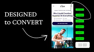
Pedro Loureiro walks through building a high-converting landing page in Figma, covering page mapping, mobile-first design, hero sections, social proof, order forms, CTAs, and CRO tactics. He uses a real project example and shares specific strategies like sticky CTAs, heatmap insights, and pricing defaults to boost conversions.
Chapters
I'm going to do something that I've never done before. I'm going to show you behind the scenes of how I actually design landing pages for the clients that I work with. I'm going to show you the Figma design process that we go through, and then of course the final result. Let's dive in. The very, very first stage that of any single landing page that we're doing is the page map. And of course, the copywriting. If you just build a landing page randomly and you just slot in different sections without any thought going into them, they can actually take away from what the main message is on your landing page. And they can basically increase your bounce rates. And lead to less conversions. So landing pages, they need to strike that balance of being long enough to warm people up and get them to convert, but short enough where the main message is communicated as efficiently as possible. And this is really where the art of CRO and landing pages comes into play. You just need to know what the sweet spot is. Once we have our page map mapped out, we know what sections are going to go in, then our copywriters come in and write the copy for it. Now, I do have experience in copywriting myself, but I'm nowhere near at the level of some people on my team. So I have them go through and come up with the different angles for the copywriting. And so what they normally do is for the hero section, which is the first section on the landing page, is they come up with 3 to 4 different messaging angles that we can test out to give our clients as much leverage on the landing pages that we're doing is we do a few different angles for them that they can test out and see which angle will resonate with their audience and with the different ads they're running. By giving them more angles to test, we maximize the performance of the landing page. So the offer and the hero section are the two most important parts of the landing page. And that's of course where our copywriters spend the majority of their time. After that, for ROWE, we have this problem solution section. So we're introducing basically what the problem is, where people are at now, and how the solution will get them to where they want to be. And the solution is their product. Then we go into explaining the benefits of what the ROWE creating product is, how to actually take it. The fact that it's been approved by different experts, and there's just placeholder copy here because we have the reviews in a different area from the different athletes. We showcase their guarantee, what the offer is, highlight some feature reviews, FAQs, and of course, a final call to action for people who scroll all the way down to the page. So how this actually turns out is this design over here. And one key thing about our process is we design in mobile first. And the reason is very simple. The majority of traffic of e-com traffic is browsing websites on their phone. So when people are scrolling through Facebook or Meta, or Instagram, or TikTok, they're coming across your ad, 80% of them are going to be on their mobile phone, they're going to experience the mobile experience of your store, of your landing page. And the crazy thing is, is the majority of stores out there are not optimized for mobile. And once you realize this, and you see this yourself, it's absolutely wild. Because the minute you start optimizing for mobile, you can experience insane results very, very quickly. So that's number one tip I would say so far is just prioritize your mobile. So you can see for Ro, what we're actually doing is the headline is stating what the product is and teasing what the end desire is. So superior at everything. And then that headline ties into the subheadline, convenience, taste, absorption, and performance. So it builds intrigue and it builds curiosity and it's very, very quick for people to read and consume that information. And of course we have a nice little image to back up. This actually wasn't the image we ended up using. We ended up using this image over here, which I definitely think was the better image. And this is also a guy who has a little bit more of a social presence as well. So acts as social proof as well. Those are the changes that we made. And then of course below we're going into the benefits of the product. So we're introducing in more detail. So no pills, no powder, no mess. And anyone who's actually experienced creatine and uses creatine in the powder form, will know how messy it can get. I used to use the powder, and then of course, when I started using Rose products when they released it, it's a game changer. You don't want to go back because it's the fact that it's in liquid form, it's got better absorption, and actually tastes pretty damn good. You're never going to want to go back to the powder form. So with a product like this, that's, you know, very visual and very easy for people to understand straight away about what the selling point is, you don't need to overdo it with the copy. It mostly comes down to the images. And that's of course why when we have an image in the hero section, We're showing the guy pouring it into the bottle, showing that it's actually liquid, showing that it's not a scoop that you're dropping in the powder. So then we go into the benefits. So people can actually scroll through and navigate through these. And then this is a very key section, is showing how easy it is for people to consume it. You can actually grab it, you squeeze it, you sip, and you go. And so what we did when we were designing this section is we wanted to create the feeling of ease throughout this section. And you can see We're not using a lot of text here. We're mainly just using images because images are a much better tool at communication than text. Takes people longer to read. And when you have a lot of text, it can make the whole thing seem cumbersome and long in and of itself. So by us using images and very short headlines like grab, squeeze, sip, and go, we're making it sound quick, fast, easy. And that just ties into what the product's main selling point is as well. So then we go into the first bit of social proof here. And we're showing 3 different athletes that all are vouching for the products and what their experience is with the products. This is placeholder text because once we were building the landing page, we didn't actually have the reviews ready, but I'll show you what they are now. So you can see if I navigate to the review section, this is what these athletes had to say about the product, and of course they're all loving it. And then we have some feature reviews from customers. So this just goes over different angles and different pain points that other people might have and shows, you know, why they actually chose ROE. The best place to communicate your guarantee, if you've got one, is above your order form and of course inside your order form as well, because this is the area of your landing page where people are going to make the purchase. If people are going to make the purchase here, you want to obviously communicate the fact that, hey, we've got you covered. You can try out the product for over 60 days, in Rose's case, risk-free. And if you don't like it, just call us up and we'll— or email us, we'll give you a full refund. That is, of course, just showing confidence that you're confident that people will love the product. And of course, you're just saying to them, hey, there's literally no risk in you purchasing the product today. Guarantees like this, when used in the right way, can be very powerful. We've been working with Grow for over a year, and we've constantly tried to improve their order form. And this order form you're seeing in front of you right now is the most optimal order form that we've designed yet. So this is like version, I don't know, like 5, 6, 7, something like that. So here's some quick tips that you can do to your own order form to help you convert more customers and of course increase your AOV. First thing I'd recommend is instead of defaulting to selecting your lowest tier item by default, default to like your middle tier option by default. So whatever is your most popular, if you're saying that your 3-month supply is your most popular, and that in Ferro's case, that happens to be their middle tier product in terms of price, then have that pre-selected by default. We used to have it defaulted to the 1-month supply, but just making simple tweaks by having it defaulted to the 3-month supply encourages more people to actually purchase at that price point. Another thing to actually test out as well is display your highest tier item in terms of price at the top, then your middle tier item, and then of course, your lowest at the bottom. So what we also have for row is giving people the option to subscribe. I see a lot of people that basically default the selection to subscriptions when people come onto the landing page. And in many cases, I would not recommend that because how I say to people on calls all the time is like when you are asking for people to subscribe, it's like asking someone on a first date for a marriage proposal. It's a lot more commitment for someone to subscribe to you than it is for them to actually convert at a higher price point, but only once off. In other words, it's a lot easier to get people to spend a lot more money up front than it is to have them spend less money but subscribe. In the order form, of course, we are communicating the guarantee again. You can see around the call to action button, just making it super visible. We're communicating the shipping time because that's another important piece of information. When people are going to purchase is when am I actually going to receive the product? And then we're reiterating the benefits again, just to remind people of all the advantages that come with purchasing Rose products. And then we give people extra information if they want to actually see it. So supplement facts, the shipping guarantee, third-party test results as well, just to really show off the value and all the science that's gone into this product. Got another social proof section as well down here. So here's an interesting fact, but when I do heatmap audits for Shopify stores, one of the most engaged sections after your hero section and after your order form is your FAQs. So a lot of people do engage with this. And that's why you could really, by just dialing this in and choosing your FAQs very strategically and making sure that they are answering the top objections that your customers have, you can make sure that more people will actually be warmed up and primed to buy. So this is actually a really important section, your FAQs. A lot of people think, okay, FAQs, no one scrolls that far down, no one engages it. but a lot of people do. So the second key takeaway from this video, after making sure that you design and prioritize the mobile experience, is making sure your FAQs are optimized and dialed in. So the final section at the bottom, we've got a final call to action section, is what I like to call it. And basically this is just a section to prompt people to scroll back up and make it easy for them to scroll back up and convert. In this section, we normally either highlight the guarantee or I basically just reiterate the main selling point of what the product is again. And you can see here that we actually did a little photoshoot with my personal trainer. This is actually the awesome dude that trains me in the gym, and he has to put up with my nonsense. But Rose sent me their product and we did a little quick photoshoot. I think it turned out quite nice. This is another important part about your images is when you're actually doing product photography, make sure that they're in the environment that your product is suited for. So for example, if you have a gym product like Krait, make sure that your product photography is in a gym. And the cool thing is you don't need to always do photoshoots if you don't have the resources for it. What you can do now is what we even did to this photo, because this guy was like in his, I think he was like in his kitchen when he took this photo. What we did is we just removed the background and then with Photoshop's AI tool, we generated a gym background. And honestly, you can never tell the difference. So you can use AI in these cases to really help you level up your images. On some landing pages, it's always a nice idea to have a sticky CTA, like what you can see down here. Just make sure that enough people are going to click on the page. So that is the whole process that's gone into designing Rose's high-converting landing page. And I hope that you got some value from this, and I hope you have really got some action principles you can take away and apply to your own store and your own brand. Now, if you want to really uplevel your CRO and your landing page skills, subscribe to this channel because I'm going to be releasing weekly videos every Friday at 3 PM UK time on landing pages, CRO, and also every second week I'm going to be releasing live CRO audits. And these are going to be really value-packed videos where I'm actually auditing different brands that have reached out to me, and I'm going to be dissecting their website and telling them basically what are the highest impact optimizations they can— I'd recommend checking them out.










