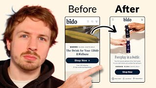
A designer rebuilds an e-commerce hero section for Bido, swapping an autoplay video for a static image and the headline "Foreplay in a Bottle." He strips away clutter, adds social proof of 50,000 shots sold, and proposes an A/B test to measure if these changes lift conversions.
Chapters
So in this video, what I'm going to be doing is redesigning an optimized version of Bido's homepage hero section. So right now they've got this section for their homepage. I'll show you what it looks like. So it basically looks like this. You got this video. I've seen just from data that using a static photo often converts better because it's very easy to land on this page. There's only one or two shots of the product here and they're gone in a few seconds. So what I just want to do with this test, clean up the copywriting, make the copywriting stronger, add some benefits in here. And then just add a really nice shot of the product if we can find it to make this section really strong. And then they can split test that against their current page. I think that'd be really, really cool. So that's the idea. That's the hypothesis. So let's get to work. So I'm going to start off with a section over here. So we're going to do 360 pixels in width. Going to set it to auto layout. And the first thing I'm going to take is I'm going to take their navigation menu and just drag that up there. We will be dragging that back in afterwards. That's 360. Cool. Now the headline that I quite liked is actually came from their SEO headline up here. So 4 Play in a Bottle. I thought that was quite nice. So I'm actually going to use that for their headline instead of this one. So let's try and use that. It's short and I think it's quite catchy. Kind of makes you want to read on. And that's when you know a headline is good, when it hooks you in like that. So if we're playing a bottle, we need to get the right font for this. Okay, so we'll just use this font for now. We're playing a bottle. Let's use this, the secondary font. I want to keep their ratings. That can definitely stay the same. What I'm going to do though is just going to make these stars a little bit smaller. So let's do that. Something like that looks good. Let's drag in the Shop Now button. Let's get rid of that plus icon over here, the arrow. We don't need that. Let's set this to auto layout. And for the subheading, what I'm going to do is I actually quite like the copywriting that they have on their product page. So I'm going to bring that in to the hero section. So I'm not going to bring all of it in, but I like this: the first sexual wellness drink that's good for you both inside and outside the bedroom. I think that's great. I think that says it all. And then underneath that is where we're going to put in the 3 different benefits, and those benefits are going to be from the product page. These benefits over here. I'm going to screenshot them, drag them in, and we'll just pretty them up and make them look a little bit better. Perfect. And so we— I just want to keep it to 3. I think 3 is good enough, and I like what we have here. I think this is pretty good. So, for playing the bottle, the first sexual wellness drink that's good for you both inside and outside the bedroom. And then we got the 3 benefits. Shop, shop Bido shots. I'm wondering about this, whether to keep that copywriting in there, but I just want to make it clear. Maybe we can say shop, shop Bido drink. And then underneath, we can just ditch that copy. You don't need to have too much copywriting there on the in the hero section. And then what we just need at the top is a really, really strong image, and then we're good. So let's try and find that image. They have a ton of great imagery. You can just see on their Instagram a ton of really nice imagery. This one's nice as well, kind of creates the whole mood. So I might just steal that. I think, you know, it's another thing that we need to do, um, we could actually just do a dual CTA. Shop for him, for her. Thinking about that because they have two different types of products, but I'm wondering that might confuse them. Shop, just say shop now, just keep it simple. Sometimes the best thing is just to keep it simple. So let's do 75, 75, and then I like the— this is probably my favorite photo. Where is it? Did I even download this one? So let's drag that in. And then we can just overlap this and do a nice little fade. Something like that works pretty well. And then let's clean up this navigation menu. Doesn't need to be this huge. So Do something like that. Let's make the logo a ton smaller. 360 pixels in width. Navigation menu definitely needs to be a bit bolder. It's really, really too thin. So make it about 2.5. Like that. And then we want the cart as well. And that is kind of what I would do. There's no reason for them to have a search icon in here because there's only— they only have 2 products. So doesn't make sense to basically have a search icon in there. That's it. And then we can keep this navigation menu the same color. So we can keep that. Let's merge these all together. I just want to check the spacing. So we're a little bit too tall in the spacing. So I need to decrease the size a little bit more. There we go. 650 pixels. So all of this is going to be visible now, which is really nice. So that's it. This is our before, this is our after. We're definitely longer than the before, but we have some nice information in here. We got the 3 benefits. I think we got a stronger headline in here and a better subheadline that actually explains a little bit, gives basically the drink a little bit more context instead of just saying the drink for your libido and wellness, which is kind of a little bit more, you know, wishy-washy. At least this headline hooks them in now. Foreplay in a bottle. Really, really catchy. And that's going to make you want to read more. And then the first sexual wellness drink that's good for you both inside and outside the bedroom. And then we have 50,000 shots sold. So some social proof, 3 benefits, and then the Shop Now button in there. So I think that's pretty good. If you're looking for further help, we do offer a service where we can craft a high-converting landing page that is designed to outbeat your current page by at least 10%. Our specialty is designing these high-converting landing pages, and we pretty much do this every day for the e-com clients that we work with, such as Snow, CarePods, Soloway, Velvet Caviar, and many more DTC brands, helping them to increase their ad performance and get better results in terms of their conversion rate, average order value, and overall profitability. If you're interested in learning what results we can get for you and how our process works, then check out the description. There are links to our website, and of course, you can also book in a call with me and answer any questions you have. Cool, and I hope you got some value from this video.