How To Design To Maximize Conversions
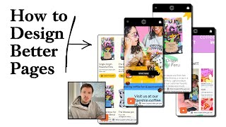
A designer audits a coffee brand's mobile site and finds missing headlines, tiny images, and buried CTAs. He shows how to fix each problem: enlarge product photos, add clear benefit copy, make buttons sticky and prominent, display pricing upfront. The core principle: conversions come from making information easy to scan and actions obvious.
Chapters
So in this video, I'm going to be auditing a brand's website and talking about how they can actually improve their conversions by applying the fundamental principles of CRO. And these principles are really the secret to maximizing your ad performance without increasing your ad spend so that you can actually scale more efficiently. So let's dive right in. Let's see what we can do to optimize this. So viewing this on mobile, I'm going to set it to 360 pixels wide. And this is your homepage hero section. What I will say about this hero section is you're missing out on having a headline, having some benefits text. And of course, the call to action button here is not really standing out too much. So it's missing those key things. And the reason why those things work so well in the hero section, and following that framework is so good, is because it gives new people who are coming back to your brand a chance to understand your brand and learn about it straight away. In most cases, when people are coming across your content or your ads or a touchpoint with your marketing, they are not spending too much time reading about it and diving deep. And so you want to make sure that whatever touchpoint they are coming across, that it will have the core elements there to educate them, to help them understand what your brand does, to help them understand what your unique selling point is. Your images are really nice. I can see that you have some beautiful images here, and I know it's going to be coffee-related, your products, but that's about it. The first time I'm coming across your brand here, I don't really know what you are selling apart from it being something coffee-related. So I would honestly map this to a really, really proven hero section template that you can follow. And I actually will send you a little template that you can, that you can map this to, that you can test and see. But those are the principles that, that work really well. So I wouldn't, I wouldn't, I'd recommend just sticking to them. So you have a little headline down here or subheadline down here, making coffee fun and approachable. Something like that could be in your headline. Up here. And then of course, underneath, I would just make it super clear on exactly what you are selling. So you have a starter kit, okay. Add to cart, 10% off bundle. So I'm still not too sure what you were selling here. And you're going straight into the selling. Okay, so you're actually selling coffee. So you are selling coffee, okay. Now I'm assuming like people can make their own brew. That's what you're selling here. And there doesn't seem to be any product page. Okay, I'm clicking in here. Okay, well, there's a lot of text here. So subscription bundle. Again, your images are really nice. There's nothing wrong with your images. They're beautiful. The branding on your packaging is amazing as well. But how your website looks, that there is no hierarchy there. It looks a little bit broken as well in some places like these. You know, paint drops, whatever you call these here, they're kind of like taken away from your image. And your image on mobile is very, very small. So I always just make sure that whenever I'm doing a page for someone that the images are really, really big. They're taking up as much space as we can so that people can really see the quality of their product. You have amazing photos, just show them off. That's what I'd say. Obviously, this text here, I think the copy is probably good because I'm not going to go through and read it, but it's probably good copy. But the thing is, it's like you're making it hard for people to consume it by blocking it up into a massive sort of like essay. So oftentimes people have great copywriting on their store, but they're just not structuring it in the right layout that makes it easy for people to read. If it is hard, like the harder it is for people to read and consume your content, the less people will actually consume it and the less deeper you'll be able to like communicate with them, which means that your persuasion and your sales and your conversions will obviously be less effective. So just make it like the real fundamental principle here of conversion rate optimization, or CRO, is just make it as easy as possible for people. Make it as easy for them to consume your content, make it as easy for them to like navigate your store. And that will help you boost your conversions. I think a lot of people think that conversion rate optimization is this sort of like advanced tactic science thing, but it's not. It really comes back to like the fundamental principles of marketing, which is just making it easy for people to understand what you sell. And obviously, if you have a great product, you will sell it, just, you just need to make it easy for them to understand what you're actually doing. So and like, just good UX/UI practices like this, like, it's very hard for people to understand, to even see this different button down here. So I would put these elements all the way up at the top, so that when they click on these different buttons to select the style, the image will update. And I can see the image is not updating, but it should update depending on which color I'm selecting, just so it's very clear to people what, what this is actually doing. The quantity selector, that's fine. Your add to cart button is all the way down here at the bottom. Honestly, what I would honestly do is just, if you're having— if you really want to have all of this text here, format it a little bit better so it's easier for people to understand. Have a little bit better hierarchy with your headline. Get, get rid of some of these sort of like graphics that you've got going on in the background, just so it cleans up the page and doesn't really distract attract people too much. Call out the savings and what they're actually saving, and I put that in the percentage mark over here. And make your image bigger, okay, so it's easier for people to read. Make sure it's interacting with the buttons, so if I click on this, it will update the image accordingly. And then what I would do is make the Add to Cart button sticky to the bottom, so I can read through all the text if I want, but I will always be able to see the Add to Cart button. And I would honestly just put the price as well in the Add to Cart button, just so it's very easy to be able to see what the actual amount is. So you've got this little button here, grab this bundle for only $200. And I can't, I can't seem to like unselect it. I'm not sure why that functionality is there. So that's confusing me a little bit, having the Grab this bundle for only $200. Let me just reload this page here so I can understand what's going on. So it's $200, but I don't understand why we would have a button down here to, to then reconfirm them if they want to opt in. If you're— if the reason why you're having this is to make sure that they're seeing the shipping information or the subscription information, just display that shipping or that subscription information. Above the Add to Cart button. And you can have that sticky to the bottom of the page that will always show. And again, I just think the formatting here is strange. It looks like there's different options for me to select here. I guarantee you that this is confusing people. If it's confusing me, it's confusing people who come across this page. Any form of confusion like this on this level, that's, that's related to like what people are getting, will really, really harm your conversions. And I'm not joking about it. That's why UX/UI and having like a really simple, like simple is best. Having a really simple UX/UI is honestly the best approach you can do to make sure that you are not killing conversions on your store. A lot of people try to get really fancy with their product pages and everything like that. And they end up screwing themselves over because they, they confuse people, they confuse customers with the UX/UI. Honestly, I'd keep it simple. If you have a subscription, you're calling out the fact that it is a subscription up here. Just put information under here. It's, it's the formatting of your text here that's making it hard for people to understand. And I don't think you need this recommit button over here. I think this is definitely confusing more people. And I'm not sure why you've had that you have this in here. So I'd be curious to, I'd be curious to learn from you why this is in here and what this function is. So you, you do also have a collection page, it seems as well. It just, it does feel like it's not really fully mobile optimized, the store, because I can see the text is really, really small. These don't look like buttons. I know they look like buttons because I do a lot of these audits every single day. So I'm used to interacting with these sites. But people who are coming across this, they've got, they're going to spend way less time than I'm spending. And they're going to be, they're not going to be paying close attention, as I'm paying close attention to your store, because they're just going to be, they're just coming across an ad, right? Or they're coming from like a referral from their friend, or they've heard you from someone else. And they just want to get to where they want to get to. and we just want to make that journey from where they, where they land on your site to where they want to get to as quick and as effortless for them as possible. And that's honestly the best approach you can do to optimizing your store. Just make it as easy as possible for them to get where they land to where they want to be. And so that's why increasing the text size, making it easy to understand the navigation is really, really important. I would also put underneath the add to cart button under here, maybe a view more or learn more button, just so it's super clear for people to understand that if they want to learn more about the different blends that they have, that they can interact with these buttons, or just make these more obvious that they are buttons and they're clickable. Maybe put them in the little square box, each of them, so people know they can click in and learn more information. You don't need to put this long text here. You've got add to cart and $21. You can just put the word add and then the price after $21, and then maybe a plus and then make all of that text a little bit bigger. That will do the same job, but make it easier for people to read. I like that you have the bundle down here, and I'm wondering if the bundle would be better actually putting that towards the top, because that could be great for someone who's coming across the brand. Because one of the big questions I can see them asking themselves is, which one do I want? Which one is the right one for me, which blend is the right one for me. So this could be a great bundle to sell people because it's higher AOV as well, which means you can start to run ads to it. And it could scale pretty well for you. That could be great for people. So I would put that bundle higher up because you're giving people 3 of your blends, which means they can try out all of the 3, figure out the one that they really want. And then of course, you can just bring them back to your product page. And then what I would do, and what I'd recommend to you is do something like what we've done for Ro, where you're offering an upsell like this. So you're offering, let's say, one blend, a 3-pack of blend, and maybe a 6-pack of blend, but then communicate to people how long they actually last for. So obviously, the one pack could be like 1 month supply, this could be a 3-month supply, this could be a 6-month supply. And then of course, you'll have the option to do a one-time purchase or subscribe and save. I think that would be really, really beneficial to you. And that could really move the needle. If you're looking for further help, I do offer a service where I can craft and launch a high-converting landing page for you that's designed to outbeat your current page by at least 10%. Our specialty is designing these high-converting landing pages, and we do this pretty much every single day for our e-com clients we work with, helping them to increase their ad performance and of course get better results in terms of their conversion rate, average order value, and overall profitability. And so if you're interested in learning more about what you can expect and how our process works, then of course just reach out to me and I will send you more details. Cool, and I hope you got some value from this audit.










