How To Improve Your Product Page UX-UI (CRO Audit)
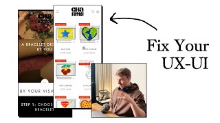
A CRO audit of a charm-bracelet product page. The speaker recommends a single hero slide with a strong headline about customization, then restructures the order form to let customers pick charms before bracelet color, with the color dynamically updating the charm display. He suggests leading with the "buy 10 charms, get the bracelet free" offer to boost perceived value.
Chapters
With mobile and with your e-commerce store, everything needs to be punchy, quick, and easy for people to read, consume, and know what the next action step is. And your hero section, this section right here, is the most important part of this page. So what I would say that you can do to improve this is keep just to one slide, don't have any other slide on there. And that one slide, we're going to use the best image that shows your product. And we're going to have a really nice headline in there that communicates exactly what you do. And like, your headline could be, you know, it could be talking about the unique selling point of your, of your brand. And so maybe you say a bracelet designed by you. You know, that could be your headline. So charm bracelets, you know, designed by you or something along those lines, where in the headline, you're calling out exactly what you guys sell, and exactly what the unique selling point is of it, the fact that you customize it. So that needs to be communicated in your headline and also in the image that you use. This image back here is nice, but again, it's just like your hero section needs to have a strong headline, maybe a supporting subheadline. So like a line or two that kind of, you know, expands upon the headline, you know, dives in a bit deeper. And then a clear button, like a clear call to action button that will say, you know, customize my 'Get My Bracelet' or 'Get My Bracelet,' 'Get My Charm Bracelets,' or 'Shop Charm Bracelets,' something like that, you know. And then that button will either scroll them down to this section or redirect them to like the product page. Or instead of having a subheadline, you can literally just list 3 bullet points, you know, that give them a little, you know, short, concise, more information about your brand and what the benefits are. This I have a problem with, right? Because you're expecting people to like scroll down and understand the process. I get what your process is. But this needs to be okay. So I guess there's going to be two parts to this audit. The first part of this audit is what I've just mentioned on your hero section. I think if you, if you look at some of even the other examples I post on x.com, some of the other hero sections, you'll, you'll be able to understand like the framework that I'm talking about here. Really strong headline. You know, you know what, I'd even, I'll even pull up something here. So I think it might be more visual. Let's go to services. You can see down here, these are some, you know, really simple but optimized hero sections that we've done for some brands, like this one with Anthros. You know, 3 words is their headline. And then we got 3 bullet points, and then we got a call to action button. That's it. I mean, you can add in social proof as well, if you've— I mean, if you want to build more trust, but those are the most essential things, having a really strong headline, having 3 bullet points in there that maybe explain your unique selling point, and then a button, you need to have a button in there just to make it easy for people to like engage and take the next action step. So I would honestly look, take a look at this, see if you can model this on your, on your store. And that will definitely get you some better results here. The next part of this audit is going to be looking at your order form here, because I can, I can already see how we can simplify things for people. And that's all I'm trying to, trying to do here on this audit is I'm just trying to think as a customer who's going through your experience, how can we give them an easier, a more effortless experience. And one of the best ways to do that is if we know that they, they need to buy the bracelet and then select a few different charms, how can we bring this functionality that we've got down here into the order form up here? And so maybe it could be something like they choose the color option. And then there's another option underneath that's choose your charm. And they can select one or then they can select 10, they can they can select how many different variations that they want. That's something that we— that you need to kind of like dive into on how the functionality is going to be set up. But that's the principle. Principle is, how can we make it super easy for people to actually get to get that? And I'm actually just thinking, because you're offering the bracelet for free, is there a different way that we can position this to make it even more appealing to people? Like, what if you did it in reverse? What if instead of them, instead of them seeing the bracelet as the first thing, what if the first step was to pick out your 10 charms? And once you have your 10 charms selected, then all you just need to do is choose which color bracelet you want, gold or silver, and you're going to get it for free. Do you get what I mean? Like, that will actually be something really cool for you guys to like test because you're now kind of like almost pushing more people to buy the full thing. And it's like, why would they come to you and just buy the basic bracelet? Doesn't really make any sense. So this offer that you've got down here, like buy 10 charms to get the bracelet for free, that's actually pretty appealing. But I think it just needs to be repositioned better. Instead of getting step 1 to choose the bracelet, I definitely think step 1 should be to picking out your charms because this, these are, these are the like the beautiful part of your brand. Like these are all the unique designs, right? You know, so I actually think now from looking at this a bit more deeply that this should be step 1. Choosing your charms, and then you have in your bracket, choose 10. And then you're going to get your bracelet for free. And then step 2 is then going to be picking out the different color for your bracelet. I definitely think that'll be a better flow for people to go through, at least test it and see these collections down here. Okay, you've got golden charms. So I'm hoping, by the way, that— okay, I see what's going on here. Okay, so you got silver and gold charms that are basically the same. So I understand now why you've done— I'm assuming that this would update. Oh no, it doesn't update. I was assuming that once you click this, it would update the charms down here. Okay, so this is another issue. If someone buys like the gold bracelet, they're probably not going to want the silver charms, right? Because then they won't really look— they won't really integrate that well. So I think, okay. It's funny, it's like the, the flow for this is pretty simple. But we just need to, like, I'm just, I'm the way my mind is working is like, how are you going to set this up on the backend so that it's easy for people? Like right now, I think it's a little confusing. You know, I think it's a little confusing how everything is laid out. And this is basically this whole audit that I'm talking about here is UI/UX. This is the, that's why UI/UX these days is like such a valuable area of, of like marketing and design, because, you know, you really kind of need to like put your brain to this and really dive deep into how the user is engaging with your store and really figuring out, okay, how can we make this as effortless as possible? So kind of like looking at this again, what's the most easiest flow that I think people can go through to like shop from your store? I definitely think the first step is them picking up the charms, you know, so that should be the first step. And the, and then you can basically say that when they select the bracelet, it should, it should really update the charms that they've selected to whatever color that they want, you know, because then that would make the most sense, right? Unless you're going to tell me that actually some people do have silver charms on a gold bracelet and they like it. If that's, if that's the case, then ignore that functionality. But something like that needs to be there where Step 1, I pick out my 10 charms. Step 2, I choose the color and chain bracelet that I want. And then that's it. I convert, you know, and ideally, this functionality should be all in one section, you know, so in a section like this, where it's like, customize your charm bracelet, you know, that's where all of this should be done.










