How To Increase Average Order Value
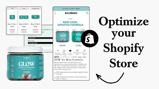
Shopify founders should optimize product pages immediately when scaling. Use clear images showing bundles and gifts, a 7-to-10 image carousel with benefits and social proof, simplified checkout with subscription options, limited discounts with expiry dates, and strategic reviews. The product page drives 90% of conversions.
Chapters
A question I get asked a lot from Shopify founders is, I'm scaling a small brand, when should I start doing conversion rate optimization or CRO? And my answer to them is always, you should start implementing the basics of CRO straight away, because the minute you do, you will start improving the performance of your ads. You'll start to actually become more profitable, and you'll be able to actually scale a lot faster and a lot more reliably. And in this video, I'm going to show you how you can actually start doing it to get some results today. Let's go. So let's see here, sea moss gummies. So sea harvested and scientifically proven ingredients to reduce and prevent wrinkles and fine lines. See here, a 6-pack, 2-pack, okay, 1-pack or 2-pack. Wait, here, this is actually 2-pack. Oh yeah, because this is buy one get one free. Okay, this is a little bit misleading here. Just show that you're getting 2 in there for instead of 1 visual. Show that you're getting 4 in here and show that you're getting 6 in here. And you can redesign them to show that there's a free gift. So I'll just show you this for the offer page. So once these images just load in, we're still waiting on one of the assets here so that we can put into this image. But basically, what I wanted to say is, for your image, you want to call out everything that's included and really everything so that it's super clear to people that when they see the image and they look at the pricing, equate the value. That's how your image can be a lot stronger. Because as I was like skimming through there, it's very easy to misread the buy one get one free or to think, okay, wow, I'm paying like $30 or $40 for like one item. Like, you don't want any bit of confusion like that to be— your customer to have any confusion like that. So just make it super clear to them, super obvious of all the free value that they're getting. And if you're scared about putting, let's say, multiple items into the image, you can just add like a free badge next to them, like what we've done here. Let's go back up here to the top because I want to start up here at the top. So, new look, updated formula. I would love to know what the reason is behind why you've done this. Because this is the first image that they're seeing when they come to this product page. Now, I'm assuming that the funnel that you have set up is going to be ads. Okay, and then they're going to this page. I'm assuming there's no other page before that. So if this is the first time that new shoppers are coming across your brand, and they're not being retargeted, why would it make sense to show them what the branding was before and what it is now? The only reason I can see that you've done this is because your ads are showing this but your new branding is this. That's the only reason I could, I could see you doing this. It's a bit of a shame because this first photo could be so much more powerful if we showed like a lifestyle shot of it. Or if we showed instead of this headline up here, new look updated formula, we actually said something that related to like the benefit or the end desire that the customer had about the product. So it's just a bit of a shame if there is a constraint there, because we could have used this, we could have got more leverage out of it basically. The big thing that I can see straight away just from going through this page is the structure is really hard to read. So everything's crammed together and you're trying to say a lot in such a small space. Simplify everything down. Like, this is a product. Again, I don't think you need to go too crazy with trying to squeeze all of the information into such a small space being the order form. You've got this image carousel over here. This is where you're going to get the most results from. I'd spend 90% of my time on this product page, going through the order form images in this listing images, and optimizing each and every single one. And the reason for that is because from the product page, the majority of customers, the majority of shoppers, they engage with this section the most. And so this is where they're going to get sold or not sold from. So how this listing photo carousel should be and how it should be best structured is it should be giving them all the information that a landing page would give them, but in a condensed format. So really, it should have maybe like 7 to like 10 photos in total maximum. But from those 10 photos or 7 to 10 photos, I should get all of the, like the core pieces of information that I need to convince me that I'm ready to buy. So it should have all the top benefits that your product provides, how it works, why it's better to alternatives on the market, some featured reviews that highlight different objections, some lifestyle photos to give it that premium quality and actually see it in the environment and And that also builds trust when you have premium imagery. And then of course, some customer user-generated photos, and that can be these transformation photos that we see here. So the other really important section is this section down here. Now I have tested this over and over again. When you have 3 columns stacked horizontally side by side, like you have now, they actually perform worse than if you were to stack them on top of each other. So this is a really, really optimized and simple order form that we've designed for row. So the reason why I want to bring this up is just look at what the difference is between your one and what we're doing for them. It's a lot simpler. We're calling out the quantity and then we're calling out if they want to do a one-time or subscription. And that is also something that I think you would benefit from as well. But you have the one-time purchase over here, but why not offer a subscription as well and incentivize people to get on that if they want to get on it? I wouldn't hard push them towards a subscription because getting them to subscribe versus getting them to spend more, but one time off is a lot harder. So you're— so it's easier to actually get them to spend more upfront, but only once than it is to get them to spend less but subscribe. That's the interesting thing about how people work. So what I would say that you can do to improve this is make sure that you are calling out exactly the images that relate to your offer. So you can see we got 1 bottle, we got 3 bottles, we got 6 bottles. Now I know that the offer that you're running is the buy one and get one free, and that's why you've got this discount running here. But I always say to people that if you want to build a long-term brand that will be able to scale reliably in the long term, you're— you can't afford to dilute your brand value by running evergreen discounts. So if you are discounting this and running this offer, always give like a time period of when this offer will expire and stick to it so that people know that you're serious. Because what will happen, maybe not now, but in the long term, is people will be trained to wait for your discounts, and then you're going to run into problems upstream. Most people don't think about this when they're in the scaling stage, because they just want to sell. But once you have customers, and you've got a large database, and people are looking up reviews, and they're, you know, and you've got other products you're trying to introduce to your store, that's when these things can be an issue. So I'm just saying, just trying to bring it to your attention. I'm not saying you need to change this, because it may be working very well for you. But when it comes to like the offer, there's always other ways that you can reposition it to make sure that your brand value is being protected and obviously actually increase your AOV even more because people would perceive it in a more positive and more desirable way. So bring in the imagery that represents how much people are going to get here, stack it horizontally, show the actual price savings like you can actually see here. And then of course I would introduce a subscription, give people the option to at least What I would say when it comes to reviews, I'm not going to read each and every single one of these. But whenever you are featuring a review, you have the data from your ads, you've got the data from your customer base, if you've been scaling this for a while now, pick out a review that will handle or touch upon or complement a really winning ad angle that you have. Such a simple but really powerful way to get a lot more juice from the content that you already have. Because let's say you have an objection that a lot of people have, or you got a winning ad angle that's like, you you find a review, let's say down here, that's, I don't know, let's just pick out this one. And let's just say that the issue that keeps on coming up, that I've been struggling with skin texture and dry spots, and I really want to have like an easy way to, to fix that problem. And I'm having to do like a really expensive skincare routine. Let's say that's the winning ad angle, something to do with that. And then you can bring in this review of my skin feels so soft now, and it will touch upon those exact points. That can be really powerful when you do it in the right way. So you have an FAQ section down here, that's fine. What I would say is I would honestly just follow the same structure that an optimized order form has. So this page is what we have designed for another brand that we're working with, and you can see same principles I'm talking about here. But the way that we're structuring the information is really important. We're just making it very easy for them to consume the most important pieces of information. So we're giving them benefits, we're showing some social proof up here, Restructuring everything to make it really clear for people to see what they're actually getting. So this is what the order form that they had originally, and this was the only image that they had. Obviously we're including a different image here to show everything they're getting to increase the value perception. And then when it comes down to the frequency selector, we're trying to communicate the most important pieces of information and really show them, okay, which option is best for them. So in the add to cart button, we're calling out the guarantee, and right underneath that we're giving these dropdown tabs that give people more information. And this is important because you don't want to, you don't want to completely cram your order form with loads and loads of content. Save that for your listing photos up here. And if people want extra information where they want to read, that's where you can save for these tabs down here. So I would put the FAQs underneath this section, and I would keep these tabs in here and figure out what are those top 3 tabs for you, for your brand, for your product. So they could be, let's say, information about the benefits. It could be information about what's actually included or What the ingredients— that could be a really important one, actually, is the ingredients in the actual gummy themselves. And when you're actually going in displaying this information, don't just have it as like a wall of text, make it easier for people to read. So have like a box inside the tab that calls out the key piece of information, bold certain pieces of text. And then of course, if you're showing the ingredients or anything like that, show the actual ingredients, like show the images of the different ingredients in there and list them. The core principle there is the easier it is for people to read and navigate your store, the more likely they're going to convert. And of course, the more they will convert. Cool. So hopefully you got some value from that. If you have any questions from this, let me know. Cheers. If you're looking for further help, we do offer a service so we can craft a high-converting landing page that is designed to outbeat your current page by at least 10%. Our specialty is designing these high-converting landing pages, and we pretty much do this every day for the e-com clients we work with, such as Snow, CarePod, Soloway, Velvet Caviar, and many more DTC brands, helping them to increase their ad performance and get better results in terms of their conversion rate, average order value, and overall profitability. If you're interested in learning what results we can get for you and how our process works, then check out the description. There are links to our website, and of course, you can also book in a call with me and answer any questions you have. Cool, and I hope you got some value from this video.










