How To Leverage "Sales Psychology" To Design Better
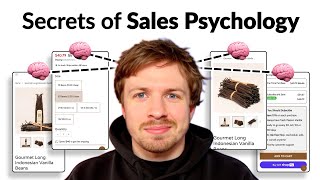
Speaker A breaks down e-commerce design tactics rooted in sales psychology: show quantity with icons, limit options to cut decision fatigue, display tiered-price savings clearly, pre-select subscriptions, and add order counts as social proof. Small design choices compound to boost trust and conversion rates.
Chapters
A very easy way that you can increase perceived value is by showing it visually. So for example, 10 beans, have a little icon in here or show an image of 10 beans next to it, then show 30 beans and then show what these sizes look like. If we take a look at this product over here, you can see 1 bottle, we're showing 1 bottle, 3 bottles, we're showing 3 bottles, 6 bottles, we're showing 6 bottles. And the whole point of that is so that we can increase the perceived value so that when people see the price tag, they're not going to go, oh, wow, that's a lot of money. They're equating it to the actual quantity they're going to get as well. And that's how you justify value. People want to see it visually, not just in text form. So this is a really powerful strategy that you can do to just make it easier for your customers to see the value behind your offers that you're doing. Another thing that I also say is giving anyone more than 4 options is a little bit on the, on the high side, because the more options you give people to choose, decision fatigue sets in or is more likely to set in, I should say. So I would also test and I would look at your data first of all and see, well, what are the top 3 or 4 options that most people choose? And then remove the other option. Just test it out for a few weeks, remove it and see if that actually helps more people to more quickly make their decision. And that's what you're trying to do at the end of the day. You're not trying to give people 1,000 different options for them to choose. You're trying to see, okay, well, what are the most popular options? That we know most of our customers like, and then set those options for new customers that are going to come in. Because the more easy you can help people make a decision, the more likely they're going to make a decision. That's the key. That's the key behind all of this. So that's what I'd recommend there. Another thing that I would recommend is how you're displaying this information. Because what is the key information that I want to know? It's the size, so the quantity of what I'm getting. I want to see the visual element so that I can equate the price to the value that I'm also getting. But the other key information is the price. And the problem with how you've displayed all the information is all that information is kind of crammed together. So it's not easy to make a comparison straight away. And we're talking about speed here. If you wanna make it easy for people to make a decision, we need to make all the information structured the same. So even when you're saying 10 beans, 30 beans, you should have carried that through for these as well. And underneath each of them, you should have put the other form of the weight metric in here as well, so pounds. Should be under each of them, or ounces, whatever one you actually want to go for. So you're using several different weight metrics in here, and that's obviously just going to slow down people that little bit more on making a decision. So for example, if I go back to Ro, you can see it's just 1 bottle, 3 bottles, and 6 bottles. But for you, if you want to include those 2 different weight metrics, pick one. So I would go for the 10 beans, the 30 beans, and then figure out how many beans are in here how many beans are in here, how many beans are in here, but also include the other weight in here as well. So you can say a quarter pound, you could say whatever this is in pounds, whatever that is in pounds, and put that information underneath in a little bit smaller text. Put the price on the far right, exactly how we're structuring it for Ro. You can see the prices on the right. And then show people visually what they're actually saving. So when they get the 10 beans, your lowest item, that's the one that you should keep at full price. If they buy your lowest tier item, they're paying the full price for it. But as they upgrade, they're actually going to be saving more and more. And that's what you need to show people so that instead of them looking at it and being like, okay, I don't know if I want to pay that much more for these beans, they're looking at it in a different way and saying, oh, I'm actually saving a little bit more. I know I want these beans. But actually, if I upgrade, I'm going to be saving a lot more. So you're giving a rational reason to their rational side of their brain on why they should be spending more with you first time. And that's kind of the art of marketing and sales psychology behind all of this. So that's something I definitely recommend there. I know we've kind of dived very, very deep into the size selector. But for you, I think this is definitely a high leverage opportunity over here. Now you have the price up here, you've also got the price down here as well. That's fine. You have the frequency options. That's cool. And I'm glad to see that you are, you're not giving a discount on the lowest tier item. That's good to see. And you're giving a discount on there, that's good to see as well. But you need to show the savings inside the little size selector so it makes it easier for them to actually compare at a glance. People don't want to have to be scrolling up and scrolling down to figure all of that out. I would also trim down on some of these items down here, like this Shop with Shop Pay button. I would get rid of that. Save that for the next step in the funnel. Just keep your Add to Cart button, the main CTA that you're trying to promote. And also, why you should subscribe. All of this information here should be inside the subscription box. And you could also pre-select that by default. See how we're doing it for row? It's a lot cleaner. But by making the whole design, the UX/UI cleaner, we're making it easier for people to actually see the information. That's something that people don't understand about design is they think, oh, good design is just for the marketer's eye or it's just for the founder's eye. It's just to make things look pretty. But good design is when you actually help your main objective, which is, in your case, it's selling more of your items. Is scaling your store, and how good design can help that is by making the information easier to consume for the consumer, for the shopper. So in your case, better design means spacing the elements out better, including the right information, making the information more structured and cohesive, it's the same format. So like I mentioned about the using the same weight metrics, having the information structured the same, showing the price savings, these things, although they may seem small, because we're talking about them in specifics, they all stack and compound on each other. So I would definitely execute on what I'm talking about here. Now you have the social proof up here. So you see 5 reviews. But if I'm a first-time customer, and I'm coming across this, 5 reviews doesn't really seem that compelling. So instead of 5 reviews, or in addition to it, you could also put in brackets how many customers you've already served or how many orders you shipped. And that is obviously going to be a much higher number. So But that just gives me another form of social proof. And at the end of the day, the whole goal of social proof is to build trust with new customers. Because one of the big concerns any new customer has when they first land on the store is, is this brand going to steal my money and not give me anything? But if they see other people have shopped with you, that kind of puts their fear-based mind at ease. And so that's something you need to be communicating here as well. If you've got really, really low social proof, like 5 reviews, That's not going to help my fear-based mind. That's, that's going to do the opposite. That's going to make me start asking questions. So bring in some proper social proof in here. If you don't have a large amount of orders shipped, then instead of having 5 reviews, bring in some strategic reviews, get rid of this and put in a quote or two from other customers that have loved your experience, that have loved your product, and you can feature them in there and ideally feature them with a face of the person as well. So that's how you can make this a lot more powerful. And when it comes to your photos, I think your photos are great, but there's also opportunity to put some text in here as well. Give people a little bit more education. So instead of them having to scroll down and can learn about your product and learn about all of these different things, how can we put all of this information in the product listing photos? Because this is gonna be the main element that people engage through. Cool. So those are some of my tips.
If you're looking for further help, we do offer a service so we can craft a high-converting landing page that is designed to outbeat your current page by at least 10%. Our specialty is designing these high-converting landing pages, and we pretty much do this every day for the e-com clients that we work with, such as Snow, Carepaw, Soloway, Velvet Caviar, and many more DTC brands, helping them to increase their ad performance and get better results in terms of their conversion rate, average order value, and overall profitability. If you're interested in learning what results we can get for you and how our process works, then check out the description. There are links to our website, and of course, you can also book in a call with me and answer any questions you have. Cool, and I hope you got some value from this video.










