How To Optimize Your Landing Page For Mobile Devices
Pedro Loureiro walks through building landing pages that convert on mobile. He covers mobile-first design, simplified hero sections, vertical scrolling patterns, compact USPs, and strategic placement of reviews, guarantees, and CTAs to reduce friction.
Chapters
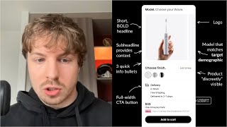
On this video, I'm going to show you exactly how I approach optimizing every single landing page I do for mobile so that it converts at the best, and how you can take these principles and apply them to your own store. Your mobile experience is so different to your desktop experience. And that's why when we do landing pages for the brands that we work with, we design them completely separately. We do mobile version first, always. It's like a rule. So these are the principles that go into having a really, really optimize a mobile landing page or store. You can take these principles and apply them anywhere. When it comes to a mobile hero section, I just like to make it as simple as possible. What I see a lot of people do is in their mobile hero section, they overwhelm the user. They put so much text in there. They put crazy visuals. They put crazy colors in there. And the whole thing just is a mess, is a visual mess. And the thing is, You've got to remember, the, you know, desktop is very— is less sensitive to, let's say, the user experience, because people are on a desktop, they have more control with their mouse. On a mobile, it's very sensitive to the user experience. Any slight bit of resistance or friction that you create on your mobile, you're increasing the chances dramatically of people bouncing and leaving your store. That's why there's like a saying with mobile design, that every pixel counts, you know, and every single pixel does count, is high real estate. So you need to think of every single element on your mobile design as being really, really expensive in terms of the real estate that it's taking up. By having this mindset, when you're adding in an element or taking an element, ask yourself, is this going to increase the chances of someone purchasing the product? Or is it going to increase the chances of someone bouncing from the page? That's the mindset you need to think of when you're going into designing a hero section. So you can see with a section like this that we designed for a client row, we've just stripped it down to like the bare essentials. We have social proof, we have a really, really strong headline that captures, you know, what these people actually want. And then we have 3 benefits, a button, and a guarantee, and a really, really nice image. And that's it. That's it. It's very simple, very simple. And yet people, when they look at this, they think, oh wow, you know, it's so aesthetically pleasing. It's aesthetically pleasing because it's simple. And it does the job that it's meant to do. You know, if we go down to the second section, let's go down to another section over here, like the problem solution, the section underneath. So this section is notoriously, you know, brands that do this section, they notoriously inject a lot of copy into this, you know, they go in depth on the, on the problem, and, you know, all the different aspects of it. And it's like an essay. And it doesn't need to be. This section, all you're trying to do is like a single paragraph is enough. You know, you want to introduce the problem, paint where they are right now, then introduce where they can get to, and then have your product be basically the bridge or the vehicle that will take them from where they are to where they want to be. And that's it. And as you can see here, one of the things that we like to do, because we know this section is so copy-heavy, and, you know, compared to the other sections on the page, we like to introduce graphics and boxes, like visual boxes like this, to break it up so it seems more appealing to read through. So you can see this, you know, if we, if we just took it, all the copy from this section and we didn't put any graphics in there, I can guarantee you very, very little people would actually read this. So one principle that I would, you know, one tip that you can take from this is if you have a really, really copy-intensive section and you can't really trim it down anymore, you don't want to because it will weaken it. Add in some images, add in some graphics, try and break it up. You know, another thing to do for mobile that will really, really help you is make sure that you're using about 150 pixels in line height— percentage in line height, sorry. Because what this will do is I see a lot of brands and what they do is they literally have the text like this. This is what their text is. It's crammed together like this. And it just makes it really, really hard to read. And what they do is they literally have their problem solution section is like this. It's like an essay like that. So what you want to do is you want to just make it as readable for people as possible. So when you have 150% line height like this, you're giving people more space between the lines. It's more like a book, it's easy to read. Because if you look at a well-written book, a well-written book has— breaks up the text quite nicely. So for example, this is not like a novel. This is, you know, a psychology book on, you know, how to optimize your mindset and your body and everything like that. But this book is very, very good. I actually recommend reading it. It's really, really good. One of the best books on psychology I've ever read. So as you can see in this book, they're using nice line height. So it's actually very easy to read. You know, the text is not too small. But they're also, if you can see what they're doing, whenever they have a really, really important point that they want you to look at, you can see that very visually in a box or they have a different styled element. In the same way, look at how we're doing it. We have different boxes where even if someone is skimming through this page, we can try and bring their eye to this. And then, you know, if they're interested or if they're hooked by this, then they can go on to read the rest of the section. Because in a way, this is how people read normally when they come to, let's say, a landing page or, you know, any other material that they're on the web that they're skimming through. When you have people who are skimming through things, this is normal for a lot of people who who are shopping, and they're in that, in that mindset, they're looking for different pieces of information. And these different pieces of information are unique to every single person who comes into your store. So for example, for example, I think a lot of people think that when people land on a landing page, they go through section by section by section, very, very structured, you know, one by one by one. That is not how people interact with landing pages at all. If you look at heat map data, if you look at you know, like a tool like Hotjar or heatmaps.com, and you look at the way that people are engaging with your page and navigating through it, you will see that they swipe through, they swipe down, they maybe stop at a different section that catches their eye, then they may scroll back up, then they may scroll all the way down to the bottom of the page, and then they may scroll up again, then they may leave the page for a few minutes, and they may come back to the landing page and then scroll down further, and then they may purchase. So this is how This is the normal behavior of how people shop on the page. And what I see a lot of people do is they try to, you know, grip and force people through this very rigid experience. You know, instead of trying to force people through a rigid experience, adapt to how people are naturally engaging with your experience, and then, you know, build around it. So take this principle from a book. One of the things I like to do is through a landing page, if there's very, very important parts that we want people to see, and we know that they're skimming through, we highlight them by doing what I call pattern interrupts. So you can see here, this is what I call a pattern interrupt. You know, we have a lot of whitespace, but then this section is really drawing a lot of your attention to. And if someone is really interested by this section, if they're like, oh, wow, yeah, I'm feeling a lot of increased stress or increased anxiety, and I don't want that, then they're going to be hooked in to read more about this section. But if someone is not interested in this information, they're interested in something else, they can then go scroll on and read further down to another section that captures their interest. And since like TikTok has become a big thing, and Instagram, YouTube Shorts, the way that people engage with pages has changed quite a lot. Like when I used to design pages, I used to have a lot of carousels, like horizontal carousels where people would like swipe through and engage with content. But less and less people I'm seeing from the data are engaging with those things. And I definitely believe that this is because of TikTok and Shorts and everything where people are trained to like scroll vertically. So to adapt to this behavior, what we're doing now on more and more of our pages is we are displaying the information vertically. Now this is harder in some aspects because this means we need to be a lot more strategic with the information we're using because we don't want to make the page super long vertically. One clever way that we're getting around this is like by using dropdowns. So you can see for this benefits section, we used to have this information in the carousel, but of course, people are not engaging with that anymore. So we have to think of a different way that we can, you know, make sure it's easier for them to engage with. So if you have a carousel section, try and test out using this vertical dropdown section instead. So you can see, now keep in mind that all of these sections will be closed by default. So all they'll be able to see is like the headline for each of these first. And then if they want to click in, and read more about it, then you just click into it. So this is a really clever way of saving space, but then also having all of the information on display if people want to click into a specific thing, if that makes sense. So like I mentioned before, an overview section is great if you have a specific USP that you want to highlight with your product. And again, same principles that I said at the start, don't overdo it, keep it simple. If you can use bullet points or icons or a single paragraph, or even just a headline and image to get this across, then use that. One of the other main principles that I use, not just in mobile design, but in just designing landing pages in general, is think to yourself, what would perfection look like when it comes to a landing page? And what perfection would look like is if you could sell people on one single section with one image and one, let's say, word. That would be perfection. That would be the least amount of text and the least amount of elements. That you could use to sell someone. So if you do that, you would be like a master. So always think about that. Always think less, less but better. You know, if you can try and reduce elements and make it easier for people to go through the page, you're going to, you know, make it more effortless for people to learn about your brand, learn about the product, and then of course convert. The how to use section. Use images instead of copy to communicate how your product actually works or how to use it. Page. You want to keep it as visual and as simple and as engaging as possible to keep people scrolling and keep people hooked throughout the page. Okay, so one way you can do this is, like I said, using images. And you can see here, for like Ro, one of our brand's creatine products, we just said grab, squeeze, sip, and go. And because we're just using one word and we're just using images, it actually feels simple. And it is simple. All they're doing is they're just picking up the bottle consuming it. That's it. You know what I mean? So you don't want to make it like an essay. You don't want to make it feel laborious if they're having to consume your product. Featured reviews. So this is a, this is a really interesting one because I get asked the question a lot of the time, oh, for my, should I, when I have reviews on my page, should I use like a widget to have like, you know, 100 different reviews on there from my product page? Or should I, should I put in some featured reviews? And what I say is, it really does depend. Some cases you need both, some cases it's good to have a widget in there that will show all the reviews. But what I would say is, if you can pick out even just 3 featured reviews that highlight 3 specific objections that you know are the top objections that your customers have, and you can put them in this section, that will make it super powerful. So for example, if you have a product that, let's say, a hair dryer, a really expensive hair dryer, and you know that one of the big objections that people have is they're like, well, How fast does this hair dryer dry my hair? And that's one of the main questions that people have. Well, pick out a review where the first review that people see is someone may be saying from your customers who's bought your hair dryer is, oh my god, this dries my hair 3 times faster. It's saving me so much time. It's well worth the investment. Do you get what I mean? So if you have, if you know that there's like 2 or 3 really, really top objections that most of your customers have, This is where this section comes in. And this is where this section is really, really powerful. You don't need 5 reviews, you don't need 10 reviews, 3 will do the job if you make sure that they're strategic and that they, you know, point out the top objections. So an expert section, you want to keep this again, this design as minimal as possible. In some sections, you still will have to use carousels, but in short sections like this, where there's only 3 or 4 different slides, they work pretty well, you know, and again, these are just more like review sections. So people are not going to be learning information from them. They're just going to be there. The purpose of these sections is to just generate trust. So just by having this section in here, and people can see that there are other people vouching for your product, that in itself generates trust. Guarantee section, I do like to add this section in when, just before people are going into the offer section, just to highlight the guarantee, just to highlight that You know, there is really no risk in you trying out this product today. So with the offer section, what I would say is just keep it as simple as possible. Use white space. So a lot of people say, oh, you know, I should keep the design as cramped as possible. But by doing that, you're making it harder for people to read. If everything's cramped together, just like how the book I mentioned, if all of this information was cramped together, I wouldn't be able to read this book. But they use graphics, they have, you know, paragraphs and line breaks. So they— so when someone is editing this book, They're very specifically structuring this information in a way that's easy to read. The same with a landing page. You need to structure it in a way that's easy to read. Offer section is really important. So you need to make sure that you're breaking this information up, you're breaking this section up in a way that's easier to read. So you can see, one of the tricks that I use is I like to use these little lines. So for example, the color selector is in its own little section. The size is in its own little subsection. And then of course, choose your bundle. Is in its own little subsection. Simple, but effective. And then of course, I like to just highlight the guarantee as well around the call to action button again, just because I know this is where most people's eyeballs are going to be on, is on the call to action area around this area. So for the FAQ section, don't overdo it. I see a lot of people, they use about 20 to 30+ FAQs. It's too many FAQs. And what you do is by adding in more, thinking that you're going to answer more people's questions, less people engage with them because they can't find the ones that are really, really important. So I always say limit it to about 5 to 8 FAQs in total, but make sure they're really, really powerful ones. Actually do your research, actually, you know, research your customers and figure out what are the top questions or objections that people have before they purchase. Put those in the FAQ section and make sure that they answer their questions. This will just alone, you know, improve your conversions and help more people to convert. If you're going to optimize any section on your landing page, I would always start with your FAQs because it's going to be the simplest section for you to do. You're just literally writing text or removing some FAQs, and it will have probably one of the biggest impacts on your bottom line. Then of course, what I like to do at the bottom of any page or any landing page is I know that people have scrolled all the way down. So what you want to do is just make it easy for people to scroll all the way back up again. Again, the principle being reduce as much friction for them to get to the purchase section or for them to convert as possible. So that's what we like to do here. And what I do like to do is I try and use this section to kind of highlight the guarantee again. So you can see, we're in this section here, we're calling out the fact that it's 90 days risk-free to try out this product. And the same with this, we're just basically calling out the guarantee as well here below the call to action button. So if you made it to the end of this video, leave a like, subscribe, of course, I'm going to be putting out more of this content every single week, and leave a comment below and tell me some future video ideas you'd like me to do.