How To Optimize Your Shopify Mobile Navigation Menu
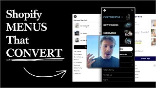
Pedro Loureiro shows how to redesign Shopify mobile menus to boost conversions, since 70-90% of mobile visitors use them. He walks through two case studies: Anthros simplified its menu to "Pick a style" with Office, Home, and Gaming options, while Ro Nutrition surfaced best-sellers and "Shop by Benefit" at the top. The key is prioritizing revenue-generating links and testing with heatmaps.
Chapters
The reason why we're putting a lot of effort into the navigation menu is because a lot of your, your mobile traffic, the majority of it, like on average, 70, 80, 90% of your mobile traffic isn't going to engage with your mobile navigation menu at some point. So your navigation menu, this little thing at the top of most people's stores that most people don't pay attention to, is such a critical part of your shopping experience. And what I found through the last few years of doing split tests and working with different brands is that The optimizations that we made on their navigation menu time and time again have proved to be the most profitable, you know, by far. And especially when you consider how, you know, easy it is, you know, compared to, let's say, doing full theme redesigns, optimizing your navigation menu is pretty straightforward. We've done two different navigation menu iterations for Antorus. So when we started working with them, the first improvement that we made was doing this V1 version over here. So the first version of our navigation menu over here tried to kind of communicate to people very, very quickly, exactly the different types of, you know, of chairs and the styles they can get. So if someone clicked on the pain relief, they'd understand all the different benefits of the Anthros chair for pain relief. If someone clicked on gamers, they understand, of course, the pain relief aspect of the chair, but also more of the styles and the different customization options you can do. And then high performers, it'd be just more about posture, etc., etc. So that's how we first did it. Now, one that obviously that version was obviously a lot better than the first one, which is just the default Shopify navigation menu that they had, which is absolutely terrible. This was the first version. But obviously, this was not the most optimized design that we did for it. So with a little bit more research and getting more data through this, we then decided to design a v2 version. And the v2 version was meant to simplify everything as much as possible. The art of CRO, or the real thing you're trying to accomplish with design, and marketing in general is to make it simple. And the more simple and straightforward you can make your message, you can make your design, your user experience, the easier it is for people to shop with you. That's really what it is in a nutshell. And you can see that we spent a bunch of time mapping out the navigation menu and laying out all the pages to try and understand how can we optimize the most easiest flow for the navigation menu. So with the Anthros chair, we didn't want to break it out into the 3 different customer types because we just thought that that's going to be confusing to people. And so what we've got here is, we've just tried to simplify everything as much as possible. And so when people are now opening the navigation menu, the first thing that they're seeing that's actually capturing their eye is to pick their style. And when they expand that, they're getting office and home and gaming. So we're just separating out to two, the two most important categories, people who are just interested in it for, you know, gaming, and want to understand different customization types and the styles. And the people who are more into, let's say, high performance into the office, you want a really ergonomic, and comfortable office chair that's going to last them, you know, decades to come. So that's how we've simplified everything. And the beauty about this new navigation menu is we're making the top most important pages, giving people access to them straight away. So for example, we're saying pick a style, so people can learn about the specific different styles there straight away. How it works, so people can understand all the science and engineering, you know, that's gone into this incredible chair. Straight away. The reviews. So you know, you've got social proof straight there from huge influencers that Anthros is partnered with as well. And of course, experts in the field. And then of course, where to try. So for people who are— because this is like a high-ticket product, for people who are still, let's say, on the fence, and actually want to try the chair first before making the investment, we've got that link there straight and handy. And then we got two more primary CTAs. So we have a Shop Now CTA. And I recommend this in most navigation menus to actually have this, just makes it super quick and easy for somebody just wants to instant information or just make the next step in their journey, they can just click Shop Now, and they'll go to like a landing page and learn a little bit more about it. Okay. And then we have Take the Posture Quiz. So this is another quiz that's in Anthorus's funnel that basically helps people understand, okay, how bad or good is your posture? And then how can Anthorus's chair help you? So that's obviously a really important part of Anthorus's funnel. So we have that in there. And of course, that wasn't present in the previous design. And of course, the secondary links, like, you know, this is actually duplicate over here, this wasn't in the, in the final design. But we have the secondary links, which are just extra information that's not really as important as the primary information. And so if I go onto their live site, you can see this is at the navigation menu. It's fully functioning and live. And if I go into mobile, you can see how it's actually mapped out on here. And of course, what we did, which is a nice little thing, is we just made the, one of the images over here a little GIF. And this is something that, you know, you might decide to do in your navigation menu as well, is actually include images into the links. It just makes them a little bit more visual. I've got another example of a navigation menu that we're currently working on. We've already done the mobile design, but we're still finalizing the desktop design over here. And that's for Ro Nutrition. We've done quite a few different variations of their navigation menus. And like I want to say again, the reason why we're putting in all this effort is because we know how important navigation menus are to conversions, how we, we know how important they are for mobile users to navigate a site. So we've just got a super simple for Ro. We've got their bestseller. You know, the two bestsellers straightaway clickable when people open up the navigation menu. Again, the principle behind this is we want to reduce friction for people to get to where they want to be. The more you can do that, the more people you're going to convert. It is really that simple. And then we've got their bundles, since we know that bundling is obviously a high AOV activity. And with ROW, quite a lot of their sales are now coming from bundles. So we want to make that, you know, easy for people to interact with. Straight away. And then we've got shop by benefit, but we basically are actually separating out the different products by category by benefit. So it's easier for people who comes on the store. And let's say they don't understand the bestsellers, or they don't really know about the bundles, but they know what they actually want in mind. So they know, okay, you know what, I want to maybe, you know, help my aging, or I want to get more energy or to support my joints, they can actually shop by benefit and get to get to learn more about the products that will actually help them. With that specific need. And then you can see here again, we're putting in a shop all CTA for someone who's just wants to, let's say, have a quick overview of all the different products and actually make the next step in the journey. They can have that and interact with it straight away. Then we have secondary links down here that are not as important, all displayed down there. And then this is how we've kind of mapped it out for desktop. So those are two recent examples of some client work we've done for navigation menus. So what are some key takeaways from this video? Well, the first thing is obviously just to draw awareness to how important your navigation menu is. And if you are doing any optimizations to your store, this is the first place that I would start with. Start with your navigation menu, see if you can just look at your user journey, maybe install some heatmap software on there, follow your user journey, look at some, you know, recordings of people navigating through your store on mobile, and actually see, is there a way that you can design or make some tweaks to your navigation menu to make it easier for people to get to where they want to be? And that is really the, the goal of what you're trying to do. The more you can make it easy for people to get to where they want to be, the higher your conversions are going to be. Another key takeaway is obviously make sure that your revenue-generating actions— and what I mean by those are your top links over— if I go back to ROE over here, these are your top revenue-generating activities like your bestsellers, your bundles, your, you know, shop by benefit. All of these links are directing straight to, you know, purchase activities. That's what I mean by it. Or make those actions visually the most, you know, engaging and important, you know, in terms of hierarchy, and make your secondary actions, which is, let's say, maybe slightly more educational, or maybe it's a bit about, you know, your story, or maybe it's about, let's say, wholesale or contact us, make those links less engaging, make them smaller, and let's say font size, or make them visually, just make them visually less engaging so that the first thing that when people see when they open up your navigation menu is not your About Us page or not your Wholesale page or not your Contact Us page. It's obviously going to be your bestsellers or your, your products and, you know, to learn more about your products and to basically the next step that's most likely going to help them understand more about your, about your product, about your business, and obviously convert. So those are the tips for navigation menus.