How To Optimize Your Shopify Store (Live CRO Redesign)
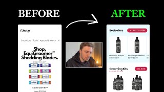
This content was created by Pedro Loureiro. This content was uploaded by Pedro Loureiro. This is a YouTube video titled "How To Optimize Your Shopify Store (Live CRO Redesign)" (content_type: YOUTUBE) created on 2024-11-22 and last edited 2026-03-26. The excerpt is an English, single-presenter walkthrough/tutorial in which the host performs a live conversion-rate-optimization redesign of a Shopify/store collection page in Figma. Topics covered include simplifying mobile navigation, surfacing bestsellers, creating bundles to raise AOV, product image/background handling, layout (2x2 grids, CTAs, shop-all buttons), social proof placement, SEO/education copy, and aesthetic improvements. The speaker narrates design decisions and practical tips while editing the page and assets.
Chapters
I came across the website and I just thought, you know what, why don't I just try and do a redesign and actually show you the process of me just approaching a redesign. And you can follow along with me live as we turn this design into, let's say, a little bit more optimized version and with all of the fundamental zero principles at work. So you can see here in their current store, they got Black Friday banner, they've got the announcement bar over here. I do think there's a little bit too much text. And the unique thing about this store when I came onto it the first time is I just thought, a bit interesting because they don't have like a traditional homepage, you know, they just went into straight into their collection page. Now, I think in the case of this brand, since they're driving a lot of organic traffic to their website, it probably makes sense for them to just have a collection page, they don't really need to talk too much about who they are or what they do, because all of the social proof is already built from their organic media source. So this is where, you know, sometimes you can go a little bit outside the box in terms of the traditional framework of a Shopify store, because depending on your traffic, you can of course just adjust your flow in the most optimal way. And of course, for this, for this brand, everyone is watching their videos or looking at them on Instagram, or coming to them from, let's say, the web, they understand who they are. So there's already that social proof that's built. So they can kind of get away with just going straight into the collection page, which is in their case, a little bit more of an easier flow for people to shop with them. So the big thing that I'm going to do is you can see they've got tons and tons of different products going on down here. Now what I'm going to try and do is, first of all, just clean up the navigation. You can see they've got different categories here, and I think the big issue with their current store is that there's no real way, easy way for people on mobile to like navigate between the different categories. They've got this like scrolling bar up here at the top, but their navigation menu itself is actually really, really bad. It's really, really poor. So what I want to do is first of all, just get the bestsellers, you know, above the fold straight away, and then just make it very, very easy for people to actually navigate to where they actually want to go. So we can try and group these by category, if that makes sense. So let's try and start off here. I'm going to try and see if I can grab this, grab this font. What font is this? Okay, so let's just go. So I'm going to start off here. Let's just make the width 360 width. I'm going to center it. And I'm going to drag it down here. And then I'm going to keep their navigation menu pretty much identical. Since not really much of an uplift is going to come from that anyway. But their navigation menu itself, like the internal navigation menu, that will certainly be. A nice uplift if I get some time to basically do that. So, just grouping things inside of frames to keep it easier inside of Figma for me to like navigate between. Let's set the width to full. Okay, and now let's just tidy things up a little bit. Let's bring this up to like 25 or something like that. And now let's just call the first category up here Shop. We can maybe make it a little bit bolder. Do something like that, bring it down. And then what I want to do is I want to bring it in, bring it in there. So what I want to do is the first thing is highlight the bestsellers. So I want to just maybe even create two different categories. The first category being shop bestsellers. I think that would be a very, very easy win. And then what we can do underneath that is we can do a shop By category, and then underneath that we can do maybe shop all. So 3 different categories. I think that'd be like the easiest and most simple way for like people to like navigate this store. Nice little tip is just separate them with like a black bar, just so it'll be easy for people to kind of scroll between them and understand what's going on. We don't need a black bar for the top. So bestsellers. So what we can do here is try and display things in a 2x2 grid. So you can see here. Got a 2x2 grid going on. I'm going to set it to full width. Let's go a little bit, 2 frames, so you can actually see what I'm doing here. Let's set it to full width. And I want to make them as big as possible here. So let's do something like, something like that. So let's first figure out what are their best sellers on their store. So let's go to desktop version, and I don't think they've actually graded them in terms of categories. Or they've set up a filter. It doesn't seem like it. But I just know from this brand before that their grooming products are the most, their most popular products. So if we go to, go to here, let's actually just see what we can do. So you know what, I'm just gonna, I'm just because I don't have the information straight away, I'm just gonna assume that let's say, let's say the de-shedding shampoo is their bestseller. And let's also say the conditioner and the blueberry bubblegum pet. We'll just take the first 3 products. Now, one other thing that I'd actually recommend for this store just straight off the bat, which I think is a really, really good idea, is offering bundles. I don't think they actually do it in terms of bundles. But, and their categories are kind of weird here because everything that they're offering is basically pet products. So I don't, it doesn't really make sense to have a category called pet products in and of itself, if that makes sense. So let me just go back to the homepage. One thing I would recommend, like I mentioned, is bundling these into bundles. And you know what, that is probably a category that we can create for them. So above Shop All, we can just create another category up here and then Shop Bundles. And then we can put underneath that, like a benefit of it. So we can just put like in, let's say, 16 font size bundle. Like, or maybe save up to, save up to, we'll say like save up to 15%. Okay. So we're just explaining to people that actually, if you bundle your products together, that you're actually going to save a little bit more. So let's do something like that. And let's do, let's just do 15. And let's bring this down to maybe 14. So it's not super And we can, I don't think they really have a color scheme, but I'm just going to go with this red since it looks quite nice. Save up to 15%. I think that looks good. And I think that looks good. And then they've got these quite thick fonts, so I'm going to try and do the really thick fonts as well with them. So let's just do that. Let's just do that. Let's just do that. Let's just do that. So I'm going to put bundles. I'm going to put bundles, let's say number 3. I think that makes sense. Categories, you know what, let's put it number 2. And let's put the— this is going to need a little bit more space. Let's keep on. So shop by category, this, this area over here, we can actually make this a little bit smaller. You know, so we can, or we can even just make it like a text list or something like that. So, because we don't need to, we don't need to make it too big. And then the shop all button will be down there at the bottom. So I like how we've got the structure going on here. It's a little bit neater. And then what we can do, just so it's easier for people to like navigate to a specific collection, because we can't obviously show the entire collection page. In just with two different products. So what we can do is we can include like a little shop all button over here. So for example, we can do something like this. So we can actually have it scrolling off the screen. Let me just do this so you can understand what I mean. So we've got three different products here. Yeah, like that. And then set the width to be 5. There we go. Perfect. And now one of them is like going to peek off the screen, as you can see. You can see there. And let me just clip content. So people will be able to like scroll between the different products over here and they'll be able to like navigate between them now. Let's just make sure these are all even, 150 width, 150 height. Same with this. And same with shop by category, even though I don't think I'm going to display the shop by category like that. I think I'm going to do something else a little bit more creative. All right, so we've got that done. You can even just, just even trim down the, trim down the text a little bit more. And then I can just say all, or shop all. Yep. Cool. So we're getting there. I'm going to actually put a call to action underneath the category. And I'm going to make it a black call to action. And I'm going to do a shop all button. So let's do rounded. Let's do a link inside there. And this is going to be a shop all button. It's always good to have a shop all button around the category section because, you know, this is a section where people are going to be drawn to, to actually see what different categories of products you have. And if they're still not sure about which product they actually want to, or which category they want to like go into, then a shoppable button is actually really handy. So it's just a nice little tip to have that available and on display on your store. So, just there. Simple little shoppable button. Let's make it 16 font height. Cool, something like that. It is perfect. And what I'm going to do here is then do, or you know what we can do? I think it might even be better to just have the button up here at the top, make it even smaller, because I think I'm gonna try and keep it consistent with all the other ones as well. So shop all can be just a small little one. Just make the padding 20. Yeah, something like that. I think that's actually even better. Maybe we can just bring it down a little bit more. I think that looks a little bit nicer. Bundle and save, because this is what I want to do now, you see. I want to create another frame inside of here. And I want to make it so that people can actually navigate to the bundles category. Shop. Shop bundles. Or we can just say all bundles. Let's do something like that. So the text, I can just do bundles. Sometimes you have to change the wording a little bit. Shop bundles, or just say all bundles. And then bestsellers, and I'm going to just say shop all, or just say all bestsellers. You can see that we're getting a little bit tight space for the wording, so I'm going to bring down my Size a little bit for the headlines. And then what I'm also going to do is just decrease the padding left to right to like 20 or even 18, just to give us a little bit more space. So cool. So now we have some nice little buttons in place here. I'm going to just decrease the space between these guys. So 15. This I think is going to be 10 or Let's try and do, try and do something smaller than that. Cool. 15. So now we're getting there. These little lines in between, we can just bring them down in opacity just to kind of clean things up a little bit, make it not so strong. And now we can start to populate the, the actual images. So, de-shedding shampoo. Let's just take this as the first image. Okay, so it's not letting me download the image from here. So I'm going to try and just use my little image downloader tool. And what I'm also going to do is try and open up Photoshop and actually just remove the background. So if I go here, Quick Actions, Remove Background, and go here. The reason being is it's going to be an all-white background homepage. So we can just make the product boxes themselves look a little bit cleaner by just removing the background or replacing it with like a light gray background. So I'll show you what I mean. In a second here. So let's just upload that. Let's go here. So as you can see, that's how it would look like normally. And you just have a bunch of these on your store, but you can see this, it just looks a little bit strange because there's no like defined area. But the minute I add like just a small light gray background, it just makes it look a lot more like a product and just cleans it up a little bit. So you can see just a subtle little change. And then I wouldn't have the product touching the bottom of the bar because it looks a little bit too crammed. So just bring it down a little bit, something like that. Done. And then we need the name for this. So what is this? This is, this product is the de-shedding shampoo, right? Yep, de-shedding shampoo. So We don't need to capture the whole name, so de-shedding shampoo, 16 oz. Let's do that. So we need to actually add in a little frame underneath this. So create another frame, do it there, go like that. And now I need to basically find out where this frame is on Figma. So there it is. There it is. So this needs to come down to Small font, so it's going to be pretty small. And we might need to use a different font like Poppins. Maybe we can go with like Lato or something like that for the body text. Just so, because I think Poppins, Poppins is maybe a little bit better for headlines, but for body text, I prefer just using a very clean and easy to read font. So Lato is a great font for that. And then de-shedding shampoo, and then what we can do is, this is another tip that I'd recommend for this store. But you can see that they offer basically one size of the de-shedding shampoo. But one really, really easy tip for them to increase their AOV and their profit basically is just add different sizes. So when I land on their de-shedding shampoo page, I could come to something like this. And I always basically show off this store because they're one of the best examples of doing bundling right. So you can see 1 bottle, 3 bottles, 6 bottles, having a functionality like this on their store. Super easy to do. But like, the power of it is, is amazing, because it's just making it super easy for people to not only get more of what they actually need to last for longer, but it also gives them a little discount. So you can see that the 3 bottles and the 6 bottles, it's actually cheaper for them per bottle to actually buy these versus the 1 bottle. So for people who are really sold on your brand, and you know that this brand, like, customers love them, they love the content that they're putting out on YouTube, So you're just making their lives easier, you're helping your customers save more money. And you're helping, you know, you're making it easier for them to shop with you. Because instead of them running out every month, or every 2 weeks or 45 days, now they can just buy like a 3-pack or 5-pack and have it last for like 3 months or 6 months. And of course, they're going to save a lot more money. So bundling is one of the best examples that you can do, one of the easiest ways that you can do to increase your AOV. So let's go with something like that, de-shedding shampoo, and then we can, we can put in the price in here as well. So, so it's about, I actually prefer just putting the, I prefer putting the original price first so that people see the higher number and then showing it actually discounted. But some other people have their own preferences with this sort of stuff. So something like that, very, very simple. And let's just decrease the space a little bit between these. So there we go, de-shrink shampoo, and then we have the price down there. And this is now going to be the form that we follow. So as you can see, now the shop bestsellers section is pretty much done. I'm actually going to change the button text inside of here to later as well, because I just think it's going to save a little bit more space and be a little bit easier to read. And let's do semi-bold. I think that looks a little bit better. More bundles and shop all. Cool. So we have 3 different buttons there and that just makes the whole section a little bit easier. So now the bundles. So like what I mentioned before, I would literally just take the, each of their different products and just bundle it. So for example, I can try and do this very, very quickly to show you what I mean. But creating an image for this is very easy. You just do something like that. Go back here, let's remove that background. And it's gonna, it's gonna cause me a little bit of trouble here. So let me do this. So de-shedding shampoo, or you know, you could even call it like, they don't even need to do a 3-pack of the shampoo, but they could call it like the, the, the de-shedding bundle. So like the de-shedding bundle. And you can, yeah, and look at this. So it's like, great, you have all the other products that come with it. So you could have the pet scent. This is going to come with it. I'm just going to do this a little bit faster so that I'm not taking up a little bit too much time here. So I come into this and let's say I want this. So I've got the pet spray now. I've got the shampoo and the other kit would be the conditioner, right? And is there anything else that we can put in this bundle that people would need? So for example, I mean, I don't want to put this in because some people are not going to want to— the idea for this bundle that I have is just we want to give people the essentials for the de-shedding of their dog that they need, but then also make it sure that, that it's, you know, it's able, it's able for them to actually repeat purchase it. So if we include like a pet spray, a pet wash sprayer, then they're not going to come back next time and buy the pet sprayer again. So you want to make sure that if you are doing bundles, you want to make sure that they're bundled in a way that people can actually repeat purchase. And you can see here, look, they actually have the image of the bundles together. So that would have saved me a little bit of time if I had seen that. There we go. There's our 3-pack, the de-shedding bundle. And we can, like, what would that price be? Let's just make up a number. So let's say it's 15 by 3, 47. So we can get them to like 45 or something like that. I'm just making this up and it would be about, let's say $60 or something like that. 60 or we can do $59.99. No, I'm not sure about the percentages if the math adds up, but just take my— take the principles from this. Don't take the actual numbers. You get, you get the point. Obviously, if someone is going to want to buy a bundle, they want to have a little bit of a discount to like incentivize them. To actually purchase. So always have a discount if you're offering your bundles. Obviously make sure that you do your math first to actually make sure it's within your margins. So we have the de-shedding bundle, and then we'd have some other bundles in here as well. Then of course what they could do, like aesthetically, they wanted to just, you know, change the background color a little bit. So maybe they would have, oh, it's not going to let me do that because, because I didn't take out the image in the background. But, you know, you would, you would do something nice and creative so that the the whole page as a whole doesn't look so bland, you know? And what we can do, because this is like a collection page, is just to bring a little bit of color and life into it, because I don't want to just like a stale white page. We can actually put in like, let's say, a nice little banner at the top and actually describe what they do. So, you know, who are they? What do they do? Let's actually see if they actually describe themselves. They have quite a nice social media following. So this is a great source of like social proof. You know, even, you know, I know that this brand is going to say to me, oh, you know, we have a lot of people coming from Instagram. So why will we put social proof there? Well, just in case, just in case anyone stumbles across this brand from the internet, and this is what they're greeted with, and they don't know about their YouTube channel, why not just promote the fact that you have a YouTube channel, you have some social proof. So if you have the social proof, show it off, you know, you earned it, you spent all the time creating the content. You know, so why not? So create a link. Let's delete that link. Do something like that. And they have like, I think they have like a couple of million followers on YouTube as well, or subscribers. So followers, and we can just say maybe like 1.2. I think it's like 2 point something million subscribers. Obviously, if I was actually doing this for real for them, working on the project, I would make sure these numbers are correct because you obviously don't want to make don't want to get your numbers wrong, because then if someone does check out your YouTube channel and sees it, sees that you don't have the subscribers that you're talking about, they're going to lose all of the trust that they, that they had with you. So obviously, if you are making any, putting any social proof on your website, make sure it's actually genuine, you know, because people are not dumb, they're gonna, they're gonna find out one way or another. So we have some awesome images of like the dogs that they've, that they've worked with. So we can actually see if we can try and get one of these. This one's a nice one, but I try and want to find an image, but these are all like photos. So one cool little tip for anyone who is in like the pet niche is if you actually go to midjourney.com and you type in happy pet, you're going to get like tons and tons of awesome images that you can use. And you know, that you can, you know, even like create a new prompt as well for your own brand. So this might be a nice little image that we can put in here, happy pet. So I'm going to download that one. This one's a cool one as well. I like that one. And then let's also get like, we need a cat in here as well because they do cats. So I want to try and get a realistic one though as well. So let's do happy pet. We can do a happy pet sitting. These ones are just Basically fake. Okay, here's a nice one. This looks kind of nice. So let's try and get that one. Not this one. This one looks great. Anything else here that we can use? Yeah, here we go. Another one. That's great. Perfect. So Photoshop, do your magic. Remove background. I think I'm going to use probably both of these, but let's just use this one. This one's actually a little bit nicer. Done. My naming scheme for files is, is not very structured, as you probably can notice. So here we go. Let's add in this image up here into the banner. Is it in the banner? No, it's not. So let's add it in. And then let's just like add like a nice little color into this. So maybe like a beige. It's a nice sort of pet color. So something like that, just a happy, happy color basically. And then we can, yeah, just do something like this. Maybe if you wanted to get really creative, we could add like a little mat underneath them. So it shows like the dogs and the cats are lying on something. Maybe we can bring in that secondary color, which is this sort of like pink that I chose. In here as well. Something like that could be cool. Let's add this as the social proof color. So 350,000 followers. And then we'd have 2.1 million subscribers. You know what, we don't even need the numbers there because I'm just gonna use the logos from YouTube. Let's try and get them. Iconify. Done. They probably have even more followers on TikTok, but I'm trying to not do everything on this video or else it will be an hour long. So there we go. That's that one done. Then YouTube, where was that icon? That's it. And that's better than, that's better than having no social proof on your page at all. And then let's just add a little title up here about actually what they sell. So Girl with the Dogs is their name. Girl with the Dogs. And then we can just have a little one-liner description to describe what their business is. So, making the world beautiful one pet at a time. I think that's quite nice. But I think we need to work on this because when people come to their website, that doesn't really apply as much. So it needs to be talking about the grooming products. So Actually, this might even be a better image over here. Her with the dog. So let's actually try and see if we can steal this. Because this is the lady. So let's do that. Let's try and take this. I could probably find another image of her on the web that might be better, but for the sake of speed, let's just take this one. And hopefully Photoshop will do a nice job of removing the background. Okay, it has. So let's replace that. There we go. Okay, I'm actually not a fan of how that image has turned out, so, because the background looks a little bit weird. So maybe we'll just keep this, and we will use Photoshop to enhance it. So one cool feature that you can do with Photoshop Web is, and with their AI tools, is you can actually, you know, use Generative Expand, and this will just expand more of the image on the left. So what this is useful for is like when you have an image that's cropped, you can expand it and then you can put some text over there. So you just gives you more space to transition the image out, which is really, really nice. So it makes for better graphics. So you can see it's a little bit strange, but this one's fine. This one I think will do. So let's just take that. Doesn't matter too much because I'm going to cover over it with a gradient. So let's take that. There we go. And do the whole thing. Send it back. And then what I'm going to do is just add this over it. I'm going to do a little gradient. Something like that. I think it's a little bit overexposed, this image, and it needs a little bit more color in there. Or something like that. The image quality itself is not great, but there's not much I can do in a short amount of time here. So it's gonna have to do for now. And then what we just wanna do is just make the gradient a little bit darker and then put another gradient over it to transition it super smoothly. Put that into black. Yeah, so something like that. Perfect. So girl with the dogs, and then we have, we could just say pet grooming products, pet grooming products, and they also sell merch, merch. And the third item we can put down will be, let's see. And like a blog, but I don't really want to put that there. Maybe the, maybe we can talk about the courses since, since this is another sort of high ticket item. Pet grooming products, merch, courses. So I feel that kind of hits all of it. Now, obviously, if I had a little bit more time, I would probably put little icons next to these just to make everything look a little bit prettier. But, uh, for the sake of time, I'm not going to do that. And then this category section down here, by the way, what I would probably do is I would either put it in these boxes, or another way that you could do it is just actually have it in text form. So what I mean by that is just literally have the links like this. So. And we'd have the categories, we'd have the categories over, where is their navigation menu? Okay. So the categories are over here. So, I don't really like how they're calling their categories because it's kind of, it's kind of confusing. So like, I would do a 2x2 grid. So since we can get everything on there, something like that. And then I need to make this a little bit bigger. There we go. The first product I would actually probably, or the first category I would say is bestsellers. Even though we're talking about it at the top, you'd be surprised some people can miss it. So we'd have bundles in here as well. Or we could have actually, we could just call them grooming kits actually. That might be better. Um, will that fit? Oh, it does. Okay, nice. Grooming kits. Perfect. That's actually quite nice. So grooming kits. Um, let's actually, what's the other category? So we've got Pet health. I think this is supplements, right? Is it? No. What is this? I want bestsellers and the grooming kits to be number 1. Then we have grooming products. We've got coat care. We've got pet toys. Then we've got pet health. Then we will have pet treats and pet treats. Collars and lashes. The reason why I'm removing the word pet now is because I think it's just getting a little bit too wordy. And then we just have collars and leashes, so it's fine. There we go. There we have all of our, all of our categories in there. And I'm just going to add a little bit more space to the top so it's a bit more easy to click. Let's just do 28. There you go. And there is basically all the different categories there and What we can even do, just to separate this out a little bit better, is make the shop all button for this category maybe full width, just to kind of differentiate it a little bit more. There we go. Shop all. So grooming kits, all kits we can put in here. All bestsellers. Category. And just say shop by category. On this page, by the way, as well, I would recommend them to have a little bit of education about what they are, what they do, a bit more about their products, about their experience, just so that it reinforces anyone who has watched their content that their products are really, really good quality, and the best for them. And also, it serves the purpose for SEO, you're going to rank higher. And then also for anyone who, who's new to your brand, who stumbles across your brand, who doesn't hasn't come from your social media platforms, now they're actually going to be educated, which means they're going to be a little bit more primed to buy than someone who comes on your page and sees nothing about who you are, what you do, and why your products are great. Okay, so I spent a little bit of extra time, another 10-15 minutes on this design, just adding in a little bit of color and just upgrading the aesthetics of the page because I felt like it was just a little bit too dull. So this is kind of what I've done with— at least the buttons are actually standing out a little bit more now. And we've got some nice transitions and, uh, yeah, just breathing in a little bit more life to the page. And obviously I spent another hour or two on this. I'm sure I could try and level this up a little bit more.










