How To Optimize Your Shopify Store (Full Walkthrough)
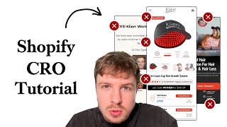
A Shopify store selling red-light therapy hair-growth products gets a full audit. The presenter fixes cut-off copy, blurry images, and cluttered layouts, then shows how to redesign the hero section with a promise-driven headline, add social proof and CTAs, simplify the order form with toggle add-ons, and break down "How It Works" into three visual steps.
Chapters
In this video, I'm going to be dissecting your Shopify store and explaining to you step by step on how you can optimize it to improve your conversion rate, your average order value, and maximize your ad performance. Let's dive right in. The key information is being cut off here. So your headline's being cut off, your button is being cut off, your benefits are being cut off, subheading being cut off as well. You've prioritized this top navigation menu up here over what's going on down here. Now it's interesting you've done this. You're like modeling some of the brands that I work with, like SolarWave. This like top navigation menu over here. Now this, when we're working with Solo Wave, we were just testing that to see actually does that improve conversion rate? It does, but under the condition that you don't push down your other critical elements, which is your headline, your hero section headline, your button, and all those key points down here. The reason for that being is that when people, when new shoppers land on your website, you need to make sure that your hero section is communicating to them what your brand actually does and needs to be communicated to them like straight away. What I would like to see here instead of this image, can we have an image that communicates your product better? Like from this image here, I understand that yeah, if you zoom in, you can see the laser working, but the image is like too blurry here to actually see what's going on. So this image over here, Michael, is definitely a better image that I would put in the hero section. But I like this one because it's clear exactly what your product does straight away from looking at it. And also, this is a really nice headline, hair growth made easy. So let's see what you have up here. You've got advanced hair restoration for hair loss, thing is for over hair thinning and hair loss. That's fine, actually, I don't mind, I don't mind that. But I like the simplicity of this hair growth made easy. So I would test putting in this headline as well, because 4 words, very easy to read, versus this. The way that I like to look at copywriting for hero sections is that your headline should be the promise. So what are your promise What are you promising your shoppers? And you're basically promising them hair growth made easy. So your subheadline and the other text that's in your section should provide the proof for that promise. So it should build belief with the shopper that your product will actually do what your headline is claiming that it will do. Well, how does it make it easy? Well, you can talk about your— the mechanism. So we have this advanced technology, you only put on the hat for 6 to 30 minutes a day, and you don't have to do anything else. Like, it's pretty much effortless. So you say start your journey here. Again, I just think it's a little bit vague what your products are from the hero section. But I think updating that image, if we brought in that image that makes it clear what your product is. You're also hitting people with a lot of these different bullet points here, but most people are not reading this. People don't really hang around on hero sections anymore. They don't spend a lot of time when they land on your website reading through all this text. It's a very— it's in a matter of seconds. And that's why I've seen that the websites that convert best, the stores that convert the best, are the ones that can capture people's attention. And communicate what they're about and why they should actually continue their journey on that website within a few seconds. And you can see in some of these examples that I'm showing you here that we're communicating what the brand is about, and we're communicating the next step that people should take very quickly to people. So the formula behind this is just a really powerful image, a really good headline, and a really strong compelling call to action that will take them to the next step. And of course, social proof. And those 4 elements really go into a strong hero section. That's something that I think you need to bring into your hero section to make it convert better. Also, this text up here, I like the badge, I like what you're doing, but I think it's just easy to miss and it's hard to read the text. This is all wrapped around here. Maybe bring that text into a line above the headline or even near the button to make it stand out a bit better. One other comment I want to make is because your brand seems to be doing red light therapy for numerous different products and numerous different pain points, I'm not sure if it's actually beneficial to just focus on one pain point. Maybe you could say that most of our customers come from this pain point, the hair restoration. But if that's true, then fine, you can keep that angle. But the way that I like to optimize stores that have multiple different products is to make sure that the headline is evergreen. This is a hero section that we've done for Goodstone down here. And in the headline, we're just communicating really what the brand is about. We're not selling them on any particular product or any particular category of their products. or we're just trying to tell them, warm them into the brand. And that's how a hero section on your homepage website should function. It shouldn't really— if you have multiple different SKUs and multiple different products in your store, different categories of them, you shouldn't really sell them into one specific category on your homepage. You should leave it open for people to navigate to whatever category they come to, because people might come for category A, other set of people might come for category B, and you don't want to force them down a particular funnel because that will cause people to bounce. So make sure that your homepage hero section caters for all your different categories. So what you can do is you could even A/B test and do another hero section that will just talk about your red light therapy technology in general and how it is actually implemented in all of your different products. And then instead of a CTA that will direct to— yeah, you're directing straight to your hair cap here. Instead of doing that, you can direct it to a collection page that will feature all your different products. And then that way, people can easily pick the journey that will suit them. They can easily pick the product that will suit them the best. Let's go into the next stage here. Let's look at your product page. So the images of your products are fine. I don't have any problem with these, and they look really premium. But I can see that you're definitely using better images on your product page than you are on your homepage. This one is looking really blurry again. And then if we look back at some of these photos down here, they're really crisp. They look premium. And the, the reason why this is important is it builds trust instantly. We can see high-quality images of your product. and people wearing them. This first image though, these different points down here are really small to read. Also, I would like to look at the structure of your images in your carousel because you've got this image over here, and then we're basically using the same image again, just of the product slightly different, and then going into more benefits. I think you would benefit from having an image like this being the start with the benefits listed straight away. So you could even bring this as maybe your first image in the carousel and update these benefit points. And the second one in the carousel could be a lifestyle photo. Someone wearing it, someone getting the results, or it could be a before and after photo showing directly the results and how quick that people can get the results they're looking for. I think that will make it a little bit more punchy because there seems to be a lot of text going on in your, in your photo carousel. And these before and after photos over here, like I would make these into like one photo. You can put like a split side by side. I wouldn't have them as separate photos over here because then it just makes it harder for people to compare. They have to like cycle between the two. So this comparison over here, again, the text is just really small, it's going to make it very hard for people to actually see what the best one is for them. So what I would say, if you still want to do a comparison like this, because I do think it's important, just surface the key information, maybe the information that you do to position these against each other, is you show how fast the results will be. So this one's in 2 to 3 months, this one's in 3 to 6, this one's in 7 to 12. And I think also put in the cost of this. So what is the price of each of these so people can equate the time period with the price. And that's obviously how you're giving value to people. You're basically saying you can get the Ultra Flex cap, which is a lot more powerful, but you're going to pay a premium price to get your results faster. And obviously, people would be— people who want the results really fast will appeal to that. There just seems to be a lot going on in your order form down here. Like, it seems to be hard for me to read and follow all of this. So we have the laser cap only, and then we have the complete system, you get vitamins, shampoo, and conditioner. Okay, down here, we shouldn't be relying on the fact that people scroll hold all the way to the end of the carousel to understand this information, because I doubt people will. I doubt most people will go all the way to the end of this. You should be bringing in here what the results are. This is the key information, right, is how fast am I going to get the, the, the results. And you're calling it the 302 Ultra Flex Cap, but down here you're calling it 302 Diode. So I would keep all the language and the terminology the exact same. If we got it called 302 Ultra Flex Cap, Let's keep that the exact same down here. Make sure everything's consistent so it's easier for people to read so that no one's getting confused by this because I'm struggling to follow this a little bit. It seems a little bit confusing and all over the place. The thing that you should be servicing here is actually how, how long is it going to take for me to get the results? This one's in 2 to 3 months. This one's in 3 to 6 months, and this one's into 7 to 12 months. So that's how you can position these. And then this down here, I wouldn't position it like this because I think how you've structured everything, it seems really confusing. We've got like— it looks like we've got like 5 different options between all of these. So you need to separate out these 2 different categories, like how we're separating out the categories in this product section over here for this client of ours. You can see we got a quantity, very visible, that quantity is on its own. And then if we look down, we got frequency on its own tab. And so you can do the same. With this, you can basically say choose your solution, or choose your cap. And these are the different options. And then what you can do down here, instead of giving them two different options down here, just add a toggle instead and say, add $60, toggle on the switch, add $60, and get the complete system. So get the vitamins, the shampoo, the conditioner, and this will boost your results. And you're going to, you're going to save 20% by doing that. So That's how you can position this, and that will clean up the UI/UX by a ton and make it easier for people to actually see what's actually going on here. And I guarantee that would get you better results. I also like down here that you are servicing how much it is actually for them for the time period, but the text you're putting down here is really small. So I would actually make sure that's bigger. I think you should put that next to the price over here, only $2.63 a day for 12 months. Again, the information over here, there's a lot going on. There's just text everywhere. It's not formatted properly, and it's just making it really hard to read. So the better you can structure information, and the more easy it is to actually read the information on your product page, the more people will actually convert. That's the rule behind all of this. And that's why I'm like stressing on it. So the How It Works section, all of these tabs, a lot of people do not put any love and attention into these tabs. But people do engage with them. And so even in these tabs, we should be optimizing them to make it easy for people to read and get the information that they want. So the how it works, break it down to like 3 steps and add some images, show how easy it is to actually set up this product. We don't want people to come to this product page and feel like it's laborious for them to use it. We don't want them to think it's complicated. We don't want them to think, oh, have any uncertainty that it's not going to work or that they don't or that they won't be able to use it. So every single bit of information on here, even the technical information, we need to break down and make it super easy for them to consume. Because that's the feeling that they want to get from something like this. People who are going to buy something like this, they're buying it because it's easy. They're not buying it because it's going to get them results, because there's alternatives on the market that are a lot more intensive for them, technically intensive, and obviously more expensive. But they take longer, or they're more technical, they need to like, they need to put in more effort, energy, or it's more risky. So people who are coming to a product like this, they want it for the ease of use. And so we want to create that feeling on the page with the images that we use. With the layout and with the text. So I'll show you this product page that we're working on for one of our clients here. And you can see in the tabs down here, we haven't just left them as like a wall of text. We're breaking down the information, we're adding in images, we're making sure that important information is bolded to make sure that it's easy for people to actually get the key information. So it's quicker for them. So they don't have to read the whole thing. They can just skim over it with their eyes, get the information, come out of the tab and go back to actually completing their purchase. And this is, it's these little things here. That most people don't talk about. But these are little things that really do move the needle. So I'll do a quicker audit of LumiFlow because I've realized the same product as your other brand. So what I've talked about there, I'm sure will apply to this brand as well. So at least this hero section, I can see all the elements are above the fold. It is obviously, it looks less branded than your other brand. So it loses that premium feel that the other brand has. Women's Day Sale, FDA clear laser caps for thicker, healthier hair. I'm glad you've done this. I'm glad that even if you're running a sale, you still actually called out in your headline here what you actually sell. So this is good. So your hero section here, although it looks maybe less pretty than the other one, I think it's actually more optimized. The only thing that I would say that is missing here is you should have an image of your product in the hero section. I'm not sure what's going on in the background. I can see like a faded image of your product in the background, but no one's going to be able to see that. You should be bringing an image up here at the top, and you've got plenty of space. So you could add an image up here at the top and push everything else down a little bit, um, and have an image that clearly shows your product working and in use. So it's nice. I like these lifestyle photos you got going on. What I would like to see though is if I click on these arrows, it shouldn't really scroll this carousel. It'd be nice if it actually scrolled through the images as well, just because it makes it less effort for people to like navigate through. This image over here, really small before and after. So if you're going to keep this, make sure that if I click on the image, you will have a zoom feature. That's really important for mobile users. I like the lifestyle photos, but I feel like they are— they don't seem to, at least for me, feel like they're in the right environment to communicate what the product is about. For example, you can have the hat with someone sitting on the couch on the sofa watching TV, that will be a better one, because at least that's communicating zero effort. And it's in a more believable environment that people are going to see wearing it. This one's nice. So I don't have any problem with that. It'll also be nice to see one where the person like maybe running, so running outside doing like their healthy lifestyle, and actually showing that the product is actually working. Basically, what I'm trying to say is bring the product into people's normal routines. So that people can visualize it. People sit on the couch and watch TV a lot. So that'll be one that resonates with a lot of people straight away. And people go for walks or runs or walking their dog. So that'll be one that will resonate with a lot of people. They could be like, oh, wow, yeah, I go for walking with my dog every single day. So I just had to put on the hat and boom, there I go. Like I'm starting to get my results. This is like the mindset that I'm trying to like communicate to you. And that will help you communicate your product better. That will help you persuade more people and of course sell more units. Below the fold. A lot of text going on here. Your headline is a little bit too long. You're trying to call out everything here in your headline, like most popular, award-winning, money-back guarantee. So you just need to structure this information easier way for people to read. If you're mentioning this, you should have the sale price next to it. Show, show how much they're saving and show when this will expire. When does your Women's Day sale end? Is it, you know, I know you're going to maybe saying it's only today only, just make it clear. That little bit of a countdown timer for today's sale will add some natural urgency. You can get away with it because you are running a limited time sale. So choose size. And I've got these little info buttons, but they don't seem to be working over here. So I want to know what's the difference between these two? Which one is the right one for me? This is the most important information. So these need to function correctly. If we're having two sizes, we need to really communicate to people which one is the right one for them, because people will not purchase if they are uncertain that it will fit them, because they're not going to spend this amount of money before they're confident. In a funny sort of way, it seems like your, your two brands they're both kind of playing to each other's weaknesses. Like your first brand, it looks more premium, it feels more trustworthy, it feels more medical, there's better images on there, and better branding. But this one, it feels like the information that you've got on the page and the headlines and some of the— and the way that you're structuring the information is better. It's better. It's still obviously still not up to par, but it's definitely better than the other brand. And it's like, I like how you've done— you've broken down the how to use sound here. And even in the description, you're using a short paragraph and you're explaining what's included. And here you're making it easy for people to see the specifications. So this is really good. So if we just optimize each of your brands' weaknesses, both would convert a lot better. If you're looking for further help, we do offer a service so we can craft a high-converting landing page that is designed to outbeat your current page by at least 10%. Our specialty is designing these high-converting landing pages, and we pretty much do this every day for the e-com clients that we work with, such as Snow, CarePods, Soloway, Velvet Caviar, and many more DTC brands. Helping them to increase their ad performance and get better results in terms of their conversion rate, average order value, and overall profitability. If you're interested in learning what results we can get for you and how our process works, then check out the description. There are links to our website. And of course, you can also book a call with me and answer any questions you have. Cool. And I hope you got some value from this video.










