How To Optimize Your User Journey | Live CRO Walkthrough
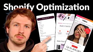
A CRO expert audits Nailboo's e-commerce site and finds friction everywhere: social proof badges too small, navigation confusing, hero copy unclear. Key fixes include moving critical elements above the fold, redesigning the menu with icons and a 2x2 grid, and changing the main CTA to "Build a Nail Kit."
Chapters
So what I'm going to do in this video is go through Nailboo's entire user journey and see what they can do to optimize every instance to maximize their conversion rates. And already I can see that things are getting cut off if we set this to 650 pixels in height. So what I definitely recommend is make sure all the key elements are above the fold. This little badge over here is really nice, but the text is a little bit too blurry and the social proof is not really doing it justice. So we've got the tiny text down here, @girls, 2.3 million followers on Instagram— or on TikTok, sorry. So that is really, really good social proof. But I definitely think there's a better way they can incorporate that, make the badge stand out a little bit better, or show the profile photo of the brand on TikTok, which 12.3 million people are following. So they'll more easily recognize the badge instead of this tiny, tiny text over here that says @girls. This social proof could be so much stronger if we just included, if we just made it bigger and easier for people to read at a glance. Because again, people are not going to land on your homepage. And read every single element. They're gonna only land here for a few seconds. So you wanna make sure that in those few seconds, they're seeing the key elements. You wanna bring their attention to the things that you know are the most persuasive. And this social proof is one of them. So we wanna make that stand out a lot better. So let's go into their navigation menu over here. So we got Build a Nail Kit, and then we got Shop All. What would help is putting little icons next to these category dropdowns to make it easier for people to read. And what I would do is put them in a 2x2 grid. See, so instead of all of this vertical space, Put them in a 2x2 grid, have the 2 CTAs stacked on top of each other. Instead of putting the CTA all the way up here at the top, which people actually have to reach to get to, put it underneath the shop button or above the shop button. Now this dropdown is a little bit broken actually. It's— this arrow should be the other way around. It's a small little detail here, but when it's pointed down, that normally means, okay, you're ready to like expand it. And when it's pointed up, that means you want to collapse it. I definitely think their navigation menu could do with a little bit of love. It seems like elements are all over the place at the bottom, at least. So put in those icons or put in images for each of the different categories. Display them in a 2x2 grid. Make it easier for people to click. Group the two main CTAs together, and that way it'll be a lot easier for people to actually click through. So let's click through on Build a Nail Kit. And I actually prefer this copy, Build a Nail Kit. This is actually better. So that's what should be communicated in their hero section as well. Instead of Build a Kit, Build a Nail Kit. Make it that little bit more easier to understand what the product is just at a glance. And that's the most important thing. When normally when I recommend these things, people are— people say to me, oh, but surely won't customers understand that this is for nails? And surely won't they learn about that? And surely won't they know, like, why do we have to spell everything out to be easy? But you don't understand, at scale, when you're driving hundreds of thousands of traffic to your store every single month, any little bit of friction, or any— I should say the opposite— any little bit of friction that you can remove can make a huge difference. And so it's more about getting into that mindset. Because if you're in the mindset, okay, how can we make this clearer? How can we make this easier for people to, to read? How can we make it easier for them to get to the destination that we know they want to get to? That's going to be the thing that actually improves your conversion rates, that's going to improve your entire experience, rather than what most brands do, which is, okay, how can we introduce a pop-up that captures more people's attention or gets them a discount code? Or how can we do this like strategic upsell that ends up actually hurting their performance more than actually improving it? Because most brands, when they do those things, they don't actually do them in a way that's actually optimized for the user experience. Because at the end of the day, here's the principle: you want to make your store as effortless to browse. In the early 2000s, every single website was optimized for desktop. And in most cases, those websites are pretty well optimized. They were simple. That's the first thing. And where they actually use color and where they use actually contrast, they actually brought your attention to key elements that they wanted you to see. Nowadays, most brands still design for desktop, but the desktop experience has become a lot more cluttered. But the thing that's changed is now the main medium for people to shop through is the mobile. And what's got lost is people are not realizing that if they take their desktop website and just convert it to mobile, they're not realizing that any friction that a desktop user has is 10 times worse than mobile because people are scrolling on their phones, they're scrolling in a much smaller screen space, you can't show as much information. So mobile is at a serious disadvantage when it comes to user journey. And that is why when I say things like you want to make it clear, You want to make it as easy as possible for people to consume. It really matters. So those little bits of friction that you can remove and make it easier for your mobile users are going to have a big impact. They're going to really stack up and compound. So let's look at the Build a Nail Kit. So what I would say in here, this page is actually very, very important. What I would do is I would show the comparison between the two different items over here. So Build a Nail Kit, I would clean up this UX/UI a little bit, show the two buttons above the fold. So you're seeing that when someone lands on here, they actually got to scroll down a little bit to actually see both of them. So there's definitely an opportunity here to optimize this a little bit more. And what I would do is I would put the distinct— the difference between the two, try and communicate that within the box so people don't have to go down and read all of this information. You want to make it as easy as possible for people to consume. So dip powder, a small little piece of text underneath that kind of explains what the benefit of that is. Same for the gel polish, a small bit of text that explains what that is about. And then underneath, you can put another call to action that says Learn what the difference is, or what is the difference, or what's right for me, or help with choosing. And they click on that, scrolls them down to the section underneath. And here they can actually learn a little bit more about it, you know. So that I think would be a better way to actually do this. So let's click back into Dip Powder and let's go to their product page. So this apply in 3 easy steps, I think most people are going to know what I'm going to say here. Text is a little bit too small. I'm glad at least the main text is actually readable. And I don't think they need all of this heavy text there, you know. So they could literally just keep it to the images, keep it to the main text down here, and if people want to learn more about the preparation, they can scroll down below the fold and learn that. So this information down here, up to 30 manicures per jar, that should be communicated up here because you want to keep all the price information together so that people can actually see, oh, it's only like $2 per manicure, you know. So you want to communicate that in one place. The only negative that I'm seeing with their kit so far is that it's not easy to actually see some close-ups of the nails. So we've got these over here. But what would, what would I think sell this so much better is if once they add it into their cart, or in the selector over here, there's some way that they can actually get like a closer up view of the products and see more photos with people wearing it. I just think that would, that would totally crush them. Because again, you're just selling, you're selling the product more visually. So in summary, kind of the changes I would make here, just optimizing these listing photos a little bit more, make the text kind of universal, make sure that they're more strategic, to go over the top selling points. Make the font size bigger. If they're running a sale, I would have this text over here, Mother's Day special, next to here. And underneath you can put buy 3 and get 3 free so that you tie everything together. Right now everything's kind of like disjointed. Also, this price messaging down here, up to 30 manicures per jar, that should be communicated up here. And then what I'd also say is they could put images into the how to apply section over here. They've got the images in their carousel over here at the end. So apply in 3 easy steps. These images, they can easily put them into this dropdown over here as well. And that will just make it a little bit easier to read. You want to make these dropdown tabs pretty easy to read because so many people engage with them. So those are my tips on what I do to optimize this.
If you're looking for further help, we do offer a service so we can craft a high-converting landing page that is designed to outbeat your current page by at least 10%. Our specialty is designing these high-converting landing pages, and we pretty much do this every day for the e-com clients that we work with, such as Snow, CarePod, Soloway, Velvet Caviar, and many more DTC brands, helping them to increase their ad performance and get better results in terms of their conversion rate, average order value, and overall profitability.
If you're interested in learning what results we can get for you, and how our process works, then check out the description, there are links to our website.
And of course, you can also book a call with me and answer any questions you have.
Cool.
And I hope you got some value from this video.










