How To Write "Persuasive" Copywriting
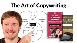
A copywriter audits an e-commerce site and shows how pairing strong headlines with compelling images converts better than text-heavy pages. He points out a cluttered hero section with a cut-off headline and buried CTA, then recommends swapping excess copy for striking product photos or video. He also suggests adding thumbnail images and price differences to the navigation menu so customers can compare variants instantly.
Chapters
So in this video, I'm going to be talking about image writing, which is the art of combining copywriting with images to actually make your message more punchy and higher converting. And of course, I'll also be covering a bunch of other really, really important zero tips that you can do today to optimize your store. So let's go through this. So I'm landing on your homepage. It seems one area where your hero section is falling down is your image is taking up quite a large amount of space, but the headline is getting completely cut off there. The CTA is all the way down here, so it's not really even visible. And all of these benefits are kind of like pushed below the fold as well. And even, even in this section, even if this was all above the fold, there's way too much information that you're giving people to consume. So this graph over here is really the 3 things that really move the needle when it comes to websites and CRO in general. And this little circle on the left, it's called compelling image writing. And this is a term that I've come up with on combining images with copywriting. So you have image writing. The reason why I've called it that is because images can communicate a lot better and a lot faster than any text can. So when you look at images and text in the same light and you see that they're actually interconnected and you can use an image, pair it with a really good headline, and together they're actually going to create something a lot more powerful to communicate your message. That's when you can actually save a lot more space. So here you can see some examples of what I'm talking about. You can see we have the headline, the scent that turns heads, and we've got an image that ties with that. So even by someone looking at the image, they will understand what the headline means. And by looking at the headline, they'll understand what the image means. And that's what I mean by headline-image synergy, or image writing if you want to call it that. The reason why I'm mentioning it for you is because if we didn't look at it that way, and if we didn't utilize a really powerful image, we would have to put a lot more text into this hero section, and it would look something more like what you have here. And so what I'm trying to communicate is that you can cut a lot of this text and copywriting when you choose a really, really powerful image. In place. So let's see if we can find something like that for you. First of all, we have this beautiful image over here. I think this is really clever, and you can do something with the text over here like you've done it to visualize the audio wavelength. This is an example of a really powerful image. So it's not perfect as it is, but with some editing, I definitely think this could be a really good contender for a new hero section design for you. So you don't really have a lot of photos, so it's kind of hard to choose a better asset for you. But basically what I would say is even a close-up shot like this of your product could be really cool. And with the headline down here. But another option that you could do is actually include a video in there, like a loopable video, showing someone actually playing the, playing the pandadrum, you know, and that way you can bring in the headline again, that would tie into it. And that will save you having to say a lot of text in your hero section. So what I'm trying to communicate is that your hero section is way too long in the text you're giving to people, you want to get your, your CTA, your call to action button above the fold. So it needs to be visible over here. This is kind of how your hero section is going to appear on most devices. 650 pixels from the top is kind of showing you how, how much screen space you have to play around with. And so there's not really a lot of space. So you really want to make sure that your image, your headline, your call to action, and some form of social proof are all there inside that space. So looking at your navigation menu, you've got Panda Drums, Music and Accessories, Bundle and Save Track Order. What I would recommend doing instead of Instead of how you've actually displayed it here, is I would bring some photos of the different types of PandaDrums in here. So you've got the PandaDrum Pro, the PandaDrum Plus, and the PandaDrum Mini. So what I would do is I would literally just put them in a horizontal line, have the, you know, Pro on the left, the Plus in the middle, and the Mini on the right. And then underneath that, you can just in one, in a couple of words, explain what the difference is between them so that people can instantly, when they click in your navigation menu, see what the difference is between your different drums. Because I remember when we spoke on our call, that was one of the things that we talked about. And show the price difference for each of them, so that when they actually open up your navigation menu, they can see the difference on a functional level of what your different products are and the difference on a price level. And of course, they'll be able to click on them and navigate to that specific product page. So once we click on the button in your homepage, we get to this page over here. And this is kind of where I'm a little bit thrown off because it feels like another landing page. So this image that you've got here, definitely a cooler image than what you have on your homepage. So it seems like you have more assets than even what you're showing in your Instagram. And so I definitely think there's an opportunity there. You probably have a better photo that you can put on your hero section to make it a lot more powerful. And this is, this hero section here is a better example of an optimized hero section because you're saying, you know, you're calling out, let's say, a powerful headline, feel the stress melt away with, with very note. I think that's kind of a typo with every note, right? What I would say to ditch, ditch the free shipping and the 30-day money-back guarantee because you're kind of selling them on the logistical benefits before they're actually even sold on the product yet. So you want to, you want to save that to the product page, all those logistical benefits, free shipping, money-back guarantee, warranty, that's kind of when they're already sold on the product, they're ready to purchase. So but what you can do here is call out some benefits on what it's like to play this. So if we ditch these bullet points down here, you'd have a couple more lines of space that you could use to really describe what your product is. How people can use it, and some of the benefits they're going to get from it. So I think that's what I would do here. Now in this section down here, there is a lot going on. It's very difficult to kind of read this. Everything's kind of competing for my attention. We've got the product photo, which is, which is really small. And this is disappointing because your product imagery is really nice. So what I would say is just make your product imagery bigger, make it take up a lot more space. And you just want to increase the spacing for all these different elements, because it feels really crammed, really compressed, and, you know, almost the opposite of what you're trying to sell people on, which is escape to calmness. And visually, it looks really chaotic. So just space everything out, give it some room to breathe, and let your product shine by having the image be the biggest. And then just make your call to action button stand out. Like, this color over here is clashing with this $150 off. Then you've got this dark green over here. Then you've got like a purple up here or pink up at the top. You've got another color down here. So there's just a lot going on with your branding with your site. So I would strip it all the way down because your product, you have 3 different colors here. You got this lovely orange color, you got the white color, and you got the black color. That's enough. I think just mute all the colors on your page and let your products really stand out. And that would draw more attention to them and that will make them feel a lot more premium. So when I click on the Pro, and this is a bit of a weird thing. I see the first image being black and I click on it, and the first image I see in the carousel is a white one. So change it so that whatever image you're showing on the previous page that they click, that's the first image that you're showing. So if it's going to be black, show the first one being black. That's a really important thing because that will instantly create some confusion with someone. Oh, did I click on the wrong link? Did I click on the mini by accident? So just make sure you address that. I like the fact that you have the color options down here. That's really, really nice. You've got some of the different benefits down here. Those are some benefits that I bring onto your homepage hero section, like I mentioned. And then you've got— I can see your add to cart text is being cut off down here. This is a big no-no. And again, I just think you're overselling your product. You're adding way too much text and information here when it's not really necessary. And it's causing clashes like this where it's kind of breaking, breaking some of the elements on your page. This is a really good benefit that you've got down here, 432 Hz. Now that is a point that I haven't seen you mention anywhere else on your site. But that's a healing frequency, right? So what I would recommend is tie that into some of your copy. You could say it's been tuned for 132 Hz for, you know, the ultimate healing frequency or something along those lines, because that will resonate with people who are looking for that. So this is the first video that you've got down here, and it's buried all the way down at your product page. This is again a bit disappointing. I would add a little— even on your homepage hero, I would add a second call to action button next to the main one. To like play, you can even add like a little, you know, you could do, you could even add, if we go back to, if this is going to be, let's say, closer to what your homepage hero should look like, you could add like a little play button here and see and add some text here, what it sounds like. And when they click on it, it would open up a pop-up with, with this video playing there. So that people can actually hear that. And that's going to really sell them on the product more than any text. More than any paragraph of copywriting, icons, or even images can do. They can hear the sound and see how the product actually works. That's going to be the biggest persuading factor in them purchasing.
If you're looking for further help, we do offer a service so we can craft a high-converting landing page that is designed to outbeat your current page by at least 10%. Our specialty is designing these high-converting landing pages, and we pretty much do this every day for the e-com clients that we work with, such as Snow, CarePods, Soloway, Velvet Caviar, and many more DTC brands, helping them to increase their ad performance and get better results in terms of their conversion rate, average order value, and overall profitability. If you're interested in learning what results we can get for you and how our process works, then check out the description. There are links to our website, and of course, you can also book in a call with me and answer any questions you have. Cool, and I hope you got some value from this video.










