Increase Sales By Making Your Store "Effortless"
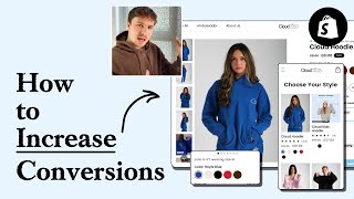
Pedro Loureiro audits an anxiety hoodie store's conversion rate optimization, reviewing everything from homepage design to cart checkout. He points out friction points like unclear product imagery, weak social proof, and confusing navigation, then shows how competitors handle these better. The goal: make buying so effortless customers don't hesitate.
Chapters
If your store isn't optimized for conversions, you're going to be losing customers before they even consider buying. So in this video, I'm going to be auditing a real store and showing you how you can apply the core principles of CRO to maximize your store's performance. So let's dive right in. When I land on a store like this, I want the value proposition to be instant. So I should understand exactly what you're selling straight away. So these are some client examples of optimized hero sections to be done, just so you can see as a reference here. And every single one of these, what we're showing above the fold is, you know, an image, the value proposition, and kind of a brief description of who the brand is and what their, you know, unique selling points are, the main ones. And we're also giving in some form of social proof. Now you do have some social proof over here. So you got 12,000 happy customers, that's pretty good. But I think what would be really, really powerful in this hero section is bringing in a review. So because your product is anxiety related, I think it'd be very, very powerful to bring in like a quote, a really, really powerful quote from one of your customers saying how the hoodies help them feel better. They feel more relaxed, they feel more comfortable. It helps them recover from maybe a stressful day at work where they can get into their anxiety hoodie and they feel, they just feel so much better. I think that'd be very compelling for new customers to land on your store and see that. So your headline here, you've got relaxation redefined. It sounds nice, but it doesn't really communicate what your brand is about. So we need to mention here some of the keywords that relate to your product, that relate to the pain point that it's solving. And again, I'll go back to some of these hero sections. You can see in every single one of these headlines here, We're calling out either the main pain point of what the product relieves, or we're calling out the main benefit of what the product actually brings people. So you can see we've got healthier glowing skin in 2 weeks. We've got fix your sit for Anthros, which is a chair. We've got award-winning fast drying, zero heat damage for life in hair dryers. And the secret to making a headline convert is just making it clear. I honestly think that this headline that you've got down here is a lot better. Hoodies with built-in stress balls. So I would remove the text from this image. Just make your image pop and stand out and have the model on her own there. Then what I would do is include a better headline underneath. You can even put it above here and just make everything fit this box a lot better. It should be— you should be having everything displayed in 650 pixels height. So everything from your announcement bar, your navigation menu, and your hero section, all of that should be visible within 650 pixels. I will also change your Shop Now button. I would actually put in Shop Anxiety Hoodies, just, just to make it even more clear for people actually what they're actually shopping for. The problem with this is it looks like a button and it's not really communicating anything beneficial to people. You know, famous stress ball hoodie. That's not really saying anything. That needs to go with something. That needs to be said by Bloomberg, or it needs to be said by someone else, because anyone can make that claim about themselves. So the featured in section over here, again, every site has got this on their store nowadays. So how you can make this a little bit more powerful is by just repurposing it in a different way. Either bring some quotes from the featured articles that you've been in with a snippet of what they said about your product, or bring some of these products, these logos in, and put them around your product here in the hero section. What that will do is a bit different, is they will associate the logos with your product. So it's a little bit different way of doing it, but it just beats the trend of everyone sticking them in the scrolling bar where they're not really doing anything. So you go straight into your bestseller section down here. That's fine. I don't think you need to oversell it. You seem to be including a lot of copywriting here underneath every section. But on your homepage, the way that your homepage should be is like a catalog for your brand. It should be the first part of your homepage because the drop-off rate is, is really significant on most homepages. Not many people scroll to the bottom. So we want to make sure that every pixel that we're putting on that page really counts. And the first section underneath about your bestsellers, it should just be getting them to that product page, getting them to the collection page about your bestseller. So I'll show you an example here of another client's store. So we've got the homepage hero section over here. And then right below, we're going to the bestsellers, but you can see the contrast. Right, so we've got your bestseller section over here. And you can see how it's just taking up a lot more space. And also this image looks blurry over here. And I definitely would make sure that you're prioritizing your images on a fashion site because people really want to see high quality images there. You can see the difference over here, we've got 2x2 grid. And we're just including only the most important bits of information and we're making it really bite-sized. So it's easy for people to read. So we've got Shop All button up here at the top, I would include a bestsellers button over here. So instead of putting them in a scrolling carousel like this, I would display them in a 2x2 grid. And you can even bring in— if you don't have 4 products to make up your bestsellers, you can just bring in a little box over there. And that can fill up as like a quote, 2 products at the top, the 3rd one underneath in the 3rd box, and then the 4th one could be like another quote from a customer, a really powerful one. That's a really, really smart way of doing it. So you can keep the structure, you make it easy for people to actually engage with it. And of course, you bring in some more social proof without cluttering anything. And here's what I mean is you can even bring some of these reviews bring one of them into that little box up there. So what would make these reviews a little bit more powerful is if we had some images of the customers as well. So I'm just going to show you a little design that I'm working on for another e-com brand. So we've picked out the top 6 or 7 reviews that handle the top objections for customers for this brand. And then of course, we picked out some nice photos of customers as well that go with it. So that's a really powerful way of how you can make your reviews stronger. So look at, okay, what are the top objections that people have when they're shopping? For a brand? And then what reviews, what customer reviews do we have that handle those objections, address them? And they could be stuff like, okay, I'm wearing this anxiety hoodie, is the fabric really good? Is the fabric good for like sensitive skin? And what, you know, is it, is it warm? Or can I wear it in the summer? Or it could be, you know, is it machine washable? Whatever those objections are, whatever the main ones that people have, bring in some reviews in there to like handle them. And that will obviously have a big impact on, of course, more people clicking through and more people converting. Your homepage is quite short, actually, looking at it now. There's only a few sections over here. You could add in a bit more education about your brand and also your story. I think that'd be really sweet, is like having an Our Story section that talks about, okay, why did you found Cloudline? Just to bring in a bit more of a human element, because people don't connect with brands, they connect with people. Your navigation menu is a really, really hot zone to optimize on any store because of just how much traffic is flowing through it. So any little improvement that you can make to your navigation menu can have significant uplift. And I'm not joking you, some of the biggest split tests or optimizations that we've done for stores have been with their navigation menu. And so this is an area that for any brand that we work with, that we are routinely testing, optimizing, coming up with new options. And again, I'll pull up that other brand that I showed you a second ago. And I will show you some of the new navigation menu ideas that we have for them. As you can see, one really basic one. This is their current one, which actually looks pretty similar to you. Looks like you're using the same theme. But you can see what we're doing here. We're just bringing some images of what the products are, making it easier for people to actually click through. We have another variation over here. We've got a review coming through. And then of course, just different positions to see which one the client actually will like and engage with. I'll show you another one. So we did the navigation menu as well for Raw Nutrition. Same principles at play here, but because they have more SKUs, we wanted to bring out in the navigation menu their top-selling ones. I definitely recommend as well that having a shop button in your navigation menu. Just in case people don't actually know where they want to go next, but they're interested. You still want to cater for those people as well. The main principle behind an optimized navigation menu is making sure that the elements that stand out the most and draw the most attention are the ones that are revenue-generating, and of course, revenue-generating the most. So those should, those should be your bestsellers, your top products, or your bundles, like high AOV products. And then you want to make the links that are less important be your secondary links. So links that, let's say, are going to your story page, your science page, like you can see here, your contact page, your wholesale page. And that way you're making your navigation menu more like a— how it should function, which is like a shop, which is like a catalog, and it should be getting people to where they want to go. If they're coming to your store, they're in some level interested in buying something. So we want to obviously make that journey as effortless for them as possible. So we're on your collection page now. And let's go through this. So I like that you have it in a 2x2 grid, but your image formatting over here is a little bit strange. So again, just making sure everything is consistent is really, really important here. What I would say is I'm not a fan of like the gray background that you have behind your photos. Your model shots themselves are quite nice. I like the model shots that you have, but I'm not a fan of the background that you've got behind them. It just makes it look a little bit dark and you wanna make your contrast nice because you can have that color pop a little bit more. So I would remove this gray background, put it maybe on like a light, very, very light blue background or like a white background. Now look a lot cleaner and a lot nicer. So the spacing is quite off here. We've got cloud hoodie, we got kids hoodie, we got the zip-up hoodie. And this, I know you mentioned about the categories, this is where you can mention in your navigation when you break it into different categories if you want to, and also on your homepage. So if we quickly come back to that, underneath your bestseller section, you could have a shop by category down here. And that can obviously filter people into where they want to get to. So I agree that your collection page should have a banner, it should have something that maybe will educate people a little bit more. That way you can actually repurpose it as a landing page as well and actually send some traffic to. You can see for Rose collection page, we're following those principles. So we've got a little banner over here, we've got the 60-day guarantee, free shipping orders $99, and we've got a nice image. But you don't need to overdo it, like a simple banner can do. Because when it comes to your collection page, And for a fashion brand in particular, people just want to engage quickly with the products, be able to compare different styles, see different color options, and have that freedom to like move around. So we don't want to make it too rigid for them. We want to make it pretty effortless. And the biggest thing you can do here on this page is just structuring the information better. The spacing over here, these stars are obviously taking up way too much space. We're not really calling out the savings and we're not really communicating why this product is on sale as well. And if we are running a sale, it should be communicated. These color options over here, we should be just displaying that on one line. So things look a little bit broken, as you can see visually. I can also see here that one of your images is missing. So that's why it looks a little bit strange here. We got like a white little box over here, but it's not visible. And then we got no image associated with it. So when I do SEO for the brands that I work with, I'm not interested in like advanced SEO tactics, or I'm not interested in like the gimmicky things you see being posted around nowadays. I'm interested in can we actually nail the foundations? Can we master the basics. And what those basics are is having really good imagery, having some really good UX/UI so that your site experience is pretty effortless. The more effortless we can get your site, the more engagement and the more conversions. And of course, the final thing is having good offers. Those are the 3 core pillars that I look at. And by mastering those pillars, you can scale your brand a lot more reliably. So another thing you can do on your collection pages, if we're going to remove the background to make everything a little bit more consistent, is we can inject some lifestyle shots as well. In between the different sections. So we could have a little section in between these two product grids over here, we could have a little section, a mini little section over here, a small little banner that calls out a benefit of your product. And it can have a nice little lifestyle shot. And then we can have in that maybe your review, a little short little feature review, or we could call out a different benefit of your product. So that way, your collection pages are doing more than just being a sales catalog, they're actually educating people as well, and having some more lifestyle photos. So finally, let's go into your product page over here. So you've got your reviews and ratings, you got your product name and your and your price above the image. Now, I wouldn't do this. I would keep all of your information in one section down here, because what you're going to have is you're going to have people scrolling all the way up to review the price and then scrolling down, and you're going to have this back and forth, and we don't want that. We want the image to be at the top, the main thing, and we want all the information that is relevant to people to be in this section down here and make it easy for them to actually engage with it. Instead of actually doing colored swatches, I would just recommend doing a little mini photo, a close-up of the fabric of each. It will just make it look a little bit more premium. I'll show you an example of the brand that I'm working on. This is what their current product page order form looks like, and they're just using a sort of like gradient, a textured gradient, but it helps people get a better idea of the actual color when they can see the product itself. So we have actually just an image here of the different colors of the product. That just makes it easier for people to switch between the ones and makes them more likely to engage with it. So come back to your store. That's what I'd recommend over there. Just have a little close-up of the fabric for each of them. and that will also be a true representation of the color as well. So your size and your size guide looks fine. I would say that your chart down here is a little bit small, especially on mobile, so I would recommend upsizing that a little bit. I do like the fact that you have the selector between, um, the, the different measurement systems, which is nice, and like the fact you brand it a little bit, but I would make the text a lot bigger. So you have white text here. I would remove the white text. Again, I'd just make your images a little bit bigger. You have built-in stress balls as well over here. That's your main feature. Oh yeah, you've got an image calling it out over here, but it's not really clear about this unique selling point. So what I would say is, again, I was gonna say this, I would have like a video that shows it and obviously have like a video with some sound on it. So I feel like you're missing that. Even this video, it doesn't really do it justice, the stress element of it. So I feel like getting a better asset that can communicate that unique selling point, whether that be a static photo with a graphic on it or like a video. That will help you convert more. So I've got no real issues with your quantity selector down here, no major issues anyway. The only thing that I'm going to say is your color palette, your color palette across your brand is quite, is quite off because we have this sort of blue and then we've got green and then we've got these color selectors and we've got all of this other stuff going on. And because there isn't any real hierarchy and there isn't sort of a neat layout for anything, everything's looking squashed and crammed and out of place. And it's creating that kind of feeling of overwhelm for me. And I guess it's ironic, because when I come to a brand like yours, it should be creating that relaxing, that clean, that minimal, that soothing feeling that I should be getting, because that is obviously what you're selling people— you're selling people that feeling through your product. So how can we do that when it comes to your order form? It's just about the structure of everything. I would reduce the color from this section. So I wouldn't be doing too much, too, too much crazy stuff here with your colors. Just make it easier for people to actually see the information. I would space things out a little bit more, give them a bit more breathing room. Communicate the savings if you are offering savings. I'm not sure why you have a discount running on your one hoodie, because you're running a sale, but I'm not sure why you're running a sale. And if that's an evergreen sale, then you shouldn't be running an evergreen sale on, you know, one hoodie, because obviously you want to incentivize people to get two or more, more hoodies and then reward them. By giving them a discount if they upgrade. And you don't want— you don't just want to give them a discount for the sake of it. But if you are running a temporary sale, then you should be communicating why you're running that sale and when it's going to end to actually build in some natural urgency. So I don't think you need to have these little badges here, selling fast. You know, this one I would remove. Again, it's just more clutter that you're putting on here. This little headline over here, this I think you can repurpose somewhere else. This is more like a little headline that you can put somewhere. you know, maybe a little underneath your, underneath your product name. And what I would say is save the color for the free shipping, and these could be little checkmarks. So like, checkmark, you get free shipping, checkmark, extra 15% off, checkmark, extra 10% off. This, I would, I would remove the discount from this. You have a 30-day guarantee, that's fine. If you are mentioning shipping over here, fast shipping worldwide doesn't really have the potency that it used to have. You want to be calling out when your shipping times are. Now a lot of people don't want to mention them because they think their shipping times are quite long. In most cases, when I actually talk about this for founders, we find out their shipping times are actually above average. Your shipping times are above average, communicate that there. And of course, if someone likes your product, they're not going to mind waiting for a few extra days. But normally, when people are buying something, they want to know what the shipping times are going to be, even if it's a little bit longer. It's better to communicate the shipping times and not communicate them at all. So you have more social proof down here. I would bring in some of this as well into your product carousel because again, the scroll depth, people are not going to scroll all the way down your site and engage with it. This seems to be a better asset down here to communicate the stress balls. So I like this one. But I think the photo quality, which should be a little bit higher, and it would be nice if there was some sound or something to communicate it if it has sound. So we have some nice customer photos down here. And this is honestly the first section that I'm seeing with your brand that is building some real credibility with me. And this is not a great sign because it's completely buried on your product page. Look at how much they have to scroll through to like get to that. And your reviews, these reviews, I think this is the main selling tool you have on this page. All of this stuff up here is not really doing it for me, you know, because anyone can kind of whip this up on the website and make these claims. But the reviews, this is where it seems so much more genuine, so much more human, so much more personal. So this section over here, I would put higher up in your page. and I would bring in and repurpose some of these elements on your homepage. Bring up those feature reviews, include the UGC images you have of the people actually wearing your products, and bring in a collage of the, of the best of these photos and bring it into your product carousel up here. That would make it so much more stronger. The final thing I want to go over is you mentioned your cart. Now I've got a different philosophy when it comes to cart. I think a lot of people, they, they, they go crazy with their cart. And it's funny, it's like they don't really optimize the other, the other parts of the website so well. But because there's so many like cart apps now on Shopify, people have like crazily complicated offers going on and functionality on their cart. And they just, they just make a mess of it. This is an area that's very, very sensitive because if someone is adding something into the cart, they have an intent to purchase at some level. They wouldn't just add an item into their cart if they weren't interested in it. But what happens is because people have so many offers going on here, they end up confusing people or dissuading people from converting. And so what I would say when it comes to your cart is just keep it super simple. We need to focus on the front end part of your store first, making sure that that experience for people when they land on your page to actually purchasing your product and getting to the cart is as simple and effortless as possible. And then once they get to the cart, our only job when they get to the cart is just making sure that they follow through. And what we want to do on the cart is instead of pitching them with loads of more offers that are maybe not, not relevant to them at this stage, we want to just make sure that they're comfortable with their purchases as you— we want to make— give them more rational reasons of why they should continue. And that could be, again, surfacing your social proof, calling out the fact that it's risk-free, you get 30 days to like try this product on, the hoodie, wear it, see if you like it. If you don't like it, then send it back. The only upsells that I have in your cart is if they buy a hoodie, we should be upselling them on the sweatpants, or if they buy the sweatpants, we should be upselling them on the hoodie, giving them an offer that makes sense. And then what we can do and how we can position that is if they've, if they've added the hoodie to the cart and they're interested in the sweatpants, if they add the sweatpants, then we can give them free shipping. So that's how we can make them feel like really excited to add more to their cart without feeling like we're just being really salesy and just pitching them stuff. If you're looking for further help, we do offer a service so we can craft a high-converting landing page that is designed to outbeat your current page by at least 10%. Our specialty is designing these high-converting landing pages. And we pretty much do this every day for the e-com clients that we work with, such as Snow, CarePods, Solo Velvet Caviar, and many more DTC brands, helping them to increase their ad performance and get better results in terms of their conversion rate, average order value, and overall profitability. If you're interested in learning what results we can get for you and how our process works, then check out the description. There are links to our website, and of course, you can also book in a call with me and answer any questions you have. Cool, and I hope you got some value from this video.










