Make Your Website Frictionless And Convert 10x Better
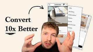
Pedro Loureiro shows how to cut friction from e-commerce sites to boost conversions. Mobile-first design, clear headlines, larger product images, authentic reviews, and smart navigation menus that work like store aisles all matter. He's worked with DTC brands like Snow and CarePod.
Chapters
If you're running traffic to an unoptimized store, you are basically wasting your ad spend. In this video, I'm going to walk you through very, very fundamental principles of conversion optimization and explain to you how you can actually apply them to your store to make the most out of your ad spend and to scale more reliably. So let's dive right in. We can see here the Shop Now button is slightly cut off, and sometimes even less information than this will be shown on the screen because people are viewing this in a browser. So the little tabs in the browser also takes up more of the screen space, meaning even less of your content is even showing. This is why it's always a good principle to really check everything on mobile on your own phone and make sure all the critical elements are showing above the fold. One thing that I can see straight away is that your product photography is really nice. The only thing that I'm going to say about this hero section is that it's not clear straight away when I land at your website what you are selling. You don't need to write a lot of copy to explain this. It can just be a few words that will complement the image because what needs to be communicated here in your hero section is basically your unique selling point. What separates you from different brands? I've gone onto Instagram. And I've got the information that I've needed from your Instagram. And this is something that I've learned along the way from doing this for a long time is that a lot of brands, the majority of e-com brands, they don't really have great copywriting on their website. But when I go to their Instagram, all of a sudden we start to see some great headlines. And this is an example of it, like unfurnished, unfinished furniture so that you can make it yours. That is all you need to say. And that is perfect. That is perfect. That's a perfect headline for your homepage hero section. What would do your hero section justice instead of showing a collage, because you're not going to get away with putting some text with this, is I think just pick one really nice image that you have that really shows off this headline and complements it so well. And that can be your hero section. Make it look super premium. We've got all of your different items down here, and then we have the stars, but the stars are not really doing anything. We just have modern bench, modern shelf. We got the stars, but there's no real rating next to them. This is an example of what I see now where people add items to their store thinking that they're going to increase conversions just because someone's told them to online. Adding in stars is only really useful if it's communicating a rating. It's not really benefiting anyone psychologically, just having stars in there for the sake of it. And in fact, you'd be better off removing them, keeping everything a lot more simple, and making your images bigger. I really do think there's a missed opportunity in making your images a lot bigger. You could even make them like a grid, like an Instagram grid. And even in the format that Instagram has now, that sort of like more vertical format. And just make sure that they're taking up as much space as possible. And then what you can do is to break up the pattern all the time because we have a lot of gray background going on here. Every like third or fifth photo, you can change one of the photos to be like a lifestyle shot. So here's an example. So you can see that we're using this grid of products over here. And you can see the third image, we're changing it to a lifestyle shot to call out a benefit. It will still link to a product, but we're just breaking up the pattern a little bit and also using that box to bring in some social proof. Now, I'm not saying that you need to talk about a benefit, but I think you benefit from bringing in some more lifestyle images. Your homepage seems very white, medical. But what I think would really benefit is creating the feeling that people get when they scroll through your Instagram. And we have more of this, like, beautiful photography going on here. And the reason why I think this is important is because this will help new shoppers visualize how it's going to actually look in their home and create that feeling of like aesthetics. And this is what it's all about. I think you really need to bring in some of this beautiful imagery that you have in your Instagram and make it feel like more of a catalog, make it feel like more of a photo gallery on your homepage. And that— those images will really sell your products more than any copywriting will, more than these stars will on their own. So I definitely recommend that. Let's go into the next page in your flow. We got a collection page over here, and then you go into a 1x1 grid. Now, I don't really recommend this because you're giving people a lot of vertical scrolling space down here, and I, and I can imagine the drop-off on a collection page would be pretty high. Keep it in a 2x2 grid and just apply the same things I told you on the page before. There's no need to put these stars in. You can put them in a 2x2 grid. Make the images take up as much space as possible. And then throughout the page, you can add in some little banners that complement everything and call out some benefits about your product as well. So this page can act as a landing page as well. It can educate them and also sell them. And that will make this page a lot stronger, meaning that you can actually send ads directly to it. It will create a really nice experience for people to see all your different products and also learn about the top benefits about them as well. So I'm in your product page now, and now we're using a different colored rating icon, and we just have one review over here. If you only have one review, I would remove or hide the review icon completely because no one wants to scroll down and read one review. It completely loses its purpose there, and something like this can really anti-sell your products instead of selling it. So in your photo carousel, this photo carousel is the most important part of your product page because it's where most people will scroll and interact with, and this is— this will really sell them or not sell them. And what we can see here is that you just put in the same image of the, of this table. And there's nothing really different between the different photos other than the angles of it. And so what I would say that you could do is just make sure that you're including in some lifestyle photos in here. Make sure that you include a review as well, a review from maybe another customer who talked about just your brand in general. Maybe it's the shipping time, maybe it's your customer service, maybe it was the actual material itself, or the setting up of the furniture and how they enjoyed it. A review like that could be really powerful. And I think you'd need that social proof, especially on a product that only has 1 review over here. You need to be bringing in that social proof. It could also be nice to bring in, let's say, some UGC images of people in their own home with the furniture to see how it looks. Give people more images to actually visualize this product in their home. So when they come down to the Select Shade down here, this is where you need to be filtering the images. Don't show all the different variations in your image carousel. Because this will just make it confusing for them. It's just, which one am I actually buying? You should only show the images that correspond to whatever option they've selected. So if I click on a 31-inch, it should only show that image in the carousel, plus the lifestyle photos, plus the other angles of that particular product. If I click on the rectangle, or, and the 46-inch, it should show that specific product. That's really important because that just makes it super clear what the customer is getting. And the more clear on what they're getting, the more confident they are in buying. So you have down here a 2-minute assembly. This is going to be a really important piece of information to communicate. I would love to see a little visual or video on how easy it is to assemble. You could even do a time-lapse. You don't need to create it for every single product, but just show one of your bestseller products being assembled. Show how easy it is. I'm pretty sure that you have some videos of assembling it here on your Instagram. Like, I can see tons of different content on your Instagram. So this is what I mean about just reutilizing this. You can bring in some of these great videos you have bring them onto your store, and see how well they're going to actually perform. This video here I just watched of the founder, this is great. I would really recommend you put something like this into the photo carousel or somewhere on your page where it's really obvious for people to see. You're missing that video content. You're missing also the lifestyle photos. And I know you sent me a message talking about landing pages and conversion rates. But the funny thing is, if you actually start implementing these things that we're talking about on your website, this will have an uplift that's much greater than any landing page can do. Because a landing page, yes, it can take what I'm saying here and put it on one single page. But the best experience for a customer with a product like yours and a store like yours is having that education, having those images, having that experience across your entire website, because your website is the best sales tool for them. Because the landing page is going to limit them. Even the best landing pages in the world for a product like yours is going to limit them. If you remember when you were a kid, and you were going into the toy store, what made that experience so amazing was the fact that you could browse around, run around and look at everything. There was no limit on which aisle you had to walk down. If it was, it would dampen the experience a little bit. And so that's what a landing page can do for a store like yours. Someone's walking into your candy store, your toy store, that's how you got to visualize it. And we want to make it a free-flowing experience for them to enjoy that whole experience and really pick out what they want. Because a lot of the times when someone's coming to you, and your brand, they may not fully know what they actually want in their house. Maybe they would know that, okay, I want a chair or want a table. But then they see another image and like, ah, yeah, that is what I want that I can really see being amazing in my place. So we want to create that experience. And that's why making your website a frictionless experience will have the biggest impact that you can do. And I also think there's a missed opportunity for bundling, like these benches, because your products are so modular. Why can't you give people like sets where they can build their own furniture? And create their own little things like Lego blocks. I think that's also something you could test out as well. Now let's go on to your navigation menu. Your navigation menu is one of the most important parts of your store, because especially for a store like yours, because I just gave you that analogy of it being a toy store, your navigation menu is like the different aisles of the toy store. So how you organize your navigation menu determines the friction that people experience when they walk down those different aisles. That's how you have to visualize it. So any optimization that we do to your navigation menu will have a serious impact on your entire website. It really will. And it's one of the most important optimizations you can do to any store because of how much traffic flows through it. Almost 90%+ of mobile traffic flows through navigation menu. So it's really sensitive to your conversion rate. One of the things that we can do here to make this more optimized is we can add in images that go next to the most important aisles or categories that we want people to float through. And then what we can also do is make the aisles of your store or the categories of your store that are not purchase orientated less visually important. You can see for Ro Nutrition, this brand that we're working with, how we designed their navigation menu is we surface some of their best-selling products straight away in their navigation menu. And it's one click. So people click on the navigation menu and then it's one click to get them to where they want to be. If they want to shop bundles, they just click over here. And then if they want to shop by benefit, They just click on this little tab and they'll be able to go there. And of course, we still have a shop button. We still have secondary links if they want more education. If you're looking for further help, we do offer a service where we can craft a high-converting landing page that is designed to outbeat your current page by at least 10%. Our specialty is designing these high-converting landing pages, and we pretty much do this every day for the e-com clients that we work with, such as Snow, CarePod, Soloway, Velvet Caviar, and many more DTC brands, helping them to increase their ad performance and get better results in terms of their conversion rate, average order value, and overall profitability. If you're interested in learning what results we can get for you and how our process works, then check out the description. There are links to our website, and of course, you can also book in a call with me and answer any questions you have. Cool. And I hope you got some value from this video.










