Mobile Optimization: What Matters Most
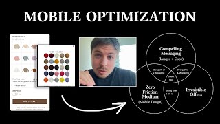
Pedro Loureiro walks through mobile optimization for Wild Bubz's product page, focusing on three conversion pillars: messaging, offer, and zero-friction medium. He shows UI tweaks, larger images, and a Color Guide popup designed to reduce friction and lift conversions on mobile.
Chapters
if you have a store where a lot of your traffic is going through a certain product page, that is the area that you should be optimizing. And I'm going to show you exactly what we did to optimize Wild Bubz's product page here, and actually some of the foundational principles that you can actually apply to your own store. What we did is, I've got two different versions I'm going to show you. The first one is obviously the original. This is what their product page looked like at the start. And this is what it looks like now. And at first glance, you're probably thinking, well, it looks pretty much the same, like similar. What's, what's actually going on here? Well, one of the, one of the real core principles of like CRO is not always to do like a massive redesign. I think people think that doing like a massive change and doing a completely drastic new version is actually something that's really, really critical. It's not because there's 3 different elements that go into like CRO, 3 different pillars. One is having really good messaging. 2 is having a really good offer. And the 3rd one is having like a zero-friction medium. And the word medium just means, in our case, in today's world, like mobile design, this is the medium now, which the majority of online sales is actually done through. So in Wild Bubz's case, that was their friction point, is the medium. And so that's obviously the thing that we focused on. So our goal was to try and find ways that we can reduce friction for mobile users on their product page. So I'll open up the Figma here and you can actually see an easier comparison of actually what we've done here. So you can see the before on the left and then obviously what we did on the right. Because this is like a personalized product, one of the things that was actually confusing people is that you can see if I go to the original carousel and I scroll through some of the images over here, I'm eventually going to get to the one that had, yeah, the yarn colors over here. So basically people needed to like pick out which yarn color they wanted. So they need to scroll down, select the sweater color, then they need to go down and select basically the yarn color down here. And of course, you know, when someone's coming through this flow the first time, they're not going to know the yarn color is up here. So you can imagine the flow. The flow is like someone's landing on the page, they're scrolling down, they're hyped up about the product. Let's say they think, oh yeah, it's awesome. Let's get this. They think maybe, all right, you know, I'm going to get a pink sweater. And then, you know what, I'm going to get a yarn color. And then they see this and they just see a list of numbers and they're like, what the hell does this mean? And then they see this text over here, please use our color guide to see options. And, you know, where is that linking to? You know, that doesn't really give any information. But basically what they had to do is scroll all the way back up, go into the actual photo carousel and scroll all the way to the end, and then they would see it over here. So you can see, really confusing, really laborious, so much effort and friction involved in this. So, Our main goal in this project was to find a way that we can redesign this without doing something that's super complicated, because we didn't want to make the store or this page very, like, heavy in terms of code. We wanted to keep things light. What we did is we just cleaned everything up in terms of the UI, added a little bit more spacing through so everything is a little bit neater. We made the images for the sweater color a little bit larger so that's easier for people to, like, click through and actually see the colors. And then for the color section, we include a little button over here called Color Guide. And I'll show you on the actual live version over here now what that looks like. You can see someone's coming through the flow, they're clicking on this little sweater over here, and then they're thinking, okay, font, yarn color, still have the numbers, but then when they want to actually see, they can actually just click on this little button over here and it triggers a pop-up with the numbers straight away for them to actually see which one they can actually get. So. Compared to the original, you can see just how much of an improvement this small little thing is, just by reducing friction. And the reason I'm recording this video and showing this is because this is really illustrating the one of the principles of CRO that I was just talking about, the medium. And the more you can reduce friction on your store for mobile users, the more conversions you're going to get. It is really that simple. And the cool thing about CRO is These principles have never changed in over 200, 300, 400 years in all of marketing. The same principles: having good messaging, having a good offer, having a zero-friction medium. I call it medium. Like, obviously, 200 years ago, 300 years ago, the medium was different. The medium back then was maybe like a traveling merchant with a horse and cart. But you can think about it, the actual sales process back then was pretty frictionless. If you like the product, the merchant would just take the product off his wagon and hand it to you and you take it home. Like that's it, pretty simple, pretty straightforward. But as our technology has evolved over the years, we, you know, with the invasion of the World Wide Web, the computer, and obviously now the mobile phone, like 10 years ago, 15 years ago, things have become more frictionless. Because if you think about it nowadays, what does a shopper have to do to actually purchase from your store? You first of all, they got to click on your ad, then they've actually got to scroll down through your page, learn more about your product, maybe watch a video, maybe read some reviews, read the shipping times, read some frequently asked questions, like answer their objections, then click on the checkout button, then enter in their payment details, then wait several days for the product to actually arrive. And then of course, unbox it, and then they can actually start using it. So you can see compared to like the first example, a lot more friction is in our current environment, which is probably something that I think a lot of founders are not aware of. They think of, oh, the fact that people are shopping on mobile, it's a pretty frictionless experience. But no, in most cases, it isn't. And the funny thing is Shopify is still not optimized for mobile. And it's really strange when you actually start to like think about this. But a lot of founders and a lot of people in the world are still building themes and still in the era of the computer, which was basically like 20 years ago, if you think about it, like the early 2000s, you know, and the minute you make that switch from thinking in a computer mindset to thinking in a mobile mindset, and start doing things that will reduce the friction in the main medium that we live in today, which is mobile shopping, you will start to experience a lot of results. This is good news, what I'm saying, because I think a lot of people think that, okay, to actually make some progress and to actually increase conversions or increase increase revenue, I need to make a real drastic change. In most cases, that will actually do more harm than good. What I'm saying that you actually need to do is you need to look at where your traffic is going on your store, figure out what is the bottleneck, the main bottleneck that is maybe slowing people down or preventing them from that in their journey. And that's what you need to actually focus on optimizing and improving. And if you can make some little small tweaks, gradual small tweaks over time, and start to eliminate each of these little bottlenecks, that's obviously going to— what's going to make the big swings and the big uplift in your conversions.










