Optimize Your UX-UI To Unlock More Conversions
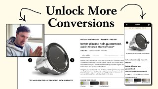
Pedro Loureiro audits a shower-head brand's website and shows how to cut friction that kills conversions. Bigger hero images, clearer CTAs, sticky add-to-cart buttons, and social proof from Instagram. The less effort a customer needs to buy, the more will.
Chapters
So in this video, I talk about the secrets behind how you can actually unlock more conversions from your website, and more specifically, how to optimize your UX/UI to make it effortless for people to navigate your store, how to communicate better with images, and how to make your brand be perceived as being more premium, which will allow you to justify higher prices. So let's dive right in. Having white text on an image or having any text really on an image is always risky. And you can see obviously here, it's just making it hard to read. And I was just recording an audit for another brand. And I was saying to them that a lot of people overcomplicate SEO for, for no real reason. SEO at the core is like really simple. And my philosophy is really simple in approach is just making things super easy to consume and making things super easy to like navigate. If you can make your website, the content on it really easy for people to read and understand and consume. And you can make your website super easy for navigate. you will increase your conversions. That's, that's the biggest block that stops most people from optimizing their ad spend and scaling efficiently is they have— not that their product is bad, not that their marketing material is bad, not that their ads are wrong. It's the fact that they're sending all of their ad traffic to a website that is not— is creating so much friction for people to understand what they're selling and buy the thing that they want to actually buy. Where I spend a lot of time helping people is trying to make things more effortless for your customers. And the more effortless you can make them, the more conversions you'll get. That's the secret and the hack to it. So things like this, like the hero section, I'd make your image bigger. I would make your image bigger. So because images do a lot of the heavy work that copywriting tries to do. So images can really sell people more effectively than text will ever do. So I would make your image bigger. And if you're, if you're a skin brand, like if you're, you're in the, in the beauty space, a closer-up shot of, of a woman smiling is really key, like showing the skin, showing the confidence, like showing the smile, showing the fact that they're happy, showing the fact that they're more confident. Like, that's the emotions, that's like the end goal of what they're trying to get to. With anyone who's buying like a skin product or a beauty product, that's what they want. And so the image is like anchoring in their mind where they want to get to, what they want. So that's why images in your space are so powerful. And I wouldn't kill the image with too much text. And I think that's what's going on here. Like, better skin and hair guaranteed with eSkin. That's, that's okay as a headline. But I just think the image, you're covering up the image, and that needs to be the first thing that people see is the, is a really powerful image. And I'm not even sure if I'd use this one. Because I think you need to, you really do need to have a clearer, like showcase of your product, because it's not clear by looking at this, at this image, what your product is. And I can see now that it's the shower. It's a shower head, right? So let's see if we can find here an image that does a better job. Sometimes on their Instagram, people, a lot of brands have better imagery on their Instagram, better messaging. So this is good. You have 13,700 followers. This is great social proof, and I would try and bring in some of that to your website. And like, this is crazy, right? Because like, look at the feeling that I'm getting for your Instagram compared to your website. Your website, it feels a little bit more like less branded, less premium, even though your imagery is really nice. But when I go to your Instagram, I have a completely different emotion. Like it looks premium, you have much better photos on your Instagram. And everything's obviously really clean because Instagram formats everything into that grid. So it like forces people to think about aesthetics a little bit better. But aesthetics are really important in your niche because Again, people are all driven by the looks. They want to look better, they want to feel better. And when you have a higher price tag product, people want to feel justified in spending that extra money. So that's what I would say. I would try and strip down some of the color that you've got going on here. You've got like red up here, and you've got this neon sort of like yellow. That neon yellow or green is quite cool. But I would just keep that with the black and the white and maybe like a beige. I wouldn't bring in any other color in there because it just looks a little bit too gimmicky. I would remove the emojis. I would clean up your text. I would use less copy in your headline and be very clear in your headline and in your hero section what you're actually selling. Like, it should be shop showerheads or shop shower or shop eSkin shower tap, whatever the term you're using to like describe your product. Make it super clear. Even if you're calling out a sale here, you still want to hit them with your value proposition. I always do that for brands. Because even if you're running a sale, we shouldn't be assuming that people who are coming back to your website are people who've known you before. So we, we should always be trying to educate new people and making it clear what we're actually selling. Your benefits down here are nice, but there could be a better way of formatting them. I'm not a fan of these sliding banners because people do not stick around to read them. They scroll far too slow and it's distracting people from what we want their eyes to go to first, which is your image, your headline, and of course the call to action. So I think this second section down here, I think too much text. My preference for a homepage is we have here a section that talks about the benefits, the USP of the brand, and gives them a call to action to like learn more or shop. And the next section should be just going straight to like the product page. So we'd have a section down here. That would literally just be the bestsellers, or literally just a list of the benefits of your product and the shop link that would direct them to the product page where they can learn more. This is, I think, is a little bit too long for my taste. And what I feel like your, your homepage is missing is that social proof. I'm looking at your Instagram. And I get a lot more of that feeling of a premium brand by looking at this, like the imagery again, really, really nice. And I think they're definitely, if you have these assets, to reuse them on your website and reuse the fact that you have this big social presence. I think that's really, really important. And this, this here, eSkin Filter Showerhead, that's what you need to be calling out on your homepage, your shop eSkin Filter Showerhead, that needs to be in your call to action button. So it's very clear to people what your actual product is. So the product page itself, Again, like the hierarchy here is a little bit strange. Like there is no real headline here. My eyes are drawn all over the place. And that this, this all kind of needs to be cleaned up. It really does. You're saying you have about 10,000+ customers. I bring that as well as some social proof that you can bring back on your homepage. And again, just the, your brand, the, the feeling that I get from your Instagram compared to your website is completely different. So that's something that you'd really benefit from is making your website feel just that little bit more premium. And it's not like you need to do anything crazy with the branding. Maybe just a better choice of fonts here, and maybe, and just touching up your, your spacing and your layouts, and bringing in some of those better assets you have in your Instagram, that will honestly do your website wonders. It will look like a completely different store if you have those things going on for you. Now, I always talk about this when I talk about product pages, but your product photo carousel is super important. It's like the most important part of your product page because this is where most people interact with. And so what this product page or this product carousel should do is it should give me, from interacting with those images, it should give me all of the information that I need to complete my sale, to go on and purchase with confidence. If it's not doing that, and it's not educating me enough, then it's not fully optimized, basically. So your product page, your photo carousel, it should really give you or give your customers an overview of all your different unique selling points, the top benefits, it should address their top concerns, you should maybe include a testimonial or two from one of your customers who's had amazing results with your product. And then a couple of lifestyle shots of your product as well. That would be really, really powerful. And that would definitely, definitely help people to convert more. So your purchase options down here, you're just giving people like a huge amount of information here to consume. The more information you're giving people, especially in the purchase area of a product page, means that it's just, again, it's creating more friction for people. The more friction you create, the less people will end up converting, just because it's like the law of effort. The more effort it takes, the less likely people are to do something. So this is an area that really does need to be cleaned up a little bit. And you just want to make it super easy for people to understand the difference. Autoship versus not autoship. And I wouldn't use that term autoship because I would just use the term subscription or a term that is more familiar to people. Maybe you're going to tell me that this is a term that people in your space use. And if that is, then that's fine. But I like to use just language that everyone knows, that when they come to this, they're not going to be like, auto-ship, what does that mean? I know it's the same as subscription, but all of these things do add up. So I would just say, and I would call out, I would maybe just put this in a 2x2 grid and call out exactly what the difference is. One-time purchase versus subscription. So this should be called subscription. This should be called one-time purchase. And then it should be very clear to people what the difference is. This, you're spending less, you're getting more. And of course you're getting your filter every single, what is this, every 90 days. Like this information needs to be really clear to people. So subscription shipped every 90 days versus one-time purchase. Because this, people will have to read all the fine details here to understand is every 90 days. A lot of people will just assume this is every 30 days and they'll be like, no, I don't want to, I don't want to subscribe. So that's what I'd say. I'd also try and make your add to cart button sticky on your product page, because it's a fair amount of distance people are having to scroll here. But I'm, I'm very confident that once you optimize this section down here, it will bring the add to cart button much higher up. So I like the fact that you have a what's in the box down here. What I would do is I would just add photos to each of these down here. So I'll show you an example of a good product page that I optimized for LifeInHere. Let's go down to the in the box section. It's pretty much the exact same as your what's in the box. But look at the difference. Look how easy it is to consume Liten's what's in the box compared to yours. Because it's more visual, people can just look at the images and they know exactly what they're going to get. So it's— we're reducing the time for people to consume. The reason why I'm repeating this over and over again is like the less time it takes people to understand your product and learn what they're getting, the more likely they're going to convert. And of course, at scale, when you're doing let's say 100,000 sessions every single day, when like millions of people are coming to your site every single month, those seconds are huge in terms of determining whether you're able to scale efficiently or not. These things really do add up. I know they may look small, but it's like the core principle behind it, making things effortless. You can see even here in the description, what we did is we called out the benefits. So instead of people having to read this massive paragraph, they can just get the quick summary of the benefits down here if they wanted to. So small little things like that go a long way. And honestly, that would, I think, make a big difference. So product page, we went over the, the optimizations there. I'm not sure if you have a collection page, doesn't look like it. But those are the main things that I would say. I'm not even going to look at the below the fold down here because not many people even consume this stuff. So if there are any big USP or unique selling points that are being mentioned or told to people down here, they need to be communicated in the product photo carousel, in that interactive slider, and they need to be communicated very quickly and efficiently for people. If you're looking for further help, I do offer a service where I can craft and launch a high-converting landing page for you that's designed to outbeat your current page by at least 10%. Our specialty is designing these high-converting landing pages, and we do this pretty much every single day for our e-com clients we work with, helping them to increase their ad performance and of course get better results in terms of their conversion rate, average order value, and overall profitability. And so if you're interested in learning more about what you can expect and how our process works, then of course, just reach out to me and I will send you more details. Cool, and I hope you got some value from this audit.










