Optimizing A Fashion Brand's Website (CRO Audit)
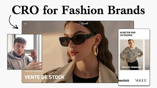
This content was created by Pedro Loureiro. This content was uploaded by Pedro Loureiro. This is a YouTube video titled "Optimizing A Fashion Brand's Website (CRO Audit)" (created 2025-04-01, last edited 2026-03-26). The excerpt is a single-speaker, monologue-style conversion-rate-optimization audit for a fashion e-commerce site (speaker labeled SPEAKER A). The speaker reviews the homepage, hero messaging/unique selling proposition, sale urgency, social proof, category layout (grid vs. scrolling banner), product imagery/carousel quality, pricing and positioning inconsistencies, size guide and color variant handling, and FAQ placement. Key recommendations include clarifying brand positioning (luxury vs. affordable), adding clear USP copy and sale end-dates, simplifying social proof, testing grid layouts, improving product photography (photoshoots and appropriate models), surfacing top FAQs on product pages, and fixing pricing display errors. The speaker closes by offering a paid service to build higher-converting landing pages.
Chapters
What I say when it comes to homepage landing pages is, even if you're running a sale like this and you have a sale banner in your hero section, you still need to communicate to new people who are landing on your page what your unique selling point is, what your store is about, what your brand is about. And I think your unique selling point is down in here. Each piece is designed with care and know-how to offer fashion that combines style and comfort. So this, basically a more condensed version of this, needs to be communicated in here. You can even just add it as a small little paragraph, sub-paragraph of 2 lines. If you're running a sale, I like the fact that you've given a reason for it and you're saying it's a closeout sale. But always give a date of when it's going to end. That way, you're going to build natural urgency with it. Now, you should have some form of social proof. You've got this scrolling banner over here. I'm not a big fan of these banners, because they're assuming that people are going to wait around to view all the information, and people are not like that. So I would honestly just kill one or just focus on one piece of information from this. Banner that you want to communicate. And that can be the fact that you have 4,000 satisfied customers. Maybe that's your main thing that you want to communicate here. When it comes to something like this, test putting them all in a grid, in a 2x2 or 3x3 grid, because you've got 1, 2, 3, 4, 5 here, you've got 5. So you get away with putting them in a 2x2 grid. And obviously one item at the bottom will be on its own, but that's fine. The reason, the point being, is you're just showing all the categories now on first glance, you're reducing the effort for people to scroll through. I know it may seem like a crazy thing. Oh, is it really that much effort to like scroll through? But on a website, you know, effort is measured in basically seconds or milliseconds. So, and that's effort in terms of time, effort in terms of physical energy as well, like swiping. So these things do matter. I do like the fact that your images are nice and big. So obviously we would have to reduce them a little bit to fit into like a 2x2 grid. But I think the trade-off there might be worth it if it's reducing friction. But you see, when I'm looking at a selling point, when it comes to like a fashion brand, it needs to be a little bit less wishy-washy than what we have here, because driven for passion, elegance, and quality— those are the things that really people don't care about when they're coming across a brand for the first time. So when it comes to this, I would make it clear on how you are positioning your brand. If you are a luxury brand, then you need to position yourself as having unique styles, high-quality materials. Maybe it's like made from hand, maybe it's your sustainability practices, maybe it's the fact that your designs are very one-of-a-kind, limited edition, like those are all unique selling points. And obviously, you can link it to like status and everything like that as well. If you're positioning your fashion brand as a cheaper option, so it's not a— it's not a— you're not basically a luxury brand, but you're a cheaper, more affordable option, then that can also be called out in your copy. You need to, you need to call that out in some way. You don't need to say I'm cheap. Obviously, that wouldn't, that wouldn't do you any service. But you basically would phrase it along the lines of, we make elegant designs that are affordable to, to, to help women look their best in every occasion, something along those lines. So that copy is still not great. But you get what I mean. That's a little bit stronger and a little bit more potent than what you have here, which is kind of doesn't really say anything. Let's just assume that you're trying to position to a lower or more affordable consumer. That's how you— that's the angle that you're going at. If that's the angle, then I would get rid of all of these really steep price points you're putting on your products and call out and position your products as, hey, the reason why we're not expensive is not that we don't have quality materials, we still have really, really quality materials. But we've just cut out the high markup value that comes with more mainstream brands. Because with mainstream brands, they're basically adding up a huge markup with just their brand name. And obviously, we're not doing that. We're still using the same— you could even say if you are using the same factories, then we're the same process. We're still using the same manufacturing process, same materials, the same method, the same delivery method. But of course, we're not changing, we're not adding on the same price point. And that's obviously how you can position yourself to new customers. That's— you can say, well, that's where we're coming in. We're trying to help women who don't have a massive budget but still want to look good and feel their best and wear quality clothes that will last them a long time, but don't have an enormous budget. That's our market. And that's what you call out in your copy. So something along those lines, if that is genuinely your market, that's what you need to be calling out a little bit more in your copy and speaking to. Because what I see some people do, which is kind of strange to me, is they are targeting people who don't have a lot of, let's say, disposable income, but they are simultaneously trying to position their brand as a luxury brand and then heavily discounting their products. And you can kind of see that the problem with that is it's almost like you're saying that you are one thing, but your behavior is saying that you're another thing. And so there's, there's confusion there, there's conflict, and people can see that. And there's— it just creates a mishmash. And people don't really know what you are, and you won't convert as well as you could. So size guide looks good. I like the fact that you've got the color variants over here. And they have the images in them. And the images update, which is nice. One thing I would say is maybe you could add little thumbnail icons down here instead of these little dots, just to make it even more easy for people to click through to the image that they want to expand upon. And some of your images, I've got to say, some of your images in your carousel are quite nice. Like these ones are much better than, let's say, this one at the start. This one at the start, I'm not sure why you're using it as your first image because it's really, really blurry. So it just creates a really, really not so great impression when you land on the page and see that. So okay, so this is— you're giving a reason here. So you're saying that you're shutting down your store. I'm a little bit confused because if you are shutting down your store, I'm not sure why this audit would apply to you. But hopefully, it's only a temporary shutdown if that is the case. So you're giving a pack and save, 1-piece, I'm assuming 2-pieces and 3-pieces. Again, this is the behavior of a brand that is not trying to position itself as a luxury brand. You wouldn't see a really luxury brand trying to sell 2 t-shirts or 3 t-shirts. But you get what I mean. So, and this is fine. Again, I'm saying there's nothing wrong with doing this as long as you just make it clear on who you're actually targeting. So I'm a little confused as well by your pricing. I'm not sure if this is because of the translation that's causing, let's say, this discrepancy. But I can see 3 pieces. I'm assuming this is 3 pieces instead of obviously rooms. But it's saying it's 119 €100 than it would have been. But it's actually €100 you'd be paying for. But one piece is €134 on its own, like the original price, and they're getting it for €40. So the numbers there don't make any sense to me. So I would just have a look at that and see what's happening there. Okay, some nice, nice reviews, which is good. So you've got an FAQ page over here. But I would honestly, I would take your top most common questions that you see people thinking about or wanting to ask. And I would put them on each product page. You don't want to create extra friction for them to get to the FAQs because FAQ, the FAQ section on the product page, and on any sort of landing page is one of the highest, most engaged sections on the page. And this is saying a lot because normally the FAQ section is all the way at the bottom. So people have to put extra effort in to go all the way down to the bottom of the page. And then of course, interact with it. So that shows how important it is. And it makes sense the FAQ section is important because if you think about yourself, when you're ever buying something from Amazon, or from any other store, let's see, outside of Amazon, what are the two most important things you look at? You look at reviews. And you'll probably— the second thing you probably look at is FAQ section. That'd be the second most likely thing you look at. Most important thing is obviously reviews. And then of course FAQ will come next, generally speaking. So that's why you want to make FAQ section as easy for people to engage with as possible. I wouldn't put it all on a separate page. I would take out your top 7 to 10 FAQ questions and put them on each and every single product page. Now the final thing I'm going to mention, and obviously this is really, really important to any fashion brand and any product page in general. The most important part of your product page is your carousel section. So your imagery. So the most, the easiest way that you can increase your conversions and your average order value and your performance in general as a brand, as a fashion brand, is to get better imagery. I'm not joking you on how simple and straightforward that is. But that is it. That is the real big hack to get more better performance out of your, out of your fashion brand. I've seen it time and time again that you can do as much as you want to really a site, you can make it look as fancy as possible, but you're always going to be limited and capped by the quality of your images. So if you have the fanciest store or theme in the world, you will still not get the best performance if you have blurry images or the wrong types of images in your, in your photo carousel. So biggest suggestion I could say to you from here is, again, the positioning, how you're going to position your brand. I think you need to be a lot clearer on that. The second thing is definitely invest in a photoshoot, invest in a photoshoot, get some better images done. And even if you're positioning your brand to more cheaper audiences, the images themselves, when they're high quality, when they're done with the right models. So if you're saying that this is because you told me that this is for an older audience, have the models who are wearing this be the older audience, make your models, the target audience that you're actually selling to, those things are going to create more trust. And that will actually really, really help you convert more customers. Cool. And hopefully you found this valuable. If you're looking for further help, I do offer a service where I can craft and launch a high-converting landing page for you that's designed to beat your current page by at least 10%. Our specialty is designing these high-converting landing pages, and we do this pretty much every single day for our e-com clients we work with, helping them to increase their ad performance and of course get better results in terms of their conversion rate, average order value, and overall profitability. And so if you're interested in learning more about what you can expect and how our process works, then of course just reach out to me and I will send you more details. Cool, and I hope you got some value from this audit.










