Paradym CRO Teardown: Mobile, Visuals & Messaging Fixes
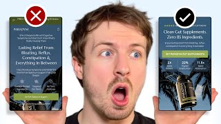
A CRO expert audits a gut-health supplement landing page and finds mobile constraints, oversized headlines, and AI-generated images killing conversions. He recommends moving the product image higher, using lifestyle photos, shortening copy, adding social proof, and defaulting to the 3-bottle bundle. He contrasts it with a cleaner client example to show how layout and concise copy drive faster comprehension.
Chapters
So the first thing I can notice is that your image of your product is getting cut off. And you can see that I'm setting this view window to 650 pixels. This gives me a rough range of what most mobile screens are going to be able to view. You got to remember, if you think that this is quite small, you got to remember that when people are viewing this on their browser, the browser area, there is a search bar in the browser and the other aspects of the browser also take up space. So that's why you really need to like check and look at your landing page on mobile after you publish it to really see what elements are visible. And we can see here, you know, the first thing that you're leading with is this problem statement. So 61% of people suffer with digestive systems, symptoms, but don't, but most don't know what's really causing them. And we have a headline here, lasting relief from bloating, reflux, constipation, everything else in between. There's a huge amount of copywriting there. People that you're basically expecting people to read when they first land the page, and they're having to scroll down to view your product. So the first thing that I'd recommend is if we can bring your image of your product up higher up and use an image of your product actually in the environment that it would be in. So using, you know, having a model holding it, showing someone taking— I'm assuming it's like a pill or something like that— taking the pill and feeling better, or whatever form that this product is being consumed, taking it and getting the end result. If you can communicate that visually, you don't need like this amount of text that you're forcing people to read. So people will be able to see the image. And then you can use a shorter headline to make it a lot more punchy. And then they can connect the two. And that will just make your messaging a lot easier for them to understand straight away when they land on your page. And the more easy we can make your messaging, the faster people are going to be able to understand it and hook them in. And that's really crucial because if people don't know what you're selling, within a few seconds, some of them are going to bounce, some of them are going to leave. So you're basically just wasting some ad spend there straight away. So you want to make sure everything is really punchy, really quick for people to understand. So let's scroll a little bit further down. I can see that you're using AI photos in here as well. I personally wouldn't recommend that because, you know, with, with everyone else kind of using it now, it just feels a little bit cheap. And you know, that's kind of like the first impression that people are going to have about your brand. They're going to just think that you just whipped this page up. And it's not really a big brand that's, that's behind this. And images are really, really important because that's, that's actually a lot of social proof comes from the images themselves. If they see your product, and they see that you did a photoshoot, and they can see some models using it, and they're associating that on a subconscious level. So images are really, really important. That's why we never recommend to anyone to do to add like stock photos or AI photos to their landing page unless they're really convincing. So we have this section down here, what's your body been trying to tell you? So again, there's a lot of copywriting that you're adding in here. Then we have another section as well that goes into, goes into more of the details. But basically, it just feels like a really heavy read. And what you need to do is just break up the sections a lot more, make it easier for them to like chunk down the information. I'm going to show you an example now of a page that we're working on right now and how we've actually broken up the information to keep people's engagement throughout that page. So So here's a landing page that we're working on right now for one of our clients. And you can see the hero section is kind of taking the principles I just talked to you about. We're using a really nice image with the product showing the use case so people can look at this image straight away and understand the use case of it. We've got some social proof, some anchoring, you know, safe for the whole family, but more social proof over here as well. That's also something that I didn't see from your hero section is there's no social proof there. There kind of needs to be something like that. And the real big Anchor for social proof is often in the image, like I mentioned. So you want to use a really good image for that. We have our call to action, which is above the fold. And in the call to action, it's telling them what the product is. So try our toothpaste risk-free to make it again, make it super clear what we're selling here. You know, we're not selling the toothbrush, we're selling the toothpaste. And we've got 3, 3 bullet points over here with benefits and a really nice headline that kind of ties everything together. And then you can see in this section underneath, we're going into the problem solution. So we're introducing the problem, which is where customers are at now, or shoppers are at right now. And then we're presenting the product as a solution and giving again, just a nice overview of the main benefits of it. But you can see that we're still not using a lot of information. We're not going really heavy on the copywriting because we know that the way people are like reading information is they're scanning it. The way that people are going through your websites is they're not looking at it and reading it line by line, which is how most people think. Their eyes are kind of darting around and they're looking for like visual cues to anchor in their attention. So that's why we use a lot of images on our landing pages, because we know that images hook them in, hook their attention. Images and headlines are the two most important things to like hook people in. Another tool that we use is called pattern interrupts. So you can see the way that we're breaking up this information here. If we had this paragraph just all the way down, it would make it harder for people to read. It would create a little bit more friction. But by putting things in a box, it's a subtle thing, but it breaks up the pattern. It makes it more easy to read because it like separates it visually. Draws a bit more attention to it. The same with this section down here, we're using a bright blue section to draw attention to it so that when people are scrolling down, it's not just a white, you know, a completely white sterile page. There's some sections in it that are drawing their attention. And in this section down here, we're going through the benefits of the product, the ingredients and the benefits tying into the benefits. Then we're going into another unique selling point of the product, explaining the transformation of how they're going to get their main benefit, which is a brighter smile, less sensitive teeth, how easy it is for them to use. And then we're going to some feature testimonials. And the powerful thing about the feature testimonials is we are calling out strategic ones that handle the top objections that customers or that the shoppers have. So we've got one that's talking about sensitivity, we got another one that's talking about the fact that it's fluoride-free, we got another one over here saying that the flavor is on point. So you can see we're touching upon different, different pain points and addressing them. And then we're doing a comparison here showing how it compares to other ones in the market. Then we're going into the offer section. So we're presenting the offer and then giving people the ability to add it to their cart. Then underneath that, we've got the FAQs and then the final call to action. And that's it. That's kind of the extent of our landing page. And if we look, if we go back to looking at yours, you can just see that the flow is a lot more, the text is a bit smaller. So it's actually harder to read the text. There's a lot more text and there's no pattern interrupts in here. So you're making it a lot harder for people to actually consume this information. It feels like they're having to put a lot of effort in to kind of learn and understand your product. And here's the trick, especially when you're driving a lot of traffic to your website, you want to make it as easy as possible for them to understand your product. The easier your messaging is to consume, the easier people will learn about your product and the quicker that they'll be likely to convert and ready to convert. So you've got some testimonials over here, but you've got them in a carousel. So they have to like scroll horizontally to like consume the carousel. Make it in a vertical stack, like I showed you in that example that we're working on. And that way, and just bring out the top 4 or 5 testimonials that are really, really powerful. First of all, they're not going to read every single testimonial in this carousel. So you want to just pick out the most important ones out there and make it easier for them to actually consume it. So stack up vertically. This is also a very, very long section over here. There's no real headline that's tying it together. I think it's all underneath this. So just seems like a really, really long section over here. And I think you have brown pills over here. But when I look up at There is another photo I think you have down here. Yeah, there's another photo down here and the pills are like green. So there's just, there's no consistency with the images as well. And I can, I can see that these are AI generated. And so all the way down here, we're about 30% down the page. And this seems to be the area that you're going more into Paradigm and introducing it. So it feels like all of the education above has all been kind of presenting the problem where they're at. And I'm honestly not sure if you needed to go that deep into the messaging. That's why I think if you brought in more images, If you broke up the text a lot more, you could condense that down, make it easier for them to read, and go into Paradigm and go into the benefits of your product a lot sooner. So I like this section. I think this is a much better section because it breaks down the information a little bit better, and it's a pattern interrupt. And when they're scrolling down here, breaks up the flow, and it's a nice photo of your product. One thing I would recommend though is just have the pills or whatever's inside your product next to it as well so that people can know what's inside the packaging. You have your ingredients in here, but they're in a carousel. That's fine for the ingredients. But if your ingredients are a really important unique selling point of your products, or main selling point of your product that people are going to really care about, then maybe you need to just display them vertically and pick out the top ingredients, or the top 3 to top 5 ingredients, go into them, and then have a button underneath if people want to actually see more of them. And I'll show you the Mouthology example over here. We've kind of done that over here. So we pulled out the top 5 ingredients in their toothpaste over here. And if people want to see the full ingredients list, they can click on this button over here. And it will display a pop-up and have the full list of ingredients in there as well. So again, we're breaking it down, making it easier for them to understand the top ingredients. And if they want the full list, we're giving them access to it. So we're not just giving them all information, because most people think if we just give the customer shopper every single bit of information, we're going to be more likely to convert them. That's actually not the case, because the more information you give, the weaker and weaker your message becomes because it gets diluted. People's attention is going to be completely spread out across your entire page, and it's going to be harder to hook them in. So you've got the transformation journey over here. Definitely, definitely, I'd recommend adding images to this, show the actual transformation instead of just having words that describe it, you know, show that transformation visually to really anchor it in. And then you go into more of the ingredients over here again. So it seems like another ingredients section. And this is kind of more of what I'd recommend. So I like how you've actually done this. I think this is fine, you know, but this seems to— this would be better to just replace the other ingredients section up here. I'm not sure why you have two. I mean, you have some more benefits as well about your product over here. These feel like more powerful benefit points than what you even had up in your hero section, like 2 times more potent, you know, that feels better than science-backed ingredients targeted gut relief and no toxic additives. If you can call out that number, like 2 times more potent, 21% more this, or 50% more that, that feels a lot more potent. That's gonna hook people in a lot more because it builds more believability. You have some numbers to back up the claims that you're mentioning. Like 11 times more absorbable. I mean, that's definitely a lot more powerful than science-backed, for sure. So you have the bundle over here. You got the 1 bottle, the 3 bottle, the 5 bottle. I would just have it default to the 3 bottle by, by default. Just so that you're suggesting to people that that's the bundle that they should be going for. So it doesn't seem like I'm able to like zoom into your images. That might just be because of how I'm viewing it on this browser, but you definitely want to have the ability for people to click in and view the image and be able to zoom in because they want to be able to read the supplement facts and see this. Otherwise, the information is really, really small. You definitely also need some lifestyle photos in here, people actually holding the product, using it, showing the actual what's inside of it, because we don't have any proper images. Of what's inside your product right now, other than the AI photos. Then you have your FAQs down here as well. And these FAQs, I'd recommend you just call out the top 7 to 12 objections that the customers have, and that's what you use this FAQ section to address. If you're looking for further help, we do offer a service so we can craft a high-converting landing page that is designed to outbeat your current page by at least 10%. Our specialty is designing these high-converting landing pages, and we pretty much do this every day for the e-com clients that we work with, such as Snow, CarePods, Soloway, Velvet Caviar, and many more DTC brands. Helping them to increase their ad performance and get better results in terms of their conversion rate, average order value, and overall profitability. If you're interested in learning what results we can get for you and how our process works, then check out the description. There are links to our website, and of course, you can also book in a call with me and answer any questions you have. Cool, and I hope you got some value from this video.










