Re-Designing A Product Page To Convert Better (CRO Audit)
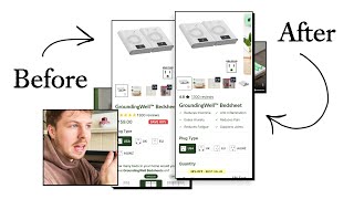
A CRO expert audits an e-commerce product page, recommending seven carousel images with doctor quotes to back health claims, pricing that frames the product as a $0.30-per-night investment rather than discounted, and a quantity selector with tiered bundle pricing (10% off two units, 20% off three) to increase conversions.
Chapters
The most important part of your product page is your image carousel. So this carousel over here. So if you take away anything from this video audit, the most important thing that you can actually do to optimize is going to be your images and the videos that are inside this carousel. What you do here in your product photo carousel will have the most impact on your conversions because this is what the majority of users will be engaging with. What I think would make more sense is since we know that so much traffic is going through this product image carousel, it would make more sense to actually reduce the amount of content that people have to swipe through and focus it down to like, okay, how can we, how can we, let's say we're doing only like 7 items in your carousel. How can those 7 items be the most powerful? Like, what do we need to say to sell your product so that people understand exactly what it is, what the main benefits are, how it works, how can we educate them on that in 7 items in your carousel? That should be the goal, because I think that you're giving them a little bit too much content here. And you're expecting people to like scroll through. And the problem with doing this is that some of the later images in the carousel may be the ones that are really, really compelling to people. Because they're so far along in the carousel, less and less people are going to engage with it. So this graphic is interesting to me because normally, to actually ground something, the current would go in reverse, right? It would go from the bed into the ground. It almost looks as if this person is getting charged. By this current that's going into them. So this image over here, you're saying fits across all bed sizes. If this is your headline, this should be at the top. But then the thing that's kind of, I think, a little bit confusing, you're saying 8 feet or 2.6 meters long. I think if you're saying fits across all bed sizes, name the different bed sizes, you know, king-size bed, single bed, queen-size bed, that will communicate what you're trying to communicate a little bit more effectively. We know that your product image carousel is the most important part of this product page. And that's why I'm focusing on this first. Everything that needs to be here needs to be really optimized. I would keep it to only 7 items in your carousel, maybe about 1 or 2 videos maximum. And those videos, I would just make sure that they are dialed in. Like the, the video that I think is really good is this one, because I think it kind of explains exactly how it works. This, I feel like you could probably communicate via an image. You know what I would do for this? You've got this nice little graphic here showing the ungrounded and grounded. Which I think is quite nice. I would honestly just show the electricity buildup in the body a little bit more denser. So like you could even have the whole of this person's body, you know, be slightly red. And then here you can see that there's like no electricity and bad electricity in his body. I think that would be a better illustration of it. This thing, this graphic, like I mentioned, I think it's a little bit confusing because it looks like the electricity is coming from the ground and going into his body. You're saying scientifically proven to treat all of these different things. Well, this is what I say with copywriting is that any bold claim needs to be backed up with some proof to make it trustworthy. And so what I would say that you could do in this carousel to make it a little bit more powerful and punchy is see if you can bring in some doctor's quote or some scientist quote or some even medical article that will back this up. You know, you can even bring in, let's say, a quote snippet from a certain doctor. And have their profile image in the, in the photo, them vouching for the fact that they stand behind this claim. Something like that will make it so much more powerful. And then these benefits over here, I would honestly list them out underneath here. Do you know what I'd also say on the product carousel is considering actually bringing this video into your product carousel as well. Because if this lady is talking about her, you know, paying with her, with her knee, right, and she's talking about how your product that she helped her with that, Well, that's just gonna make it so much more powerful and give people a really, really genuine reason, another reason as to why they should invest in your product. So this video could be very powerful, it could be one of the two videos in your product listing carousel. The first video could be this video over here, which I think is very good explaining your product. And the second video could be this customer video to like review talking about your products and what and what, how it's helped to reduce their pain. I think the other thing that you can do in your product carousel is just make sure that the fonts and the styling is just more consistent and just a little bit more premium. I think, you know, the shadows and everything, it kind of makes it look a little bit more cheap when your products, like the photos, the actual product photography that you have is really, really nice. And so it's kind of like a little bit of a, of a strange contrast to have such nice product photography. And then we have like this really kind of like shadow box over here with the text on it. It just doesn't really look that appealing. You know, when someone's looking at it, this is not a really major issue with your product carousel, but these little things to make— because you're selling, let's say, more of a high-ticket product because it's like around the $100 price point, you know, these little aesthetic changes, they do add up and they do create more trust. That's kind of what those are doing. When we, when we have a nicer looking website, when we have nicer looking graphics, when we have— and the most important thing is have a really good product photography, which you already have— all those things create trust for someone. If we talked about your product carousel, I've kind of suggested some some optimizations you can make to those. Let's go on to your order form now and actually see what we can do here. So the first thing that I would say is you are offering this at a discount. I can see that straight away. Now, and this is what I say to a lot of brands who run a discount, is why are you running a discount? And sometimes, you know, that's the first time that a founder or brand owner has been asked that question. It kind of makes them think, which is kind of funny. But like, I think a lot of people think, oh, you It's just good practice to run a discount, but not in all cases. If you have a premium product and you know it's worth and you know its value, don't be afraid to stand behind its value. And like, if you're saying that people won't buy it for $180, but the actual price that we always run it for is $100, make that the full price then. I would only ever discount something if it is genuinely on sale or you're running like a special bundle or promotion. If you run an evergreen discount, which is kind of like what this looks like, because you're not really giving any reason as to why it's on discount, people might associate it with being more cheap. That's how the perception is. Because you're, you're, you're cutting the cost in half. And anytime anyone cuts the cost of something in half, it's normally like a Black Friday sale or clearance sale or spare stock sale. I know they may be done because of a conversion tactic, but they can also in the long term damage your brand. So here's the principle behind this. If you are discounting something, give people a reason as to why it's discounted. So you could say, say 50%, and then you could have next to it, let's say, until February the 14th. And then underneath that, you know, you can say maybe the, you know, New Year's sale or something like that. And I understand, look, if we look at your banner up here, you already are offering a 10% off with the New Year's sale. And so people are going to be buying this product from you with potentially getting 50% plus another 10% as well, the New Year's sale, I'm assuming. So it's quite a lot that you're offering off there. And this kind of just takes the premium perception that someone would have of your product and really diminishes it by quite a bit. A lot of people think they have a price problem. But when you— whenever you have a price problem, it's not because of the price itself, it's because you're not communicating the value in the most effective way. And the most effective way you can communicate your value is with better product photos that explain your product in more detail, communicating the actual end desire benefits of what this is doing. Because you're saying to people, hey, this is going to reduce your insomnia, this is going to reduce your pain, this is going to, you know, help you sleep better, sleep deeper. Well, that's going to be well worth $100, $150 to most people. This is the way I look at it. If your product is good and it does solve people's problems with insomnia and with, you know, helping them to sleep deeper, that's obviously going to be well worth the $100 they're going to pay. And if you're noticing that your audience is still very price sensitive, well, there's other ways that we can handle the price objection. We can say we can compare your product, which is, let's just say, the full price. This is $100. So think about this, they're paying $100 to get the solution, to get, you know, better sleep and less pain versus, you know, hundreds of dollars, potentially thousands of dollars on medical treatments, medicine, and all the other associated like side effects that come with those sorts of things. So I think what I would like to see in your product listing carousel as well is a comparison chart that handles the price objection directly. You keep your product at full price, let's say it's $100, you don't show us on sale, but you stand behind the value that you say we're actually one of the most, the smartest investment option because you're going to be paying. And if we even do it every single year, let's say it's $100, divide that by 365, you're going to be paying like $0.30 a night for better sleep. So when you look at it that way, your price now gives people a very rational reason as to why you're the smart investment. Okay, so let's come on to the final thing with this quantity selector. So you've got 1 bed, you got 2 beds, you got 3 beds. So you're asking them how many beds in your home would you like to have the granny bedsheets on? But here's another thing that you could do as well is, well, they're going to have to wash the sheets, right? So it makes sense for them to actually buy 2, because once that sheet is in the wash, they can have the other one and the fresh one that they can actually use that night. So I would honestly just keep the language very, very simple. I would just say quantity. And instead of displaying it horizontally as how you've got it, I think it'd be better to actually display it vertically. It'll be something like, for nutrition over here, if this order form didn't dump, then it's still one of the best order form designs that we've done because, because it's so easy for people to read it and see it. So you can actually see here, this is kind of how the design that we followed for them, and I'm just going to try and map that out quickly for you and see how that would look. And so this is how I position it. I would say 3 bed sheets at the top, and then I would do 2 bed sheets in the middle, okay? And that's the one I would have selected by default, 2 bed sheets. And then we've got the 1 bed sheet down here at the bottom, okay? So this is selected by default, and then What you can do, one bed sheet, you offer that at full price, that's going to be the full $100, whatever the price is going to be. Got $100 for one bed sheet. So $100 is going to be for two is going to be $200. We're going to multiply that by 0.9. So it's going to be $180. $180 divided by 2 is going to be $90 each. So it's going to be $90 each for that. And so what are they saving? So they're saving $90 by 2, saving about $20. So for 3 bed sheets, this can be 100 by 3. So that's 300. 300 multiplied by 0.8, because they're saving 20% off, it's going to be 240. 240 divided by 3 is $80 each. It's going to be spending $80 each on that, and they're going to be saving 80 by 3. They're going to be saving like $60. Just make sure my math is right. That's 80 by 3. And $300 minus— yeah, so $60. So actually quite a lot of savings when they actually upgrade to buy 3. So this is the order form design that we have so far. So if your order form, you can see we just cleaned it up a lot more. You know, we're not offering a discount now, but of course, the way that we're doing the discounts is we're doing it in a way where we're incentivizing them to, of course, increase the quantity, you know, so it makes a little bit more sense. And this is a great way to offer discounts, but not reduce the perceived value too much of what people are looking at with your product, you know. So, of course, in summary, it comes down to you whether you want to continue offering your 50% or 60% discount. But I've kind of explained the reasons as to why I think in most cases, that's not the best strategy if you have a high-ticket product, you know, like this. But if you still do want to offer your 50% discount, I would recommend giving people a reason as to why you are running that sale. So, you know, call it the New Year sale and give it an expiry date so that you're adding some natural form of urgency to do with it.










