Stop Losing Sales On Mobile — Do This Instead
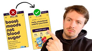
A conversion specialist audits a soda brand's mobile site and finds friction everywhere: oversized headlines that cut off, navigation menus that bury products, and product pages that hide pricing. The fixes are concrete: tighter benefit-focused copy, image shortcuts for products, expandable nutrition tabs, and clearer price-per-can displays.
Chapters
The most important section on your landing page is the first section that people land on. In this video, I'm going to be walking through a live example of how you can actually optimize this section to maximize the conversions. Let's dive right in. So what I can see straight away, your headline is quite big. This, what you're actually seeing here, is what most mobile screens are going to see. You can see that the call to action is being cut off. Your products are being cut off. The headline is actually quite massive. And what it seems like, it seems like your website is quite optimized for desktop. When it comes onto mobile, the first impression is not looking good for mobile. And I would assume that the majority of your traffic is browsing and converting on mobile. And if that is the case, then you really need to make sure that this is optimized for the mobile experience, because you're going to be able to convert a lot more. You're going to be able to reduce the friction for mobile users. And that means if you can reduce the friction for mobile users to actually browse your store and consume the information that you've got here. Then they're going to have a better browsing experience. Better browsing experience means they're more likely to stay on your site for longer. And that means they're more likely to actually convert and turn into an actual customer. So I like your headline. I think your headline is good. This subheadline though, down here, it's explaining the ingredients, which is good. But I also feel like it kind of needs to tie in and give more proof to the bold promise that you're actually saying in here, which is boost moods, not blood sugar. I feel that you need to reinforce the fact that this is like a sparkling soda drink. But that's actually good for you. And that needs to hit a little bit stronger. So let's see if we can see a better headline that you can use and check out your Instagram. So this is the key information that you definitely need to surface on your homepage. 2 to 4 grams of sugar, 20 cals, like 20 calories per can of, of soda is pretty good. So that's information that you definitely need to surface there. And also the fact that it's caffeine free. That's another piece of information that you need to mention. You could even say, you could even tie in something like this into your headline as well. Good tasting soda without the guilt, you know, or something like that. I feel like just that the copywriting on your homepage needs to be a little more powerful. And your, your subheadline underneath your logo is the perfect soda. That could also be a great headline to actually put in here. The perfect soda boosts moods, not blood sugar. And then underneath you have those 3 different bullet points, those 3 different benefits. So, you know, 2 to 4 grams of sugar, zero caffeine, and you can put another thing in there like really quality ingredients that actually help you. So something like that definitely, I think, would make it a lot more powerful. Have a better image of your products over here. This is really, really small down here and it's been cut off. So definitely think that we can do a lot to this hero section to improve it and make the first impression, which is the most important impression for anyone coming across your website, a really, really strong impression and hook them in to actually engage with your website further. So the next step in your funnel is your navigation menu. It seems to just be a pattern that you've got this larger font size here. And the problem with that is it just is taking up a lot of space. You can see we're still kind of getting some bits of information cut off here. And there's also no hierarchy to your navigation menu. You've got your Our Story at the top and you've got your Shop underneath. Your navigation menu is really important because so much traffic clicks through and flows through that funnel. And the reason why navigation menu is so important is because for desktop users, people can easily navigate around with a mouse. It makes the whole experience feel a lot quicker, and they have a lot more control of where they want to get to. And they can also open up multiple tabs. On mobile, it's a lot harder for them to do that. The navigation experience in many cases is a lot slower, it creates a lot more friction. And yet we know that the majority of mobile traffic, or the majority of traffic on stores, is mobile users. And a lot of stores do not optimize their flow for mobile, they make it harder for them to get to the pages that they want to get to. So desktop experiences have a great experience. Mobile users actually have this sort of worse experience with a lot more friction in there. So it kind of doesn't make any sense. And a lot of websites and a lot of brands are catching up to this only now. But creating less friction for your mobile users will get you ahead. That will give you the edge. So what I'm actually saying that you can do here is create a better hierarchy. So make this, make your navigation menu a better experience. Because the first question that we have to ask when someone clicks on your navigation menu is where do the majority of people want to get to? When they're coming across your brand. And of course, it's to do with your product, because that's what you're selling. At the end of the day, your whole brand is about selling a product, it's about selling your soda, soda cans. So if we know that, then the first link in your navigation menu should not be about your story, it should be about your products. And it should really surface your top best-selling products straight away and make it really accessible for them to click into them. If you can do that, you will just get a lot more people to get to those product pages straight away when they click on your navigation menu. And in turn, that will lead to more sales. If you can capture people and hook them in faster and get them to where they want to be, that will definitely lead to more sales. It is really as simple as that. But of course, it comes down to just executing it in the right way. So instead of just having the word shop, I bring in an image in here to actually show your 4 different products. They can click on that link, it will go to the product page, the variety pack. And then underneath it, I would make all of these other links less visually significant. So you can decrease the font size. Push them a little bit further down, and you should have a little bit extra space in your navigation menu because of that. And in that space, you can surface your value propositions again. This is another good space in your flow to educate people. You can also bring in a testimonial. If you have a really powerful testimonial from a customer that handles the top objection, you can bring that in here. So you can even mention something if a customer— we can even see if we have one on your product page, but maybe there might be a review. Yeah, even something like this. I will confess, I'm not a regular soda drinker. I always find it too sweet. But this is so tasty, I would absolutely buy it again. Something like that could be great in your navigation menu. Or even something like this. My mom was— is a type 1 diabetic, and I thought it was very good. I really appreciate the ingredients. She was very impressed. So that's awesome. So imagine someone who's struggling with that as well, they come across that, they see that review in your navigation menu, which is the second step in your funnel. And they also are experiencing that or going through that. And then they think, okay, this might be the drink for me. I can experience it. So that's hooking them in further. So you're just casting that net wider and deeper, and you're catching more people's attention, hooking them in. So that's how you can do this a lot more strategically. I quite like the theme of the product page. I like the fact that it's blue. I think it has a sort of vibe to it. Your brand has got this sort of colorful vibe, which I like. So let's look at your images. Okay, you have the nutrition facts, which is great. I would like to see a feature. I'm hoping that on mobile, because I'm viewing this on my browser here, But I'm hoping on mobile, if I click on this, it would expand the nutrition facts and make it easier for me to see. I like the fact that you're really calling out the fact that it only has 20 calories. That makes it pretty clear. That's good to see. So this information over here, I feel like is misused space. You're just kind of saying try 3 cans. Again, what I would be putting here is your value proposition. Don't assume that they've read it on the first stage in your funnel. And I'm also assuming that you're sending traffic directly to this page. So we should be assuming that they're fully cold. Even if they are organic traffic or warmed up traffic, the best way to view them as is fully cold is if they have only watched 1 or 2 seconds of your ad, or they've only come across one of your social media posts, and they don't really know too much about your brand, but they've kind of piqued, piqued their attention, and now they're on your page. So what I would do is really hone in the fact that 20 calories per can, it's got zero caffeine, and it's designed to be blood sugar friendly. The thing that I'm not too sure about with your flow is that you've got these images here and they say single flavor. And I know you're mentioning it's 12 cans over here, but I would really like to see that visually displayed. Show the 12 cans in a pack. That way they can really equate the value to what they're actually seeing visually. They can see, they can equate the price to the value. So, and I would also make sure that you're, I would also put the $2.99 as the main text up here. So $2.99 per can. And then if they save, because look at it, it's getting cut off over here. If they save, it's $2.55 per can. So they're saving almost like 15% if they subscribe, right? I think that's, that's what it says. It's getting cut off. Yeah, save 15%. But you know, this information here, it shouldn't get— it shouldn't be cut off. So this ingredients tab is, is probably going to be a very important part of your brand to actually communicate the ingredients that are inside your product. And what I would say is, if we know that people are engaging with this, and we we know this information is important for them to read, how can we actually break it down and make it easier for them to consume? And I'm going to show you a brand that I've worked with, one of my clients here, Lifan. I can just show you one of their tabs. So you can see this is their tabs over here. We got in the box, and we got the specs. We've got in the box, we've got the description. You can see how we're breaking down the information. We didn't just put a whole paragraph in here. We've also broken down the top benefits from this as well for people who just want to read it at a glance. In the box. We're using images and icons and listing all the information as well to make it easier to read. And that's what you can do as well. Instead of just using a paragraph of text here, how can you add little— display them in a list, add little icons next to them showing the different ingredients. So because this is an important value proposition, make the information easier to read. If you make it easier to read, more people will read it and more people will actually get compelled by it. I also like this, what's not inside. And you know what you could do? You could actually combine this into one. So instead of having this into two separate tabs, you could say what's inside, and that could be your— and then you list out the ingredients. And then underneath it, you just put a little space and you say what's not inside and you have a little X. Cane sugar, high fructose corn syrup, artificial sweeteners. And that's a real good way to like hone in your value proposition again. So that's what I would say. And I think you can make this so much more powerful by doing that.
If you're looking for further help, we do offer a service so we can craft a high-converting landing page that is designed to outbeat your current page by at least 10%. Our specialty is designing these high-converting landing pages, and we pretty much do this every day for the e-com clients that we work with, such as Snow, CarePod, Soloway, Velvet Caviar, and many more DTC brands, helping them to increase their ad performance and get better results in terms of their conversion rate, average order value, and overall profitability. If you're interested in learning what results we can get for you, and how our process works, then check out the description. There are links to our website, and of course, you can also book in a call with me and answer any questions you have.
Cool.
And I hope you got some value from this video.










