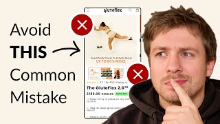
Pedro Loureiro audits an e-commerce product page and finds confusing offers: the page claims both 100+ and 50+ workouts, and calls the same thing a starter kit and bundle kit. He recommends enlarging product photos, removing redundant text, and adding a comparison graphic so buyers know what they're actually getting.
Chapters
So when it comes to product pages that you're sending traffic directly to, the most important thing that you can do to optimize is your listing photos, because these listing photos are going to be the main element that people are going to engage with, and that's going to really influence their decision on whether they're ready to buy or not buy. So if we just take a quick look through this, we can see that the text is quite small when you're viewing on mobile. Like this review over here, it's a little bit small as well. I just enlarge it a little bit or even try and trim it down to kind of call out the most important part. And I would simplify it. I would try and simplify all of the information that you've got inside your product page. See, I would strip out all the fancy design and just make it easier for people to actually understand the information that you're trying to communicate. So over 100+ gym-quality workouts, keep that in the same headline, keep the same standard headline across each of these listing photos and make the images of the actual workouts bigger because that's an important thing that people are going to want to actually see. Okay, can it do that exercise? Can it do this exercise? This part down here at the bottom, you don't necessarily need that. So I would just remove that and use the extra space to make all the images a lot larger. So this image over here, I would make the text a lot bigger. You could even remove this subtext down here and just keep the main, the main headline for each of them. So for example, over 100+ gym-quality workouts, up to 16 to 35 pounds of resistance, cost-effective, lightweight and portable, lifetime warranty. Like, you could just keep that text because if people want to have more information, they can just scroll down, they can learn about it. Inside the order form. Bring in some more review photos like this into your listing photos that are specifically there to handle the top objections that you know your customers have. So whether that be, does it actually really work? Is the shipping fast? You know, what is the quality like, you know, is it going to last? Bring in those reviews that handle those specific things. And that's going to make it a lot more powerful. Because of course, at the end of the day, when people see other people talking about your product, and and vouching for it, that's 10 times more powerful than your own sales pitch about your product. So this, I would just simplify this again, you've got very, very small text going on here. And also that your fonts and everything like that are all different sizes. You got 50+ different workouts over here. And then we're saying over here, 100+ gym-quality workouts. So there's this coherence in your message. And then we have the starter kit versus the Bundle Kit. And okay, and this is where you have the— so this is where you're saying 100+ different workouts, and this is actually where you're saying 50+ different workouts. But you can see how that's going to create confusion to people if they don't see the next image. So what I would say that you can do to this, create a simple comparison chart, like a simple graphic in the order form that compares the two of these so that people can see which one is the best one for them. So instead of them having to swipe through two images, they can see very clearly in one image what are the— what are they getting with the starter kit, what are they getting off the upgrade to the bundle kit 2.0. So because you have two different offers over here and you're including this information in your order form, this is also what's creating confusion for me because you're saying 16 kgs for deep glute activation, but then I'm reading down here it's 16 kg resistance in the bundle kit 2.0. So is the 16 kg not included if I have the starter kit, and yet it's still communicating it there. So you can see, because you're including all of this information at once, and because there's no easy comparison between the starter kit and the bundle kit, that is what's creating the large amount of confusion for me. You know, I want to know exactly what I'm getting in the starter kit and exactly what I'm getting in the bundle kit so I can make my decision confidently on which one I think is best for me. And that's honestly a big part of sales. If you have two different offers, a lot of people think, oh, it's the offer itself that's not working. In many cases, it's not the offer. It's because you're giving people, let's say, two different options. And the hard thing that's going on there is you're not making it easy for people to decide which is the best decision for them. So the rule of this, or the principle behind all of this, is the more easy you can make it for people to understand which offer is best for them by actually including a comparison, by breaking each of them down a little bit more, that's going to help you win more of the sale, that's going to help more people to continue and shop with confidence. As for everything else, I would look down below your fold and try and see if you can bring up more assets that you have in below the fold into your listing photos. Because like I mentioned, the listing photo is going to be the most important part. This seems to be a good asset that you could bring in showing how the product actually works. And that's something that's missing in the listing photos as well. So Try and see if you can bring that in. And like I also mentioned, try and see if you can bring in some more photos of people with the product. This is a really nice photo because I can see the product, it looks genuine, and the product looks like good quality over here. The lighting of this photo looks good, it looks sturdy, it looks like it's made from some proper materials. So see if you can bring in an image like this into your listing photos as well. So in fact, because you have a few different photos in here from different customers, I would just create a collage and bring that collage into your product listing photos, or just take a review from all of them, add in maybe another 1 or 2 reviews into your listing photos as well. But basically, those are my top suggestions on what you can do to optimize this.
If you're looking for further help, we do offer a service where we can craft a high-converting landing page that is designed to outbeat your current page by at least 10%. Our specialty is designing these high-converting landing pages, and we pretty much do this every day for the e-com clients that we work with, such as Snow, CarePods, Soloway, Velvet Caviar, and many more. DTC brands, helping them to increase their ad performance and get better results in terms of their conversion rate, average order value, and overall profitability. If you're interested in learning what results we can get for you and how our process works, then check out the description. There are links to our website, and of course, you can also book in a call with me and answer any questions you have. Cool, and I hope you got some value from this video.