The 3 Most Powerful CRO Strategies to Boost Sales
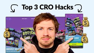
Pedro Loureiro walks through conversion optimization for e-commerce stores, covering navigation, product pages, pricing strategy, and checkout simplification. He uses real client examples like Snow and CarePods to show how these changes boost sales and average order value.
Chapters
In this video, I walk through some of the most important conversion rate optimization strategies that you can do right now to improve your store. These strategies involve making your store more frictionless, improving your messaging, and crafting a high AOV irresistible offer. So let's dive right in. So I talk about navigation menus quite a lot, and the reason why I talk about them so much is because how important they are. The amount of traffic, the amount of your mobile traffic that engages with your navigation menu is crazy. And I really recommend installing a heatmap software or looking at your user journey and actually seeing where your traffic will go, because a lot of people don't believe me when I talk about this. They think that when people land on the page, the button that they're most likely to click is this one down here. That's actually not true. The majority and the majority of stores that I audit, they engage with the navigation menu the most. So if we know that, how can we make this experience on the navigation menu more optimized for them? Well, it just means that we need to make it super easy for them to get to where they want to be. And so what I'd say is it just comes down to hierarchy. You can see for this navigation menu for Ro Nutrition, we're surfacing the bestsellers straight away. You can do that in yours by adding in the images. You could add in a little tab to shop bundles if they wanted to buy a set of your gummies. Another thing that you could do is maybe you could add a shop by flavor. And then the secondary importance down here, you could have all your different learn links down here, find in store, login, order status. Those could all be less visually important. Below the main CTA in your navigation menu. So we have a collection page and we just have a banner here that says All Candy. So this banner is taking up a massive amount of space and it's not really selling me anything. It's just saying All Candy. And you can actually turn this into a landing page. And it's very easy to do that. You can just keep everything you have here. But if you add some education in here, if you add some bullet points, like what you have on your homepage, you can now send traffic to another page and test it out and see if it will perform better. And a lot of cases when we optimize the collection page and we add in some education to it, it actually converts better than the homepage will. Why not do that? Why not actually see if you can optimize this? And of course, imagine if it can beat your homepage by 10% or beat a product page by 10%. That's a huge uplift that you're getting for your margins, for your ad spend. Doing something like this is really worth your time. And what I'd say that you can do is still have your All Candy up here, but just make that text really small at the top. And in your headline, call out your main value proposition again. So you can say guilt-free candy with up to 60% less sugar, or you can call out the 100% dye-free with prebiotics, whatever the main unique selling point is, you can list them out here, or you can list all of them out here in little bullet points. Definitely bring in some social proof. And I definitely think you should bring in a stronger image in the background. This one kind of looks a little bit blurry. And it's really hard to kind of see what's going on. One thing that I love about your brand is the insane visuals of little sugar particles on the candy, like they look really good to eat. And I think this, this image is kind of missing it. Like it looks a little bit plain, a little bit blurred. So bring in some of those nicer images you have. When I come to your Instagram, and this is a theme with a lot of brands that I do an audit for, is their Instagram feels more like a proper website than their website does. Like you have the social proof here and it just feels so much more professional. It gives me instant trust when I look at this. I love all the I love all the social proof that people are doing. This image is awesome over here with a person eating it in the bath. I think that really adds some funness to your brand. And you can call these guys out as well, Loved by Bath Foods. Look at them, they have a ton of followers as well. So this is all going to help you sell more of your product. You could also mention the fact that you're in certain stores in the US. And basically just more images with your, with your customers or your people holding up your gummies. I think that's awesome. Look at these photos over here. This looks great as well. Bring in some of those photos to your website. So in your navigation menu, coming back to what I said before, you should not be Having these different 4 links showing here. It should be the shop candy link should be open by default. And your variety packs, don't just call them out here and say variety. Call out the variety packs. It's really important. I definitely recommend following a structure similar to Raw Nutrition. Having a dropdown tab for maybe the shop by flavor. Say shop bundles here, shop variety packs. And then have 2 of your best sellers up here surfacing. This I definitely think would convert better for you. Let's just go into one of your different items over here. So let's go into this. Don't offer a discount on your lowest priced item because you're kind of diluting your brand value, unless it's on a sale. And it doesn't look like you are running a sale right now, so you should not be discounting your 4-packs at all. I would keep them full priced. And I don't really like the UI/UX on your product pages at all. It's really confusing, and it seems a little bit broken as well. Like, when I click on the different bag sizes, it goes to this image being the first image instead of this one, and it should not show this one. Like, this one is completely irrelevant. Should be showing this one to me. Yeah, that needs to be definitely fixed there. This review, I wouldn't place that there. I'd actually place that lower down. I actually think this would be more powerful if you did this. If you took this review, had the second image in your carousel be a user-generated photo, and have this review in there. And then of course you're saving that space down here, and more people are likely to actually see the review as well. Now, one thing I want to say as well is your imagery. If we— if I selected an APAC down here, I want to see the different APACs over here. I want to actually see the value that I'm buying. I'll show you an example over here. For raw nutrition, we got 1 ball, we got 3 balls, we got 6 balls. You have nice little images down here that show the value. This is really important because now people are equating the perceived value with the price, and it's going to make them a lot more likely to purchase the higher price items because they're seeing the value they're going to get for them. I would stack the pack size vertically instead of horizontally. You can have more space, you're going to be able to add the images that actually show the different options in there, like I mentioned, and it's going to be easier for people to switch between the options. Your Subscribe and Save plan, I think, is a little bit too big. Keep it simple like Rose one. We're keeping it pretty simple down here. We just got subscribed and save, and then it has just a little bullet points here, 3 different bullet points on what that means. Simple UI, but it does— it makes a big difference. I would also test on defaulting to one-time purchase versus subscribe and save. I don't know if you have tested this, but test this out, one-time purchase, because what we found is that people are more likely to spend more upfront— so buy the 32-pack, buy the 16-pack— than they are to actually buy less, buy the 8-pack, with subscribe and save. And the reason behind that, by psychology, is that your subscription is like another layer of commitment that someone has to do when they're interacting with you the first time. So it's a lot harder to get someone to subscribe and actually pay less than it is to spend more upfront, but only do it once. So what I would say is to really maximize your ads, if you're running ads to your, to your site, you should be trying to craft a really high AOV offer. And I think prioritizing one-time purchase, making subscribe and save an option, but making it secondary. And making sure that we're trying to push people towards the higher packs, I'd say that will get you better results. I'd also recommend definitely restructuring your entire order form. It's really hard to see what's going on here. Like the little titles, bag size, choose your flavor, pack size, really small, really hard to read. And the spacing here is kind of weird. Like we have bag size, it's kind of close to this, but then choose your flavor, there's a massive gap. Pack size down here. There's a lot going on. There's a lot of color. There's a lot of different options. We have purple being used down here, and then the call to action is like a green. But the Buy with Shop Pay stands out more than the Add to Cart button. There's a lot going on. And honestly, when it comes to like really optimizing your conversion rate, less is better. And there's already a lot going on with your images and with your colors. So you don't want to take away from this. I think your product imagery should have all the color, your branding should have all the color. But when it comes down to your UX/UI down here, strip it down, keep it simple. And the clearer it is, the more likely people are to convert. So you have these different options down here. Instead of a little view button down here, I would honestly just put a little add button over here and just make it like the little upsells. If people are walking into a supermarket and near the checkouts they have sweets, and the reason why they have sweets there is because those are like, those are, people don't have to think about purchasing them. They're just, okay, I want that, I'll add it into my bag. So those little small little upsells you can put next to here. Still give people the option to view more, learn more, but have the add to bag option. One click away, so it's even more frictionless for people to add them into your cart. You actually do it in your cart. So I would basically just take this functionality and put it on the page before. I think this is perfect, but I would also add a view more button next to it. You can put the ad, maybe make the add button slightly smaller, and then just have a little small little view button next to it if they want to read more text. I think it's going to be really important for the t-shirt because this one is really hard to see what I'm getting because it's on a black background. If you're looking for further help, we do offer a service so we can craft a high-converting landing page that is designed to outbeat your current page by at least 10%. Our specialty is designing these high-converting landing pages, and we pretty much do this every day for the e-com clients that we work with, such as Snow, CarePods, Soloway, Velvet Caviar, and many more DTC brands, helping them to increase their ad performance and get better results in terms of their conversion rate, average order value, and overall profitability. If you're interested in learning what results we can get for you and how our process works, then check out the description. There are links to our website, and of course, you can also book in a call with me and answer any questions you have. Cool, and I hope you got some value from this video.










