The Anatomy Of A High Converting Landing Page (Plus BONUS Swipe File!)
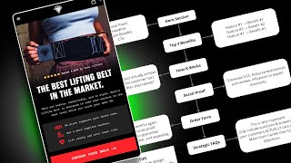
Pedro Loureiro breaks down a landing page framework that moves visitors from hero section through benefits, social proof, and FAQ to maximize conversions. The structure includes a hero with headline and CTA, top three benefits, how it works, differentiation, UGC, order form, and strategic FAQs. A swipe file of real hero sections is included.
Chapters
On this video, I'm going to be going over basically a very simple but high-converting landing page framework that I've tested out numerous and numerous times for my clients. And this one always crushes. So I'm putting this together because I know a lot of you guys out there, you know, you've got your different e-com stores. Let's say you're an agency that's building landing pages for people, or, you know, you've got your own store and you're, you know, you're kind of confused about what sort of layout that you should follow. Well, the way I look at it is you don't need to reinvent the wheel. There are frameworks and there are layouts that are proven to convert, and this is one of them. This is a very simple one. I tried to strip out all of the unnecessary things to make it as simple as possible, and I want to break down each and every single part of this. And as a little bonus, what I also do is at the end of the video, I'll leave you a link and I'll put it in the description here on where you can access to my swipe file. So this is like a swipe file with all the different redesigns that I've done for different clients. So you can kind of get the, the different ideas, um, from there as well. So that would just take things up to the next level. So let's go through this one by one. So the first section is going to be your hero section. This is basically, you know, the first section that you're going to land on when you land on the page. So this is very, very important because if you're running cold ads, the first section that those cold ads go onto, people click on your ad and they land on the page, that's going to be super important whether they're going to bounce, which is going to negatively affect your ad spend, or they're going to stick on the page, get hooked in by your headline, get hooked in by your image, and then go on to convert. So this is really, when it comes down to landing page, this is one of the most important sections. So you wanna make sure that your hero section is dialed in. And basically what I've put in here is 4 principles that you need to make sure that your hero section has in order to ensure that it's set up the best to convert people. So make sure it has some form of social proof. This can be the total amount of customers. And what I'll do, I'll pull up my swipe files. You can kind of see like, um, and this will hopefully give you— these are all different hero sections, by the way. So this will, because this is the most important section, this is why I'm giving you access to this white file. This is the most important section that you need to focus on for your landing page. So you can get a lot of different ideas from here. And you can see I've broken down, like, there's a lot of different examples that I've done here for different stores and different pages. So you can see different, there's different types of social proof. Like for this client, we're just showing, you know, different, like, articles that they've been featured in. But we have also the total amount of customers that they've had. Simple design, but like you can see just by adding in these elements, we're making sure that people are, you know, are building up trust when they come to this page. So look at this brand. We're saying actually it's 50,000 efficient welders have bought this product. Let's go to another one. Okay. What are we saying here? We're saying 20,000 adventurers have bought this product and trust this brand. So again, it's, it's when people are landing on this page, not think they're not going to think that, oh, I'm the first customer that's going to buy for this, buy from this brand. Because you got to think about it. When people are scrolling on Meta or Facebook or Instagram and they click on your ad, a lot of the times they have never seen your brand before. You know, so you have to build up that trust as fast as possible if you want them to stick on the page and feel trustworthy enough to actually go on and convert and spend money on your product. Okay. So go through these examples. You can kind of pick out different ideas for your own, um, for your own store and then apply it. But yeah. So going back to this framework, make sure you have some form of social proof in there. Another form of social proof is like even just adding in like a featured customer quote. You can even say something like that. So for your headline, some principles to follow is your headline. The way I do copywriting, and I kind of try and simplify it as much as possible, this is so much complicated theories and frameworks out there, and I know I'm giving you another framework today, but I want to make it as simple as possible, you know? So for the headline, this is what I do and this works for the clients that I work with. So you can take inspiration from this. For your headline, make your headline be the promise of what your product does. So for example, if I'm selling, I don't know, a tooth whitening product, I'm gonna say get whiter teeth in X amount of days. That's the promise. And then the subheadline underneath should explain how my product achieves that. So we use X technology to, you know, ensure that your teeth get the, you know, the whitest glow in the shortest amount of time. Um, you know, that, that also cares for sensitive teeth, et cetera, et cetera, et cetera. Poor example of copywriting, but you get my principle. Headline should— the main headline should come up with the promise to hook people in. The subheadline should then explain how it achieves that. So it's believable, you know, because I mean, if you come up with a ridiculous headline, some people are going to be like, well, sure, but they want— your product is obviously the vehicle to take people from where they are now to where they want to be, get them to that end desire. So that's why the subheadline and the headline like that go well together, basically. Optional. This is optional, but recommended. You can also break, break it down so you can add 3 different benefits, like, and you can bullet point it. So I'm sure I have some examples of this on this whiteboard as well. Yes. So over here, so you can see headline, this probably should have a subheadline as well to make it stronger. But again, it's just, you need to know this is the art of like building a landing page. You need to know the balance of when to include certain information and when not to include it. Because if you include too much information, people are not going to read it. And if you include too little information, it's not going to convert people and it's not going to hook them on the page. So there's an art to it, you know? So you can see here, these are 3 different bullet points to kind of break it down. And here we go again. We've got, you know, a powerful headline that we got 3 different bullet points that kind of explain the benefits of the product. And there should be more examples as well. You can see here for a SaaS company, here for like this sort of dating company, I believe. I can't remember because I've done these like a while ago. But yeah, you get the idea. Then we go into the how it works section. Sorry. So then after that, we have the call to action, which is just simply your button. So you should always have a button above the fold, which, which is just in this section because obviously you want people to take action and, you know, or at least move down the page. So then we go into the top 3 benefits. So this is like a section that's just going to basically break down and expand upon how your product does what it does. And what are the benefits of it? So that's, that's kind of the gist of it. That if you want to go even deeper, you can create a how it works section to explain like the routine. So how did your, how does your product actually do what it did, what it does basically, you know, and why. And this is important, like why is it better than any alternative? So once you've established the benefits from this section, so painting the end desire, getting people hyped up about that, then you have a section underneath that basically explains how it actually does that. So how it's gonna take people and deliver on the benefits that you promise. Then it's important in this section to explain why it's better than any alternatives in the market. Because once you sold people on your promise and that your product can actually do what it does, some people might be thinking, well, can I buy like a cheaper alternative from Amazon or from another competitor? And that is why you need to explain to people why your product is better than the alternatives on the market. So you can say we have a unique technology, we use unique ingredients, when you buy from us, you're going to get, you're going to be protected by our awesome guarantee, which means you can try it out for like 90 days. And if you don't get the results, then we'll refund you. So things like that are going to basically hook people into buying from you. And that's an important thing. And a lot of brands don't do this actually. So they have a great product, they have a great offer, but then they don't explain why their offer or why their product is better to shop from them compared to anyone else in the market. So you need to have that piece as well. So then social proof. So this is a section where you can call out featured reviews, show UGC. If you have any influencers or experts, include them in there as well. That's really, really powerful. And then order forms. So this is obviously the one of the other really, really important sections on your page. And I'll pull up an example of a page. So Raw Nutrition, I use these pretty often in my, in my videos because these guys are pretty awesome and their product is amazing. And I love the founder, Ryan. He's an awesome dude. So yeah, and I also have tried these products and they're amazing. So I love this brand. But basically if I scroll down, so this is like the order form. This is a product page, but on a landing page, if I try and pull up one of the landing pages that we've done for them. Yeah. So here's a section, 3 bullet points, headline, social proof. Button. We have the benefits section, basically the routine. So like how to take it, et cetera, et cetera. We've got more. This is like an extra section that explains how it does what it does. So you can see the framework in use here. Um, obviously we've kind of added on a little bit more. This section basically explains what I just told you down here. So why is it better than the alternatives? That's what this section does. Social proof. And then the order form. So you can see it here. And this order form is obviously to communicate the offer and to just establish a little bit more trust from people. So again, to tell people social proof, the guarantee. So, you know, you're safe from shopping from us. That's what you want to communicate here. And then we're just reminding them of the benefits of the product. So keep it simple. I know this is more of like a fancier design that we're doing for this, for this brand. It doesn't need to be a fancy design. You just need to have the elements there in place, like the principles. Okay. The design could come after. So, yeah. And then the final thing is getting in some strategic FAQs. Now I did highlight here, this is very important because practically maybe like 1% of the people that you hear from in the e-commerce space talk about this. And yet this is huge in terms of the value this can provide to your page. I've looked at, I mean, hundreds of heat map data from different landing pages and websites and one of the most engaged with sections on any website that I look at on any landing page is the FAQs. And if you think about it, it makes a lot of sense because, you know, even if you have the best landing page in the world, people are still gonna have some questions and some objections. That's why these FAQs are so important because you can structure them in a way where you're picking out 5 to 10 FAQs that really, really target the top questions that people will have, the top objections that people will have. Like, For example, how long will it take to ship? And then get even more strategic and be like, well, what if it doesn't work? You know, that might be a question that someone's thinking in the brain and then explain to them your guarantee. Well, if it doesn't work, we're giving you 60 days to try out the product. So we'll refund you if it doesn't work. And then boom. Okay. You know what? I'm, I'm now confident that I'm going to go ahead and make this purchase. So you can see what I mean about these FAQs. Now, there is no quick process to doing this. This is why I think no one really does this because it's very tedious. You actually have to, read your customer reviews. You actually have to know what pain points your customers, you know, or have and what questions they're thinking before they're purchasing. But one other thing that I do to kind of make this easier is I put myself in the mindset of the customer. So when I'm going through the page, I'm thinking to myself, like, what questions would I be having for me to feel comfortable from purchasing from this, from this brand? So just some different mindset principles there, but this is really, really important. And that's why I say try and implement all of these different things. If you implement like 4 of these things and then you say, okay, why is it not working? Well, it's because you probably haven't implemented the whole thing. So implement the whole thing. I mean, I've done, you know, hundreds of landing pages now, and this is always a framework. This is stripped down to the absolute essentials. This is the actual absolute essentials that you need on the landing page for sure. So, um, and then there's some tips here that I've added in just from my own experience of doing these is like prioritize the mobile design. So a lot of people when they're doing a landing page, they design it on desktop. And because of that, they neglect the mobile design. When I'm always doing a design for a client, I start with the mobile design first because in e-com, the majority of people are shopping on mobile. So you need to make sure that the mobile experience is optimized more so than the desktop. Like a lot of the times when brands come to me and they show me their website, they say, oh, why is it not converting? And they show me and they start showing me their desktop. And I'm like, well, you just told me that there's like only what, 5% of your customers that are shopping on desktop and 95% are shopping on mobile. And so when they then switch to showing me the mobile experience, then we start to see the glaring, you know, reasons why it's not converting well. So, that's a really, really important tip and that will save you a lot of time and a lot of stress. And then also make sure your photos are high quality. People buy with their eyes. If you're going into any store and you wanted to spend, let's say, $100 on a product, would you buy that product if it was in, like, mesh, like crushed up packaging and there was like dirt all over it and it looked like it was just being like thrown around the place? No, you wouldn't. You'd want, you want to buy it if it's packaged nicely, if it looks clean, if it looks, you know, you know that when you take out the product, it's going to be in a nice shape. And it's the same analogy for when you're shopping online and more so because when you're shopping online, you don't get to feel and see that product in your hands or in a space. So that's why your images are even more important when you're shopping online, because you need to make sure that they are high quality, good lighting, and that they show the product actually in use. So some lifestyle photos there, you know, with the right age group. So if, if you have like a supplement brand, That's for, you know, like 50+ women. Don't show like a 20-year-old using your supplements. It's going to be totally off the mark. You know what I mean? So things like that. And of course, the final thing I want to mention is just bug test it. You know, it's like, again, this is another thing that people don't do. And yet it's so important. And yes, it's boring. No one likes doing bug testing, but it's really important. Like how many times have I seen, I booted up a store, they'd say, hey, I need help with conversions. And. We find out this like a massive bug on like their landing page that's causing a section not to work properly. And of course that's gonna harm your sales. So hopefully this helps. Hopefully you have gotten some value from this. And, uh, what I'll do is I'll leave a link below in the description where you can see this swipe file, and this will hopefully help you with coming up with your hero section and making sure it's pretty optimized.










