The Conversion Trap of "Pretty" Stores
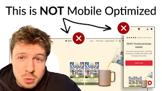
A DTC store looks polished but has hidden friction points killing conversions. The audit reveals specific fixes: enlarge hero images, simplify navigation, reframe free-shipping thresholds from 12 cartons to 3 packs, expand bundle options to boost average order value, and use product photos instead of color swatches.
Chapters
I'm going to show you an example of a store that looks like it's conversion optimized. But once I actually took a deeper dive, I saw some major things that they were doing that are actually causing friction for their customers and of course will be impacting their sales. So let's dive right in. I can already see if we just set this to 650, which is the average screen space that a mobile phone will have. We can see that your image is being cut off. Everything else though in your hero section I think is really nice. I like your headline. I like your subheadline. Explains what the headline is about, explains what you sell. The only thing I'd say is missing is your image. And this image over here is nice. I think it's really clear, but I would just bring it up here, make it, make it bigger. So I think extend it like end to end because the image is going to be the first thing that people see when they land on your page. Right now it's just like a wall of text. So bring that up to the top. And ideally what I would say you could do is instead of it being this entire beige here section that people are landing on, see if you can actually use another image that will bring a lot more color in. We've seen that hero sections have a lot of color, like a massive background image, or things that look more engaging visually will actually hook people in for longer. Because when they land on your website, let's say it's a completely new shopper who's never heard about your brand before. And that's always the best mindset to be in. They will stay on your page for a few seconds longer if they're hooked in visually. And that's the power of it. If we can hook them in visually, they stay on your page longer. And of course, that means they have a more chance to actually read the text. Read, will understand what you're about. And of course, think, okay, actually, this is a really cool brand. Let me browse your store and actually learn more about you. And then of course, convert. So that's the trickle-down effect of getting those precious few seconds when they land on your page. And that's why it's so important. Your social proof is great. 50,000+ 5-star reviews. Every single store is doing this now. They're all saying the same thing. Everyone is using the same stars and the same, you know, total order numbers and the same 5-star reviews. So I And one of the best things I would say you could do to make this stronger is actually to bring in a feature review. You've probably got a lot of ad data of what is actually working in terms of hooks. And if you have that data, one of the best things you can do is actually pair that to a really strong review. Let's say for example, you know that a winning ad— and I'm going to scroll down to let's say a review that you have. Let's say this, right? You have a winning ad that's talking about repairing my leaky gut. Imagine if you brought that review in underneath this here section. So you brought the image up, you make the whole here section, the background, like a really engaging photo. So it's actually hooking people in. And then you use this space down here to bring in that review. And that review can talk about the leaky gut and how your bone broth has helped, let's say, that lady repair it. So now people are going to get hooked in for longer. They're going to read the information. And they're going to actually see something, see an angle or a pain point that is really performing well in your ads, which means it's going to be more likely to hook in new customers as well, or new shoppers to land on your page. The curious thing is actually more people will click on your navigation menu in general than they will on your main CTA. So let's take a look at this. So you've got shop and you've got bundles and you've got the secondary links. All of this space over here, you're using about 20% of this space for the shop and the bundles link. But all of your secondary links down here, which which are not really going to move the needle in terms of your conversion rate, your average order value, or hook in new shoppers. These are taking up the majority of your space. Easy little thing you can do is take all of these links down here, put them below your main CTA, and then expand all of this stuff. So bring out your best sellers and show them visually. So a visual example of what I'm talking about is like this. So you have your product name on the left, little subtext here, and you don't need to call it like bestseller. For you, this could be maybe you're talking about what type of product it is. So maybe it's like bone broth, or you could even say soup or whatever. You could use that subtext for a really important piece of information, or maybe the main benefit of what that product is. See, for Ro, that we've added in the save 10% off. So we're giving people a reason of why they should shop the bundles, what the benefit of it is. This is great for people who have shopped from your brand before, they're coming back, and they were going to let's say purchase the same bone broth again, but now when they actually see, okay, we've made it clear to them that they're going to save more when they buy a bundle, they actually will go to the bundle and of course check out. So that's the psychology behind it. So just communicating what the benefit is of them shopping with a bundle with you and making it clear what the savings are going to be will have a big impact. So those are your changes for your navigation menu. So let's go to your collection page. So the first thing that I can see up here is you've got this filtering mechanism up here. Now I'm not too, I'm not too big of a fan of this because it seems just to me, it just seems like everything's all over the place. We've got a search bar and then when I exit out the search bar, the thing still remains full size and then I have to scroll through. It just seems a bit strange how it's been designed, a bit too clunky. I would have completely simplified everything down. And I would have used that space. This is a big amount of space that you're using up here all for this filtering system you've got, which I think is just overload of buttons for people to click on. I would have used all of that space or a lot more of that space to again communicate what your value proposition is. That way, you can send traffic directly to this collection page and it will warm up cold traffic. So here's an example for Raw Nutrition. We've got a banner in here that's calling out some little value propositions that they have. But you could honestly, you know what you could have done? You could have used that space on your collection page to bring in a nice little hero section image. Even, it could even be like this image that you've got down here. Change out the hero section to be that really striking image that you have. And then maybe bring in this image over here to your collection page at the top. Put in a little headline at the top again, a small little one, a different one that kind of gives another different value proposition of your brand. Put in some benefits underneath, like maybe repairs your leaky gut, some other benefits. And then underneath that, you could even just copy and paste this subtext headline that you've got down here, great tasting bone broth, and calling out the fact that you've got 50,000 reviews. So bringing in those key information, social proof, a headline that kind of gives people, communicates the main desire of what people are looking for, and then the subheadline explaining how your products actually work and how they will fulfill on that desire. That, I think, would be really powerful because then you can send traffic to this collection page and it will convert a lot better than just sending them to a page that has no information to warm them up straight away. So you have this little slider down here, add 12 carts and get free shipping. I quite like that. I think that's a clever idea. You're communicating, you're taking basically the functionality from the cart, and actually bringing it down here. I actually quite like this. I like the fact that the cart is down here. This is clever. So I wouldn't change anything about that. I think that's really good. So I see what you've done. So you've got basically, you've got 4 packs over here. And that helps them get to the 12 pretty easily. But when I first look at the add 12 cartons to get free shipping, that seems like quite a goal to get to, you know, it seems like a big distance. So I'm wondering if you've ever tested this, but have you ever tested just making everything like a multipack bundle? So even the chicken and ancient grain hearty soup, have you tested making that a 4-pack as well? And, and this as well, so that way any item that the customer adds into the cart, will be like 4 items, like minimum. And that way you can basically reframe this and say instead of adding 12 more cartons, you can just say add 3 packs to your cart and get free shipping. So that, that could be something interesting for you to test out. Again, just reducing that distance for the customer to actually think, okay, 12 cartons might seem like a lot to get free shipping, but 3 packs, if I only have to add 3 packs to get free shipping, that doesn't seem like a whole lot more. It's basically the same thing. You're not really changing your offering. It's just changing the way that we're positioning the information. So you have these benefits down here inside the product page, and this is what I'm talking about. How can we bring these from here and surface them on the collection page as well? Like even underneath here, I don't want to overload them with information when they come onto this collection page, but I think taking a really good value proposition for each of these gives your product basically that kind of like sciencey edge. So let's go into one of your product pages over here. So one thing I'd say straight away, just, I would bring your title down here to only be on a maximum of 2 lines. There's no reason— there's no benefit of putting on 3 lines. I think just the formatting is off, just pushes everything down and makes it harder to read. So I'd make this smaller, put it on 2 lines. The most important section on your product page is your listing photos, and I can tell that these are pretty good. They look pretty optimized to me. So let me just go back and see. I like these. I like the fact that you can actually zoom into them as well. I like this. So you had the nutrition information, you've got the ingredients, got a nice lifestyle photo over here. I think your listing photos are great. I've got no complaints about them. I think they're all looking pretty good. So you seem to be pushing people by default to the subscription instead of the one-time purchase. I found a lot more success with the brands that I work with pushing them to one-time purchase rather than subscription. And then of course, once they buy, let's say a bigger bulk order once off straight away, then we can upsell them on the subscription afterwards, just making it more frictionless for first-time customers to shop with you. One thing you can do is you've got the 4-pack over here, it seems like a missed opportunity to not give them like a 6-pack or 12-pack option in that product page. And that will just really boost your AOV. Because I can imagine that what people are doing— and I don't even have to look at your data to this— but I can imagine what people are doing is they're going in, they're buying one 4-pack, then they're going in, buying, like, adding in 2 to the cart, adding in 3 to the cart. So they're buying multiple packs, and we just want to give them a nice reward for doing so. So you can see how we structured it for row. They buy 1 ball, they're paying full price. If they buy a 3-pack, they're getting a nice discount. If they buy 6 packs, they're getting a really big discount. That could be a really nice way to do it, and we're still incorporating the subscription in there as well. Definitely, I would recommend adding in the 6-pack and the 12-pack options in here as well. Because then what you can say when they buy your 6-pack, let's say, is you can add like a little banner up here and you can say, get free shipping, qualify for free shipping straight away. Just making it easier. Someone who only wants to buy the one specific product from you, one flavor, you're just making it easier for them to get all the perks, to get the free shipping, and make it easier to actually get that and also to feel rewarded. I like the fact that on the flavor section, you can switch between any of the different product pages from this. This is great. but make it easier for people to see the differences between them. Instead of having this little color here, just add a little photo of the actual item. That'll make it a lot easier for people to understand the differences and get to where they want to be. It's like a visual anchor instead of this color. So it's interesting because on this product over here, you have this functionality over here with the quantity, and then you don't have the quantity functionality on the previous page that I looked at. So I'm curious as to why You've done on this page, but not the previous one. And I wouldn't recommend doing it like this. You've got all of these different widgets stacked up on top of each other, and it seems really just messy how you've done it. Just look at how simple we've done it for Ro. It's just quantity, and I like the fact that things are updating dynamically. So if we're offering something that doesn't have subscription on it, we'll just toggle the subscription off, just making it clear for people. Going the extra mile and just making things simple and easy to understand visually straight away, just helps take all the thinking and working out away from your customer and makes it just a more joyful experience for them. If you're looking for further help, we do offer a service so we can craft a high-converting landing page that is designed to outbeat your current page by at least 10%. Our specialty is designing these high-converting landing pages, and we pretty much do this every day for the e-com clients that we work with, such as Snow, CarePod, Soloway, Velvet Caviar, and many more DTC brands, helping them to increase their ad performance and get better results in terms of their conversion rate, average of value and overall profitability. If you're interested in learning what results we can get for you and how our process works, then check out the description. There are links to our website, and of course, you can also book in a call with me and answer any questions you have. Cool, and I hope you got some value from this video.










