The Fastest Way To Unlock More Conversions
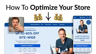
Pedro Loureiro audits Snow's teeth-whitening site and recommends tightening the announcement bar, showcasing Dr. Brian Harris as social proof, surfacing high-AOV bundles early, and adding larger pack sizes like 6-packs and 9-packs to boost average order value. Small visual and copy changes compound into significant conversion lifts.
Chapters
The biggest uplifts that you can do to increase conversions come from where your traffic is actually flowing. And in this video, I'm going to be going through Snow's website, which is a teeth whitening brand, and looking at where the traffic is actually going and how they can optimize each and every single different stage to really move the needle. So let's dive right in. So let's go through this. If you're running a little sale in your announcement bar over here, I would just make sure everything fits on one line, which is a golden rule, just makes it easier to read. And then just make sure that your code stands out. So I would make sure all the other text's like lowercase or something. Then you can put your code in capitals. So I'm gonna set this to like 650 in height, and we can actually see that your button is slightly getting cut off. It's somewhat visible. I think you can just make some easy quick fixes here to just bring that up a little bit more. Get your headline onto like a couple of lines. The biggest thing I would say about this is just the formatting. Like your— there's 3 different types of like font sizes over here. So it just makes it a bit harder to read this. And you're featuring this doctor here, Brian. Dr. Brian Harry. I'm assuming that he's maybe a celebrity doctor, he's maybe someone with good authority. If that is the case, and you've got him on your homepage, feature his credentials in your homepage. So I'll show you this. So I'm showing you this on Ro's homepage. So we got a big influencer here drinking one of their products, you know, Eric Hyman, and we're showing his credentials here. So just building in some social proof straightaway for anyone who doesn't know who this is. And you can see even in the formatting of this hero section, We're not using really a lot of copy. The headline is only on like 2 lines. We've got some social proof here. Everything's really, really clear and easy to read. And those little things, you might not think they're really going to make a big difference, but those little things do add up. Like your social proof here at the bottom is all the way buried, is all the way buried at the bottom. Instead of having a badge over here, that's where I think you should be putting the credentials of who this person is and building more authority around your products. So underneath your hero section, your homepage, this is always where I'd recommend that you put your bestsellers so people can get straight to your most popular products and actually shop them straight away. Honestly, when it comes to like optimizing your navigation menu, all you really need to do is just make it really easy for them to see what the different categories are. And you can do this by just adding little icons next to different categories or images. And then what I would recommend is bring out or feature your high AOV bundles in here so that more people are aware of them. People who are familiar to your Snow brand are coming back, they're navigating through your, through your navigation, and then you see the bundle and they're like, okay, wow, I like, I love Snow. I've been using them for a while. Why don't I get the bundle and upgrade to like a, you know, entire kit, get more of your products and save more. So feature your bundles in here at the top. Or you could use that space that like banner space inside of your navigation menu to call out your sale again. So your spring sale, and when people click on it, it will just go directly to the sale page like you've got here. So looking at your spring cleaning sale, I definitely think again, there's, there's quite a lot of text going on. And the golden rule when it comes to collection pages is your product grid should be visible without having to scroll. And so really, I would recommend bringing up your product grid all the way up to here and ditching some of this text. So we actually see professionally developed by Brian, Dr. Brian Harris DDS. So you've got his credentials over here, but I guarantee that people are going to miss that. That should be on the homepage. That should be on the first part of the, like, if you're sending traffic directly to your sell page, by the way, you should have a photo of him in here as well. And have his credentials in there again. And there's definitely no need to have this much text, because I can guarantee you that people are not going to be reading all of this. And that the problem with having too much text is actually dilutes your message. So if we have less text, but we choose the text really, really intentionally, and we say, okay, this is the headline that we want to lead with, this is the subheadline that we want to lead with. And we're really, really strategic about it. And this is the social proof we want to include, that's going to be a lot more powerful. Because a lot more people are going to read it and a lot more people are going to get persuaded by it. So that's what I recommend, and definitely include an image up here in your banner so it doesn't feel like it's just, you know, a boring collection page. Another thing I'd recommend for your product grid is to make your images a lot bigger. They seem to be quite small right now, you know, and there's a lot more white space you can actually fill them out with. Another thing I would say is add a little tag underneath the product name to describe what that benefit is. So the 3-pack extra strength gold wand, communicate that that's whitening serum. So you can have whitening serum as a tag underneath that, so that people can look at the different tags and instantly know what this product is actually going to do for them. Now the last thing I'm going to do is just check out your product page very, very quickly. So trustpilot review, they've actually got a quote from Dr. Brian Harris. So, so this is the thing that I'm saying here is I feel like you're really underutilizing the social proof of this doctor that you've clearly partnered with. So this quote should really be featured in snippets across the entire user journey, should feature a snippet, snippet of it on your homepage, a snippet of it on the collection page, and another snippet of it on your product page as well. And that's going to make it so much more powerful when people actually read that, because now they're not going to miss it, they're going to see it in every single instance. So another thing I'd recommend when it comes to a product like this is show the information that customers are going to be looking for. And one of them is, how long is this product going to last for? Is this going to last me this 3-pack a month, or 3 months, or 2 months? And if it's only gonna last me a month or less than 2 months, there's a really good opportunity there to add a 6-pack option in here. So this could be a 3-pack option. Why not add a 6-pack option and maybe a 7-pack or 8-pack option, and then you get like maybe one free pack as well. So it's like a 9-pack. You know, but you actually only pay for 8. So that could be a really nice way of increasing AOV, giving your customers a lot more value who want to use this product, but they don't want to have to keep on coming back to your store every so often, or adding 3 of these items to the cart and paying extra for shipping. You're actually rewarding them for purchasing more. So that could be something to test out. In your listing photos, there's no real consistency. Your headlines are all different sizes. Some of them have like ticks on them. Oh, actually, I can see this is like on 2 different lines here. And then some of the text is like really small. Like this is really small. It's kind of really hard to see how, you know, what these images even are. And there's no functionality. It doesn't seem like there is. Maybe it is on mobile. But there's no functionality to actually click in and zoom in on this image. Some of them are really, really blurry. Like this one is quite blurry here. And it's just, that's a, that's an easy optimization I can say that you and your team can do is just, just upload higher resolution versions of these images and make the text bigger, so it's easier for people to read. And bring out, cut out some of the clutter, come out, cut out some of these little icons you've got over here that are not really doing anything. They're just adding clutter to it. If you're looking for further help, we do offer a service so we can craft a high-converting landing page that is designed to outbeat your current page by at least 10%. Our specialty is designing these high-converting landing pages. And we pretty much do this every day for the e-com clients that we work with, such as Snow, CarePods, Soloway, Velvet Caviar, and many more DTC brands, helping them to increase their ad performance and get better results and in terms of their conversion rate, average order value, and overall profitability. If you're interested in learning what results we can get for you and how our process works, then check out the description. There are links to our website. And of course, you can also book a call with me and answer any questions you have. Cool. And I hope you got some value from this video.










