The Real Reason Why You Can't Scale on Shopify (CRO Audit)
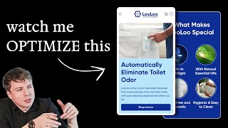
Pedro Loureiro audits a touch-free toilet freshener brand and finds the real scaling problem isn't design but mismatched messaging: copy, images, and video that don't work together. He points to a tiny logo, unclear headlines, missing product videos, and confusing visuals that contradict the touch-free claim. The fix: enlarge product images, add demo videos, use dual CTAs, and let visuals do the work.
Chapters
There is one huge thing that is preventing a lot of brands from scaling, and it's not what you think. It's not to do with your button color. It's not to do with how your website looks. It's not even to do with what theme you're using on Shopify. It's actually to do with your messaging. And what I mean by that is the copywriting and the images that you're using that explain your product, that communicate the benefits of it, and that guide users through a journey through your landing page, through your website, and prime them to buy. And on today's video, I'm going to walk you through a live SEO audit that I've done for a brand recently. I'm going to show you the tips and tricks that I'm recommending to them on how they can improve their messaging so that they can convert more customers. And you can apply these principles to your own store and your own brand to do the same. Let's dive in. So first thing I would say is your logo describes what your product is, which is great. But this text over here is so small that you can barely read it. Now I can see it because again, we're zooming in here. What I would say just to make it super obvious for people is bring this line that you've got here, touch-free toilet freshener, put it above here, put it above here, and you can put it small, like about 12 pixels in font size, just so when someone lands on your page for the first time, they're going to see, okay, this is a touch-free toilet freshener for the first time. So they're going to instantly know what your product is about. I like your photo. I think this is great, shows basically what the product does. It would be even more powerful though if you had a video, like if you had a short video that looped. Showing, okay, someone touches it, and then basically showing how the freshener actually works, if that makes sense. So that would be even more powerful. You do have it down here, I can see, but I think it'd be better to actually just show like a more professional video. Now I'm not sure why you've put this into the little box over here, because I think just make your images as big as possible. So I would have put this all the way out to the edge to make it as big as possible. So what automatically eliminate toilet odor. That is great for a headline, but basically one of your main selling points is you're a touch-free toilet freshener, right? So you don't actually need to touch it. The only issue that I have with this photo is it does actually look like he's touching it. It does look like he's actually pressing on that button. Okay, one thing I would say is just put a dash in here. So odor blocking, odor blocking essential oils, odor blocking Dash blocking essentials when you sit. I think that's good. I would just maybe, yeah, so I would do that first point. The first point I mentioned is bring this sort of subheadline that you've got down here, bring that and put it in small text above here. Your hero section also needs some social proof, so I would add that in here as well. And then what I'm going to say is I would almost add two buttons into your hero section. Shop Lulu, and then right underneath it you can put How It Works. Someone clicks on How It Works, scrolls them down to the next section down here. So you sit, it sprays, breathe easy. So the only issue that I have with this is you're leaning more heavy into the copy than you are into the photos. I would make the photos big, much bigger so that we can actually see it. And honestly, you don't really need to, you don't really need to go as heavy into this text as I think you are doing right now. So for example, you could literally just say, put the images in, like make the images a lot larger. And you could just say, you sit, it sprays, breathe easy. You could just say that. You can see from the images how the product works. I don't think you need to go as heavy into the copy here. You'll make it a little bit more visually engaging. And also this video that you've got here that shows how it does, how it works as well. Visit our start guide. So what is this? This is like a listicle, I'm assuming, right? This is actually cool. Push any time for an extra boost, boost of freshness. So the spray button over here— oh, so you actually do have to press it. Okay, so this is the bit that I'm a bit confused is you're basically saying that it's a touch-free toilet freshener. And yet the photo that you're using is someone who's clicking the button for the extra boost. I don't think, I don't think it matches up correctly. If you're— the way that this works, which I understand now, is that someone sits on the toilet, and then once they leave, or while they're sitting, it automatically releases the odor-blocking essential oil mist. So I think you need to show that in some way visually in your image, not someone who's clicking on the button for the extra for the extra mist, because I think people can see this and they're like, oh, do I have to click on the button every single time I sit on the toilet? And isn't that gross? Like everyone's just clicking on the button. So I could see some people having an issue with that, with it, with the image. So I think this image is just causing a little bit more confusion because it's not really showing how your product works. It's actually showing a specific feature of your product, which isn't the main feature. So that's why I'd be careful with that. Visit the start guide. I actually think this is quite good. Like your photos here are really, really good. I would try and see if you can bring some of these sections onto your homepage. I particularly like this. I think this is a really nice section. It's not too long. And then of course, if they want to get some extra information here, they can click on these little tabs. So I would definitely bring this onto your homepage so that people can learn a little bit more about it. Okay, so let's go back into your homepage and I'm going to go onto your product page. So I'm going to click through. Okay, so I don't think that's being linked up correctly. Maybe you said this is a new store that you're launching. I'd have to check what you messaged me. About. Okay, so it's got a built-in nightlight. That's actually quite cool, actually. Oh, but it looks like the toilet is glowing though. I'm assuming it doesn't glow the toilet, or does it? Maybe it does. Maybe there's another light that glows through the toilet. So this image I feel like is a little bit better. This kind of shows the touch-free aspect of it. Hygienic— I think the spelling there is, uh, Needs to be fixed. Needs to clean. Okay. Let's check out your Instagram because sometimes people write great copy on their Instagram that they can use. So you've actually been featured in these old news articles, right? So Good Housekeeping, Reader's Digest, and USA Today. So some major publications. I would try and use those in your website and try and feature the quotes for each of them. That makes sense. I think that would make it a lot more powerful. You've actually got some nice photos. I'm not logged into my account, so I can't view this, but you've actually got some nice photos here you can use as well on your website. Maybe I can't see this video, but maybe this might be a nice video to actually use in your hero section if it shows how it actually works with the mist coming out. That could be quite good. So what I'm actually trying to say here in a nutshell is your images and your copy go together. And when they don't go together is when problems can occur. So for example, like this, the mix mash of messaging, because you're saying it's touch-free. Yeah, we can clearly see a photo of a guy touching the button. So that's where things could fall apart. So when you have a— that's why when I refer to copywriting and images, I use one word which is called messaging. Because what messaging means to me is when you combine images, videos, and copywriting together harmoniously. And harmony is like the key word because they should all complement each other and the sum of their parts. So the, what am I trying to say here? The output should be greater than the sum of their parts, if that makes sense. So they should all tie together in a way where the overall message, which is being communicated to the end customer, is so, is super clear. More than, let's say, the individual elements. And what I mean by that specifically is I'll show you some examples of some hero sections that we've done. And I'll show you this. So for example, let's go to which one could we— would easily explain this. I guess Anthur is probably a good example. Like their headline is so simple. It's 3 words, fix your sit. But if we just had that headline on its own, it wouldn't make any sense. We just had only the headline on its own and nothing else there. So no images, nothing else. It wouldn't make any sense. People wouldn't know what we're referring to. Because we have an image of their product here, their chair, both Tied together. And if you remove one of them, if you remove the headline, and if you remove the image, the whole thing would fall apart. But because both of those elements are together, it creates the whole message, which is fix your sit. People know, okay, this is some— this is a product that is to do with a chair that's going to help me correct the way that I'm sitting and help me sit better. So do you understand what I'm saying? Like, another example is Plantwave. Listen to plants in real time. If I didn't have a photo here of this product with the waveform in the background and the leaf and the product, it would, the whole thing would collapse. The whole message would collapse, right? Of what we're trying to communicate here. This is what I mean. And this is what you're lacking in your hero section is right now, this does not complement what your text is down here. And the reason why I'm focusing so heavy on this, you might be like, why is this really important? Well, it is important because Your first section on your hero section is the most important part of the entire page because this is where people land on your website. This is the first section they see. And just how a great ad, the first few seconds determine the success of it, how well it's going to hook people in. The first few seconds of when people land on your landing page or your homepage or your website is crucial to whether they bounce or to whether they go on and actually convert. So that's why the most important thing that you can do from this audit is to take away the power of messaging. And when you can use the right image and the right headline that complement each other, you can elevate and increase the overall message and of course, help more people to convert.










